Button separated reusable component - ita-social-projects/what-front GitHub Wiki
Required:
-
children:
jsxorstring- inner content of button -
onClick:
func- click handler
Optional:
-
type:
string- button type. Default: 'button' -
variant:
string- bootstrap variants of button (danger, warning, primary etc). Default: 'secondary' -
className:
string- additional class that you can apply to button. Default: '' -
disabled:
boolean- default: false
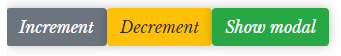
<Button onClick={incrementCounter}>Increment</Button>
<Button onClick={decrementCounter} variant="warning">Decrement</Button>
<Button onClick={showModalHandler} variant="success">Show modal</Button>
- use @mixin button() for styling;
- accordint to button's function and destination you should add propper color to it (for instanse: #FF2121 / $danger-color / map-get($colors, buttonReject-color) for button "Delete" view more in layouts/mock-ups in Figma)
- in case there is an icon inside the button you should import it as Component;
Functions:
- the button should be clickable and invoke proper actions;