Part 3. Customize Your Dashboard - initialstate/pi-health-dashboard GitHub Wiki
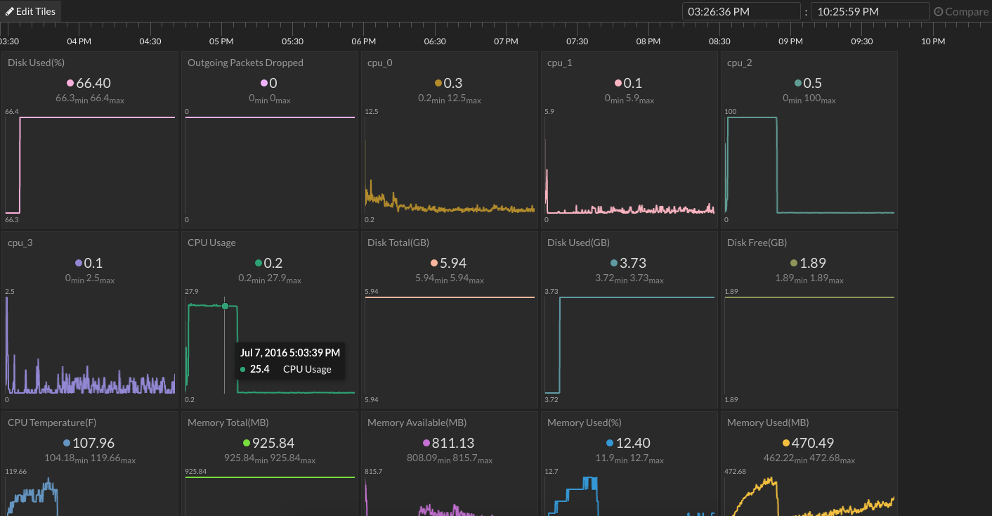
Go to your Initial State account and click on the new data bucket called :computer: Pi3 Performance then click on Tiles to view the dashboard. Your initial dashboard will look similar to the one above after your pihealth.py script has run for a few minutes. Let's customize and organize the data on this dashboard into something useful.
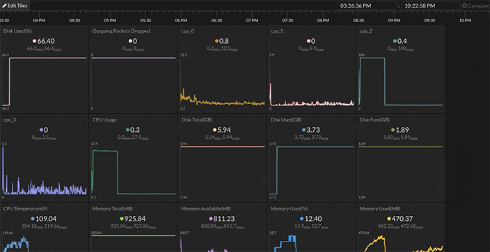
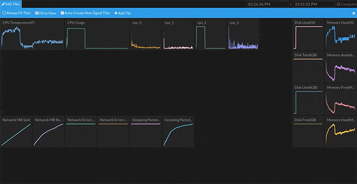
There are a lot of tiles and data streams in this dashboard. Let's make the tiles smaller and get all of the information onto a single screen. Click on the Edit Tiles button in the top left corner and deselect "Always Fit Tiles". This puts our dashboard layout into manual mode. Next, resize each tile to 1/4 its original size by click+dragging the corner of each tile while in edit mode. You can drag each tile to whatever position you like on the screen. I created three groups of tiles, one for CPU usage, one for disk/memory usage, and one for network usage (see below).
One of the many nifty things you can do with this dashboard is create multiple tiles / data views per data stream. For example, you can create tiles to see the line graph for CPU Temperature as well as a gauge graph and the last value. To add a new tile, click on Edit Tiles, then +Add Tile. The new tiles configuration box will popup. Select the data stream that will drive this tile in the SignalKey box, then choose the Tile Type, and create a title for this tile.
In my dashboard, I created multiple views for CPU Temperature, CPU Usage, and each individual CPU Usage data stream.
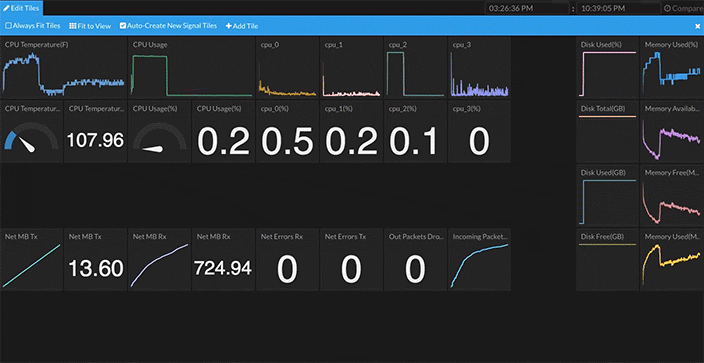
You can change the view type of a tile by right-clicking on the tile and selecting Configure Tile to bring up the Configuration dialog box. Select the desired Tile Type in the drop-down menu.
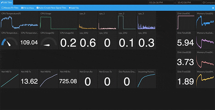
The gauge graph is extremely useful for data streams such as Disk Usage(%) and CPU Usage(%). When you select a gauge graph view, you can set the min and max value for the gauge in the Tile Configuration. It is important to set the min/max to 0/100 for Disk Usage(%) and CPU Usage(%) gauges to make sense.
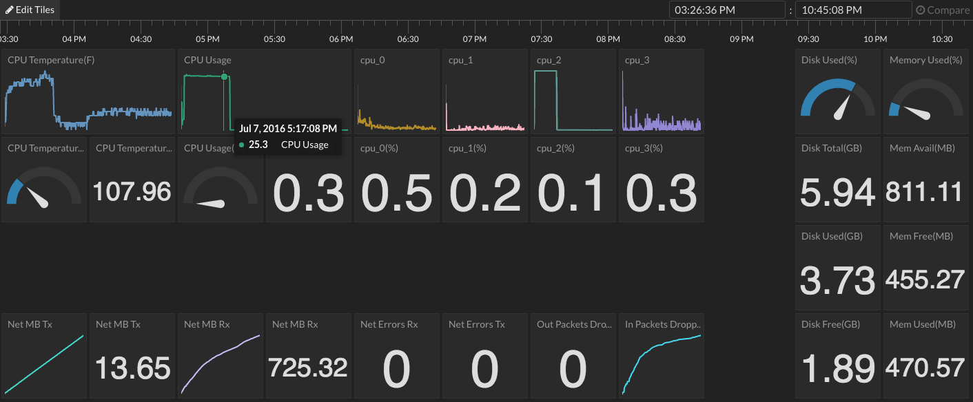
This is what my dashboard looks like after I finished customizing it. This dashboard is publicly shared for you to play with here. I can get a ton of information-at-a-glance such as disk usage, memory usage, spikes in CPU usages, CPU temperature changes, etc.

Tiles gives you several options to mine through your data such as the timeline, comparing two time periods, multiple signals in one tile, and more. You can even view your dashboard on your mobile device and add an app icon to your home screen.