Statistics Examples - incanter/incanter GitHub Wiki
- Student’s t-test
- Linear regression with dummy variables
- Bayesian linear regression
- Permutation test (means difference)
- Permutation test (correlation)
- Principal components analysis
- More examples available at the Incanter blog
For a complete list of statistical functions, see the API documentation for the incanter.stats library.
First, load the plant-growth sample data set.
(use '(incanter core stats charts datasets))
(def plant-growth (to-matrix (get-dataset :plant-growth)))
Break the first column of the data into three groups based on the treatment group variable (second column),
(def groups (group-on plant-growth 1 :cols 0))and print the means of the groups
(map mean groups) ;; returns (5.032 4.661 5.526)View box-plots of the three groups.
(doto (box-plot (first groups))
      (add-box-plot (second groups))
      (add-box-plot (last groups))
      view)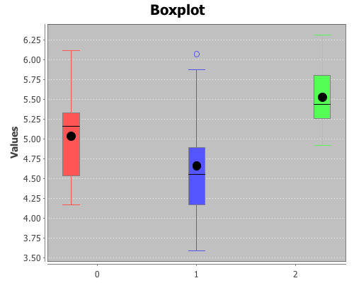
Create a vector of t-test results comparing the groups,
(def t-tests [(t-test (second groups) :y (first groups))
              (t-test (last groups) :y (first groups))
              (t-test (second groups) :y (last groups))])
Print the p-values of the three groups,
(map :p-value t-tests) ;; returns (0.250 0.048 0.009)Based on these results the third group (treatment 2) is statistically significantly different from both the first group (control) and the second group (treatment 1). However, treatment 1 is not statistically significantly different than the control group.
Let’s compare the means of the treatments with the control group using linear regression,
where each group is identified with dummy variables as follows: control group (b1 = 0, b2 = 0),
treatment one (b1 = 0, b2 = 1), and treatment two (b1 = 1, b2 = 0).
(use '(incanter core stats datasets))Load the plant-growth data and create dummy variables representing the groups using the :dummies option of the to-matrix function.
(def plant-growth (to-matrix (get-dataset :plant-growth) :dummies true))Run the regression with the linear-model function.
(def y (sel plant-growth :cols 0))
(def x (sel plant-growth :cols [1 2]))
(def lm (linear-model y x))
Check the p-value of the F statistic for overall model fit:
(:f-prob lm) ;; returns 0.016The model fits at a alpha level of 0.05, now check the estimates of the coefficients and p-values of the t-statistics for each coefficient:
(:coefs lm) ;; returns (5.032 0.494 -0.371)
(:t-probs lm) ;; returns (0.0 0.088 0.194)
The first coefficient (the intercept), with a value of 5.032, represents the mean of the control group, since that is the reference group (b1 = 0, b2 = 0), and is statistically significantly different from zero.
The second coefficient (0.494) represents represents the difference between treatment two (b1 = 1, b2 = 0) and the control, but it is not statistically significantly different from zero, at a 0.05 alpha level, with a p-value of 0.08.
The third coefficient (-0.371) represents the difference between the control and treatment one (b1 = 0, b2 = 1), it is also not significant.
Unlike the t-tests comparing the two treatments with the control, the regression does not provide evidence that either treatment is significantly different than the control.
Sample distributions of the parameters from the previous linear-model can be obtained through Gibbs sampling with the sample-model-params function. The estimates of the parameters, their standard errors, and 95% intervals can then be estimated from the resulting empirical distributions.
Load the bayes library and sample the model parameters:
(use 'incanter.bayes)
(def samp-params (sample-model-params 5000 lm))
View histograms of the distributions of the coefficients:
(view (histogram (sel (:coefs samp-params) :cols 0)))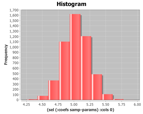
(view (histogram (sel (:coefs samp-params) :cols 1)))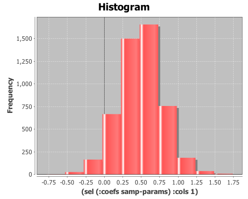
(view (histogram (sel (:coefs samp-params) :cols 2)))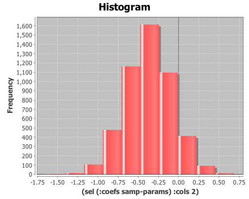
Compare the OLS and Bayesian estimates of the coefficients:
(map mean (trans (:coefs samp-params))) ;; returns (5.033 0.494 -0.374)
(:coefs lm) ;; returns (5.032 0.494 -0.371)
and the estimates of the standard errors:
(map sd (trans (:coefs samp-params))) ;; returns (0.207 0.293 0.288)
(:std-errors lm) ;; returns (0.197 0.279 0.279)
Finally, compare the estimates of the confidence intervals. First, the confidence intervals from OLS:
(:coefs-ci lm)
;; returns ((4.628 5.4368) (-0.0788 1.066) (-0.943 0.201))
The Bayesian CI for b0:
(quantile (sel (:coefs samp-params) :cols 0) :probs [0.025 0.975])
;; returns (4.634 5.429)
The Bayesian CI for b1:
(quantile (sel (:coefs samp-params) :cols 1) :probs [0.025 0.975])
;; returns (-0.065 1.063)
The Bayesian CI for b2:
(quantile (sel (:coefs samp-params) :cols 2) :probs [0.025 0.975])
;;returns (-0.928 0.197)Now let’s compare the means of the treatments with a permutation test. Load the necessary libraries:
(use '(incanter core stats datasets charts))Load the plant-growth data set.
(def data (to-matrix (get-dataset :plant-growth)))Break the first column of the data into groups based on treatment type (second column) using the group-by function.
(def groups (group-by data 1 :cols 0))Define a function to calculate the difference in means between two sequences.
(defn means-diff [x y] (minus (mean x) (mean y)))Calculate the difference in sample means between the two groups.
(def samp-mean-diff (means-diff (first groups) (second groups))) ;; 0.371Now create 1000 permuted versions of the original two groups using the sample-permutations function,
(def permuted-groups (sample-permutations 1000 (first groups) (second groups)))and calculate the difference of means of the 1000 samples by mapping the means-diff function, defined earlier, over the rows returned by sample-permutations.
(def permuted-means-diffs1 (map means-diff (first permuted-groups) (second permuted-groups)))This returns a sequence of differences in the means of the two groups.
Now calculate the proportion of values that are greater than the original sample means-difference. Use the indicator function to generate a sequence of ones and zeros, where one indicates a value of the permuted-means-diff sequence is greater than the original sample mean, and zero indicates a value that is less.
Then take the mean of this sequence, which gives the proportion of times that a value from the permuted sequences are more extreme than the original sample mean (i.e. the p-value).
(mean (indicator #(> % samp-mean-diff) permuted-means-diffs1)) ;; 0.088The calculated p-value is 0.088, meaning that 8.8% of the permuted sequences had a difference in means at least as large as the difference in the original sample means. Therefore there is no evidence (at an alpha level of 0.05) that the means of the control and treatment-one are statistically significantly different.
Calculate a 95% interval of the permuted differences. If the original sample means-difference is outside of this range, there is evidence that the two means are statistically significantly different.
(quantile permuted-means-diffs1 :probs [0.025 0.975]) ;; (-0.606 0.595)The original sample mean difference was 0.371, which is inside the range (-0.606 0.595) calculated above. This is further evidence that treatment one’s mean is not statistically significantly different than the control.
Plot a histogram of the permuted-means-diffs using the density option, instead of the default frequency, and then add a normal pdf curve with the mean and sd of permuted-means-diffs data for a visual comparison.
(doto (histogram permuted-means-diffs1 :density true)
      (add-lines (range -1 1 0.01) (pdf-normal (range -1 1 0.01)
                                               :mean (mean permuted-means-diffs1)
                                               :sd (sd permuted-means-diffs1)))
      view)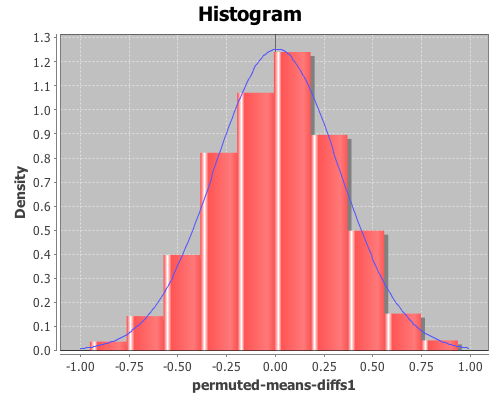
The permuted data looks normal. Now, calculate the p-values for the difference in means between the control and treatment two.
(def permuted-groups (sample-permutations 1000 (first groups) (last groups)))
(def permuted-means-diffs2 (map means-diff (first permuted-groups) (second permuted-groups)))
(def samp-mean-diff (means-diff (first groups) (last groups))) ;; -0.4939
(mean (indicator #(< % samp-mean-diff) permuted-means-diffs2)) ;; 0.022
(quantile permuted-means-diffs2 :probs [0.025 0.975]) ;; (-0.478 0.466)
The calculated p-value is 0.022, meaning that only 2.2% of the permuted sequences had a difference in means at least as large as the difference in the original sample means. Therefore there is evidence (at an alpha level of 0.05) that the means of the control and treatment-two are statistically significantly different.
The original sample mean difference between the control and treatment two was -0.4939, which is outside the range (-0.478 0.466) calculated above. This is further evidence that treatment two’s mean is statistically significantly different than the control.
Finally, calculate the p-values for the difference in means between the treatment one and treatment two.
(def permuted-groups (sample-permutations 1000 (second groups) (last groups)))
(def permuted-means-diffs3 (map means-diff (first permuted-groups) (second permuted-groups)))
(def samp-mean-diff (means-diff (second groups) (last groups))) ;; -0.865
(mean (indicator #(< % samp-mean-diff) permuted-means-diffs3)) ;;  0.002
(quantile permuted-means-diffs3 :probs [0.025 0.975]) ;; (-0.676 0.646)
The calculated p-value is 0.002, meaning that only 0.2% of the permuted sequences had a difference in means at least as large as the difference in the original sample means. Therefore there is evidence (at an alpha level of 0.05) that the means of the treatment-one and treatment-two are statistically significantly different.
The original sample mean difference between the control and treatment two was -0.865, which is outside the range (-0.676 0.646) calculated above. This is further evidence that treatment two’s mean is statistically significantly different than the treatment one’s.
Plot box-plots of the three permuted-means-diffs sequences
(doto (box-plot permuted-means-diffs1)
      (add-box-plot permuted-means-diffs2)
      (add-box-plot permuted-means-diffs3)
      view)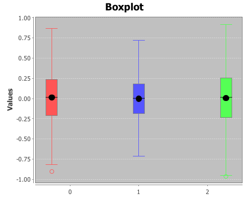
Permutation tests can be used with many different statistics, including correlation. Start by loading the necessary libraries:
(use '(incanter core stats charts datasets))Load the us-arrests data set, and extract the assault and urban population columns:
(def data (to-matrix (get-dataset :us-arrests)))
(def assault (sel data :cols 2))
(def urban-pop (sel data :cols 3))
Calculate the correlation between assaults and urban-pop:
(correlation assault urban-pop)The sample correlation is 0.259, but is this value statistically significantly different from zero? To answer that, we will perform a permutation test by creating 5000 permuted samples of the two variables and then calculate the correlation between them for each sample. These 5000 values represent the distribution of correlations when the null hypothesis is true (i.e. the two variables are not correlated). We can then compare the original sample correlation with this distribution to determine if the value is too extreme to be explained by null hypothesis.
Start by generating 5000 samples of permuted values for each variable:
(def permuted-assault (sample-permutations 5000 assault))
(def permuted-urban-pop (sample-permutations 5000 urban-pop))
Now calculate the correlation between the two variables in each sample:
(def permuted-corrs (map correlation permuted-assault permuted-urban-pop))View a histogram of the correlations
(view (histogram permuted-corrs))
And check out the mean, standard deviation, and 95% interval for the null distribution:
(mean permuted-corrs) ;; -0.001
(sd permuted-corrs) ;; 0.14
(quantile permuted-corrs :probs [0.025 0.975]) ;; (-0.278 0.289)
The values returned by the quantile function are (-0.278 0.289), which means the original sample correlation of 0.259 is within the 95% interval of the null distribution, so the correlation is not statistically significant at an alpha level of 0.05.
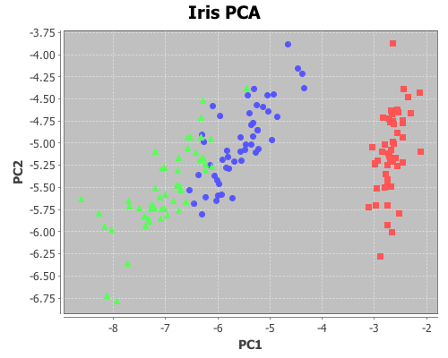
The following is an example of using principal components analysis to project four dimensions of Edgar Anderson’s Iris data onto two dimensions formed from the first two principal components, and then plotting the data with each species a different color in order to better see clustering.
Load the necessary Incanter libraries
(use '(incanter core stats charts datasets))Load the iris dataset
(def iris (to-matrix (get-dataset :iris)))Run the pca on the first four columns only
(def pca (principal-components (sel iris :cols (range 4))))Extract the first two principal components
(def pc1 (sel (:rotation pca) :cols 0))
(def pc2 (sel (:rotation pca) :cols 1))
Project the first four dimension of the iris data onto the first two principal components
(def x1 (mmult (sel iris :cols (range 4)) pc1))
(def x2 (mmult (sel iris :cols (range 4)) pc2))
Now plot the transformed data, coloring each species a different color
(doto (scatter-plot (sel x1 :rows (range 50)) (sel x2 :rows (range 50))
                    :x-label "PC1" :y-label "PC2" :title "Iris PCA")
      (add-points (sel x1 :rows (range 50 100)) (sel x2 :rows (range 50 100)))
      (add-points (sel x1 :rows (range 100 150)) (sel x2 :rows (range 100 150)))
      view)
More examples to come….
For more information see: