Using Popups - ianharrigan/haxeui GitHub Wiki
Popups can be used to create user dialogs or warning messages that prompt user for a decision, they can also be used to create floating panels or windows with any content that can be dragged around.
By default, popups contain a header with title and dragging area, a body with widgets, and a footer with buttons that cause the popup to close when clicked, all this can be modified of course.
Simple popup example:
PopupManager.instance.showSimple("This is a simple popup.");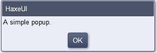
The popup blocks the user interface until OK button is clicked, this is the default popup behavior.
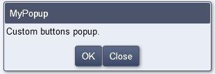
The choice buttons can be changed at creation time using the configs file. The example below shows how to change the choice buttons and listen to the button clicked when the popup is closed.
var configs : Dynamic = { };
configs.buttons = [PopupButton.OK, PopupButton.CLOSE];
PopupManager.instance.showSimple("Custom buttons popup.", "MyPopup", configs, onPopupClosed);

function onPopupClosed(btn:Dynamic) {
	if (Std.is(btn, Int)) {
		switch(btn) {
			case (PopupButton.OK) : trace ("User clicked OK!");
			case (PopupButton.CLOSE) : trace ("User clicked CLOSE!");
		}
	}
}
There are also other popup templates that can be created from PopupManager:
-
SimplePopup- A simple message box -
ListPopup- A list of items for user to select -
CalendarPopup- A calendar for user to select a date -
BusyPopup- A waiting message that is removed after a timeout -
CustomPopup- Custom popups, more on this below
These can be tested on showcase demo: http://haxeui.org/showcase.jsp
Popups content can be customized to be any DisplayObjectContainer, meaning that mostly any container or component can be used. The example bellow shows how to set another containter to be the popup content and also a way to retrieve the contents once the popup is created.
// creating popup content:
var box:VBox = new VBox();
box.percentWidth = 100;

var text = new Text();
text.text = "Enter user name: ";
box.addChild(text);

var input = new TextInput();
input.id = "input";
input.percentWidth = 100;
box.addChild(input);

// showing the custom popup:
var popup = PopupManager.instance.showCustom(box, "My Custom Popup", null, onPopupClose);

//....
function onPopupClose(btn:Dynamic) {
   var name = popup.content.findChild("input", TextInput, true).text;
   trace("Name is " + name);
}
The configs file can be used to add different pre-made buttons, however, for more control over the buttons you can either use popup.addCustomButton or don't use typical popup buttons at all. PopupManager.instance.hide(popup) can be used to manually terminate the popup when an event occurs. Popup.addCustomButton can be used to achieve a consistent look across popups.
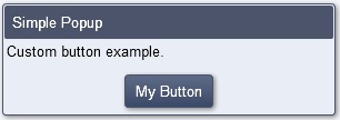
The example below shows how to add a custom button to the buttons footer and how to manually close the popup once it is clicked.
var btn = new Button();
btn.text = "My Button";
btn.addEventListener(UIEvent.CLICK, onPopupButton);

popup = PopupManager.instance.showSimple("Custom button example", "Simple Popup", { /* empty */ });
popup.addCustomButton(btn);


function onPopupButton(e:UIEvent) {
	trace("My Button Clicked");
	PopupManager.instance.hidePopup(popup);
}
Configs are used on popup creation, since they are untyped here's a list of configs that can be set:
-
id: String - Sets the popup component id. -
styleName: String - Allows to select the popup visual style. -
modal: Bool - Weather the popup blocks the rest of the UI or not. By default this is true, set it to false to create windows or toolbars that can be dragged around. -
useDefaultTitle: Bool - If no title is set, sets the popup title to "HaxeUI" or hides the title label and drag bar otherwise. -
root: Root - The associated ui root component. -
buttons: Array - Popup buttons to be added, seePopupButtonclass for available buttons.
Transitions can be set to:
Toolkit.setTransitionForClass(Popup, "fade");
// or
Toolkit.setTransitionForClass(Popup, "slide");
// or
Toolkit.setTransitionForClass(Popup, "none");