Examples - highfestiva/finplot GitHub Wiki
Simple example
It's straightforward to start using. This shows every daily candle of Apple since the 80'ies:
import finplot as fplt
import yfinance

df = yfinance.download('AAPL')
fplt.candlestick_ochl(df['Open', 'Close', 'High', 'Low'](/highfestiva/finplot/wiki/'Open',-'Close',-'High',-'Low'))
fplt.show()
Featured example
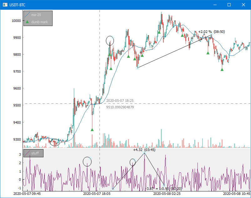
This 25-liner pulls some BitCoin data off of Bittrex and shows the above:
import finplot as fplt
import numpy as np
import pandas as pd
import requests

# pull some data
symbol = 'USDT-BTC'
url = 'https://bittrex.com/Api/v2.0/pub/market/GetTicks?marketName=%s&tickInterval=fiveMin' % symbol
data = requests.get(url).json()

# format it in pandas
df = pd.DataFrame(data['result'])
df = df.rename(columns={'T':'time', 'O':'open', 'C':'close', 'H':'high', 'L':'low', 'V':'volume'})
df = df.astype({'time':'datetime64[ns]'})

# create two axes
ax,ax2 = fplt.create_plot(symbol, rows=2)

# plot candle sticks
candles = df['time','open','close','high','low'](/highfestiva/finplot/wiki/'time','open','close','high','low')
fplt.candlestick_ochl(candles, ax=ax)

# overlay volume on the top plot
volumes = df['time','open','close','volume'](/highfestiva/finplot/wiki/'time','open','close','volume')
fplt.volume_ocv(volumes, ax=ax.overlay())

# put an MA on the close price
fplt.plot(df['time'], df['close'].rolling(25).mean(), ax=ax, legend='ma-25')

# place some dumb markers on low wicks
lo_wicks = df['open','close'](/highfestiva/finplot/wiki/'open','close').T.min() - df['low']
df.loc[(lo_wicks>lo_wicks.quantile(0.99)), 'marker'] = df['low']
fplt.plot(df['time'], df['marker'], ax=ax, color='#4a5', style='^', legend='dumb mark')

# draw some random crap on our second plot
fplt.plot(df['time'], np.random.normal(size=len(df)), ax=ax2, color='#927', legend='stuff')
fplt.set_y_range(-1.4, +3.7, ax=ax2) # hard-code y-axis range limitation

# restore view (X-position and zoom) if we ever run this example again
fplt.autoviewrestore()

# we're done
fplt.show()
Real-time examples
Included in this repo are a 40-liner Bitfinex example and a slightly longer BitMEX websocket example, which both update in realtime with Bitcoin/Dollar pulled from the exchange. A more complicated example show real-time updates and interactively varying of asset, time scales, indicators and color scheme.
finplot is mainly intended for backtesting, so the API is clunky for real-time applications. The examples/complicated.py was written a result of popular demand.
MACD, Parabolic SAR, RSI, volume profile, and others
There are plenty of examples that show different indicators.
| Indicator | Example |
|---|---|
| MACD | S&P 500 |
| RSI | Analyze |
| SMA | Analyze 2 |
| EMA | Analyze |
| TD sequential | Bitfinex |
| Bollinger bands | BitMEX |
| Parabolic SAR | BitMEX |
| Heikin ashi | Analyze |
| Renko | Renko dark mode |
| Accumulation/distribution | Analyze |
| On balance volume | Analyze |
| Heat map | Heatmap |
| Volume profile | Volume profile |
| VWAP | Volume profile |
| Period returns | Analyze 2 |
| Asset correlation | Overlay correlate |
| Lines | Bitcoin long term |
| ms time resolution | Line |
For interactively modifying what indicators are shown, see examples/complicated.py.