Heart Disease Dataset - emilc-jpg/datavisualization GitHub Wiki
I created two charts in R on the Heart Disease dataset obtained from here.
First, we start with importing the data and recoding some of the values into more descriptive categories.
library(ggplot2)
heartdata = read.csv("C:\\Users\\Emily Chen\\Documents\\RStudio_Projects\\heart.csv")
colnames(heartdata) # here we see the first column has a strange name "ï..age" so we rename
names(heartdata)[1] <- "age" # rename the column appropriately
heartdata$cp[heartdata$cp == "0"] <- "asymptomatic"
heartdata$cp[heartdata$cp == "1"] <- "atypical angina
heartdata$cp[heartdata$cp == "2"] <- "non-anginal pain"
heartdata$cp[heartdata$cp == "3"] <- "typical angina"
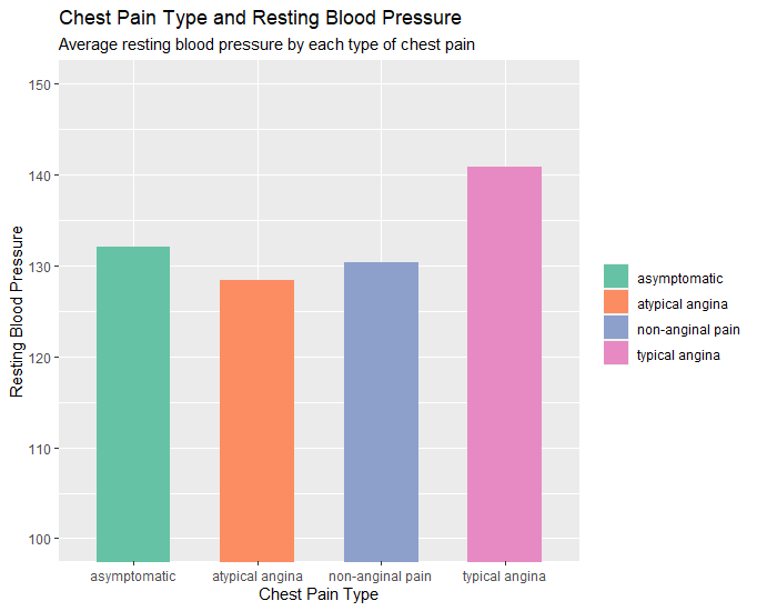
heartdata2 <- aggregate(trestbps ~ cp, data=heartdata,FUN=mean)
heartdata2
Now we are ready to make our charts!
# Column Chart (chest pain type x rest blood pressure)
# layers, aesthetoc, type of graph, coord_cartesian for axis zoom, scale_fill for color palette, labs for
labels.
p <- ggplot(data=heartdata2, aes(x=cp, y=trestbps, fill=cp)) + geom_bar(stat="identity", width = 0.6) +
coord_cartesian(ylim=c(100,150)) + scale_fill_brewer(palette ="Set2")
p + labs(title="Chest Pain Type and Resting Blood Pressure", subtitle="Average resting blood pressure by
each type of chest pain.", x="Chest Pain Type", y="Resting Blood Pressure") +
guides(fill=guide_legend(title=NULL))
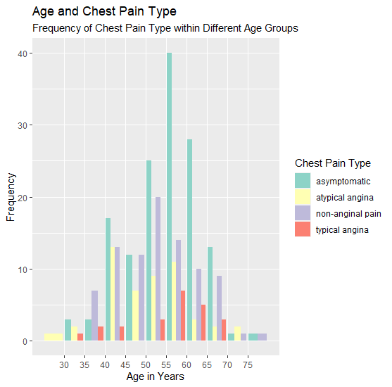
# Variable with column chart (age x chest pain type x frequency)
o <- ggplot(data=heartdata, aes(age, fill=cp)) + geom_bar(position=position_dodge()) + scale_x_binned() +
scale_fill_brewer(palette ="Set3")
o + labs(title="Age and Chest Pain Type", subtitle="Frequency of Chest Pain Type within Different Age
Groups", x="Age in Years", y="Frequency") + guides(fill=guide_legend(title="Chest Pain Type"))