Day2 ggplot2 Data visualization - e394282438/R-personal-study-notes GitHub Wiki
2 Data visualization
2.1.1 Prerequisites
library(tidyverse)
library(palmerpenguins)
2.2 Qusetion
The relationship between two variables, for example: Do penguins with longer flippers weigh more or less than penguins with shorter flippers? What does the relationship between flipper length and body mass look like? Is it positive? Negative? Linear? Nonlinear? Does the relationship vary by the species of the penguin? And how about by the island where the penguin lives.
#> 明确想分析的科学问题,以企鹅数据集为例,flippers_length和weigh之间是什么关系?正相关?负相关?线性?非线性?与企鹅品种有关吗?与它们生活的岛屿有关吗?
2.2.1 Data view
Use penguins data frame as an example.
Run penguins, in this data frame variables are in the columns and obvervations are in the rows.
#> 直接运行penguins, 列为变量,行为观测值。
#> A tibble: 344 × 8
#> species island bill_…¹ bill_…² flipp…³ body_…⁴ sex
#>
#> 1 Adelie Torger… 39.1 18.7 181 3750 male
#> 2 Adelie Torger… 39.5 17.4 186 3800 fema…
#> 3 Adelie Torger… 40.3 18 195 3250 fema…
#> 4 Adelie Torger… NA NA NA NA NA
#> 5 Adelie Torger… 36.7 19.3 193 3450 fema…
#> 6 Adelie Torger… 39.3 20.6 190 3650 male
#> 7 Adelie Torger… 38.9 17.8 181 3625 fema…
#> 8 Adelie Torger… 39.2 19.6 195 4675 male
#> 9 Adelie Torger… 34.1 18.1 193 3475 NA
#>10 Adelie Torger… 42 20.2 190 4250 NA
#> … with 334 more rows, 1 more variable: year ,
#> and abbreviated variable names ¹bill_length_mm,
#> ²bill_depth_mm, ³flipper_length_mm, ⁴body_mass_g
#> ℹ Use print(n = ...) to see more rows, and colnames() to see all variable names
Run glimpse(penguins), see all variables and the first few observations of each variable.
#> 运行glimpse(penguins), 第一列显示出全部8个变量,后面是前几个观测值的预览。
#> Rows: 344
#> Columns: 8
#> $ species Adelie, Adelie, Adelie, Adel…
#> $ island Torgersen, Torgersen, Torger…
#> $ bill_length_mm 39.1, 39.5, 40.3, NA, 36.7, …
#> $ bill_depth_mm 18.7, 17.4, 18.0, NA, 19.3, …
#> $ flipper_length_mm 181, 186, 195, NA, 193, 190,…
#> $ body_mass_g 3750, 3800, 3250, NA, 3450, …
#> $ sex male, female, female, NA, fe…
#> $ year 2007, 2007, 2007, 2007, 2007…
In RStudio, run View(penguins) to open an interactive data viewer.
#> 在RStudio种,运行View(penguins), 列出全部数据。
2.2.3 Creating a ggplot layer-by-layer
With ggplot2, we begin a plot with the funcition ggplot(), defining a plot object that we then add layers to.
2.2.3.1 The dataset to be used
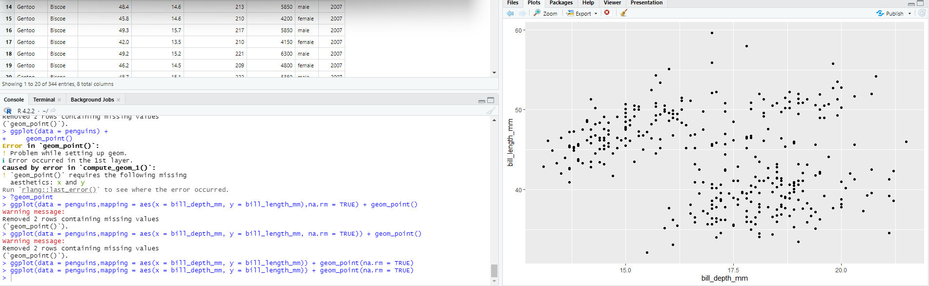
ggplot(data = penguins)
#> 选择数据集
It creates an empty graph like an empty canvas.

2.2.3.2 aesthetics
#> 定义坐标轴
The mapping argument of the ggplot() function defines how variables in the dataset are mapped to visual properties of the plot. The mapping argument is always paired with the aes() function, and the x and y arguments of aes() specify which variables to map to the x and y axes. For now, we will only map flipper length to the x aesthetic and body mass to the y aesthetic. ggplot2 looks for the mapped variables in the data argument, in this case, penguins.
ggplot(data = penguins, mapping = aes(x=flipper_length_mm))
#> 定义x轴
ggplot(data = penguins, mapping = aes(x=flipper_length_mm,y=body_mass_g))
#> 定义x轴和y轴
2.2.3.3 geom
#> 选择图表类型
In ggplot2, use geom_ to choose geometric objects. For example, bar charts use bar geoms (geom_bar()), line charts use line geoms (geom_line()), boxplots use boxplot geoms (geom_boxplot()), and so on. Scatterplots break the trend; they use the point geom: geom_point().
#> 条形图geom_bar(),线型图geom_line(),箱型图geom_boxpolt(),散点图geom_point()
ggplot(data = penguins,mapping = aes(x = flipper_length_mm, y = body_mass_g)) + geom_point()
#> Warning message:
#> Removed 2 rows containing missing values (geom_point()).
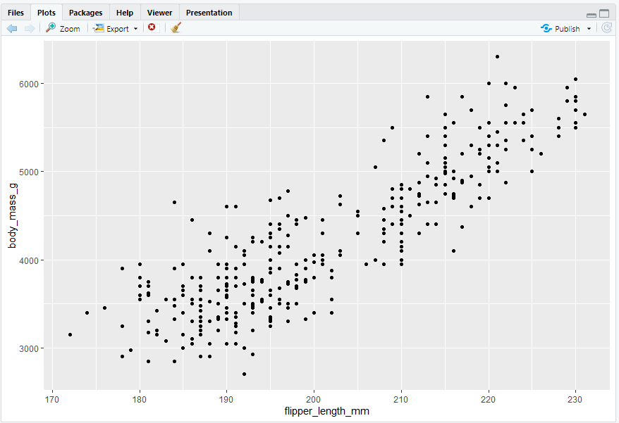
#> Removed 2 rows containing missing values (geom_point()). 是因为数据集中缺少两只企鹅的体重和脚蹼长度值(NA),可通过下述方法调取缺失值,“缺失值同样重要”:
penguins |> select(species, flipper_length_mm, body_mass_g) |> filter(is.na(body_mass_g) | is.na(flipper_length_mm))
#> # A tibble: 2 × 3
#> species flipper_length_mm body_mass_g
#>
#> 1 Adelie NA NA
#> 2 Gentoo NA NA
2.2.4 Adding aesthetics and layers
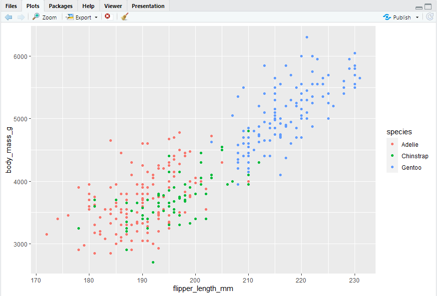
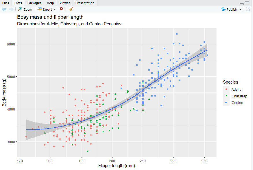
Let’s incorporate species into our plot and see if this reveals any additional insights into the apparent relationship between flipper length and body mass. We will do this by representing species with different colored points.
“in the aesthetic mapping, inside of aes()”
#> 用颜色区分品种,
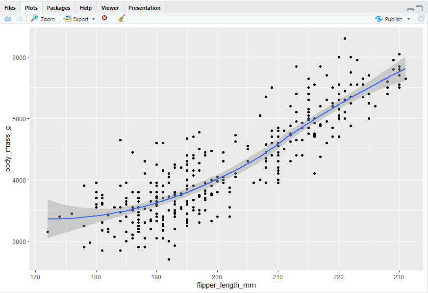
ggplot(data = penguins,mapping = aes(x = flipper_length_mm, y = body_mass_g, color = species)) + geom_point()
Adding a smooth curve
#> geom_smooth() 添加平滑趋势线
ggplot(data = penguins,mapping = aes(x = flipper_length_mm, y = body_mass_g, color = species)) + geom_point() + geom_smooth()
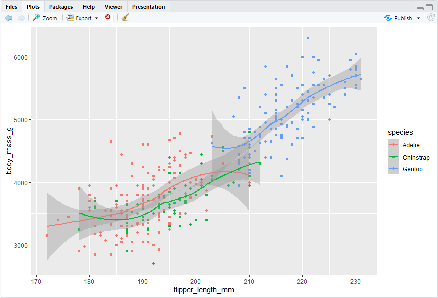
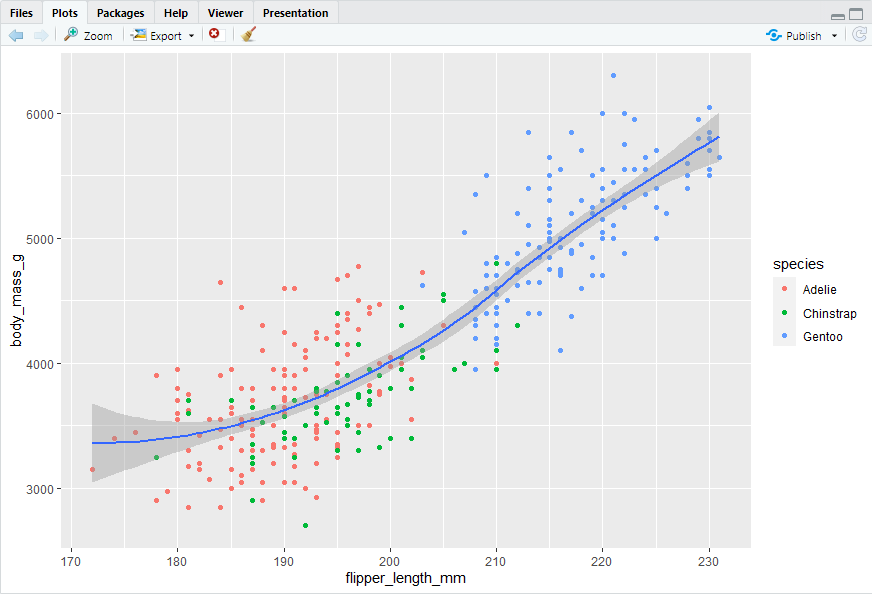
#> 但是这里趋势线也是按照物种分类的,而不是全部数据整体的趋势。这是由于颜色分类是在全局层面上定义的。如果仅为geom_point()指定color = species,结果如下:
ggplot(data = penguins,mapping = aes(x = flipper_length_mm, y = body_mass_g)) + geom_point(mapping = aes(color = species)) + geom_smooth()
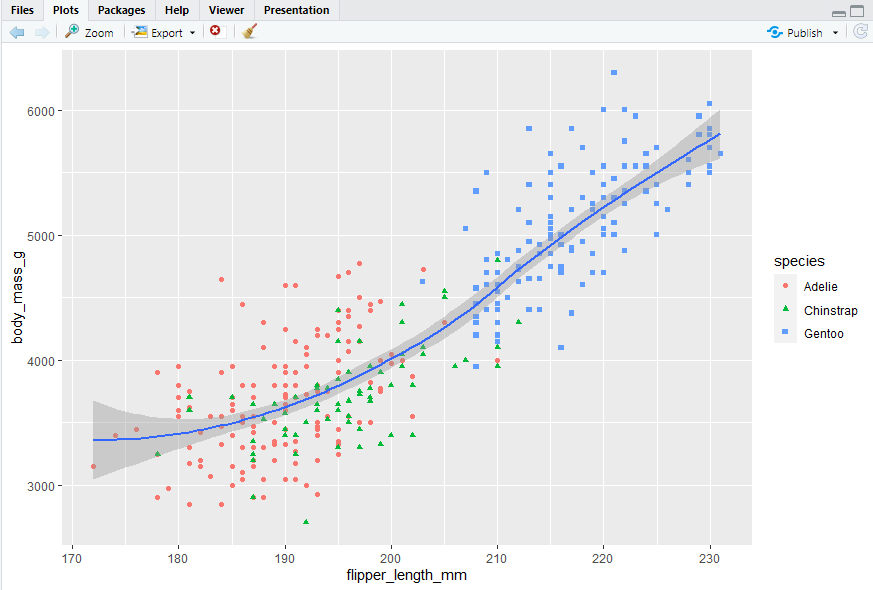
Adding shape aesthetic
ggplot(data = penguins,mapping = aes(x = flipper_length_mm, y = body_mass_g)) + geom_point(mapping = aes(color = species, shape = species)) + geom_smooth()
labels
Using labs() function in a new layer.
ggplot(data = penguins,mapping = aes(x = flipper_length_mm, y = body_mass_g)) + geom_point(mapping = aes(color = species, shape = species)) + geom_smooth() + labs(title = "Bosy mass and flipper length", subtitle = "Dimensions for Adelie, Chinstrap, and Gentoo Penguins", x = "Flipper length (mm)", y = "Body mass (g)", color = "Species", shape = "Species")
2.2.5 Exercises
- 344 rows, 8 columns
- a number denoting bill depth (millimeters)
-
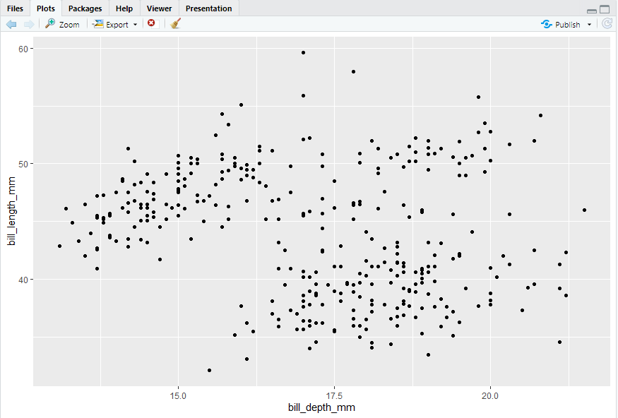
ggplot(data = penguins,mapping = aes(x = bill_depth_mm, y = bill_length_mm)) + geom_point()
-
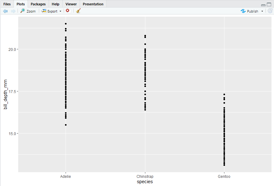
ggplot(data = penguins,mapping = aes(x = species, y = bill_depth_mm)) + geom_point()
- missing aesthetics: x and y
- na.rm If FALSE, the default, missing values are removed with a warning. If TRUE, missing values are silently removed.
ggplot(data = penguins,mapping = aes(x = bill_depth_mm, y = bill_length_mm)) + geom_point(na.rm = TRUE)
-
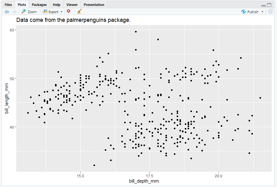
ggplot(data = penguins,mapping = aes(x = bill_depth_mm, y = bill_length_mm)) + geom_point(na.rm = TRUE) + labs(title = "Data come from the palmerpenguins package.")
-
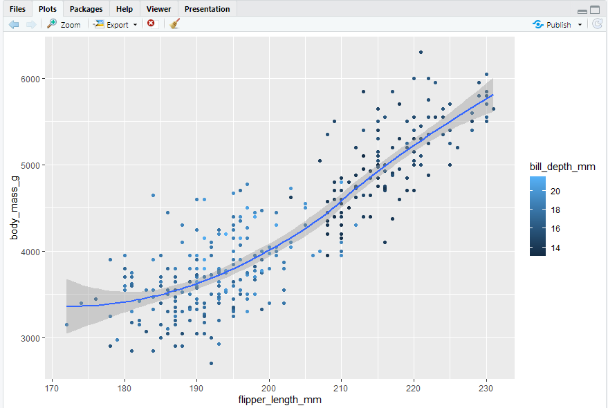
ggplot(data = penguins,mapping = aes(x = flipper_length_mm, y = body_mass_g)) + geom_point(mapping = aes(color = bill_depth_mm)) + geom_smooth()
- se Display confidence interval around smooth? (TRUE by default, see level to control.)
- same graph with different conciseness
2.3 ggplot2 calls
#> 语法的简洁化
ggplot(data = penguins, mapping = aes(x = flipper_length_mm, y = body_mass_g)) + geom_point()
ggplot(penguins, aes(x = flipper_length_mm, y = body_mass_g)) + geom_point()
penguins |> ggplot(aes(x = flipper_length_mm, y = body_mass_g)) + geom_point()
2.4 Visualizing distributions
How you visualize the distribution of a variable depends on the type of variable: categorical or numerical.
#> 根据变量的类型(分类或数字)来选择可视化变量的分布类型(图表类型)
2.4.1 A categorical variable
#> 一个变量的绘图方式 bar chart
#> 分类变量可以选择条形图(柱状图)
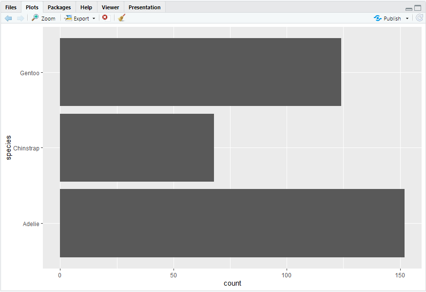
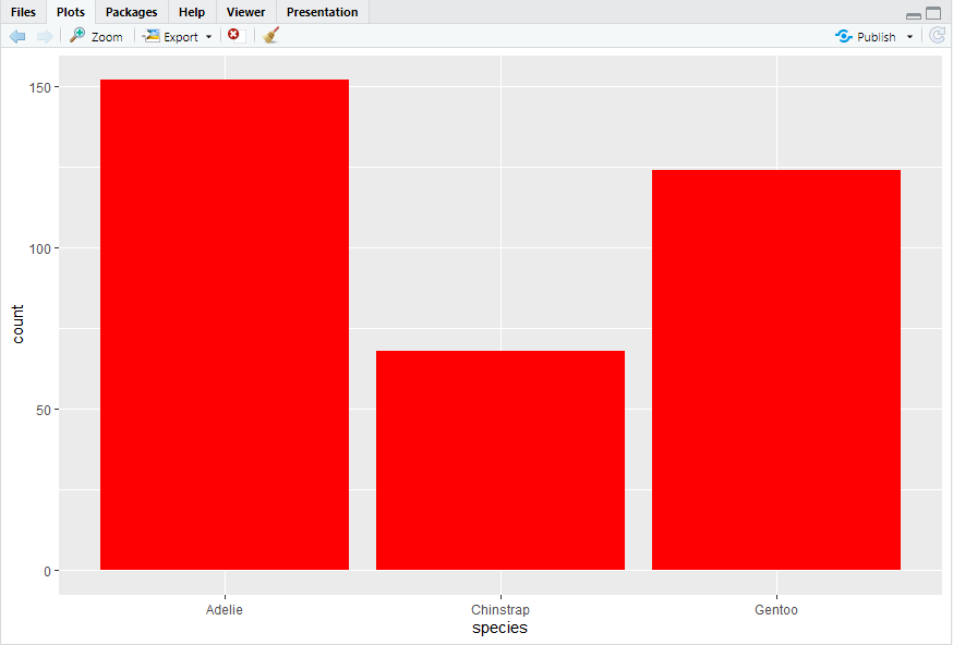
ggplot(penguins, aes(x = species)) + geom_bar()
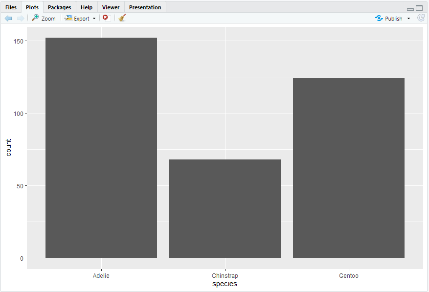
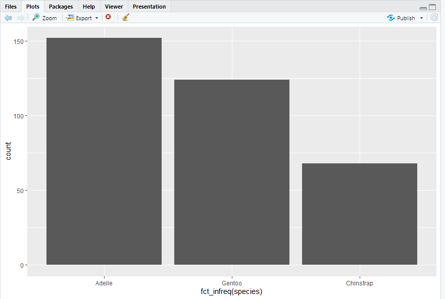
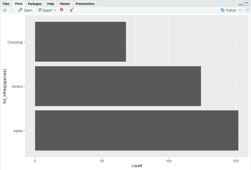
ggplot(penguins, aes(x = fct_infreq(species))) + geom_bar()
#> 柱状图中,最好对变量按一定顺序重新排序,这涉及到dealing with factors,即本示例中的fct_infreq()
2.4.2 A numerical variable
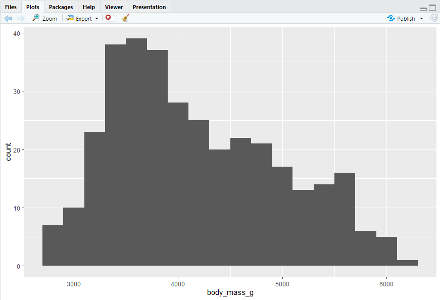
A variable is numerical if it can take any of an infinite set of ordered values. Numbers and date-times are two examples of continuous variables. To visualize the distribution of a continuous variable, you can use a histogram or a density plot.
#> 使用直方图geom_histogram()或密度图geom_density()来描述连续变量
ggplot(penguins, aes(x = body_mass_g)) + geom_histogram(binwidth = 200)
#> 通过调节binwidth内的参数,可以调整柱状图的区间范围
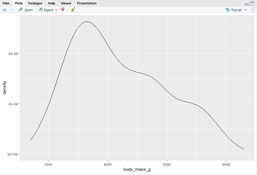
ggplot(penguins, aes(x = body_mass_g)) + geom_density()
penguins |> count(cut_width(body_mass_g, 200))
#> 可获得区间范围
#> # A tibble: 19 × 2
#>cut_width(body_mass_g, 200)n
#>
#> 1 [2.7e+03,2.9e+03] 7
#> 2 (2.9e+03,3.1e+03] 10
#> 3 (3.1e+03,3.3e+03] 23
#> 4 (3.3e+03,3.5e+03] 38
#> 5 (3.5e+03,3.7e+03] 39
#> 6 (3.7e+03,3.9e+03] 37
#> 7 (3.9e+03,4.1e+03] 28
#> 8 (4.1e+03,4.3e+03] 25
#> 9 (4.3e+03,4.5e+03] 20
#> 10 (4.5e+03,4.7e+03] 22
#> 11 (4.7e+03,4.9e+03] 21
#> 12 (4.9e+03,5.1e+03] 17
#> 13 (5.1e+03,5.3e+03] 13
#> 14 (5.3e+03,5.5e+03] 14
#> 15 (5.5e+03,5.7e+03] 16
#> 16 (5.7e+03,5.9e+03] 6
#> 17 (5.9e+03,6.1e+03] 5
#> 18 (6.1e+03,6.3e+03] 1
#> 19 NA 2
2.4.3 Exercises -
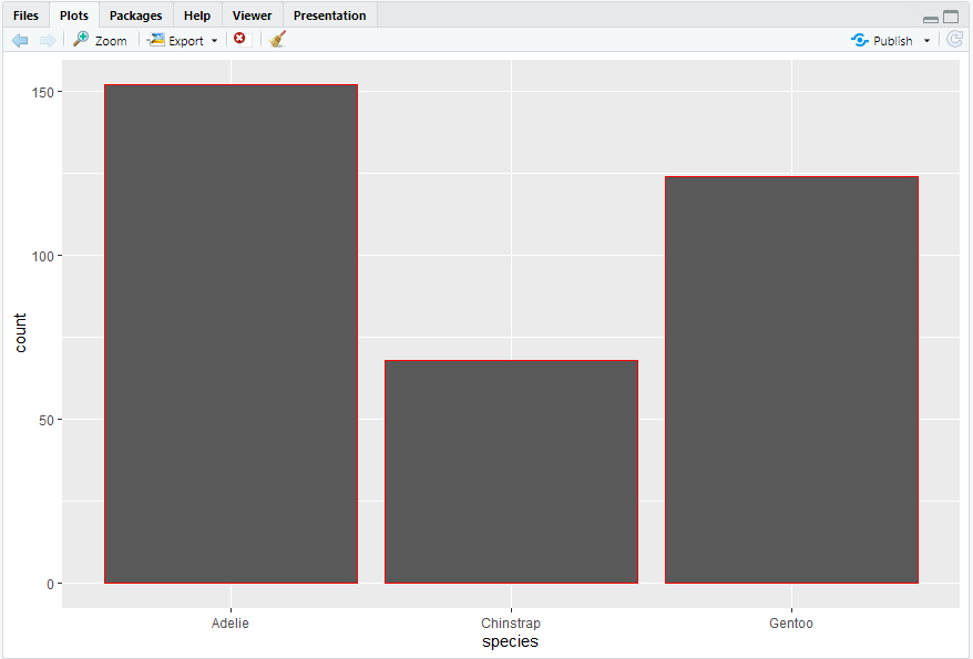
ggplot(penguins,aes(y = species)) + geom_bar()
ggplot(penguins, aes(y = fct_infreq(species))) + geom_bar()
-
ggplot(penguins, aes(x = species)) + geom_bar(color = "red")
ggplot(penguins, aes(x = species)) + geom_bar(fill = "red")
- bins: Number of bins. Overridden by binwidth. Defaults to 30.
-
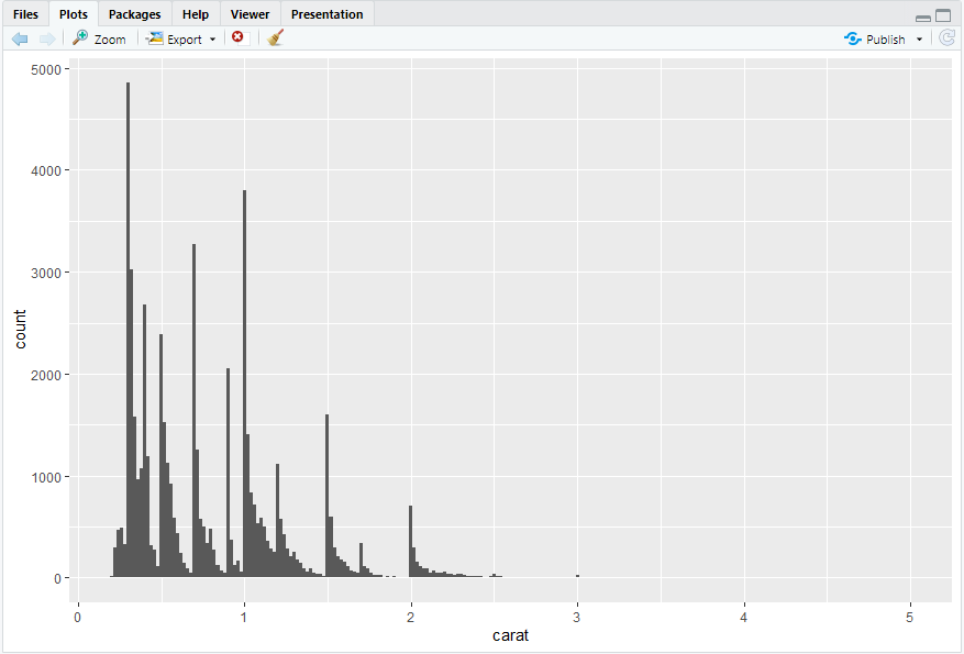
ggplot(diamonds,aes(x = carat)) + geom_histogram(binwidth = 0.02)
2.5 Visualizing relationships
#> 两个变量之间关系的绘图方式
2.5.1 A numerical and a categorical variable
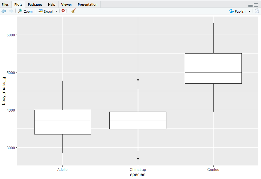
boxplot
#> 需要注意箱型图中的点、线的意义
ggplot(penguins,aes(x = species, y = body_mass_g)) + geom_boxplot()
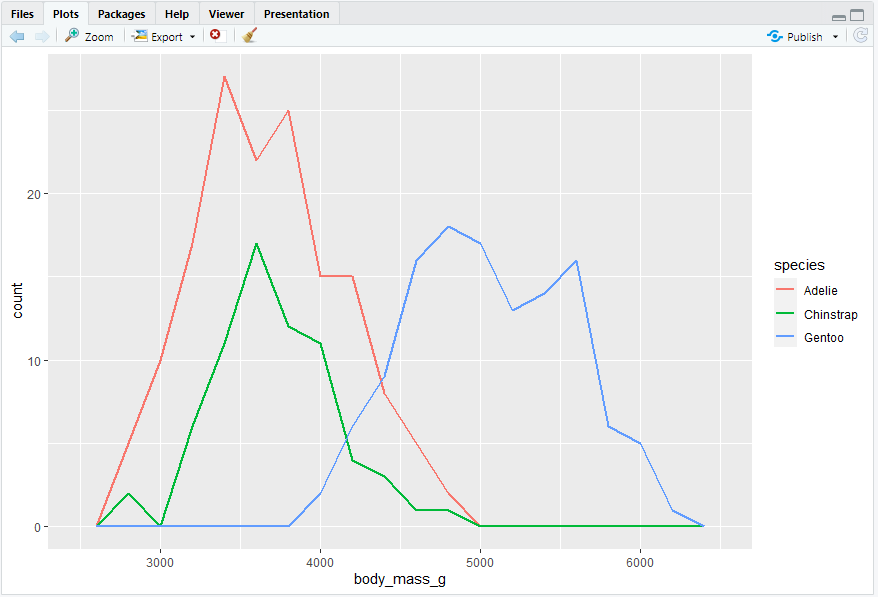
geom_freqpoly()
#> 频率多边形,与geom_histogram()执行相同的计算,但使用线条来显示结果。当不同组的数据有重叠时比柱形图更清晰。
ggplot(penguins, aes(x = body_mass_g, color = species)) + geom_freqpoly(binwidth = 200, linewidth = 0.75)
#> 此处还使用了线宽linewidth参数,可以使图形更清晰
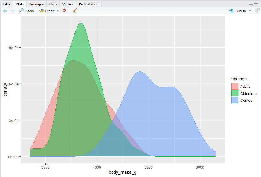
ggplot(penguins, aes(x = body_mass_g, color = species, fill = species)) + geom_density(alpha = 0.5)
#> appha表示透明度,此处设置为0.5
Note the terminology we have used here:
We map variables to aesthetics if we want the visual attribute represented by that aesthetic to vary based on the values of that variable.
Otherwise, we set the value of an aesthetic.
#> 这里没完全看懂
2.5.2 Two categorical variables
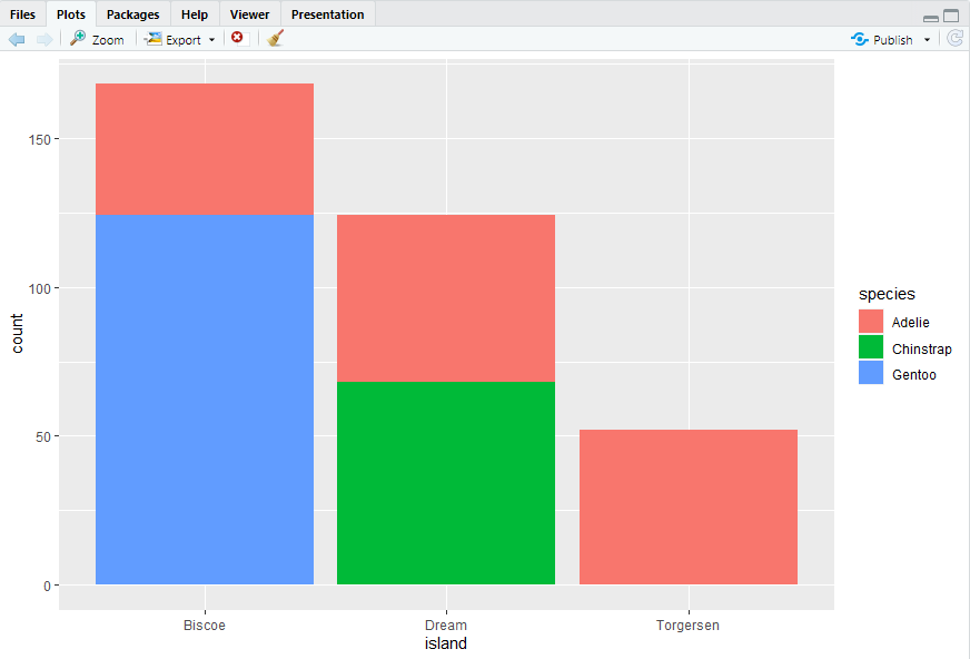
#> 两个分类变量也可以用分段条形图来描述。但是需要线将数据按x变量和堆叠的fill变量进行划分。
ggplot(penguins, aes(x = island, fill = species)) + geom_bar()
ggplot(penguins, aes(x = island, fill = species)) + geom_bar(position = "fill")#> 注意position = "fill"的应用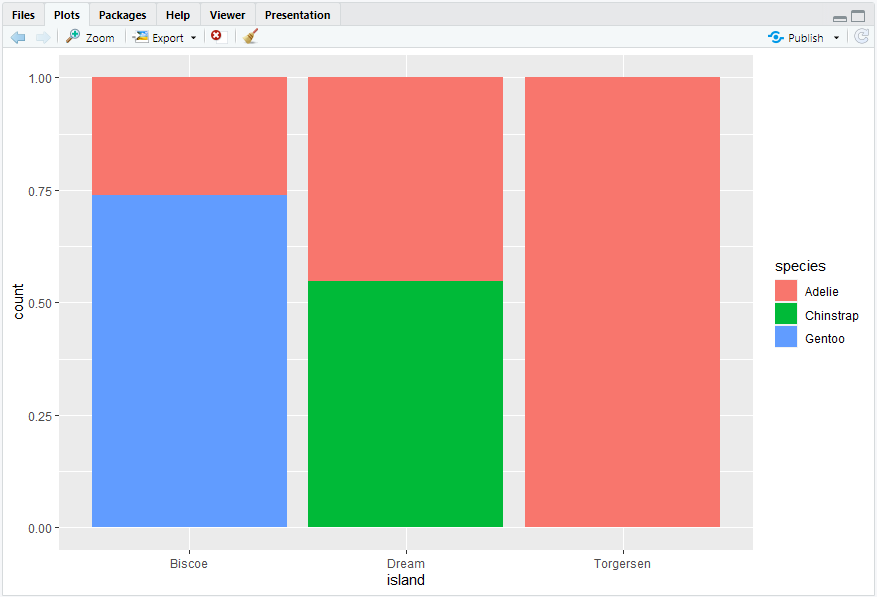
2.5.3 Two numerical variables
geom_point() #> 散点图geom_point()和平滑曲线geom_smooth(),散点图可能是最常用的可视化两个变量关系的图
2.5.4 Three or more variables
#> 向两个变量的图中增加第三个变量的方法:颜色,形状
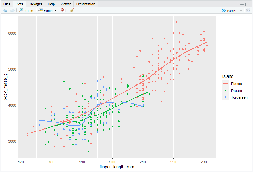
ggplot(penguins, aes(x = flipper_length_mm, y = body_mass_g)) + geom_point(aes(color = species, shape = island))
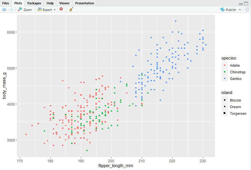
#> 然而,在图中添加太多映射会使图片混乱且难以理解。另一种分类变量特别有用的方法是将图拆分为分面,每个分面显示一个数据子集的子图。
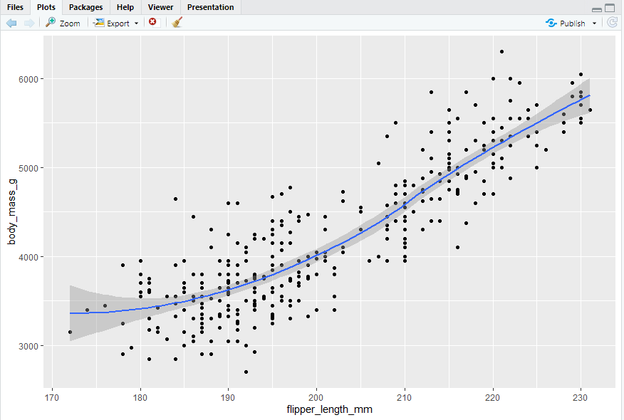
To facet your plot by a single variable, use facet_wrap(). The first argument of facet_wrap() is a formula2, which you create with ~ followed by a variable name. The variable that you pass to facet_wrap() should be categorical.
#> 使用facet_wrap()函数,使用~和变量名称创建该函数,该变量应该是分类变量
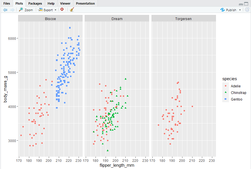
ggplot(penguins, aes(x = flipper_length_mm, y = body_mass_g)) + geom_point(aes(color = species, shape = species)) + facet_wrap(~island)
2.5.5 Exercises -
?mpg:
#> 可以通过绘图时的一些warning提醒来区分离散值和连续值,如size参数不推荐使用离散值去定义,就会有提醒
categorical:manufacturer, model, trans, drv, fl, class
continuous: year, cty, hwy, displ, cyl
ggplot(mpg, aes(x = hwy, y = displ)) + geom_point(mapping = aes(size = model))
#> Warning message:
#> Using size for a discrete variable is not advised.
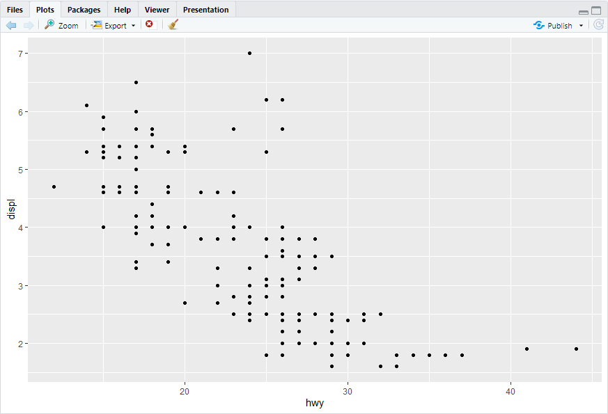
ggplot(mpg, aes(x = hwy, y = displ)) + geom_point()
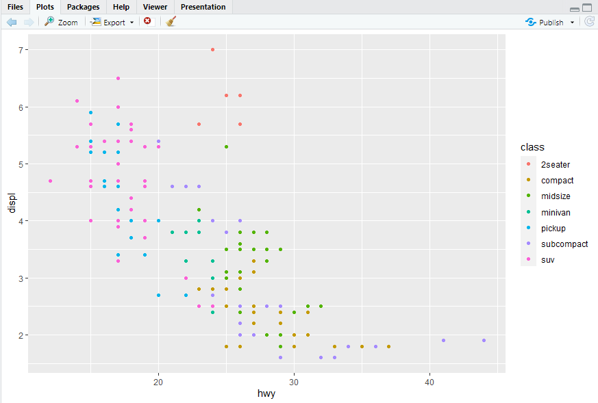
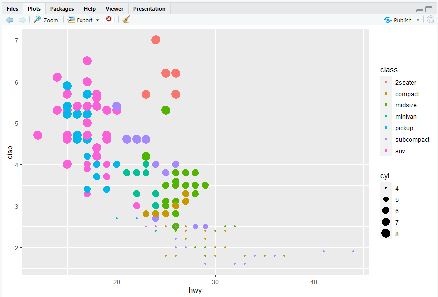
ggplot(mpg, aes(x = hwy, y = displ)) + geom_point(mapping = aes(color = class))
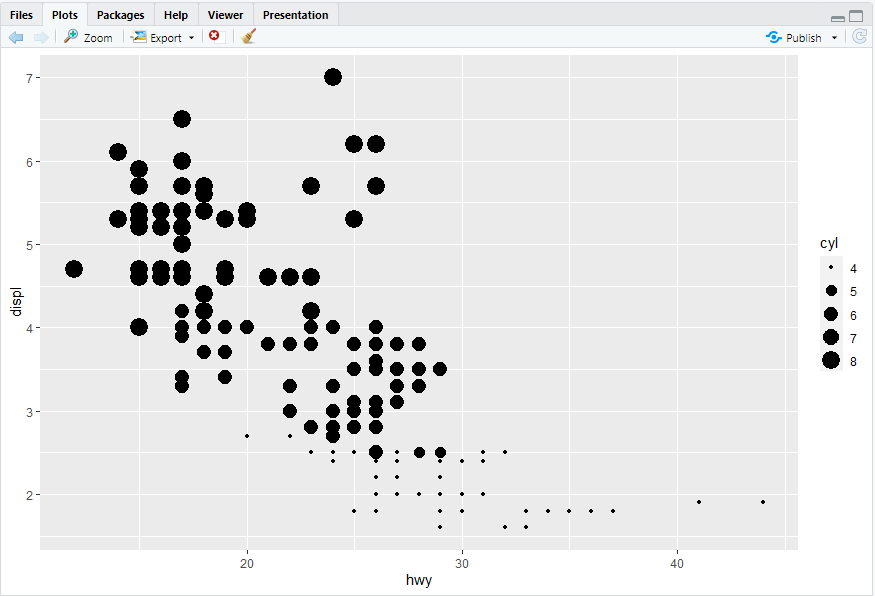
ggplot(mpg, aes(x = hwy, y = displ)) + geom_point(mapping = aes(size = cyl))
ggplot(mpg, aes(x = hwy, y = displ)) + geom_point(mapping = aes(color = class, size = cyl))
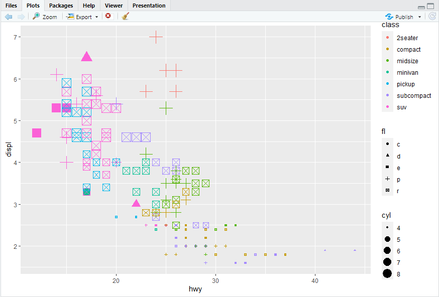
ggplot(mpg, aes(x = hwy, y = displ)) + geom_point(mapping = aes(color = class, size = cyl,shape = fl))
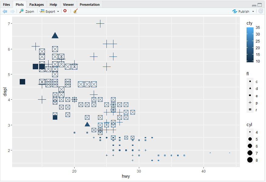
ggplot(mpg, aes(x = hwy, y = displ)) + geom_point(mapping = aes(color = cty, size = cyl,shape = fl))
#> 离散变量不建议使用size参数
3.
#> 散点图里没有线宽linewidth这个参数
ggplot(mpg, aes(x = hwy, y = displ)) + geom_point(mapping = aes(linewidth = class))
#> Warning messages:
#> 1: In geom_point(mapping = aes(linewidth = class)) :
#> Ignoring unknown aesthetics: linewidth
#> 2: Using linewidth for a discrete variable is not advised.
ggplot(mpg, aes(x = hwy, y = displ)) + geom_point(mapping = aes(linewidth = cty))
#> Warning message:
#> In geom_point(mapping = aes(linewidth = cty)) :
#> Ignoring unknown aesthetics: linewidth
4.
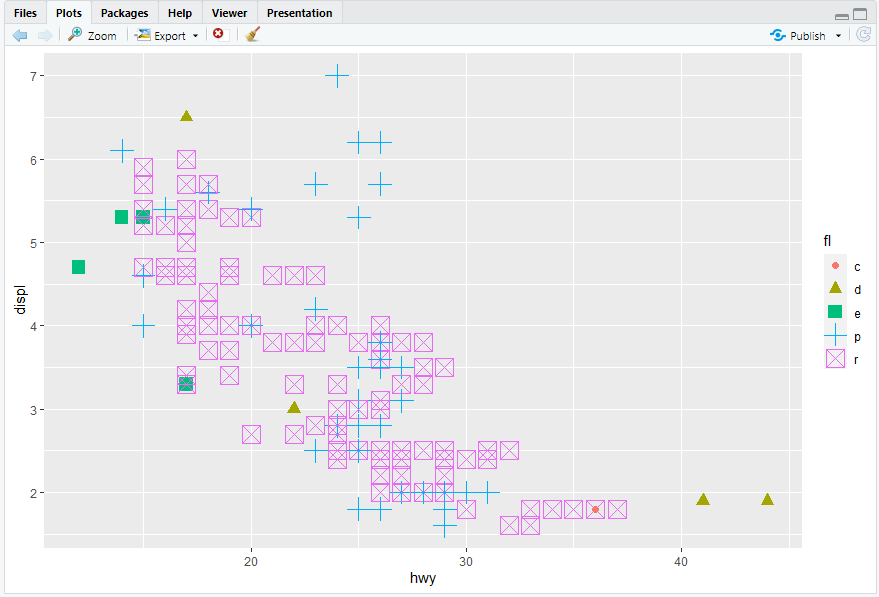
ggplot(mpg, aes(x = hwy, y = displ)) + geom_point(mapping = aes(color = fl, size = fl,shape = fl))
5.yes
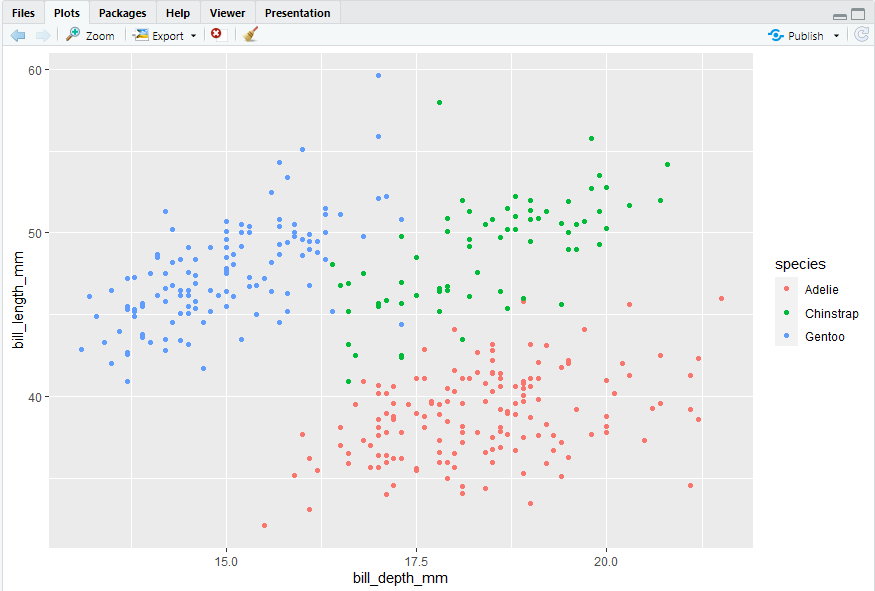
ggplot(penguins, aes(x = bill_depth_mm, y = bill_length_mm)) + geom_point(mapping = aes(color = species))
6.
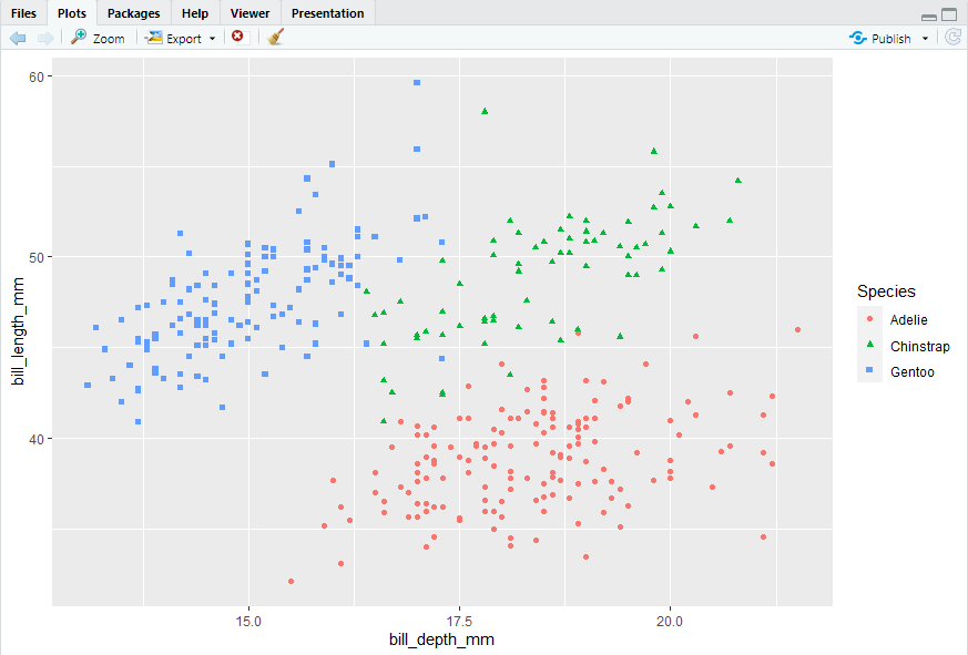
ggplot(penguins, aes(x = bill_depth_mm, y = bill_length_mm, color = species,shape = species)) + geom_point() + labs(color = "Species", shape = "Species")
#> 因为在使用labs定义图例时用的是"Species",与变量名称"species"首字母大小写不同,统一变量名命名即可合并图例
2.6 Saving your plots
#> 使用ggsave()可将图像导出
ggsave(filename = "my-plot.png")
2.6.1 Exercises
1.geom_point
2.ggsave(filename = "my-plot.pdf")