Graph Data - danielwilczak101/EasyGA GitHub Wiki
Here you can find all the different methods to graph the progress of your genetic algorithm.
- Graphing functions
- Show multiple plots at same time
- See past runs
- Change the graph
- Using matplotlib and EasyGA graphing
Graphing is based on the matplotlib framework. The graph data is pulled using prebuilt database functions that can be found on the Store / Access page.
import EasyGA
ga = EasyGA.GA()
ga.evolve()
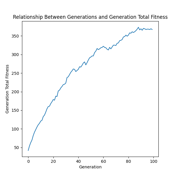
ga.graph.generation_total_fitness()
ga.graph.show()Graphing each generations total fitness. The standard EasyGA fitness function was used with 100 generations and a population size of 50.
Current population:
Chromosome - 0 [5][5][5][5][5][5][5][5][5][5] / Fitness = 10
Chromosome - 1 [5][3][5][4][8][9][8][5][5][5] / Fitness = 5

# Current generation total fitness would be 15.
import EasyGA

ga = EasyGA.GA()
ga.evolve()

ga.graph.highest_value_chromosome()
ga.graph.show()
Highest value chromosome is used to show the highest value chromosome of each generation. The standard EasyGA fitness function was used with 100 generations and a population size of 50.

import EasyGA

ga = EasyGA.GA()
ga.evolve()

ga.graph.lowest_value_chromosome()
ga.graph.show()
Lowest value chromosome is used to show the lowest value chromosome of each generation. This can be useful when trying to reduce some type of error in your fitness function. The example uses minimize fitness example.
import EasyGA
for _ in range(5):
ga = EasyGA.GA()
ga.evolve()
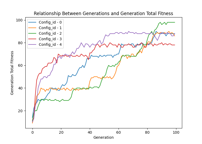
ga.graph.generation_total_fitness("all")
ga.graph.show()Each of the functions above have the ability to use the "all" parameter to graph each of the runs("Config_id") has in the database. Using different colors to show the lines apart.

import EasyGA

for _ in range(5):
    ga = EasyGA.GA()
    ga.evolve()

ga.graph.generation_total_fitness("average")
ga.graph.show()
Sometimes showing all the run lines on one graph can get messy so showing an average of all of them can have great incite to your data.

To graph more than one graph at a time you can use matplotlib's sub plot feature with our graphing functions.
import matplotlib.pyplot as plt

import EasyGA

for _ in range(2):
    # Create a new genetic algorithm each loop.
    ga = EasyGA.GA()
    ga.evolve()
    ga.print_population()

# Graph the average of the two runs.
plt.subplot(1, 2, 1)
ga.graph.highest_value_chromosome("average")

# Graph all the runs.
plt.subplot(1, 2, 1)
ga.graph.highest_value_chromosome("all")

# Show the graph.
ga.graph.show()
To quote w3school documentation because they explain it really well.
plt.subplot(1, 2, 1)
#the figure has 1 row, 2 columns, and this plot is the first plot.

plt.subplot(1, 2, 2)
#the figure has 1 row, 2 columns, and this plot is the second plot. Check out the ga.past_runs() function on the config page to see a summery of your past ga runs.
Choosing a plot can be done in two different ways. The difference between them is accessibility to the full range of Matplotlib. We've found that really only a few graphs are normally used so we made it easier for you to use.
ga.graph.type_of_plot = "bar"
ga.graph.type_of_plot = "line"
ga.graph.type_of_plot = "scatter"
EasyGa allows to also change the yscale.By default it is set to "linear". To see all the available scales please see the matplotlib yscale documentation.
ga.graph.yscale = "linear"
ga.graph.yscale = "log"
ga.graph.yscale = "symlog"
etcOption two allows you to change the graph to whatever type is supported by Matplotlib. Please see their documentation for more information. It is worth noting that the ga.graph function must be after the graph has been created using plt.figure.
import EasyGA
import matplotlib.pyplot as plt

# Create the genetic algorithm
ga = EasyGA.GA()

# Create 50 chromosomes each with 10 genes and 150 generations
ga.population_size = 100
ga.chromosome_length = 10
ga.generation_goal = 150

# Evolve the genetic algorithm
ga.evolve()

# Plot the data from the genetic algorithm
plt.figure(figsize = [6, 6])
ga.graph.highest_value_chromosome()  # Change this so it doesn't make its own figure or show
plt.xlabel('My datas generations')             # override the xlabel
plt.ylabel('How well the fitness is')  # override the ylabel
plt.title('My GA fitness x generations')     # override the title
plt.show()