intern_basic_bootstrap.md - brainchildservices/curriculum GitHub Wiki
Bootstrap is a free and open-source CSS framework directed at responsive, mobile-first front-end web development. It contains CSS- and JavaScript-based design templates for typography, forms, buttons, navigation, and other interface components.
There are multiple ways to customize Bootstrap. Your best path can depend on your project, the complexity of your build tools, the version of Bootstrap you’re using, browser support, and more.
Once downloaded, unzip the compressed folder and you’ll see something like this:
bootstrap/
├── css/
│   ├── bootstrap-grid.css
│   ├── bootstrap-grid.css.map
│   ├── bootstrap-grid.min.css
│   ├── bootstrap-grid.min.css.map
│   ├── bootstrap-grid.rtl.css
│   ├── bootstrap-grid.rtl.css.map
│   ├── bootstrap-grid.rtl.min.css
│   ├── bootstrap-grid.rtl.min.css.map
│   ├── bootstrap-reboot.css
│   ├── bootstrap-reboot.css.map
│   ├── bootstrap-reboot.min.css
│   ├── bootstrap-reboot.min.css.map
│   ├── bootstrap-reboot.rtl.css
│   ├── bootstrap-reboot.rtl.css.map
│   ├── bootstrap-reboot.rtl.min.css
│   ├── bootstrap-reboot.rtl.min.css.map
│   ├── bootstrap-utilities.css
│   ├── bootstrap-utilities.css.map
│   ├── bootstrap-utilities.min.css
│   ├── bootstrap-utilities.min.css.map
│   ├── bootstrap-utilities.rtl.css
│   ├── bootstrap-utilities.rtl.css.map
│   ├── bootstrap-utilities.rtl.min.css
│   ├── bootstrap-utilities.rtl.min.css.map
│   ├── bootstrap.css
│   ├── bootstrap.css.map
│   ├── bootstrap.min.css
│   ├── bootstrap.min.css.map
│   ├── bootstrap.rtl.css
│   ├── bootstrap.rtl.css.map
│   ├── bootstrap.rtl.min.css
│   └── bootstrap.rtl.min.css.map
└── js/
    ├── bootstrap.bundle.js
    ├── bootstrap.bundle.js.map
    ├── bootstrap.bundle.min.js
    ├── bootstrap.bundle.min.js.map
    ├── bootstrap.esm.js
    ├── bootstrap.esm.js.map
    ├── bootstrap.esm.min.js
    ├── bootstrap.esm.min.js.map
    ├── bootstrap.js
    ├── bootstrap.js.map
    ├── bootstrap.min.js
    └── bootstrap.min.js.map
Bootstrap is supported by an extensive color system that themes our styles and components. This enables more comprehensive customization and extension for any project.
Form More Check Check Bootstrap Colors
Breakpoints are customizable widths that determine how your responsive layout behaves across device or viewport sizes in Bootstrap
- Breakpoints are the building blocks of responsive design. Use them to control when your layout can be adapted at a particular viewport or device size.
-
Use media queries to architect your CSS by breakpoint. Media queries are a feature of CSS that allow you to conditionally apply styles based on a set of browser and operating system parameters. We most commonly use
min-widthin our media queries. - Mobile first, responsive design is the goal. Bootstrap’s CSS aims to apply the bare minimum of styles to make a layout work at the smallest breakpoint, and then layers on styles to adjust that design for larger devices. This optimizes your CSS, improves rendering time, and provides a great experience for your visitors.
Find More Available breakpoints at Bootstrap Breakpoints
Containers are a fundamental building block of Bootstrap that contain, pad, and align your content within a given device or viewport.
Containers are the most basic layout element in Bootstrap and are required when using our default grid system. Choose from a responsive, fixed-width container (meaning its max-width changes at each breakpoint) or fluid-width (meaning it’s 100% wide all the time).
While containers can be nested, most layouts do not require a nested container.

 <div class="container">
   <!-- Content here -->
 </div>
Use .container-fluid for a full width container, spanning the entire width of the viewport.
 <div class="container-fluid">
   ...
 </div>
Containers are the most basic layout element in Bootstrap and are required when using our default grid system. Containers are used to contain, pad, and (sometimes) center the content within them. While containers can be nested, most layouts do not require a nested container.
Bootstrap comes with three different containers:
-
.container,which sets amax-widthat each responsive breakpoint -
.container-fluid, which iswidth: 100%at all breakpoints -
.container-{breakpoint}, which iswidth: 100%until the specified breakpoint
The table below illustrates how each container’s max-width compares to the original .container and .container-fluid across each breakpoint.
See them in action and compare them in our Grid Example.
To know more about .Container Visit:- Bootstrap Container
Bootstrap’s grid system uses a series of containers, rows, and columns to layout and align content. It’s built with flexbox and is fully responsive. Below is an example and an in-depth explanation for how the grid system comes together.
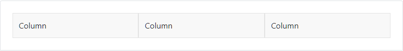
 <div class="container">
   <div class="row">
     <div class="col">
       Column
     </div>
     <div class="col">
       Column
     </div>
     <div class="col">
       Column
     </div>
   </div>
 </div>
The above example creates three equal-width columns across all devices and viewports using our predefined grid classes. Those columns are centered in the page with the parent .container.
Breaking it down, here’s how the grid system comes together:
-
Our grid supports six responsive breakpoints. Breakpoints are based on
min-widthmedia queries, meaning they affect that breakpoint and all those above it (e.g.,.col-sm-4applies tosm, md, lg, xl, andxxl). This means you can control container and column sizing and behavior by each breakpoint. -
Containers center and horizontally pad your content. Use
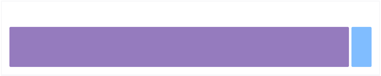
.containerfor a responsive pixel width,.container-fluidforwidth: 100%across all viewports and devices, or a responsive container (e.g.,.container-md) for a combination of fluid and pixel widths. - Rows are wrappers for columns. Each column has horizontal padding (called a gutter) for controlling the space between them. This padding is then counteracted on the rows with negative margins to ensure the content in your columns is visually aligned down the left side. Rows also support modifier classes to uniformly apply column sizing and gutter classes to change the spacing of your content.
-
Columns are incredibly flexible. There are 12 template columns available per row, allowing you to create different combinations of elements that span any number of columns. Column classes indicate the number of template columns to span (e.g.,
col-4spans four).widthsare set in percentages so you always have the same relative sizing. -
Gutters are also responsive and customizable. Gutter classes are available across all breakpoints, with all the same sizes as our margin and padding spacing. Change horizontal gutters with
.gx-*classes, vertical gutters with.gy-*, or all gutters with.g-*classes..g-0is also available to remove gutters. - Sass variables, maps, and mixins power the grid. If you don’t want to use the predefined grid classes in Bootstrap, you can use our grid’s source Sass to create your own with more semantic markup. We also include some CSS custom properties to consume these Sass variables for even greater flexibility for you.
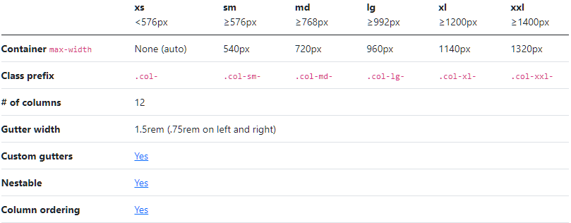
Bootstrap’s grid system can adapt across all six default breakpoints, and any breakpoints you customize. The six default grid tiers are as follow:
Extra small (xs) Small (sm) Medium (md) Large (lg) Extra large (xl) Extra extra large (xxl) As noted above, each of these breakpoints have their own container, unique class prefix, and modifiers. Here’s how the grid changes across these breakpoints:
For More Visit:- Bootstrap Grid System
Images in Bootstrap are made responsive with .img-fluid. This applies max-width: 100%; and height: auto; to the image so that it scales with the parent element.
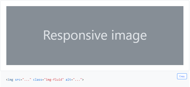
In addition to our border-radius utilities, you can use .img-thumbnail to give an image a rounded 1px border appearance.
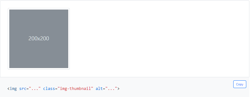
For More Visit Responsive images
Here’s what you need to know before getting started with the navbar:
- Navbars require a wrapping
.navbarwith.navbar-expand{-sm|-md|-lg|-xl|-xxl}for responsive collapsing and color scheme classes. - Navbars and their contents are fluid by default. Change the container to limit their horizontal width in different ways.
- Use our spacing and flex utility classes for controlling spacing and alignment within navbars.
- Navbars are responsive by default, but you can easily modify them to change that. Responsive behavior depends on our Collapse JavaScript plugin.
- Ensure accessibility by using a
<nav>element or, if using a more generic element such as a<div>, add arole="navigation"to every navbar to explicitly identify it as a landmark region for users of assistive technologies. - Indicate the current item by using
aria-current="page"for the current page oraria-current="true"for the current item in a set.
Navbars come with built-in support for a handful of sub-components. Choose from the following as needed:
-
.navbar-brandfor your company, product, or project name. -
.navbar-navfor a full-height and lightweight navigation (including support for dropdowns). -
.navbar-togglerfor use with our collapse plugin and other navigation toggling behaviors. - Flex and spacing utilities for any form controls and actions.
-
.navbar-textfor adding vertically centered strings of text. -
.collapse.navbar-collapsefor grouping and hiding navbar contents by a parent breakpoint. - Add an optional
.navbar-scrollto set amax-heightand scroll expanded navbar content.
Here’s an example of all the sub-components included in a responsive light-themed navbar that automatically collapses at the lg (large) breakpoint.
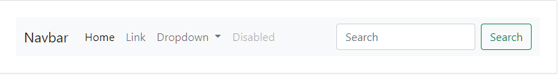
For More About Navbar
Dropdowns are toggleable, contextual overlays for displaying lists of links and more. They’re made interactive with the included Bootstrap dropdown JavaScript plugin. They’re toggled by clicking, not by hovering.
Dropdowns are built on a third party library, Popper, which provides dynamic positioning and viewport detection. Be sure to include popper.min.js before Bootstrap’s JavaScript or use bootstrap.bundle.min.js / bootstrap.bundle.js which contains Popper. Popper isn’t used to position dropdowns in navbars though as dynamic positioning isn’t required.
Any single .btn can be turned into a dropdown toggle with some markup changes. Here’s how you can put them to work with either <button> elements:
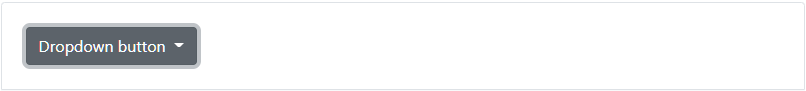
For More About Visit: DropDown
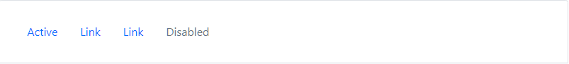
Navigation available in Bootstrap share general markup and styles, from the base .nav class to the active and disabled states. Swap modifier classes to switch between each style.
The base .nav component is built with flexbox and provide a strong foundation for building all types of navigation components. It includes some style overrides (for working with lists), some link padding for larger hit areas, and basic disabled styling.
Note:- The base .nav component does not include any .active state. The following examples include the class, mainly to demonstrate that this particular class does not trigger any special styling.
To convey the active state to assistive technologies, use the aria-current attribute — using the page value for current page, or true for the current item in a set.
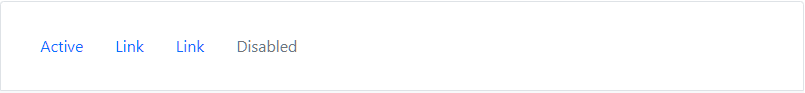
  <ul class="nav">
    <li class="nav-item">
      <a class="nav-link active" aria-current="page" href="#">Active</a>
    </li>
    <li class="nav-item">
      <a class="nav-link" href="#">Link</a>
    </li>
    <li class="nav-item">
      <a class="nav-link" href="#">Link</a>
    </li>
    <li class="nav-item">
      <a class="nav-link disabled" href="#" tabindex="-1" aria-disabled="true">Disabled</a>
    </li>
  </ul>
Classes are used throughout, so your markup can be super flexible. Use <ul>s like above, <ol> if the order of your items is important, or roll your own with a <nav> element. Because the .nav uses display: flex, the nav links behave the same as nav items would, but without the extra markup.
  <nav class="nav">
    <a class="nav-link active" aria-current="page" href="#">Active</a>
    <a class="nav-link" href="#">Link</a>
    <a class="nav-link" href="#">Link</a>
    <a class="nav-link disabled" href="#" tabindex="-1" aria-disabled="true">Disabled</a>
  </nav>
Bootstrap includes several predefined button styles, each serving its own semantic purpose, with a few extras thrown in for more control.

 <button type="button" class="btn btn-primary">Primary</button>
 <button type="button" class="btn btn-secondary">Secondary</button>
 <button type="button" class="btn btn-success">Success</button>
 <button type="button" class="btn btn-danger">Danger</button>
 <button type="button" class="btn btn-warning">Warning</button>
 <button type="button" class="btn btn-info">Info</button>
 <button type="button" class="btn btn-light">Light</button>
 <button type="button" class="btn btn-dark">Dark</button>
Link
For more Visit
A card is a flexible and extensible content container. It includes options for headers and footers, a wide variety of content, contextual background colors, and powerful display options.
Cards are built with as little markup and styles as possible, but still manage to deliver a ton of control and customization. Built with flexbox, they offer easy alignment and mix well with other Bootstrap components. They have no margin by default, so use spacing utilities as needed.
Below is an example of a basic card with mixed content and a fixed width. Cards have no fixed width to start, so they’ll naturally fill the full width of its parent element. This is easily customized with our various sizing options.
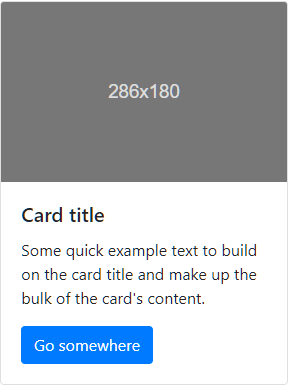
 <div class="card" style="width: 18rem;">
   <img class="card-img-top" src="..." alt="Card image cap">
   <div class="card-body">
     <h5 class="card-title">Card title</h5>
     <p class="card-text">Some quick example text to build on the card title and make up the bulk of the card's content.</p>
     <a href="#" class="btn btn-primary">Go somewhere</a>
   </div>
 </div>
For More Visit Bootstrap Cards
The official Bootstrap documentation does not provide examples for footers, so we decided to provide Bootstrap footer example built using the containers, rows, and columns provided by the Bootstrap Web Framework.
Find the Footer here.
To Learn More About Visit:- Navs and tabs