bootstrap_layout.md - brainchildservices/curriculum GitHub Wiki
- In Bootstrap, container is used to set the content's margins dealing with the responsive behaviors of your layout. It contains the row elements and the row elements are the container of columns (known as grid system). The container class is used to create boxed content.
- Containers are the most basic layout element in Bootstrap and are required when using our default grid system.
- Containers are used to contain, pad, and (sometimes) center the content within them.
- While containers can be nested, most layouts do not require a nested container.
There are two container classes in Bootstrap:
-
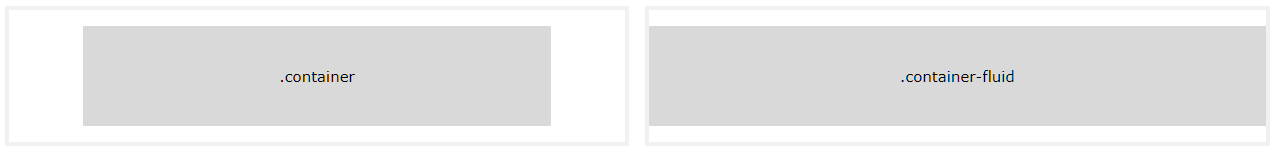
Container
The
.containerclass provides a responsive fixed width container -
Container-fluid
The
.container-fluidclass provides a full width container, spanning the entire width of the viewport
- Container Padding
By default, containers have 15px left and right padding, with no top or bottom padding. Therefore, we often use spacing utilities, such as extra padding and margins to make them look even better. For example, .pt-3 means "add a top padding of 16px":
Example:-
<div class="container pt-3"></div>

  <div class="container pt-3">
    <h1>My First Bootstrap Page</h1>
    <p>This container has a top padding of 16 pixels (.pt-3).</p>
    <p>Try to Add/remove the pt-3 class to see the difference.</p>
  </div>
Wrong Syntax-1
  <div "container pt-3">
    <h1>My First Bootstrap Page</h1>
    <p>This container has a top padding of 16 pixels (.pt-3).</p>
    <p>Try to Add/remove the pt-3 class to see the difference.</p>
  </div>
Wrong Syntax-2
  <div class=container pt-3>
    <h1>My First Bootstrap Page</h1>
    <p>This container has a top padding of 16 pixels (.pt-3).</p>
    <p>Try to Add/remove the pt-3 class to see the difference.</p>
  </div>
- Create a simple webpage using container.
- Create a simple webpage using container-fluid.
- Bootstrap's grid system allows up to 12 columns across the page.
- The Bootstrap Grid System is used for layout, specifically Responsive Layouts.
- how it works is vital to understanding Bootstrap.
- The Grid is made up of groupings of Rows & Columns inside 1 or more Containers.
- The Bootstrap Grid can be used alone, without the Bootstrap JavaScript and other CSS Components.
- If you do not want to use all 12 columns individually, you can group the columns together to create wider columns.
- The grid system is responsive, and the columns will re-arrange automatically depending on the screen size.
- Make sure that the sum adds up to 12 or fewer (it is not required that you use all 12 available columns).
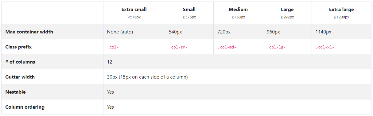
- Bootstrap Grid has five classes :
- .
col- (extra small devices - screen width less than 576px) - .
col-sm- (small devices - screen width equal to or greater than 576px) - .
col-md- (medium devices - screen width equal to or greater than 768px) - .
col-lg- (large devices - screen width equal to or greater than 992px) - .
col-xl- (xlarge devices - screen width equal to or greater than 1200px)
- .
<div class="row">
  <div class="col-sm-6" style="background-color:yellow;">50%</div>
  <div class="col-sm-6" style="background-color:orange;">50%</div>
</div>
<div class="row">
  <div class="col-sm-4" style="background-color:yellow;">33.33%</div>
  <div class="col-sm-4" style="background-color:orange;">33.33%</div>
  <div class="col-sm-4" style="background-color:yellow;">33.33%</div>
</div>
<div class="row">
  <div class="col-sm-6" style="background-color:yellow;">33.33%</div>
  <div class="col-sm-6" style="background-color:orange;">33.33%</div>
  <div class="col-sm-6" style="background-color:yellow;">33.33%</div>
</div>
<div class="row">
  <div class=col-sm-4 style="background-color:yellow;">33.33%</div>
  <div class=col-sm-4 style="background-color:orange;">33.33%</div>
  <div class=col-sm-4 style="background-color:yellow;">33.33%</div>
</div>
While Bootstrap uses ems or rems for defining most sizes, pxs are used for grid breakpoints and container widths. This is because the viewport width is in pixels and does not change with the font size.
See how aspects of the Bootstrap grid system work across multiple devices with a handy table.
- Create a 3*3 grid webpage
- Use all grid classes
- Use a background image
- Use container or container-fluid