BSintroduction.md - brainchildservices/curriculum GitHub Wiki
- Bootstrap is a free front-end framework for faster and easier web development
- Bootstrap includes HTML and CSS based design templates for typography, forms, buttons, tables, navigation, modals, image carousels and many other, as well as optional JavaScript plugins
- Bootstrap also gives you the ability to easily create responsive designs
- Easy to use: Anybody with just basic knowledge of HTML and CSS can start using Bootstrap
- Responsive features: Bootstrap's responsive CSS adjusts to phones, tablets, and desktops
- Mobile-first approach: In Bootstrap , mobile-first styles are part of the core framework
- Browser compatibility: Bootstrap is compatible with all modern browsers (Chrome, Firefox, Internet Explorer, Edge, Safari, and Opera)
- With Bootstrap you can focus more on the website you wanted, and spend less time wrestling with some of the CSS issues, media queries, and cross-browser compatibility.
- Since Bootstrap is basically just a collection of CSS and JavaScript files, you can alway customize any of it as much as you want.
- All you have to do is just to implement it and modify it to your website features and needs.
-
access Bootstrap ->(https://getbootstrap.com/)
-
To get the Bootstrap features, you should include these two links in your 'head' tag
<!-- CSS only -->
<link href="https://cdn.jsdelivr.net/npm/[email protected]/dist/css/bootstrap.min.css" rel="stylesheet" integrity="sha384-+0n0xVW2eSR5OomGNYDnhzAbDsOXxcvSN1TPprVMTNDbiYZCxYbOOl7+AMvyTG2x" crossorigin="anonymous">
<!-- JavaScript Bundle with Popper --> <script src="https://cdn.jsdelivr.net/npm/[email protected]/dist/js/bootstrap.bundle.min.js" integrity="sha384-gtEjrD/SeCtmISkJkNUaaKMoLD0//ElJ19smozuHV6z3Iehds+3Ulb9Bn9Plx0x4" crossorigin="anonymous"></script>
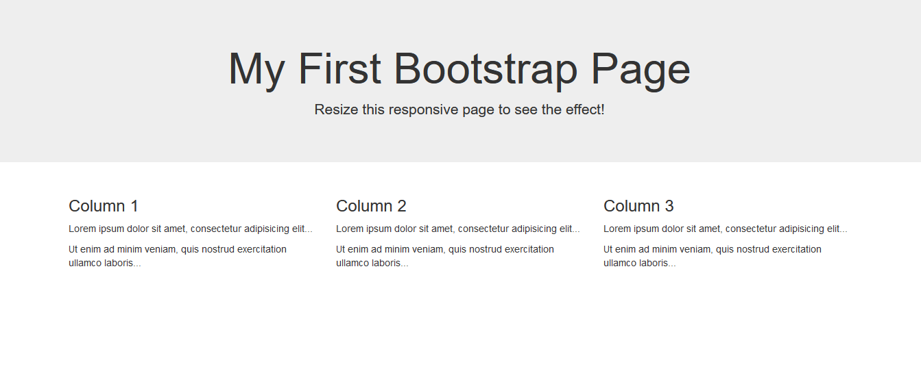
- Introducing you to a simple webpage created using bootstrap
-
code used -
<!DOCTYPE html> <html lang="en"> <head> <title>Bootstrap Example</title> <meta charset="utf-8"> <meta name="viewport" content="width=device-width, initial-scale=1"> <link rel="stylesheet" href="https://maxcdn.bootstrapcdn.com/bootstrap/3.4.1/css/bootstrap.min.css"> <script src="https://ajax.googleapis.com/ajax/libs/jquery/3.5.1/jquery.min.js"></script> <script src="https://maxcdn.bootstrapcdn.com/bootstrap/3.4.1/js/bootstrap.min.js"></script> </head> <body> <div class="jumbotron text-center"> <h1>My First Bootstrap Page</h1> <p>Resize this responsive page to see the effect!</p> </div> <div class="container"> <div class="row"> <div class="col-sm-4"> <h3>Column 1</h3> <p>Lorem ipsum dolor sit amet, consectetur adipisicing elit...</p> <p>Ut enim ad minim veniam, quis nostrud exercitation ullamco laboris...</p> </div> <div class="col-sm-4"> <h3>Column 2</h3> <p>Lorem ipsum dolor sit amet, consectetur adipisicing elit...</p> <p>Ut enim ad minim veniam, quis nostrud exercitation ullamco laboris...</p> </div> <div class="col-sm-4"> <h3>Column 3</h3> <p>Lorem ipsum dolor sit amet, consectetur adipisicing elit...</p> <p>Ut enim ad minim veniam, quis nostrud exercitation ullamco laboris...</p> </div> </div> </div> </body> </html> -
Result webpage-