Components:beforeCreate - bettyblocks/cli GitHub Wiki
This is a guide on the basics of beforeCreate. For an API reference for every exposed prop check this page.
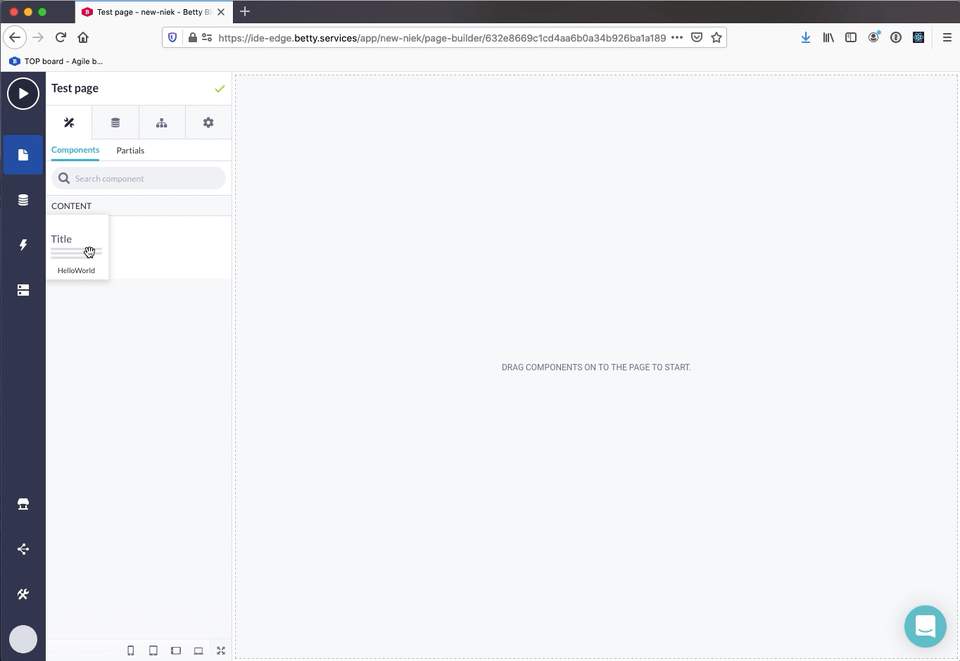
All you need to do to start working with beforeCreate is add an extra key to your prefab config. When this is your original prefab:
(() => ({
  name: 'HelloWorld',
  icon: 'TitleIcon',
  category: 'CONTENT',
  structure: [
    {
      name: 'HelloWorld',
      options: [
        {
          type: 'TEXT',
          label: 'Content',
          key: 'content',
          value: '',
        },
      ],
      descendants: [],
    },
  ],
}))();
You can add the beforeCreate key with a functional component as value:
(() => ({
  name: 'HelloWorld',
  icon: 'TitleIcon',
  category: 'CONTENT',
  beforeCreate: () => {
    return <h1>Hello world!</h1>
  },
  structure: [
    {
      name: 'HelloWorld',
      options: [
        {
          type: 'TEXT',
          label: 'Content',
          key: 'content',
          value: '',
        },
      ],
      descendants: [],
    },
  ],
}))();
This results in the following pop-up:
For mutating the original prefab you need two things:
- The original prefab
- A function that accepts a (mutated) prefab as an argument. When called the
beforeCreatepop-up will close and the prefab will be added to the canvas
Both are exposed as props in the beforeCreate component as prefab and save. The following example shows how to use a text input to set the value of the Content option in the HelloWorld component.
(() => ({
  name: 'HelloWorld',
  icon: 'TitleIcon',
  category: 'CONTENT',
  beforeCreate: ({ prefab, save }) => {
    const [state, setState] = React.useState('');

    return (
      <>
        <input
          type="text"
          onChange={event => {
            setState(event.target.value);
          }}
          value={state}
        />

        <button
          type="button"
          onClick={() => {
            const newPrefab = { ...prefab };

            newPrefab.structure[0].options[0].value = state;

            save(newPrefab);
          }}
        >
          Save
        </button>
      </>
    );
  },
  structure: [
    {
      name: 'HelloWorld',
      options: [
        {
          type: 'TEXT',
          label: 'Content',
          key: 'content',
          value: '',
        },
      ],
      descendants: [],
    },
  ],
}))();
This results in the following behavior:
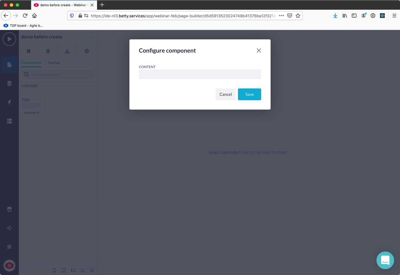
To have your pop-up comply with the Betty Blocks style guides we expose component helpers. The onSkip on the footer is an optional prop that can be used to skip certain configuration in the beforeCreate.
The following example converts the pop-up from the previous example into a pop-up which complies with the Betty Blocks style guide:
(() => ({
  name: 'HelloWorld',
  icon: 'TitleIcon',
  category: 'CONTENT',
  beforeCreate: ({
    close,
    components: { Content, Field, Footer, Header, TextInput },
    prefab,
    save,
  }) => {
    const [state, setState] = React.useState('');

    return (
      <>
        <Header onClose={close} title="Configure component" />
        <Content>
          <Field label="Content">
            <TextInput
              onChange={event => {
                setState(event.target.value);
              }}
              value={state}
            />
          </Field>
        </Content>
        <Footer
          onClose={close}
          onSkip={() => {
            const newPrefab = { ...prefab };
            save(newPrefab);
          }}
          onSave={() => {
            const newPrefab = { ...prefab };

            newPrefab.structure[0].options[0].value = state;

            save(newPrefab);
          }}
        />
      </>
    );
  },
  structure: [
    {
      name: 'HelloWorld',
      options: [
        {
          type: 'TEXT',
          label: 'Content',
          key: 'content',
          value: '',
        },
      ],
      descendants: [],
    },
  ],
}))();
This results in the following pop-up: