Styles - bcgov/common-hosted-form-service GitHub Wiki
This documentation is no longer being updated. For the most up to date information please visit our techdocs
Home > CHEFS Components > Custom Components > Styles
Working Examples
Try a working example View example
Download this example file and import it into your design example_styles_schema.json
Styles (Tutorial)
Create visually pleasing designs with built-in formatting styles using our version of Bootstrap.
On this page:
Styles(Tutorial)
Components
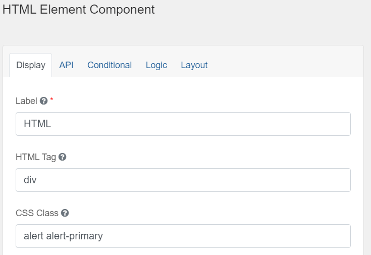
Bootstrap Components can be added using the Layout > HTML Element in Advanced Fields. Copy and paste components from the examples on the Bootstrap site. There are also a few samples implemented here in the working example.
You can either paste examples directly into the content field or into the HTML Tag and CSS Class fields like this:
You'll find some components built into simple and advanced fields like Panel. Other options are also available in components like adding prefix and suffix to input groups.
Utilities
Experiment with Bootstrap Utilities to add custom styles to your form.

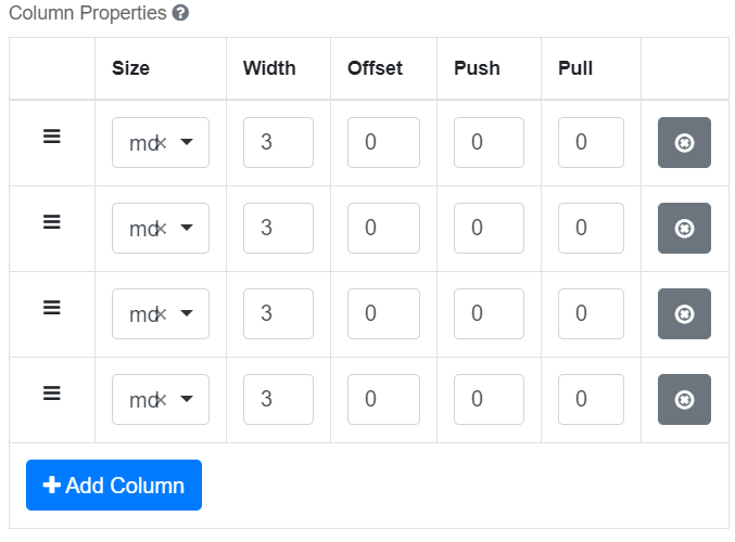
Columns
Use Bootstrap Grids to customize columns. A form is 12 columns wide, divide it up any way you like (6x2, 4x3, 10+2, etc). There are some pre-set column widths in Simple Fields. In Advanced Fields, here's an example of 4 columns of width 3 (4 X 3 = 12):
You can also nest columns, that is to say put columns inside of other components like a panel or even another parent column component.
Icons
Add icons to buttons and input fields from Font Awesome.
Button Icons
Example, enter “fa fa-plus” in one of the button icon fields.
Input Icons or Text
You can add an input icon in front of a field by adding an HTML tag into the “Prefix” field. <I class=”fa fa-phone”>.
