Styleguide - alexitsios/Calamity GitHub Wiki
Style describes an identity. In our case, "visual" identity. Take completely random screenshots from your favorite games. If you can tell them apart, it's because of their style and artdirection. What's important to understand is that any amount of detail, be it as low as pixel art or as high as 8k photorealism is only a tool for- and a part of style. Aiming for a style means aiming to create something specific and recognizable.
What we associate with the "styles" of old video games is often the result of dealing with limitations such as hardware, experience and talent. It's not uncommon that a sub-culture is generated from these and limitations eventually welcomed. And this is where things get tricky, because the outcome of fighting limitations and embracing them can look VERY different from each other.
The truth is, everything is style. But it is NOT set in stone and it should always be free to evolve naturally.
As we all know, the PlayStation was able to produce some mind-boggling effects.
Example mind boggling effects

But even though we can now identify its games were often very blocky and in low resolution, the truth is, monitors and TVs used to blend colors in ways that sometimes made them look fairly realistic even by modern standards. The images were more vibrant and hard edges were harder to make out, which is still not perfectly replicable with modern shaders.
Example LCD vs CRT

In fact, a lot of environments seemingly had complex lighting effects, realistic sheen of various surfaces, high poly models and sometimes even complex reflections!
Example high detail environment

Example complex light transport effects

Games with fixed camera positions were especially beautiful for the time, being often way ahead of what was possible to render on consumer hardware. This was achieved through prerendering, a process in which images and scenes can be rendered at much higher resolutions using effects that might only become available to us in the future for use in real time. Fortunately we are in the future and these effects come fairly cheap using much less effort.
Common themes in horror explore the eerie, mysterious, surreal and overwhelming, sometimes unknowable, threats. A successful horror medium is in large part defined by its ability to instill fear in the observer. Causing fear in a safe game environment is no easy task, as we're limited to a small subset of things that make us afraid. For instance, the horror of being met with an eviction notice and the anticipation of becoming homeless, while realistic and something we can empathize with, is extremely hard to replicate in a game, let alone visually, but more primal fears are hard wired to our senses, making them perfect candidates for us to represent graphically.
Some of our textures will require us to delve into the uncomfortable. There are about three main ways we can instill discomfort into an observer using simple graphics (without delving into the far more vague territory that is the uncanny). We can use filth, body horror and the darkness. Noteworthy is that none of these are necessarily scary given the wrong context.
Filth is the hardest to describe as to how it makes you uncomfortable, so let's look at some real life examples.
Example 1
Example 2
Body horror is about the concept of changes to the body that envoke an instinctive fear in us. There is a reason why the concept of zombies gets to us and that's because we're hardwired to keep distance from the dead in order to not contract possible diseases. Body horror and the fear of bodies is related, even if it doesn't make that much sense to us thinking about it logically. This instinct is also the source for what we call the uncanny valley.
Example 1
Example 2

NSFW - About examples of real life body horror and gore
I will not give instructions on how to find pictures of real deceased humans. I don't think the value outweighs the moral dilemma and potential serious harm in doing so. It's worth to mention that many artists have willingly traumatized themselves watching vile imagery and footage for the sake of getting things that little bit more realistic. The only reason I'm even mentioning it is that it's somewhat of a logical conclusion to solving a problem we encounter in horror productions. To put your mind at ease, should you have any interest in getting your art to feel more authentic. It's not worth, the majority of "content" is of too poor quality to be useful and no less traumatizing, and the normal player will never ever know the difference.
If the itch persists and you really want to know how eerie it is to look at human remains, go to a museum or watch a documentary on mummies. Skip everything else.
The darkness is almost self explanatory. However, similar to body horror, there are reasons we're instinctually afraid of the dark. As humans, we're defenseless. We're considering ourselves apex predators and by all means, we are, but if we were without our modern technology, without thousands of years of civilization giving us the safest foundation we've ever had, we'd be in a completely different scenario. Keeping away from the dark and unknown, in a safe place where no harm can get to us is one of our deepest instincts. A lot of predators hunt at night, and we compensate our bad vision in the dark with a vivid imagination. Which is great, because we can leverage this and don't need to break our heads over how to design some actually terrifying monster. That's not completely true. But darkness is one of our best tools to make peoples' imaginations go nuts.
The takeaway here is that what you can't see is often more important than what you can see. Shining light on a monster will trivialize it. Make it known and something we can categorize and recognize. We have to strike a balance between giving the player proof that a monster really exists and showing as little of it as possible, all while creating an urgent situation of keeping away from it. But that's a game design issue, not an art issue.
Getting the player immersed is the most important precursor to setting the mood. Even though a seasoned gamer may have an easy time immersing themself in any fantasy world, we have to understand the environments and objects we're creating well enough to give the player the illusion that real world rules apply. Decorating a room in an abandoned military facility with broken furniture may serve the theme, but we also have to be clear as to "why" it is broken so players won't start asking too many questions. An undisturbed room can stay in pristine condition and it can take many years for any sort of decay to occur. So when in doubt, ask questions about the context the object will be in before applying weathering effects, blood splatter or similar effects.
All that being said, we will want to create visually realistic depictions of real life objects and materials and not leave the player wondering what they are looking at or complaining something doesn't look right.
Creating realistic assets may sometimes require us to study objects more thoroughly by looking at pictures and videos, breaking them down into simple shapes, learning about their uses and details and sometimes making educated guesses about their makeup. Does an object look like metal? If yes, does it look more like iron, aluminum or something else? It's always best to gather a detailed description of what the surfaces of that object look like. However, descriptions like "tumbled steel revolver with ivory handle" are completely sufficient and contain good terms to look up examples for on the internet.
Setting the player up to experience certain emotions is HARD. Making the player feel with the characters is mostly in the hands of the writing team, but immersion, the most important part of it all, depends on the delivery. This includes us, bringing across emotions visually. There's a reason the main character usually won't run through a field of flowers right after tragedy. As artists, it is in our power to accompany emotional scenes with art that feels right for the moment. Beyond that, it is in our power to guide the players' subconscious and invoke emotions.
You can find great examples for visual representations of emotions by looking up paintings depicting these emotions. For instance, what do paintings depicting depression have in common? People lowering their heads or cowering, lots of pictures playing with draining colors or a complete lack of them, abstract depictions of peoples' faces, their hands covering them or no faces at all. And here's where we can also see, that it's not necessarily the most realistic looking paintings that make us relate the most. Abstract depictions can guide us on a search for meaning while opening ourselves to the raw emotions of a scene. But that doesn't mean "abstractness" is the end all be all of visual communication. As with real languages, there needs to be meaning behind our art.
Games like Silent Hill change their surroundings to get us emotionally closer to what the characters are feeling. Silent Hill can look simply run down and depressing, it can also be engulfed in fog or darkness. But it can also look like a nightmare. What these visual changes mean to the story or how literal they are don't matter. The game is visually clear on what it wants you to feel. The sun might be up, but searching a loved one in a foggy, empty city can be an interpretation of how it might feel to search for a loved one, blind to everything but what's immediately in front of you and losing orientation.
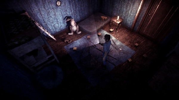
Retro style reimagination of Escape the Ayuwoki going for a 90ies game feel.. Visually, this is closest to what we want our game to be like. What sets it apart from games from the actual 90ies is that nothing is prerendered, lighting is done in real time, allowing for the use of a flashlight to illuminate parts of the room. It's making use of modern PBR materials to make the game look more realistic, even though it's set to a very low resolution. It strikes a perfect balance between readability and horror like occlusion of the surroundings because of its flashlight mechanic.
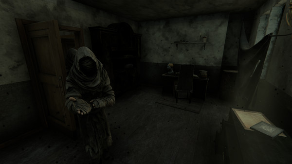
A story heavy uphill battle to fighting a plague. Very surreal. Graphically, it plays in the early 20th century during fall. Heavy on sepia colors and shades of dark gray/black. Notable are its visual effects symbolizing a spreading disease of unknown origin infecting people, buildings and entire districts. It makes extremely good use of making you afraid of its environment by keeping deadly threats occluded at night, in thick fogs and other effects and particles. It effectively takes classic visual horror methods to the maximum.
Visually, those two games cover pretty much all of our bases, believe it or not. We could spend days or weeks finding more games that visually speak the language we're going for, only to end up back here, confirming the same ideas. Let's use the saved time to visually dissect these further. :)
First off, it means that where we want to set limitations isn't as clear cut, because going with the same limitations as PS1 hardware wouldn't add positively to our style and only put boulders in our path. But we can and should still take inspiration by the quality achievable using minimal resources.
Games like the Escape the Ayuwoki DEMAKE show us what's possible in a retro aesthetic with modern means and without losing any of the retro charm. We can likely even take things a couple of steps further.
This section goes over a couple of important definitions and things to consider to help find the right amount of detail.
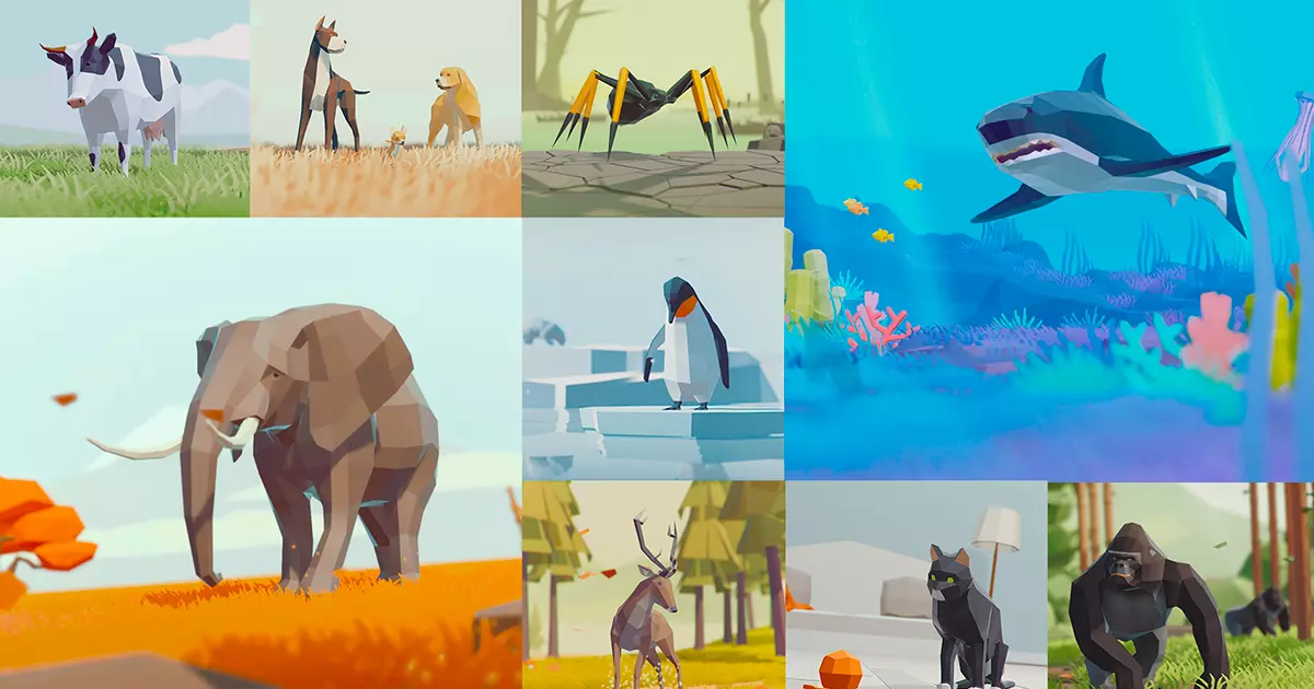
Due to our resolution of 480x270 pixels, we can easily go with "low poly" models for everything, focusing our attention more on objects taking up a lot of screenspace.
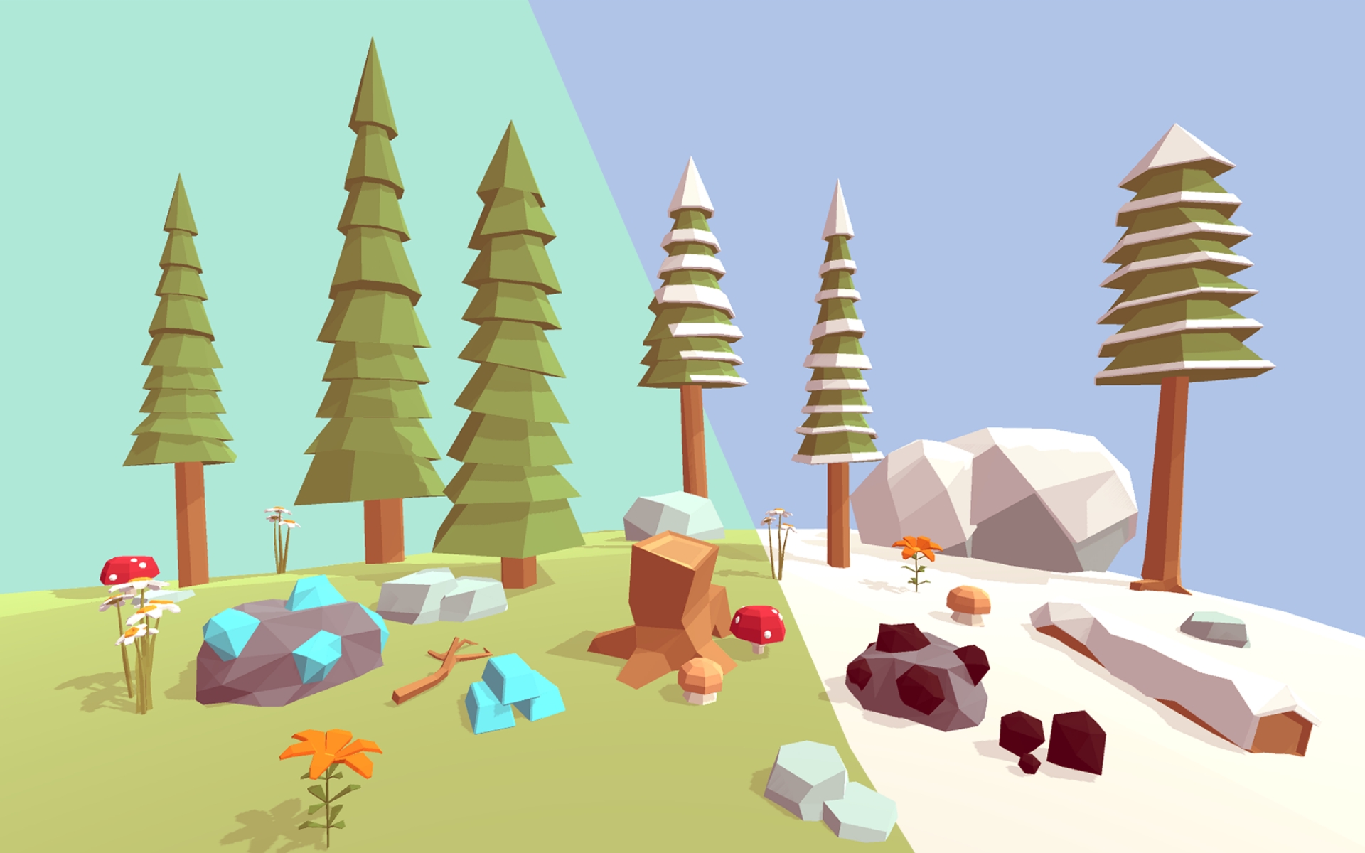
Low poly encapsules 3D models that use a relatively small number of polygons without sacrificing the recognizability of what they're trying to depict. There isn't a specific limit on polygons or tris, but fine details are usually left to textures while we try to use the minimal amount of polygons and tris to get a consistent and recognizable silhouette of our objects.
Low poly is sometimes a bit misunderstood and reduced to a small subsection of what it can me. Being most often associated with hyper minimalistic and retro 3D models. The minimalistic approach making use of mostly flat colors and no amount of smoothing, and retro style which makes use of high quality textures with baked shadows/highlights and hides jarring hard edges on the models by not using modern light effects and instead using static vertex lighting. (Dynamic vertex lighting came a generation later)
Minimalistic Low Poly assets
Retro style low poly

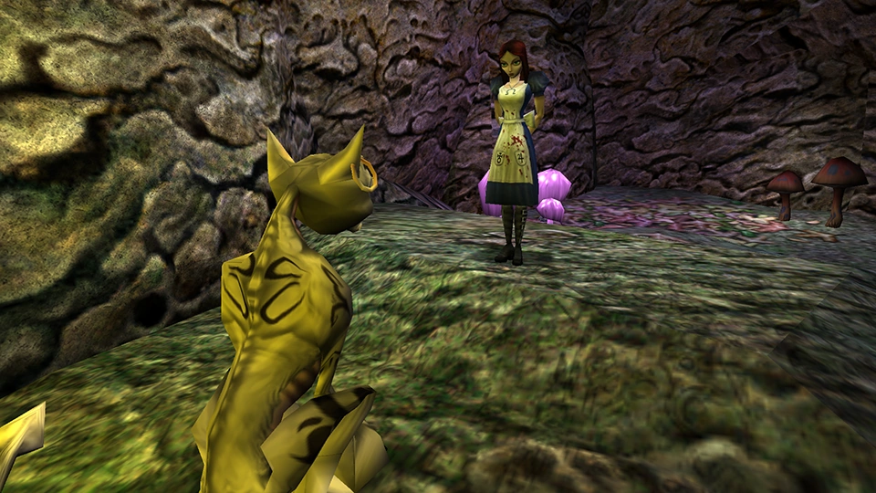
Alright alright, this last one isn't super fair, it's retro style because it's actually a retro game from the year 2000. But you can't have a talk about horror style without at least mentioning the masterpiece American McGee's Alice. But the tech is too old and the style too surrealistic to draw conclusions for our project beyond how it isn't compatible with what we're doing...
Both styles are low poly and have their applications, but with negatives outweighing the positives for us.
Low poly doesn't have to limit us. Anyone more familiar with the technicalities can fill me in if there is a better name for it, until then we're going with "Oh shit, this is actually low poly?!".
Examples of "Oh shit, this is actually low poly?!"
Altair by Genc Buxheli
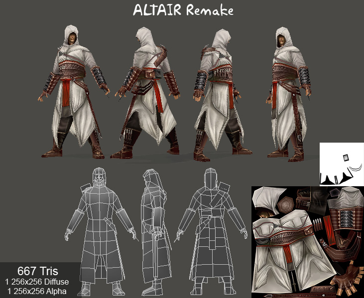


The most important part about creating such low poly models is to know where details are necessary and where you can go with the bare minimum. A lot can be achieved without creating high poly models and retopologizing them in low poly. These were just examples of images that look well in high definition. We need a lot less to get the same effect due to our resolution.
Areas in which we want the most detail are usually wherever we pay the most attention to or where people are expected to look at most. Speaking about humanoid models for instance, it's not wrong to have significantly more detail in the face than the legs for instance. What great low poly meshes also seem to have in common is good attention to readable silhouettes. It might negatively pull the attention, if an object looks much more blocky than it's supposed to.
Smoothing groups are used to average the normals of adhering polygons and tris to prevent hard edges. Hard edges aren't something we need to avoid all costs, but they can look jarring on a leg or across a face. So we usually try to avoid them on organic shapes. The reason we're using them is to make the surfaces of our models look much higher definition than they are.
Many low poly styles were made with the conscious decision to embrace the blockiness and hard egdges. Not us. It's a good idea to get very familiar with the concept and how to use them well.
Imagine a perfect cube of any size. What is its story? If you scramble to find anything to say about it other than it's a cube, that's okay. When we create models, we often have to think further than to create a perfect object. Add three parallel grooves to one side of the cube, maybe they even go over one edge and onto another of its faces. Now we have something to talk about. It might be the scratches of a beast.
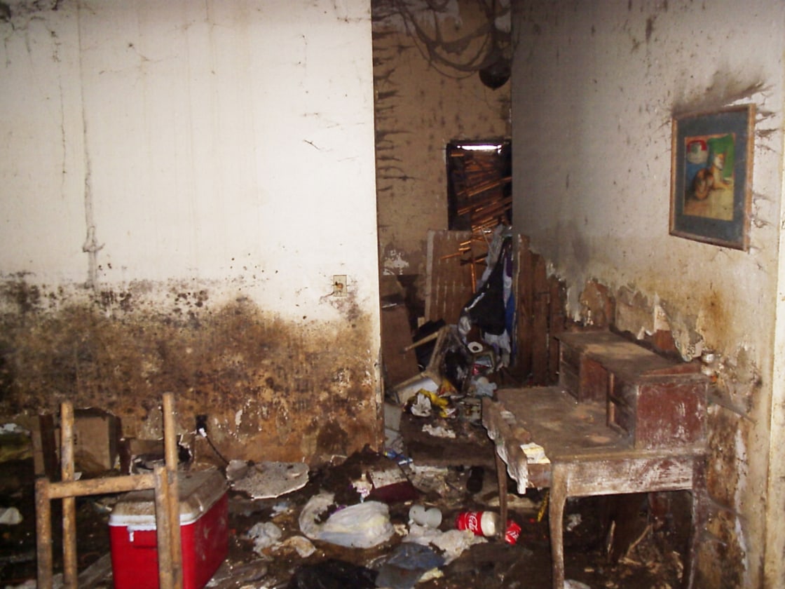
When we're talking about a story an object tells, we're talking about its physical chracteristics that give us some clues about its past and what it went through. And some of the most common stories we're telling in horror are about the disrepair and destruction through time.
Real life example of a room in Chernobyl
It's important to have a concept over how fragile our surroundings are.
Take this as a rule of thumb, you don't have to do the math for every single model. However, doing it at least a couple of times will get you on track. Our resolution is 480x270 pixels. If an object, takes up 80% of the screen by height (216 pixels tall), double its height and round up to the next higher potency of 2 (numbers like 32, 64, 128, 256, 512...), which in this case will be 512 and you've figured out the size of texture to use. Deciding texture sizes this way will make sure they are roughly uniform and individual pixels aren't as easy to make out due to our resolution. We also limit texture sizes to a healthy middle between bare minimum and too big to be noticable.
For the sake of all of us getting on the same page, let's forget everything you've learned about color theory, color harmonies and all that. We're going to severely limit our palette and aim for a look that's not always the aesthetically most pleasing. The horror genre comes with its own set of rules.
It may be hard to believe, but colors are easily one of the more complex topics for us to tackle. It's easier to pinpoint when colors aren't right, but broken down into their components, they turn into a powerful tool to underline whatever message you're going for.
Its often being speculated that our brains evolved the way they did to process images better. ELABORATE FURTHER, GET SOURCES
Context is actually always the defining factor and can't be judged by itself. Olive green may not be color you may immediately pick when painting or making textures, but if you have brick red and ocher, aswell as different shades of gray and sepia colors, what you have in your hand are perfect colors to paint a low light, low saturation picture with some somber tones.
The key is, you can't and never should judge individual colors. This is also why at this point, if you're having troubles finding applications for colors outside the high saturation spectrum, to dig a little into color theory and learn some of the principles, because what we're doing in the following sections builds on the understanding of the relation between darkness and desaturation and what how colors mix. Which can be significantly more complex than it first seems.
We all know what RGB does. It's Red, Green and Blue in ranges of 0-255 and it makes up all colors our computers can output. But if you have experience making digital art using all kinds of different color spaces, you may have noticed some are more straightforward and precise to use than others. While RGB provides access to 16 581 375 colors, and HSV only gives access to 3 600 000, which is roughly just a fifth, the HSV colorspace makes picking your colors less ambiguous and lays our colors out by what we care about most in art.
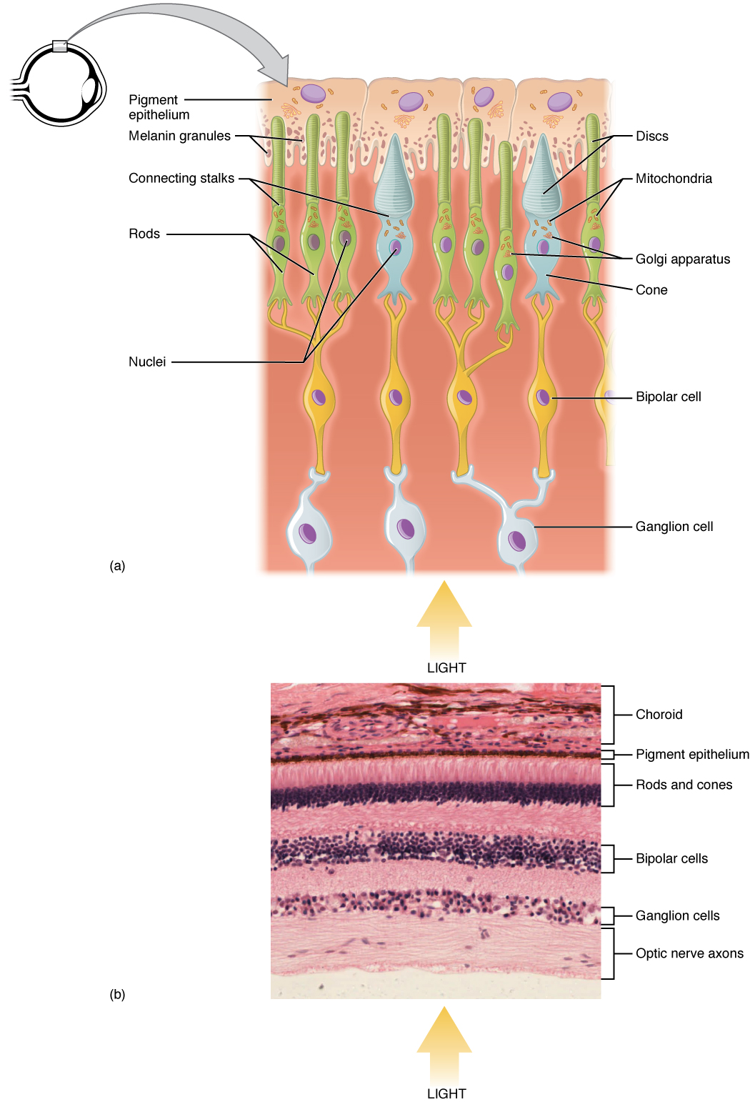
Contrary to what HSV might imply, Value, the last one, is the most important. What value is is the difference between light and dark. Our retinas (not including "some" people with colorblindness colorblind) have two different kinds of photoreceptors, called cones and rods.
Photoreceptor cells broken down
You might be asking, what the f*** does it have to do with making textures for a game we put in our portfolio? Here's the thing, just about every artist working in AAA knows this or has at some point learned it. It's the one of the most relevant pieces of information an artist has to be aware of and studying artists are encouraged to master the use of value before they delve into the use of color.
More on value later.
The hue in the HSV colorspace is best described with a color wheel.
HSV color wheel
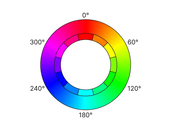
It's a 360° circle cycling through all of our available hues. You may know it in linear form as a rectangle, beginning and ending with red. It's the same concept, but described in 360 steps.
When painting, we often mix yellow and white to our paint to give us a lighter brighter version of that color and blue/purple and black when we need a darker version. Digitally, we call this hue shifting, and it works by moving the selection of our hue ever so slightly toward these colors.
This is actually also source of a huge fallacy. While it's a convenient rule to shift toward these colors at all times, the reason we started to do that was to create more vibrant art. It is a stylistic approach to making the most out of very limited color palettes in pixel art for instance. It has its legitimate uses in photorealistic painting when we're painting a scene of a sunny day and using two main sources of light. The sun and the sky. Why the sky? Because everything that's bright and colored will bounce back some of that color onto other objects. It's called bouncing light. Even if the sun is at a specific angle, the shadow might still be lit by the blue light of the sky.
Crazy, but while this is important to know, how we'll shift colors will be different, because our textures don't need to have the color of the light hitting them baked in. (Baking colors is the process of having light and dark parts of a model colored in as light and dark, regardless of any ambient color ingame. Nowadays it's mostly used in games going for a retro aesthetic or mobile applications)
Imagine a white piece of paper. Now imagine the same piece of paper, but it's very old. Is it yellow now? That's because aging objects often change their hues over time. The hue, while being far from the only factor, can change over the course of time and influence the look of an object. Whether it's accumulated dirt, exposure from the sun or pigments breaking down in the heat.
Saturation is second most important of the values, although virtually pointless without the hue. If you're looking at a black and white picture with a single red apple in it, that's where your attention will be drawn to.
Highly saturated colors are associated with summer, happiness, while the lack of saturation can be depressive and dull. Which is great for us! Horror thrives on bad feelings, so unless it's gore and blood, keep the saturation down and you'll be good!
Let's think about the word highlight for a moment in the context of games. Do you think about something of importance or something in focus being lit up?
To get back to those cones and rods mentioned earlier. We have significantly more rods in our retinas than cones. I know, boring theory again? Just hang on for a minute, if you remember one thing, remember this. We could navigate our world without colors, but without light, we'd see nothing.
Because of our perception of light, we can make out objects. If an object is brighter, we also see it easier and it pulls our attention.
We won't limit ourselves on hue and go with the natural colors objects have. However, old and faded things often gravitate toward sepia. Use your best judgment.
Generally it's going to be a good choice to desaturate any colors we use and only saturate them if we want to highlight something important.
For all intents and purposes, the value will reflect how bright an object is in real life.
Textures can tell us more about an object than simply what material it is made of. Don't misunderstand, good material textures are incredibly important. But let's focus about everything that doesn't just say "wood" or "iron". Let's talk about grime, wear and tear, signs of aging, that sort of thing.
A texture can tell you a lot about its past. Was it humid and grew mold, moss or was it even underwater and now has barnacles growing on it? With textures we can tell stories that deepen the immersion of the player and give him hints about the past. If you've read the 3D section, this may sound familiar. It's the same concept, but textures have a lot more potential, because adding dirt can even done procedurally in real time.
Imagine for a second a person. They pick up a picture frame. It's a picture of them as a child. The picture turns old, loses color, maybe the glass gets dirtier. The once young hand has now become old. A scene like this could be powerful. And it's possible to tell this story solely by changing the textures.
But not everything has to necessarily be dynamic. There is a lot of flavor and history we can add to most textures just by giving them a couple of blemishes. Think about what plausible past the thing you're currently texturing could have had and imagine how you can prove it. Is it really old? Search for similar objects that are really old online. Does it have a specific kind of damage? Look that up aswell.
How does age show and how can you apply it to your texture?
At this point you may have noticed. Anything out of the ordinary is where our eyes are drawn to. Be it a red apple in a black and white image or a light in the dark. Let's make things slightly more complicated. If you had an image of noise with a single spot of blank space, your eyes will be drawn to that blank spot and vice versa if it was a white image with a little bit of noise.
It's helpful to imagine any kind of detail as stress. Too much of it, and your eyes will try to find a position to rest on, but when there's nothing to look at, that's also boring. Being aware of this, we can draw the attention of the player. But making textures, we may sometimes without meaning to create too many distractions in a scene for the player to properly filter what to look at and what to identify as unimportant clutter.
This is why it's important to understand that while any details we can give a texture for flavor, we should focus that detail work on objects of higher importance, so they stick out easier. Hidden object games are this theory taken to the extreme, where everything has so much detail everywhere that it's hard to find a specific thing in the scene. Unless that's exactly what we want, we should make our average textures used on backgrounds, props and other clutter as "boring" as possible.
Sorry, out of alliterations... ... Alright, I just didn't want to call this one "Materials mean mass" because it's not the main point I want to make here.
Anyways, material textures are a kind of reusable texture portraying a specific material. One of their greatest features is that you can find a lot of scanned, photographed or procedurally made textures at high resolutions online and free to use for commercial products. Textures.com for instance is a great source for these. (Personally I've never used them, but if creating textures yourself is not quite your thing, this an invaluable resource depot)
Using material textures can provide a solid foundation to be built on. They are not unlike certain texture CDs from the 90ies and can be edited to suit your needs. The problem being that PBR materials are a lot harder to edit than simple textures.
They are mentioned here because it's important to be aware that they exist and that we're capable of creating them, should we require a specific material we'd like to apply in many different places. (Generic iron and steel for instance)