Highlighting - ajvondrak/vondark GitHub Wiki
This page gives a visually guided tour through the highlighting features of the vondark color scheme. It goes over the specific choices made given the Design. All the screenshots show MacVim GUI windows unless otherwise noted. The font is Menlo normal 11pt.
- Intro
- Special text
- Passive highlighting
- Gutter
- Diff mode
- Folds
- Search
- Status line
- Command line
- Popup menu
- Spelling
- Tabs & Splits
- Syntax
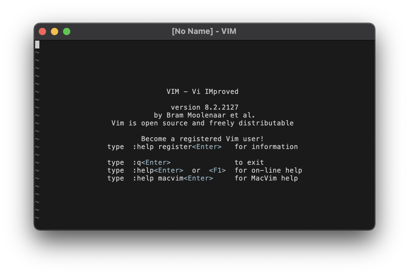
As soon as you start Vim, you can see the core highlight groups at work in the standard intro message.
- Normal text is light on a dark background (grey80 on grey10).
- The default cursor blinks, alternating the same foreground & background colors.
- The special keys
<Enter>and<F1>are highlighted as active text in Material Blue Grey 500 (light). - The end of buffer
~markers are highlighted as inactive text in a medium grey (grey40).EndOfBufferis normally linked toNonText, but the latter is treated as special text, whereas we want the EOB markers to command less attention.
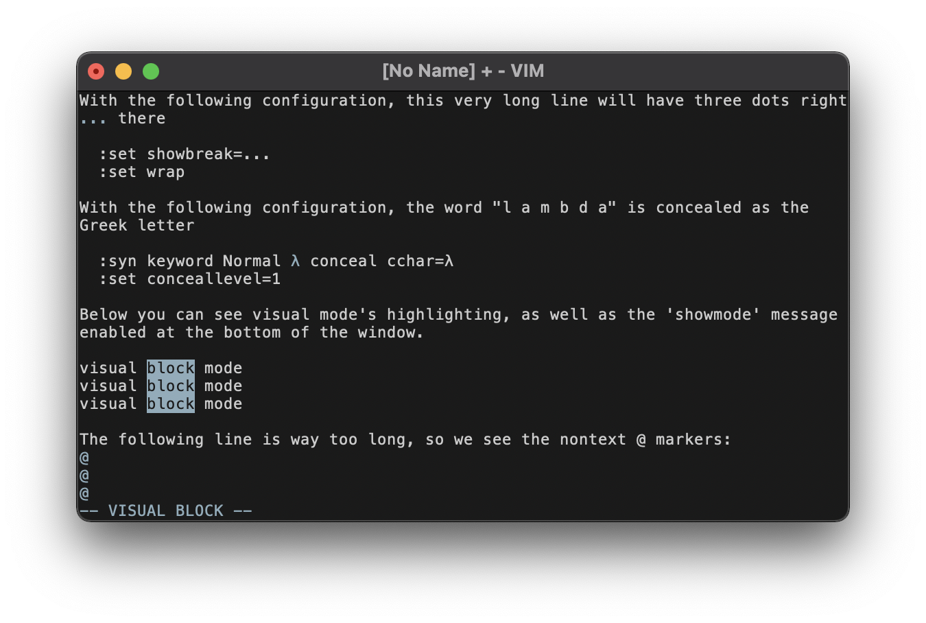
Various forms of "special" text are highlighted in Material Blue Grey 500 (light). The same color is used for active highlighting actions, such as the various visual modes.
The screenshot shows:
- the
NonTextgroup highlighting the@markers at the end of the window and the...characters from'showbreak'. - the
Concealgroup highlighting the specially-concealed "lambda" keyword, which shows as the blue-grey λ in the:syn keyword lambda conceal cchar=λline. - the
Visualhighlighting, which is also a good opportunity to show theModeMsghighlighting in the-- VISUAL BLOCK --message at the bottom of the window.
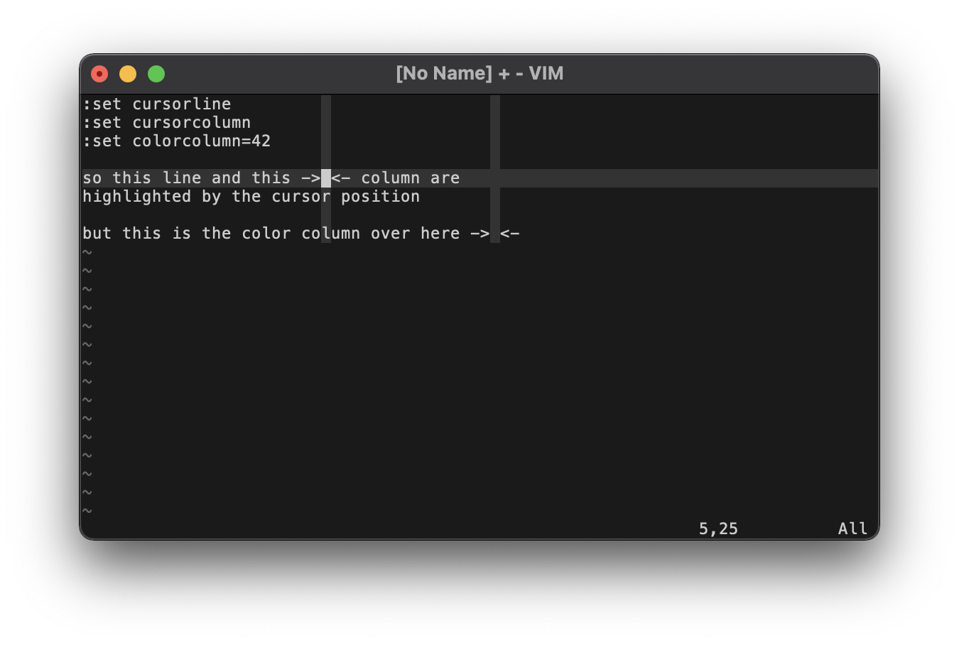
Some lines & columns can be highlighted passively without the user making an overt selection (as in visual mode). These subdued stripes use a very dim grey20 background, allowing you to continue reading the text underneath. The screenshot shows the highlighting you get from 'cursorline' and 'cursorcolumn', which follow the line & column of the cursor. It also shows the 'colorcolumn', which highlights a static column in the window.
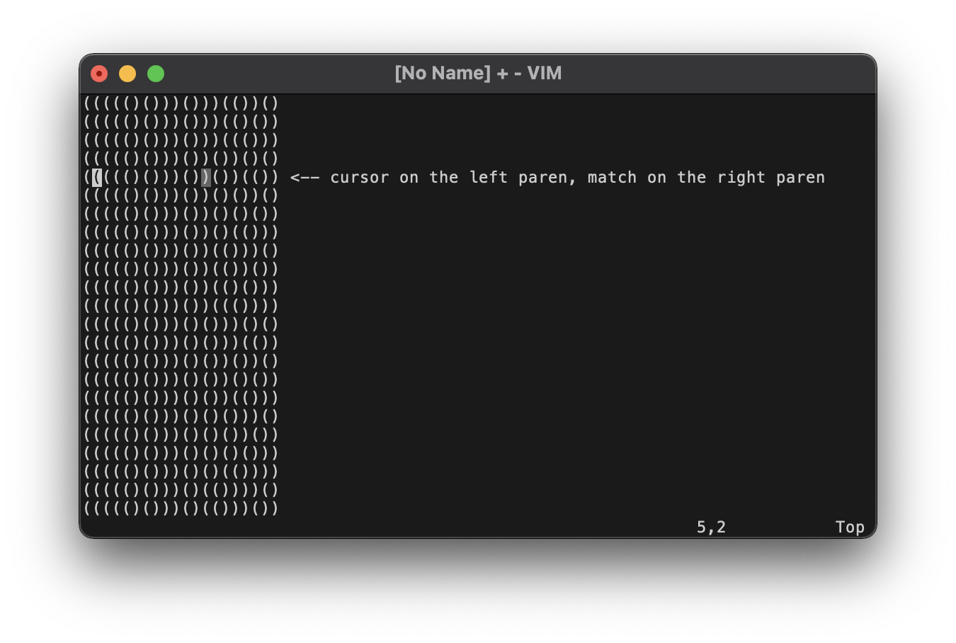
Bracket matching would conceptually fit the mold of this same passive highlighting. However, the normal passive grey (grey20) proves too hard to see when highlighting only a single character like a parenthesis. Instead, a brighter grey (grey40) is used.
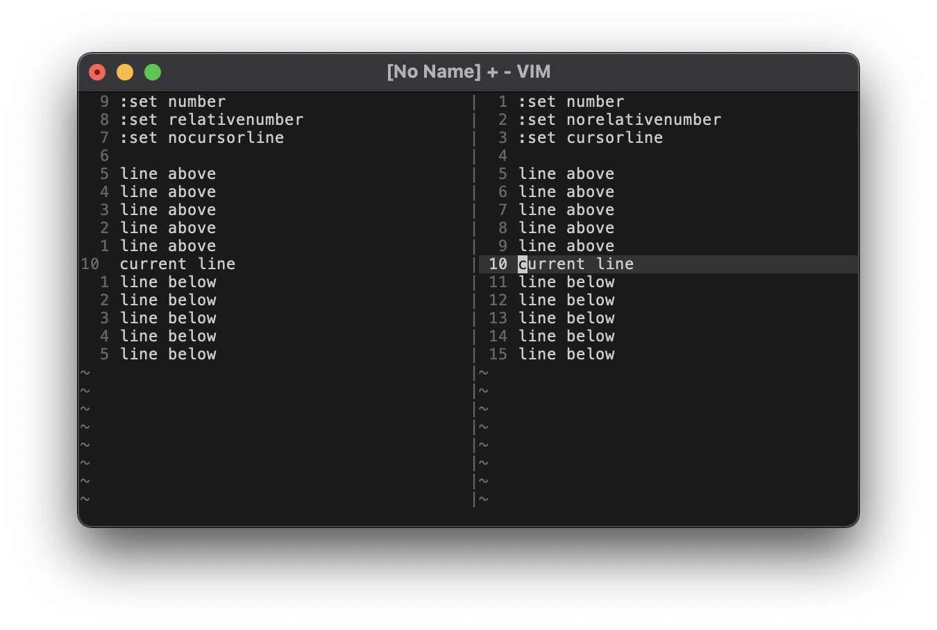
The left column of the window, often referred to as the "gutter", contains line numbers as well as other possible markers. The FoldColumn highlighting is shown in the Folds section. The SignColumn highlighting is not shown. Typically it gets overwritten, such as by vim-gitgutter, but the default will be highlighted just like regular line numbers.
Line numbers themselves shouldn't draw that much attention, so they're highlighted as inactive text in a medium grey (grey40). This goes for both absolute and relative line numbers, as can be seen in the left vertical split of the screenshot. If 'cursorline' is enabled, the passive highlight (grey20) will extend into the gutter and the absolute/relative number will be (comparatively) emphasized using the normal foreground color (grey80), as can be seen in the right vertical split of the screenshot.
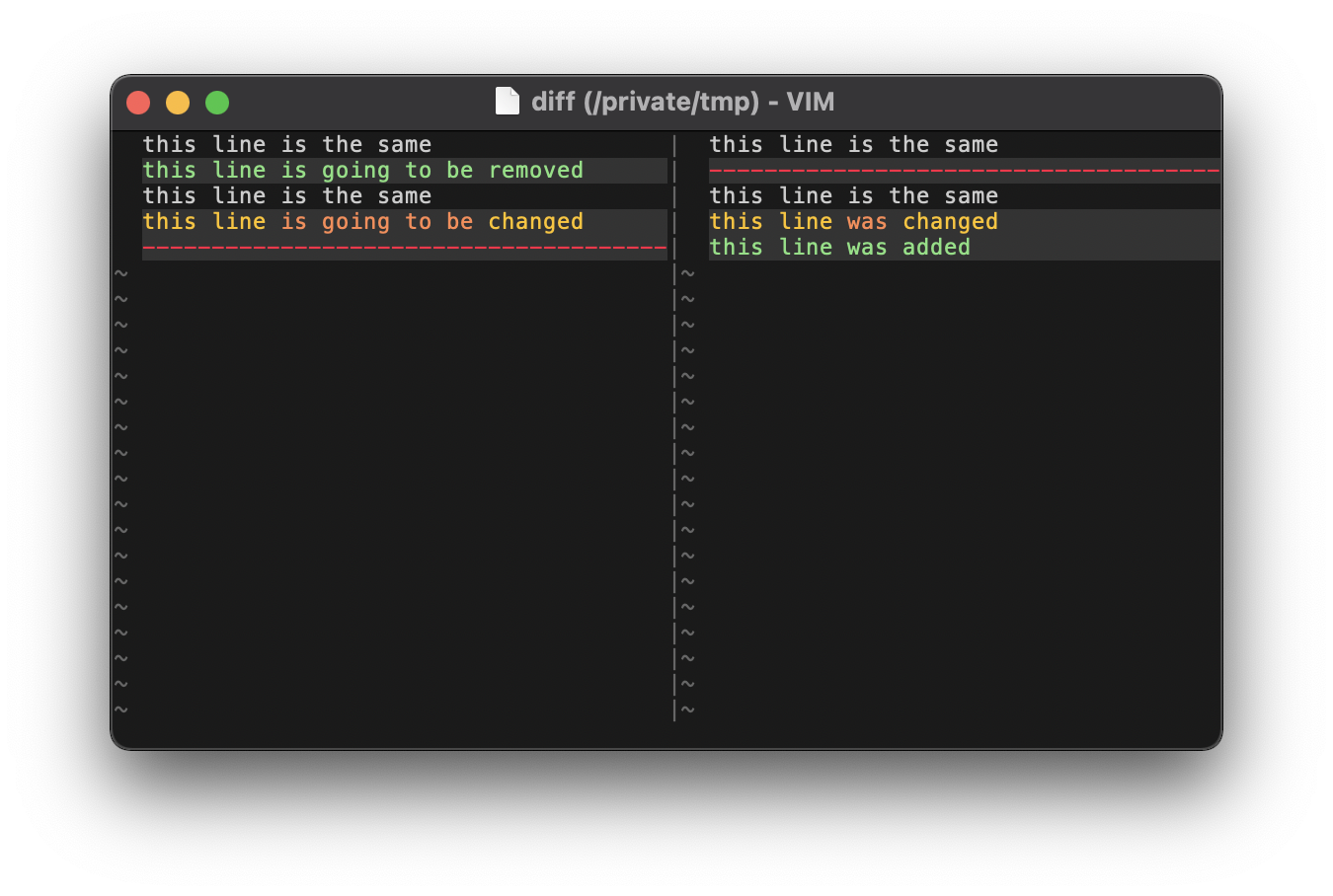
Diff mode is like its own little microcosm of syntax highlighting, so we dip into the chromatic colors. All changes are passively highlighted in grey20 for emphasis, and deletions/changes/additions follow the traffic light red/yellow/green pattern. 🚦 Orange is used within changed lines to emphasize the altered text. In terms of the actual Color Palette:
- red is Material Red A400,
- yellow is Material Amber A400,
- green is Material Green 500 (light), and
- orange is Material Deep Orange 500 (light).
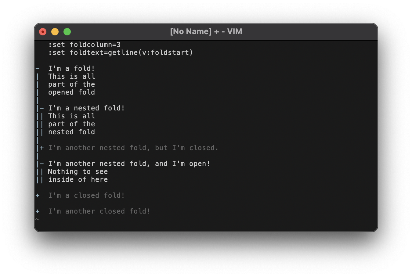
While many color schemes choose to draw attention to folds using loud highlighting, this never made sense to me. I use folds to get rid of things I don't want to see! I even go so far as to set a custom 'foldtext' that does away with all the extraneous text and just shows the first line of the fold completely unaltered. This setting is used in the screenshot, just to illustrate what I'm designing against.
Because of my strong feelings about folds, they're highlighted as inactive text in grey40. They're like comments (cf. the Syntax section), but even dimmer. This makes them pretty low-contrast against the background, but that's intentional: they're designed to be less visible than any "real" text.
However, there's an unintrusive way to draw slightly more attention to folds, in case they're too subtle. The 'foldcolumn', while arguably a form of passive highlighting, is important for noticing where you have folded text (especially if you pare down your 'foldtext' like I have). As such, its highlighting is elevated to an active Material Blue Grey 500 (light). This has much better contrast, so it's easier to spot, but it still doesn't get in the way too much. The fold column is shown in the screenshot, but if it's disabled you'll just have the grey40 text. The column might also be easier to see if you enable line numbers alongside it (cf. the Gutter section).
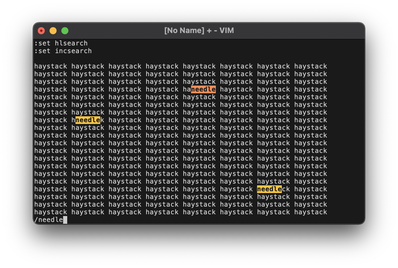
Though search is a form of active highlighting, using the standard Material Blue Grey 500 (light) isn't very distinctive. It's too easy to confuse with standard visual mode highlighting. It's also hard to distinguish 'incsearch' results from 'hlsearch' results using only one color. You'd have to resort to formatting tricks, like bold vs normal font or inverting the foreground/background colors. But none of those tricks make the search as distinguishable as I'd like.
So instead, we give search a personality all its own using two of the chromatic shades: Material Deep Orange 500 (light) for the current incremental search and Material Amber A400 for the other results. Both types of result are also in bold. Applying these colors as backgrounds with the text inverted to grey10 gives the appearance of using a yellow highlighter, with a deeper orange for the active search. ✍️
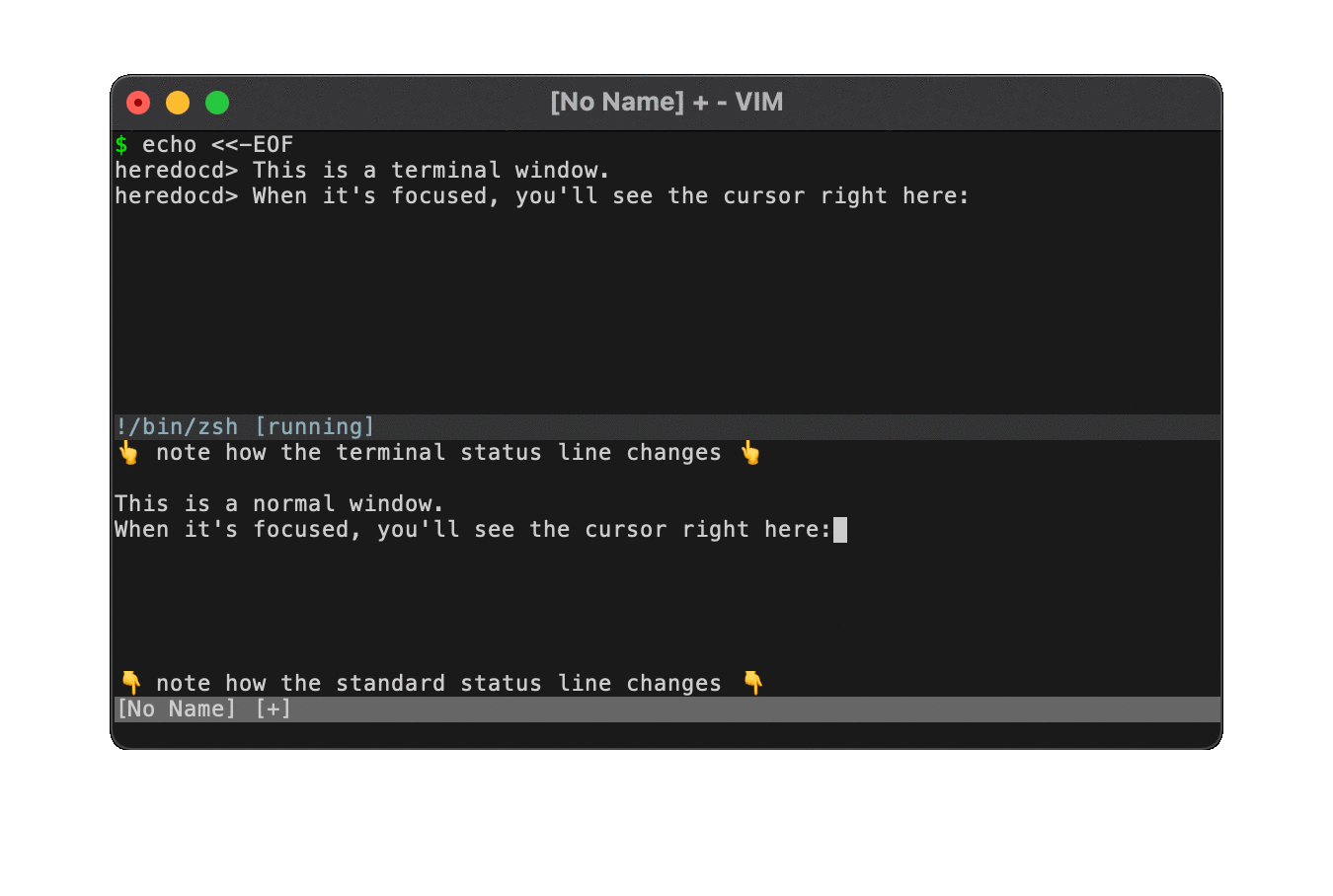
Status lines are used to separate different windows. The status line of the currently focused window is highlighted differently from all the other non-current status lines. In Vim 8 you can also open a special terminal window, which highlights the status line differently to distinguish it from normal buffers.
Two rules apply to both types of status line:
- The current status line is highlighted as an active UI component using the brighter grey40 background.
- Other status lines are highlighted as inactive UI components in the dim grey20 background.
However, the text colors change between the terminal windows & normal windows:
- An inactive terminal window's status line uses Material Blue Grey 500 (light) text.
- An active terminal window's status line uses Material Blue 500 (light) text.
- Standard status lines always use the normal grey80 text.
The two blues were chosen for their relative contrast: the blue-grey a dull, inactive shade compared to the light blue as a bright, active shade. Not only are they good duals of each other, they contrast well against their respective backgrounds.
In the above animated screenshot, you see two windows in a horizontal split. On the top is a terminal window, on the bottom is a normal buffer, and they both have status lines thanks to :set laststatus=1. Focus bounces back & forth between the top and bottom, showing the four different cases:
- Focused terminal, unfocused buffer:
- The terminal window's status line is a bright light-blue on a brighter grey40.
- The standard window's status line is the usual grey80 on a dim grey20.
- Unfocused terminal, focused buffer:
- The terminal window's status line is a dim blue-grey on a dim grey20.
- The standard window's status line is the usual grey80 on a brighter grey40.
The command line itself isn't really highlighted by Vim. Even the q: buffer just uses Vimscript syntax highlighting. But Vim does highlight different types of output that commands can generate, primarily from messages. For example, we already saw the ModeMsg highlighting in the Special text section, where -- VISUAL BLOCK -- was displayed in the command line area. But there are several other scenarios.
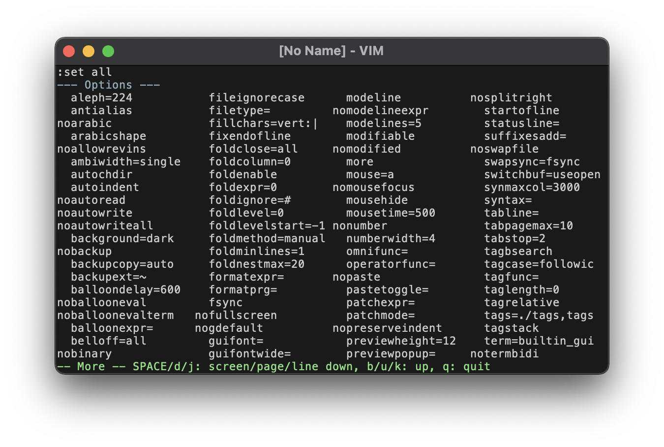
In this screenshot of the :set all output, you can see the --- Options --- line towards the top. It gets highlighted by the Title group as special text, much like the mode message. The Title group is also used by some languages' syntax highlighting, such as Markdown. Also, thanks to the 'more' option, you can see the -- More -- message at the bottom. It gets highlighted in Material Green 500 (light), which is vaguely semantic: green for "go", as in moving forward, as in seeking through more text.
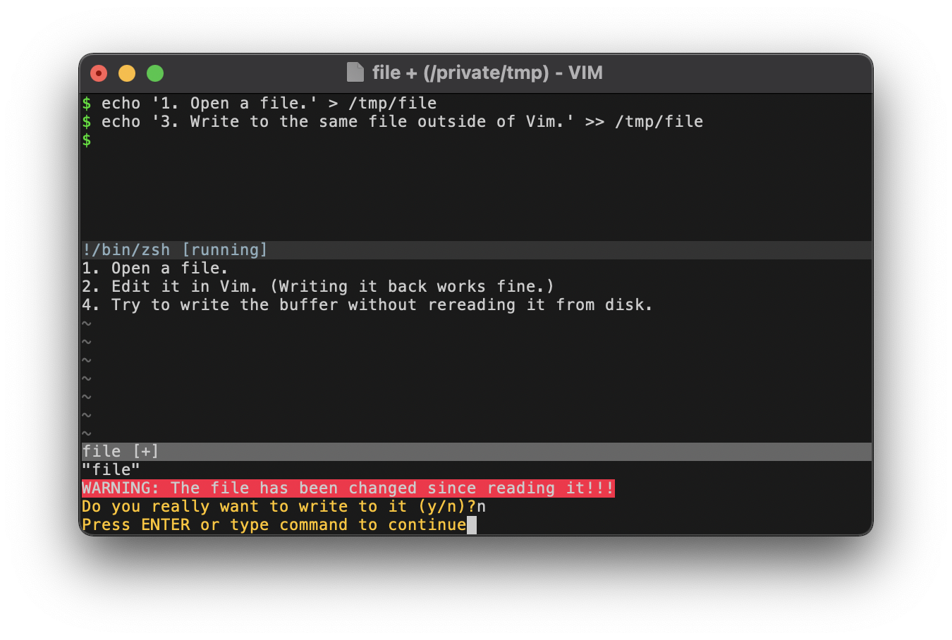
This screenshot goes through a circuitous process to trigger an error:
- We create a new file from the terminal.
- We edit the file in Vim and write the changes back to disk.
- We append text to the file from the terminal. Now the contents on disk won't match what's in the Vim buffer.
- Because we don't have
'autoread'enabled, Vim will trigger an error when we try to write the buffer back to disk.
This specific error is interesting because it shows us two different highlighting groups.
First, the error message is highlighted with a Material Red A400 background. Because as we all know, errors are red! 🛑 I opted to use this as the background color because I found that plain red text wasn't foreboding enough. Indeed, it was hardly even noticeable. While my natural inclination when highlighting the background like this would be to invert the foreground to grey10, here I opt for the normal grey80 text. Even though it's lower contrast (with a ratio of 2.4 versus 4.52), for some reason I find the light text easier to read than the dark text.
You can also see that the yes/no prompt is highlighted in Material Amber A400. Following the classic traffic light colors, such a yellow is suitable for these neutral prompts. 🚥 The highlight group is called Question, but this is a bit of a misnomer: the same group is used to color the hit-enter prompt, which you can also see in the screenshot.
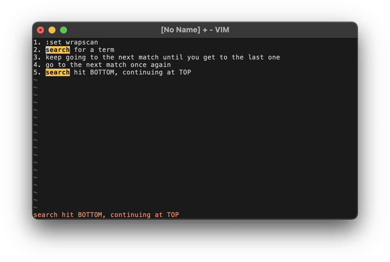
Warning messages, being semantically "in between" the neutral question prompts and the alarming error messages, are highlighted as the color in between the yellow & red: Material Deep Orange 500 (light). This screenshot shows an example in the search hit BOTTOM, continuing at TOP message that you get from the 'wrapscan' option.
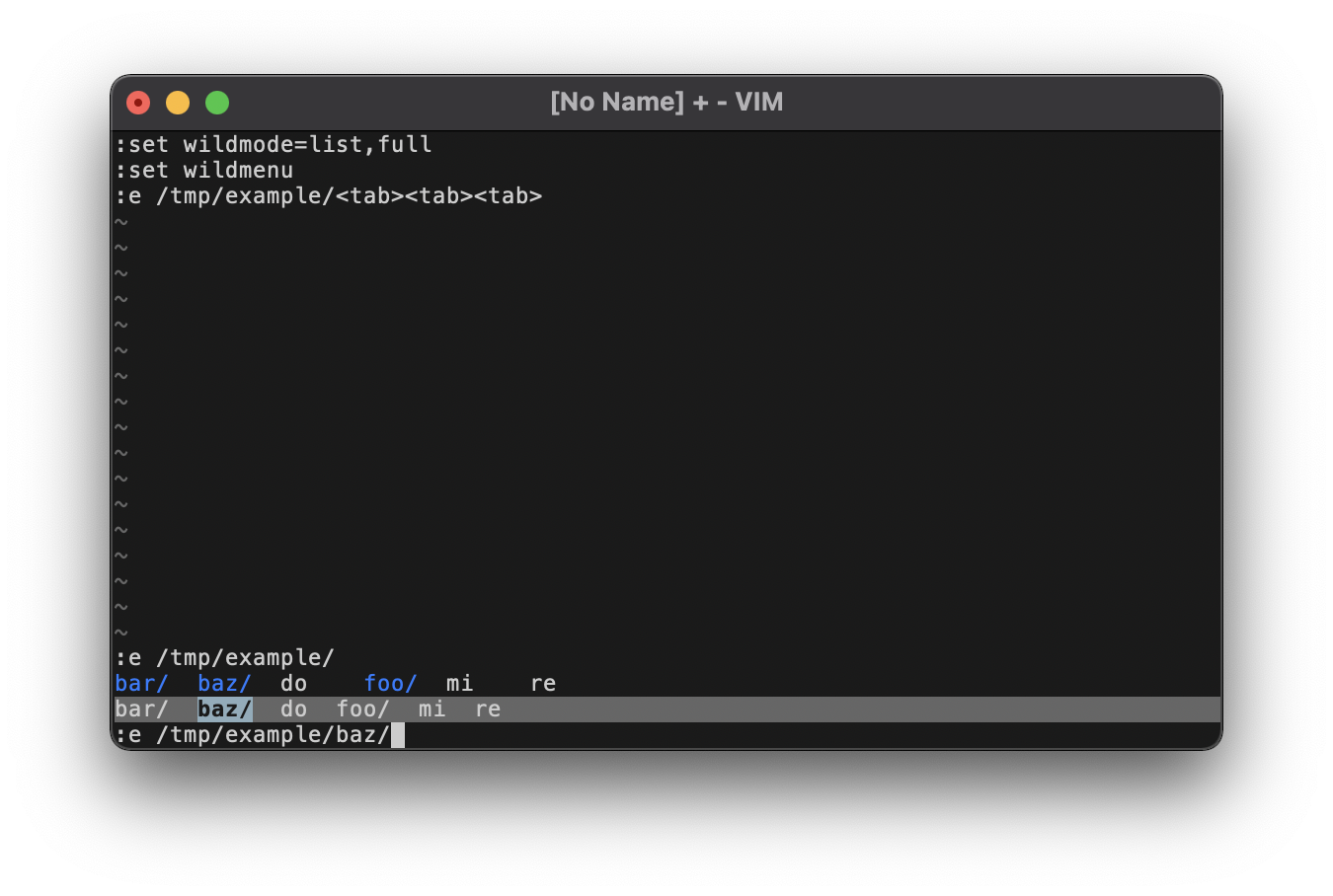
Finally, this screenshot shows command line highlighting for tab completion. In this example, we're trying to :e a file whose pathname we'll attempt to autocomplete. With the 'wildmode' option set to list,full, the first <tab> will output a list of possible filenames. Here we see 3 directories (foo/, bar/, baz/) and 3 files (do, re, mi) arranged in alphabetical order. Notice that directories are highlighted in Material Blue A400, which distinguishes them from regular files.
Due to the 'wildmenu' option, the second tab will trigger the enhanced completion menu. This inserts a status line enumerating possible matches. This will have the same highlighting as a normal, active status line (as of this writing, you actually can't change this!). However, the current match is further highlighted as an active selection with a background of Material Blue Grey 500 (light) and inverted grey10 text in bold. By hitting <tab>, you cycle through possible matches. In the screenshot, we've hit <tab> a third time to move the selection over to the second item in the enhanced menu (the directory baz/).
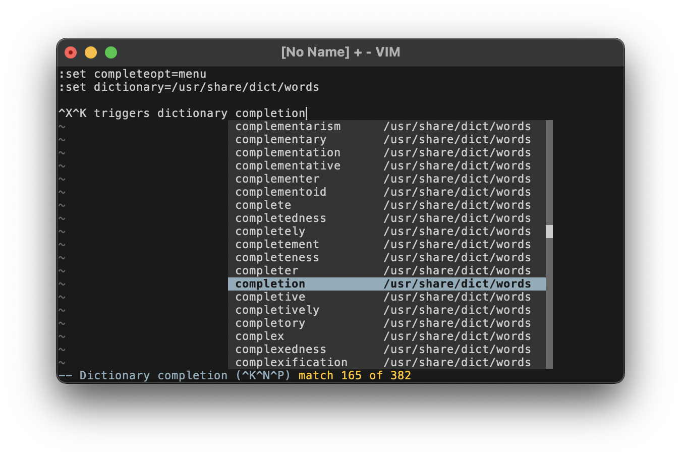
The popup menu highlighting coordinates the different greys to create a holistic UI component.
- Text is in the normal grey80.
- The current completion is colored as an active selection in Material Blue Grey 500 (light), with the text inverted to grey10 in bold.
- The popup menu's background is an inactive UI component in grey20, while the scrollbar is an active UI component in grey40. The distinction between "active" and "inactive" here is fairly arbitrary (it could be argued either way), but using the darker background for the main window is better for text contrast.
- The thumbnail in the scrollbar is also grey80, in keeping with the foreground of the main window.
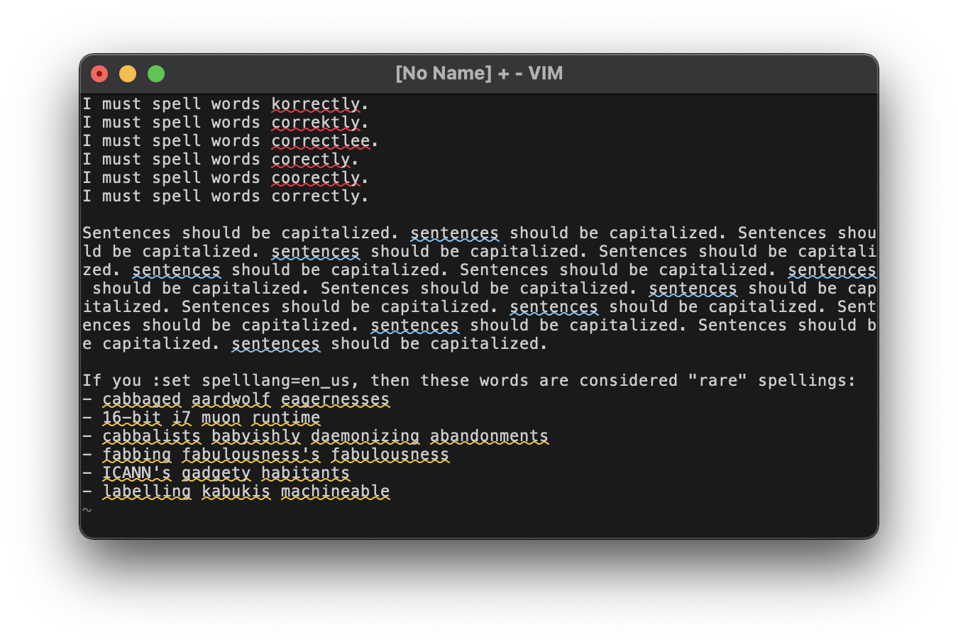
Borrowing from the standards set by Microsoft Word, spelling errors are highlighted with different colors of curly underlines:
- Bad spelling is underlined in Material Red A400.
- Capitalization issues are underlined in Material Blue 500 (light).
- Rare or local spellings (determined by your
'spelllang') are underlined in Material Amber A400.
The above screenshot comes from the MacVim GUI, where curly underlines are trivially supported. However, terminal support for curly underlines is inconsistent. Those that do support this type of underline don't always support coloring underlines separately from the text's normal foreground. As a compromise, when running Vim in the terminal, spelling errors will (a) attempt to use curly underlines (most terminals will fall back gracefully to straight underlines if undercurls aren't supported) and (b) set the foreground color of the text according to the above categories.
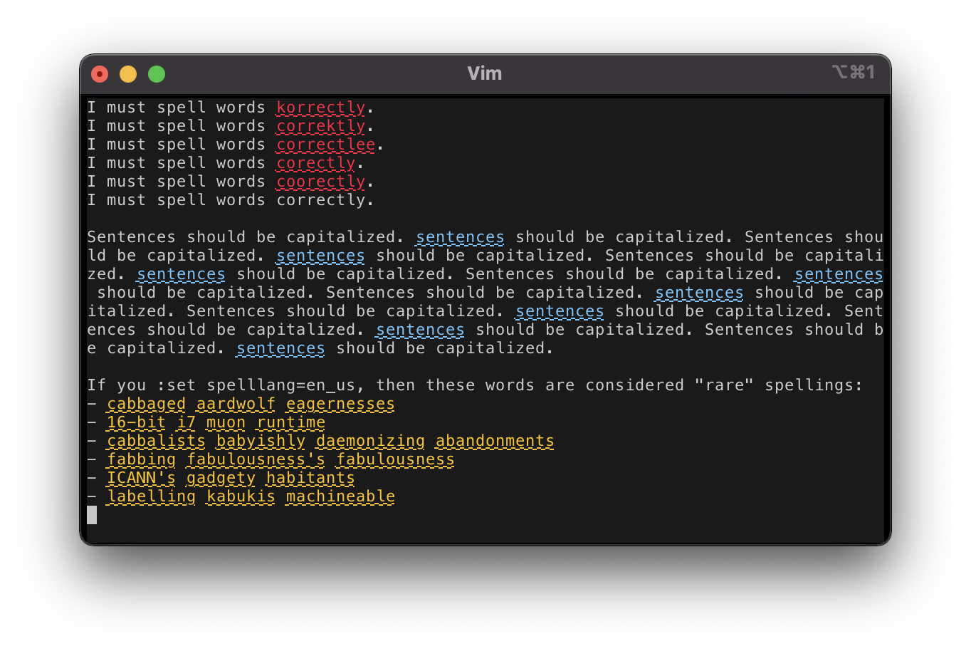
This screenshot demonstrates the terminal highlighting using Vim in an iTerm2 window. The coloring is made possible with 'termguicolors', and undercurls are made possible using
let &t_Cs = "\e[4:3m"
let &t_Ce = "\e[4:0m"
However, as of this writing, iTerm2 does not support coloring underlines separately from the foreground. There's no good way to detect this, so terminal highlighting will always just set the entire foreground color for spelling errors, as seen in the screenshot. See commit f7d829d for details.
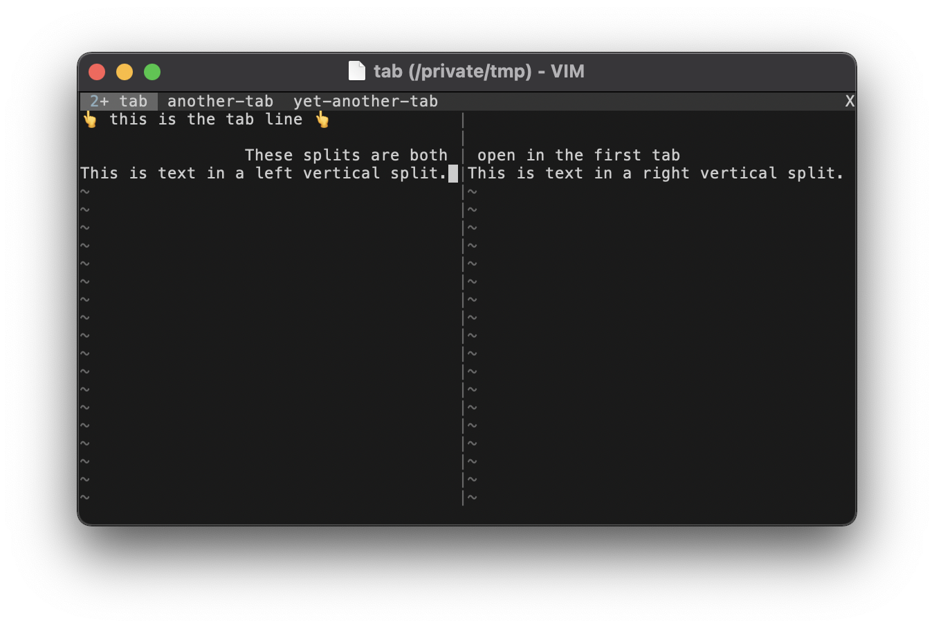
In terminal Vim, or in the GUI when you do not have e in your 'guioptions', tabs will display at the top of the window similar to a status line. Like the status line, the tab line uses the same active UI and inactive UI background colors. We consider the current tab the "active" one, highlighted in a brighter grey40. The rest of the tab line is considered "inactive", highlighted in the dim grey20. Text is the normal grey80, although the default 'tabline' format will use the Title group to display the number of splits in a tab. This can be seen in the screenshot as a 2 in the first tab's label colored Material Blue Grey 500 (light). The contrast is pretty poor, but changing the group would involve mangling 'tabline', which is certainly out of scope for a color scheme. If using GUI tabs isn't an option, then coming up with a better 'tabline' is left as an exercise for the user.
Also pictured in this screenshot is the VertSplit group. We've seen vertical splits in other screenshots, but it's worth pointing out that the column of | characters gets highlighted in the medium grey40. Normally we'd use the passive highlighting color, grey20, but the | character is so thin that it would be too hard to see in such a dim color.
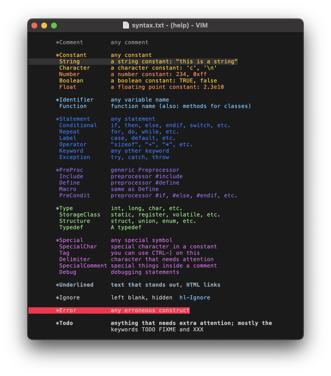
Finally, the bulk of the Color Palette is used to highlight the canonical syntax groups, as detailed in the Design. The groups can be seen in the above screenshot taken from Vim's syntax help page.
What the highlighting actually looks like in the wild will vary based on your language and its corresponding syntax definition. It would be impossible to showcase all the possibilities. However, several example screenshots are available on the Examples page.