AdmiralTheme - admiral-team/admiralui-ios GitHub Wiki
AdmiralTheme - the framework that responsible for dynamic change app theming. At the same time, you can dynamically change not only colors, but also fonts.
Advantages:
- Supports any number of themes, including dark and light
- Support mechanism of standard theme change and manual
- More than 10+ custom colors and fonts for each theme
- Easy theme change setup
- Possibility of custom settings for changing the theme for each ui element
- Theme storage
SwiftUI
1. Import AdmiralTheme
In any file you'd like to use AdmiralTheme in, don't forget to import the framework with import AdmiralTheme.
import AdmiralTheme2. Add property of theme manager on the root view for observing change theme and refreshing all hierarchy views.
Important to mention that we get theme managers through the Appearance which is main point of theming access. Read more about Appearance
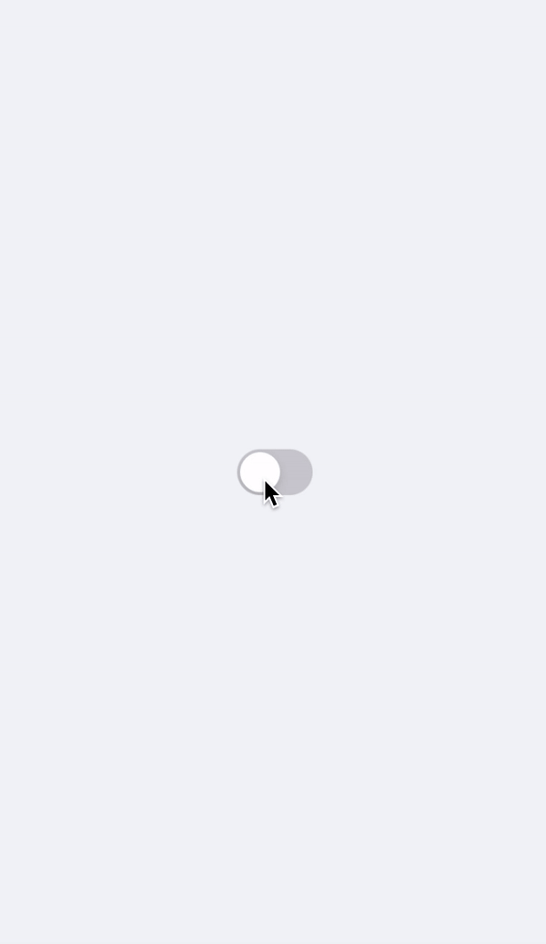
@ObservedObject private var themeManager = Appearance.shared.swiftuiThemeManager3. Add Toggle to the body and set the background color of view. Then set current theme when toggle state changes:
 var body: some View {
      ZStack {
          manager.theme.colors.backgroundAdditionalOne.swiftUIColor
          Toggle("", isOn: $switchMode)
              .onChange(of: switchMode) { value in
                  manager.theme = switchMode ? .dark : .light
              }
      }
}import AdmiralTheme
import SwiftUI
struct ContentView: View {
@ObservedObject private var manager = Appearance.shared.swiftuiThemeManager
@State private var switchMode = false
var body: some View {
ZStack {
manager.theme.colors.backgroundAdditionalOne.swiftUIColor
Toggle("", isOn: $switchMode)
.onChange(of: switchMode) { value in
manager.theme = switchMode ? .dark : .light
}
}
}
}Live example:
UIKit
1. Import AdmiralTheme
In any file you'd like to use AdmiralTheme in, don't forget to import the framework with import AdmiralTheme.
import AdmiralTheme2. Add AnyAppThemable protocol to your UIViewController for observing app theme changing
Important to mention that AppTheme - is a container that has list of colors and fonts.
AdmiralUI supports four system themes - Light, Dark, SMELight and SMEDark.
You can create your own AppTheme or add more functionality to existing theme. Read more about AppTheme
class MainViewController: UIViewController, AnyAppThemable {}3. Add apply(theme: AppTheme) method to update the visual settings of your view when app theme change
Remember that there is two ways to update settings of your view when app theme changes:
- Call
apply(theme: AppTheme)method which you should use if you want to update views settings through hierarchy. - Or call all
autoManage()method inviewDidLoad(). This method subscribes all view hierarchy to observe theme changing. Be careful to use it because it may affect your performance.
func apply(theme: AppTheme) {
   view.backgroundColor = theme.colors.backgroundAdditionalOne.uiColor
   switcher.apply(theme: theme)
}
4) Add the UISwitch and update app theme when switcher flag isOn changes.
private lazy var switcher: UISwitch = {
let switcher = UISwitch()
switcher.translatesAutoresizingMaskIntoConstraints = false
switcher.addTarget(self, action: #selector(self.changeSwitch), for: .valueChanged)
return switcher
}()
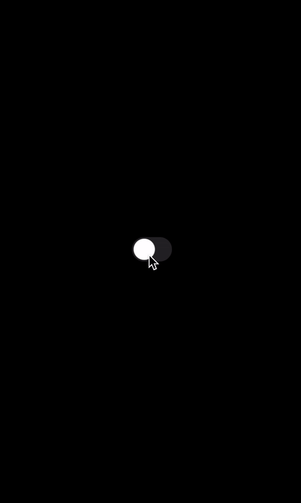
@objc private func changeSwitch(_ switchView: UISwitch) {
Appearance.shared.theme = switchView.isOn ? .light : .dark
apply(theme: Appearance.shared.theme)
}final class ViewController: UIViewController, AnyAppThemable {
private lazy var switcher: UISwitch = {
let switcher = UISwitch()
switcher.translatesAutoresizingMaskIntoConstraints = false
switcher.addTarget(self, action: #selector(self.changeSwitch), for: .valueChanged)
return switcher
}()
override func viewDidLoad() {
super.viewDidLoad()
addSubViews()
setupContraints()
}
func apply(theme: AppTheme) {
view.backgroundColor = theme.colors.backgroundAdditionalOne.uiColor
}
private func addSubViews() {
view.addSubview(switcher)
}
private func setupContraints() {
switcher.centerYAnchor.constraint(equalTo: view.centerYAnchor).isActive = true
switcher.centerXAnchor.constraint(equalTo: view.centerXAnchor).isActive = true
}
@objc private func changeSwitch(_ switchView: UISwitch) {
Appearance.shared.theme = switchView.isOn ? .light : .dark
apply(theme: Appearance.shared.theme)
}
}Live example:
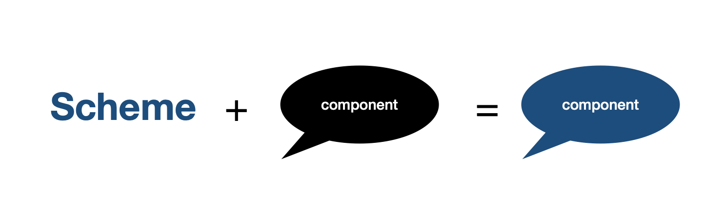
Scheme - the container that has visual settings of colors and fonts that allow you to customize component.
The main reason why we introduced Scheme is the separation of logic and visual settings.
In this tutorial we explain the interaction between Scheme and component using the example of CustomSwitch.
SwiftUI
Let's take a closer look at the scheme of CustomSwitch component:
public struct CustomSwitchScheme: AppThemeScheme  {
  public var font: AFont
  public var tintColor: AColor
  public var textColor: AColor

  public init(theme: AppTheme = .default) {
      font = theme.fonts.body1
      tintColor = theme.colors.elementAccent
      textColor = theme.colors.textPrimary
  }
}
Every scheme in AdmiralUI components support AppThemeScheme protocol.
The purpose of this protocol is to require subscribers to support the initializer with given AppTheme.
Next, inside the body of the initializer, we put down the appropriate colors and fonts settings for our properties from AppTheme.
On the component side, we have a property that stores the Scheme through the SchemeProvider.
In turn SchemeProvider - the object whose task is to store the CustomSwitchScheme and update it when it's needed.
  public struct CustomSwitch: View {

  // MARK: - Private Properties

  @ObservedObject private var schemeProvider: SchemeProvider<CustomSwitchScheme>

  // MARK: - Initializer

  public init(
      ...
      schemeProvider: SchemeProvider<CustomSwitchScheme> = AppThemeSchemeProvider<CustomSwitchScheme>()
  ) {
      self.schemeProvider = schemeProvider
  }
By default we set the SchemeProvider as AppThemeSchemeProvider because we want to update our component when AppTheme changes.
This mechanism works because AppThemeSchemeProvider looks at theme change in SwiftUIThemeManager. Read more about SwiftUIThemeManager.
But you can create your own SchemeProvider with custom Scheme and pass it in the initializer of the component. Read more about SchemeProvider.
Finally we set the properties of CustomSwitch with given CustomSwitchScheme settings:
public func makeBody(configuration: Self.Configuration) -> some View {
  Toggle(configuration)
     .foregroundColor(schemeProvider.scheme.textColor.swiftUIColor)
     .font(schemeProvider.scheme.font.swiftUIFont)
     .toggleStyle(
        SwitchToggleStyle(
          tint: schemeProvider.scheme.tintColor.swiftUIColor
        )
     )
}
UIKit
The mechanism of how Schemes interact with components in UIKit is not much different from SwiftUI.
It is important to add that you can use your own colors and font when you create Scheme in SwiftUI or UIKit.
  struct CustomScheme: AppThemeScheme {
     let backgroundColor: AColor
     let textLabelColor: AColor
     let textFont: AFont

     init(theme: AppTheme = .default) {
         backgroundColor = AColor(color: .gray)
         textLabelColor = AColor(color: .black)
         textFont = AFont(
             name: "SFProDisplay-Medium",
             family: "SF Pro Display",
             size: 22.0,
             weight: 500,
             letterSpacing: 0.0,
             textStyle: .title3
         )
     }
}Imagine the situation where you dont want to use the defaults settings(colors or fonts) of component like CustomSwitch.
In this tutorial we explain how to set custom visual settings of the component.
SwiftUI
There is two ways to do that:
- Using
SchemeProvider - Using
ManualSchemeProvider
Lets look at example with SchemeProvider:
1. Initialize the CustomSwitchScheme with needed colors and font:
 init() {
      var scheme = CustomSwitchScheme(theme: .default)
      scheme.font = AFont(
         name: "SFProDisplay-Medium",
         family: "SF Pro Display",
         size: 22.0,
         weight: 500,
         letterSpacing: 0.0,
         textStyle: .title3
      )
      scheme.tintColor = AColor(color: .red)
      scheme.textColor = AColor(color: .black)
}
2. Initialize the SchemeProvider with custom CustomSwitchScheme
SchemeProvider - the object whose task is to store the CustomSwitchScheme and update it when it's needed.
By default we set the SchemeProvider as AppThemeSchemeProvider because we want to update our component settings when AppTheme changes.
This mechanism works because AppThemeSchemeProvider looks at theme change in SwiftUIThemeManager. Read more about AppThemeSchemeProvider.
In this situation we don't want use default AdmiralTheme updating mechanism, we want to control an updating of CustomSwitch whenever we want.
So, lets create the property of SchemeProvider and pass the created CustomSwitchScheme to it:
 @ObservedObject private var schemeProvider: SchemeProvider<CustomSwitchScheme>

 init() {
      var scheme = CustomSwitchScheme(theme: .default)
      scheme.font = AFont(
         name: "SFProDisplay-Medium",
         family: "SF Pro Display",
         size: 22.0,
         weight: 500,
         letterSpacing: 0.0,
         textStyle: .title3
      )
      scheme.tintColor = AColor(color: .red)
      scheme.textColor = AColor(color: .black)
      schemeProvider = SchemeProvider<CustomSwitchScheme>(scheme: scheme)
}
3. Add SchemeProvider to the initializer of CustomSwitch:
In any file you'd like to use AdmiralSwiftUI in, don't forget to import the framework with import AdmiralSwiftUI.
var body: some View {
   ZStack {
     CustomSwitch(
        isOn: $switchMode,
        schemeProvider: schemeProvider
     )
   }
}import AdmiralTheme
import AdmiralSwiftUI
import AdmiralUIResources
import SwiftUI
struct ContentView: View {
@ObservedObject private var schemeProvider: SchemeProvider<CustomSwitchScheme>
@State private var switchMode = false
init() {
var scheme = CustomSwitchScheme(theme: .default)
scheme.font = AFont(
name: "SFProDisplay-Medium",
family: "SF Pro Display",
size: 22.0,
weight: 500,
letterSpacing: 0.0,
textStyle: .title3
)
scheme.tintColor = AColor(color: .red)
scheme.textColor = AColor(color: .black)
schemeProvider = SchemeProvider<CustomSwitchScheme>(scheme: scheme)
}
var body: some View {
ZStack {
CustomSwitch(
isOn: $switchMode,
schemeProvider: schemeProvider
)
}
}
}
3. Add SchemeProvider to the initializer of CustomSwitch:
 @ObservedObject private var schemeProvider: SchemeProvider<CustomSwitchScheme>

 init() {
      var scheme = CustomSwitchScheme(theme: .default)
      scheme.font = AFont(
         name: "SFProDisplay-Medium",
         family: "SF Pro Display",
         size: 22.0,
         weight: 500,
         letterSpacing: 0.0,
         textStyle: .title3
      )
      scheme.tintColor = AColor(color: .red)
      scheme.textColor = AColor(color: .black)
      schemeProvider = SchemeProvider<CustomSwitchScheme>(scheme: scheme)
}
The second way is to set custom parameters of scheme is using ManualSchemeProvider:
1. Initialize ManualSchemeProvider:
  @ObservedObject private var manualSchemeProvider = ManualSchemeProvider(
      scheme: CustomSwitchScheme(theme: .default)
  )
2. Add CustomSwitch component to the body with created ManualSchemeProvider:
  var body: some View {
      VStack {
          CustomSwitch(
              isOn: $toggle,
              schemeProvider: manualSchemeProvider
          )
      }
      .padding()
  }
3. Update manualScheme provider when toggle changes:
  var body: some View {
      VStack {
          CustomSwitch(
              isOn: $toggle,
              schemeProvider: manualSchemeProvider
          ).onChange(of: toggle) { _ in
              updateSwitcher()
          }
      }
      .padding()
  }

  private func updateSwitcher() {
      var switcherScheme = CustomSwitchScheme(theme: .default)
      switcherScheme.tintColor = AColor(color: .green)
      manualSchemeProvider.update(scheme: switcherScheme)
  }
4. Final code:
import SwiftUI
import AdmiralTheme
import AdmiralSwiftUI

struct ContentView: View {

  @ObservedObject private var manualSchemeProvider = ManualSchemeProvider(
      scheme: CustomSwitchScheme(theme: .default)
  )

  @State private var toggle = false

  var body: some View {
      VStack {
          CustomSwitch(
              isOn: $toggle,
              schemeProvider: manualSchemeProvider
          ).onChange(of: toggle) { _ in
              updateSwitcher()
          }
      }
      .padding()
  }

  private func updateSwitcher() {
      var switcherScheme = CustomSwitchScheme(theme: .default)
      switcherScheme.tintColor = AColor(color: .green)
      manualSchemeProvider.update(scheme: switcherScheme)
  }
}
UIKit
All components in AdmiralUIKit has public property of Scheme that contains visual settings of colors and fonts.
Lets look at example:
/// A control that offers a binary choice, such as On/Off.
open class CustomSwitch: UISwitch, AnyAppThemable {

  // MARK: - Public Properties

  public var scheme = CustomSwitchScheme() {
      didSet { updateScheme() }
  }
...
If you want to use your own colors and fonts to customize the CustomSwitch:
1. Recreate the CustomSwitchScheme and set your own colors and font:
private var customSwitchScheme: CustomSwitchScheme {
  var scheme = CustomSwitchScheme()
  scheme.font = AFont(
     name: "SFProDisplay-Medium",
     family: "SF Pro Display",
     size: 22.0,
     weight: 500,
     letterSpacing: 0.0,
     textStyle: .title3
  )
  scheme.tintColor = AColor(color: .red)
  scheme.textColor = AColor(color: .black)
  return scheme
}
2. Set property of scheme with customSwitchScheme in CustomSwitch component:
In any file you'd like to use AdmiralUIKit in, don't forget to import the framework with import AdmiralUIKit.
private var switcher: CustomSwitch = {
  let switcher = CustomSwitch()
  switcher.scheme = customSwitchScheme
  return switcher
}()
Final code:
import AdmiralUIKit
import AdmiralUIResources
import AdmiralTheme
import UIKit

final class ViewControllers: UIViewController, AnyAppThemable {

  private var customSwitchScheme: CustomSwitchScheme {
      var scheme = CustomSwitchScheme()
      scheme.font = AFont(
         name: "SFProDisplay-Medium",
         family: "SF Pro Display",
         size: 22.0,
         weight: 500,
         letterSpacing: 0.0,
         textStyle: .title3
      )
      scheme.tintColor = AColor(color: .red)
      scheme.textColor = AColor(color: .black)
      return scheme
  }

  private lazy var switcher: CustomSwitch = {
      let switcher = CustomSwitch()
      switcher.scheme = customSwitchScheme
      switcher.translatesAutoresizingMaskIntoConstraints = false
      return switcher
  }()

  override func viewDidLoad() {
      super.viewDidLoad()
      addSubViews()
      setupContraints()
  }

  func apply(theme: AppTheme) {
      switcher.apply(theme: theme)
  }

  private func addSubViews() {
      view.addSubview(switcher)
  }

  private func setupContraints() {
      switcher.centerYAnchor.constraint(equalTo: view.centerYAnchor).isActive = true
      switcher.centerXAnchor.constraint(equalTo: view.centerXAnchor).isActive = true
  }

}
AppTheme - the container that has list of colors and fonts.
All colors allocated in ColorPalette object, all fonts are in FontPallete. You can expand both by using mechanism of inheritance.
If you want to create your own AppTheme you should create ColorPalette, FontPallete and pass it in the initializer of custom AppTheme.
Lets look at example:
Example
1. Create an instance of ColorPalette and FontPalette:
final class CustomColorPalette: ColorPalette {

  let customColor: AColor

  init(customColor: AColor) {
      super.init(
          disabledAlpha: 0.5,
          backgroundAccent: AColor(hexString: "#FFFFFF"),
          backgroundAccentDark: AColor(color: .red),
          ...
      )
      self.customColor = customColor
  }
}

final class CustomColorPalette: FontPalette {

   let customFont: AFont

   init() {
      super.init(
          body1: AFont,
          body2: AFont,
          ...
      )
      self.customFont = .init(
          name: "SFProText-Medium",
          family: "SF Pro Text",
          size: 14,
          weight: 12,
          letterSpacing: 4,
          textStyle: .body
      )
  }
By default AdmiralTheme support four system app themes:
DarkLightSMEDarkSMELight
But you can create your own theme or expand an existing theme. Use the inheritance mechanism to expand the functionality AppTheme.
2. Create an instance of AppTheme with created CustomColorPalette and FontPalette:
final class CustomAppTheme: AppTheme {

  override init(
      id: AppTheme.ThemeIdentifier,
      displayName: String? = nil,
      colors: ColorPalette,
      fonts: FontPalette
  ) {
      super.init(id: id, colors: colors, fonts: fonts)
  }

  required init(from decoder: Decoder) throws {
      fatalError("init(from:) has not been implemented")
  }

}
3. Add created custom AppTheme to your View::
struct ContentView: View {

  @ObservedObject private var schemeProvider = SchemeProvider(
      scheme: CustomScheme(
          theme: CustomAppTheme(
              id: "CustomAppTheme",
              colors: CustomColorPalette(),
              fonts: CustomFontPalette()
          )
      )
  )

  var body: some View {
      VStack {
          Image(systemName: "globe")
              .imageScale(.large)
              .foregroundColor(schemeProvider.scheme.bgColor.swiftUIColor)
          Text("Hello, world!")
      }
      .padding()
  }
}AppTheme support Codable protocol, it means that you can store it as you wish(UserDefaults, CoreData and etc).
If you do not want to implement your theme save mechanism, then you can use AppThemeUserDefaultsStorage that allow you to save, remove and select themes.
-
Scheme- the number of visual settings for view. Its include font, color settings. -
ColorPallete- the public class that include a list of colors. -
FontPalette- the public class that include a list of fonts with settings like name, family, size, letterSpacing and textStyle. -
Theme- the object that includeColorPallete,FontPalatte. The example of 'Theme' isSMELight.
-
AppThemeScheme- the public protocol that acceptsAppThemewhich gives an access to ColorPalette and FontPalette -
AppTheme- the public class that has ColorPalette, FontPalette and access to current app theme(Light, Dark, SMELight, SMEDark) -
AFont- the public class that present a font with options like name, family, size, letterSpacing and textStyle. -
AColor- the public struct that present a color with available information to use it inAdmiralSwiftUIorAdmiralUIKit
The struct of SwiftUI theming mechanism in AdmiralTheme:
graph TD;
    Component --> SchemeProvider;
    SchemeProvider --> Component;
    SchemeProvider --> Scheme;
    Scheme --> AppTheme;
    AppTheme -->ColorPalette;
    ColorPalette --> AColor;
    FontPalette --> AFont;
    AppTheme -->FontPalette;

    Appearance --> SwiftUIThemeManager;
    SchemeProvider --> SwiftUIThemeManager;
    SwiftUIThemeManager --> AppTheme;
The struct of UIKit theming mechanism in AdmiralTheme:
 graph TD;
    Component --> AnyAppThemable;
    AnyAppThemable --> Component;
    Component --> Scheme;
    Scheme --> AppTheme;
    AppTheme -->ColorPalette;
    ColorPalette --> AColor;
    FontPalette --> AFont;
    AppTheme -->FontPalette;
    AnyAppThemable --> UIKitThemeManager;
    UIKitThemeManager --> AnyAppThemable;

    Appearance --> UIKitThemeManager;
    UIKitThemeManager --> AppTheme;