AdmiralSwiftUI Controls Buttons - admiral-team/admiralui-ios GitHub Wiki
AdmiralUI support different styles for buttons:
PlatformButtonStylePrimaryButtonStyleSecondaryButtonStyleGhostButtonStyleTwoTitlePrimaryButtonTwoTitleGhostButton
To configure the current button style for a view hierarchy, use the buttonStyle(_:) modifier. You can create buttons in three sizes: (small, medium, big) by specifying size Type in init PrimaryButtonStyle:
Button("Text", action: {})
    .buttonStyle(PrimaryButtonStyle(isLoading: .constant(true)))
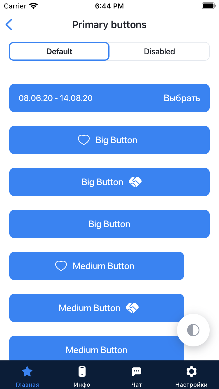
You can create a button with PlatformButtonStyle specifying the following parameters in init:
Big - the main button, the width of which depends on the width of the screen;
Medium - an additional button of a smaller size, the button does not change its size depending on the width of the screen;
Small - changes its width depending on the content inside it, often used with the keyboard.
You can create a button with an activity indicator instead of text by specifying isLoading: .constant(true) in init PrimaryButtonStyle.
In this case, the text that you pass to the Button will not be shown, but the activity indicator will be shown instead: You can add accessibilityIdentifier (a string that identifies the element) in PrimaryButtonStyle
To configure the current button style for a view hierarchy, use the buttonStyle(_:) modifier. You can create buttons in three sizes: (small, medium, big) by specifying size Type in init PrimaryButtonStyle:
Button("Text", action: {})
    .buttonStyle(PrimaryButtonStyle(isLoading: .constant(true)))
You can create a button with PlatformButtonStyle specifying the following parameters in init:
Big - the main button, the width of which depends on the width of the screen;
Medium - an additional button of a smaller size, the button does not change its size depending on the width of the screen;
Small - changes its width depending on the content inside it, often used with the keyboard.
You can create a button with an activity indicator instead of text by specifying isLoading: .constant(true) in init PrimaryButtonStyle. In this case, the text that you pass to the Button will not be shown, but the activity indicator will be shown instead:
You can add accessibilityIdentifier (a string that identifies the element) in PrimaryButtonStyle
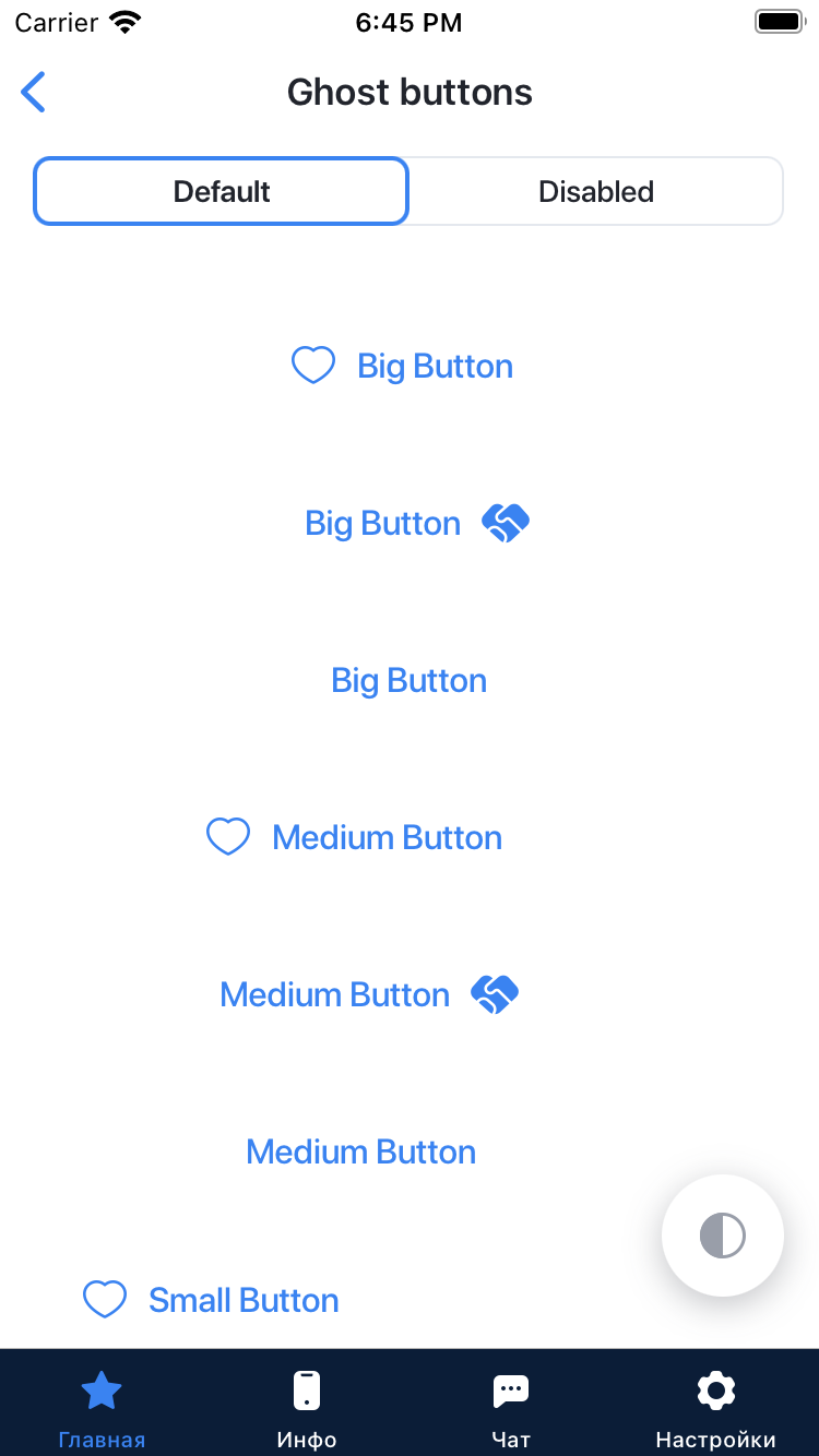
SecondaryButtonStyle - The style for creating the Secondary Button. A secondary button, for additional actions, is used independently or in combination with other types of buttons.
To configure the current button style for a view hierarchy, use the buttonStyle(_:) modifier. You can create buttons in three sizes: (small, medium, big) by specifying size Type in init SecondaryButtonStyle::
Button("Text", action: {})
    .buttonStyle(SecondaryButtonStyle(sizeType: .small))
You can create a button with SecondaryButtonStyle specifying the following parameters in init:
Big - the main button, the width of which depends on the width of the screen;
Medium - an additional button of a smaller size, the button does not change its size depending on the width of the screen;
Small - changes its width depending on the content inside it, often used with the keyboard.
You can create a button with an activity indicator instead of text by specifying isLoading: .constant(true) in init SecondaryButtonStyle. In this case, the text that you pass to the Button will not be shown, but the activity indicator will be shown instead:
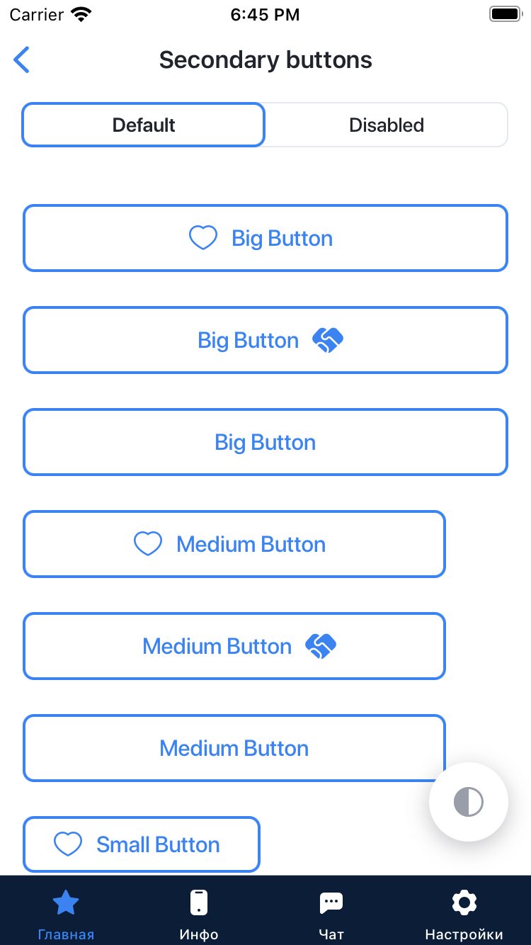
GhostButtonStyle - The style for creating the Ghost Button. Is used in cases when the main button is not enough, often goes with it in pairs when you need to designate several actions, one of which is the main one.
To configure the current button style for a view hierarchy, use the buttonStyle(_:) modifier. You can create buttons in three sizes: (small, medium, big) by specifying size Type in init GhostButtonStyle:
Button("Text", action: {})
    .buttonStyle(GhostButtonStyle(sizeType: .small))
You can create a button with GhostButtonStyle specifying the following parameters in init:
Big - the main button, the width of which depends on the width of the screen;
Medium - an additional button of a smaller size, the button does not change its size depending on the width of the screen;
Small - changes its width depending on the content inside it, often used with the keyboard.

You can create a button with an activity indicator instead of text by specifying isLoading: .constant(true) in init GhostButtonStyle. In this case, the text that you pass to the Button will not be shown, but the activity indicator will be shown instead:
TwoTitleGhostButton - A TwoTitleGhostButton with two text headers (left and right). TwoTitleGhostButton - is used in cases when the main button is not enough, often goes with it in pairs when you need to designate several actions, one of which is the main one..
TwoTitleGhostButton(
                    leftText: "left Text",
                    rightText: "right Text",
                    leftAction: {},
                    rightAction: {})
You can create a button with TwoTitleGhostButton specifying the following parameters in init:
 - leftText - value of String
 - rightText - value of String
 - leftAction - the callback action by tapping left action the button
 - rightAction - the callback action by tapping right action the button
To run live demo with Buttons open Xcode and run project with Example target. Then in the main page -> Buttons:
You can help us to find bugs or ask us to add features.
- To start
issueplease use ready-made templates. - To make changes to the repository, you need to create a
forkof the project, make changes to the code and create apull requestin our project. You can read more about this in the Github documentation.