9.8 正常流normal flow,浮动floats和绝对定位absolute positioning的对比(done) - acelan86/css GitHub Wiki
为了说明正常流,相对定位,浮动和绝对定位的区别,我们基于下面的HTML提供了一组例子:
To illustrate the differences between normal flow, relative positioning, floats, and absolute positioning, we provide a series of examples based on the following HTML:
<!DOCTYPE HTML PUBLIC "-//W3C//DTD HTML 4.01//EN">
<HTML>
  <HEAD>
    <TITLE>Comparison of positioning schemes</TITLE>
  </HEAD>
  <BODY>
    <P>Beginning of body contents.
      <SPAN id="outer"> Start of outer contents.
      <SPAN id="inner"> Inner contents.</SPAN>
      End of outer contents.</SPAN>
      End of body contents.
    </P>
  </BODY>
</HTML>
这个文档中,我们假定下面的规则:
In this document, we assume the following rules:
body { display: block; font-size:12px; line-height: 200%;
       width: 400px; height: 400px }
p    { display: block }
span { display: inline }
outer和inner元素生成的盒子的最终位置在每个例子里是不同的。在每个插图中,插图左边的数字标明了双倍空间(为了准确标识)行的正常流的位置。
The final positions of boxes generated by the outer and inner elements vary in each example. In each illustration, the numbers to the left of the illustration indicate the normal flow position of the double-spaced (for clarity) lines.
译注:这里的双倍空间行是由上面的line-height:200%产生的。
注意:本节的图是用作说明的并且不能缩放。它们用于指出CSS2.1中不同的定位方案之间的不同,而不是作为所给例子的参考渲染结果。
Note. The diagrams in this section are illustrative and not to scale. They are meant to highlight the differences between the various positioning schemes in CSS 2.1, and are not intended to be reference renderings of the examples given.
考虑下面关于outer和inner的声明,它们不会改变盒子的正常流:
Consider the following CSS declarations for outer and inner that do not alter the normal flow of boxes:
#outer { color: red }
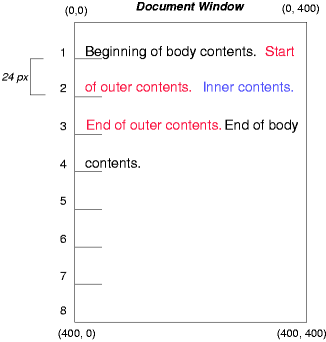
#inner { color: blue }p元素包含所有行内内容:匿名的行内文本和两个span元素。因此,所有的内容将在一个行内格式化上下文,在一个由p元素创建的包含盒中进行布局,像下面这样:
The P element contains all inline content: anonymous inline text and two SPAN elements. Therefore, all of the content will be laid out in an inline formatting context, within a containing block established by the P element, producing something like:
看相对定位的结果,我们指定:
To see the effect of relative positioning, we specify:
#outer { position: relative; top: -12px; color: red }
#inner { position: relative; top: 12px; color: blue }
文本正常布局在outer元素的顶端,outer的文本流入它的正常流位置并且按尺寸在行1的结尾处切割,包含文本的(分成3行)line box被作为一个单元移动了“-12px”(向上)。
Text flows normally up to the outer element. The outer text is then flowed into its normal flow position and dimensions at the end of line 1. Then, the inline boxes containing the text (distributed over three lines) are shifted as a unit by '-12px' (upwards).
inner的内容,作为outer的一个儿子,将立即在句子“of outer contents”的后面正常布局(在行1.5)。然而,inner的内容自身相对于oouter的内容偏移了“12px”(向下),回到它们的行2的原始位置。
The contents of inner, as a child of outer, would normally flow immediately after the words "of outer contents" (on line 1.5). However, the inner contents are themselves offset relative to the outer contents by '12px' (downwards), back to their original position on line 2.
注意outer后面的内容不受outer的相对定位的影响。
Note that the content following outer is not affected by the relative positioning of outer.
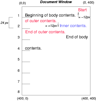
注意如果outer的偏移量是“-24px”,outer的文本和body的文本将重叠。
Note also that had the offset of outer been '-24px', the text of outer and the body text would have overlapped.
现在考虑通过下面的规则,浮动inner元素的文本到右边的效果:
Now consider the effect of floating the inner element's text to the right by means of the following rules:
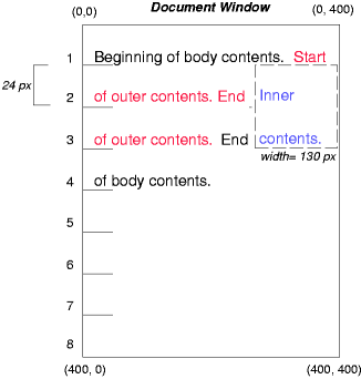
#outer { color: red }
#inner { float: right; width: 130px; color: blue }
文本正常的流动在inner盒的顶部,inner盒被拉出流并且浮动到右margin(它的“width”属性被明确的定义)。浮动元素右边的line boxes被缩短,文档中剩下的文本排布到它们里面。
Text flows normally up to the inner box, which is pulled out of the flow and floated to the right margin (its 'width' has been assigned explicitly). Line boxes to the left of the float are shortened, and the document's remaining text flows into them.
为了展示“clear”属性的效果,我们给例子添加一个兄弟元素:
To show the effect of the 'clear' property, we add a sibling element to the example:
<!DOCTYPE HTML PUBLIC "-//W3C//DTD HTML 4.01//EN">
<HTML>
  <HEAD>
    <TITLE>Comparison of positioning schemes II</TITLE>
  </HEAD>
  <BODY>
    <P>Beginning of body contents.
      <SPAN id=outer> Start of outer contents.
      <SPAN id=inner> Inner contents.</SPAN>
      <SPAN id=sibling> Sibling contents.</SPAN>
      End of outer contents.</SPAN>
      End of body contents.
    </P>
  </BODY>
</HTML>
应用下面的规则:
The following rules:
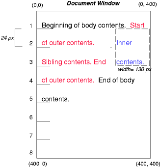
#inner { float: right; width: 130px; color: blue }
#sibling { color: red }
这个规则导致inner盒浮动到右边并且文档中剩下的文本排布到空出的空间中:
cause the inner box to float to the right as before and the document's remaining text to flow into the vacated space:
但是,如果兄弟元素的“clear”属性被设置成“right”(就是,生成的兄弟盒不接受它右边的浮动盒的一个位置),兄弟内容开始流动到浮动元素的下面:
However, if the 'clear' property on the sibling element is set to 'right' (i.e., the generated sibling box will not accept a position next to floating boxes to its right), the sibling content begins to flow below the float:
#inner { float: right; width: 130px; color: blue }
#sibling { clear: right; color: red }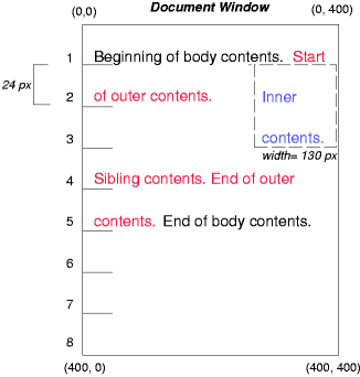
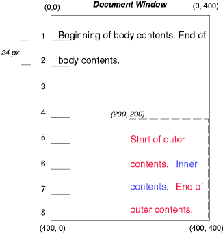
最后,我们考虑绝对定位的效果。考虑下面对outer盒inner的CSS声明:
Finally, we consider the effect of absolute positioning. Consider the following CSS declarations for outer and inner:
#outer {
    position: absolute;
    top: 200px; left: 200px;
    width: 200px;
    color: red;
}
#inner { color: blue }
这些导致了outer盒的顶部被定位到与它的包含块相关的地方。这个包含块通过最近的已定位的祖先节点建立(或者,如果不存在,在我们的例子中,将使用初始化的包含块)。outer盒的上边在包含块下方“200px”处而左边距离包含块左边“200px”。outer的子节点相对它们的父节点正常流动。
which cause the top of the outer box to be positioned with respect to its containing block. The containing block for a positioned box is established by the nearest positioned ancestor (or, if none exists, the initial containing block, as in our example). The top side of the outer box is '200px' below the top of the containing block and the left side is '200px' from the left side. The child box of outer is flowed normally with respect to its parent.
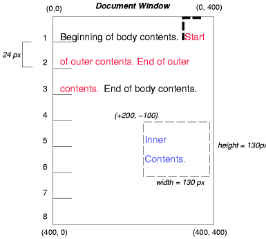
下面的例子展示了一个相对定位盒中的绝对定位盒。尽管父亲outer节点没有确切的偏移,设置它的“position”属性为“relative”是为了让它的盒子可以作为定位的子孙节点的包含盒服务。因为outer盒子是一个被分割成多行的行内盒,所以第一个行内盒的顶部盒左边缘(在下面的图例中用细虚线描绘出来的那个地方)作为“top”和“left”的偏移的参考位置。
The following example shows an absolutely positioned box that is a child of a relatively positioned box. Although the parent outer box is not actually offset, setting its 'position' property to 'relative' means that its box may serve as the containing block for positioned descendants. Since the outer box is an inline box that is split across several lines, the first inline box's top and left edges (depicted by thick dashed lines in the illustration below) serve as references for 'top' and 'left' offsets.
#outer {
  position: relative;
  color: red
}
#inner {
  position: absolute;
  top: 200px; left: -100px;
  height: 130px; width: 130px;
  color: blue;
}
结果如下:
This results in something like the following:
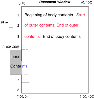
如果我们不定位outer盒子:
If we do not position the outer box:
#outer { color: red }
#inner {
  position: absolute;
  top: 200px; left: -100px;
  height: 130px; width: 130px;
  color: blue;
}
inner的包含块变成默认包含块(在我们的例子中)。下面的图例展示了这种情况下inner盒子将被放置在什么地方。
the containing block for inner becomes the initial containing block (in our example). The following illustration shows where the inner box would end up in this case.
相对和绝对定位可能被用于实现change bars, 像下面的例子所示:
Relative and absolute positioning may be used to implement change bars, as shown in the following example. The following fragment:
<P style="position: relative; margin-right: 10px; left: 10px;">
I used two red hyphens to serve as a change bar. They
will "float" to the left of the line containing THIS
<SPAN style="position: absolute; top: auto; left: -1em; color: red;">--</SPAN>
word.</P>
结果如下:
might result in something like:
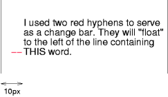
首先,段落(它的包含块的边展现在图例中)正常流动。然后它以包含块的左边缘偏移“10px”(也就是,在偏移的预期内,一个“10px”的右margin被保留)。作为change bars的两个连字符“——”被从流中取出并且被定位在当前行(由于“top:auto”),距离它的包含块左边缘“-1em”(通过p建立在它的最终位置处)。结果就是change bar看起来像“浮动”到了当前行的左边。
First, the paragraph (whose containing block sides are shown in the illustration) is flowed normally. Then it is offset '10px' from the left edge of the containing block (thus, a right margin of '10px' has been reserved in anticipation of the offset). The two hyphens acting as change bars are taken out of the flow and positioned at the current line (due to 'top: auto'), '-1em' from the left edge of its containing block (established by the P in its final position). The result is that the change bars seem to "float" to the left of the current line.