Toolbars - accountforgithub/enyo GitHub Wiki
Toolbars
onyx.Toolbar
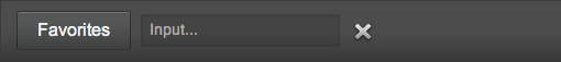
onyx.Toolbar is a a horizontal bar that contains controls used to perform common UI actions.
A Toolbar customizes the styling of the controls it hosts, including buttons, icons, and inputs, e.g.:
{kind: "onyx.Toolbar", components: [
    {kind: "onyx.Button", content: "Favorites"},
    {kind: "onyx.InputDecorator", components: [
        {kind: "onyx.Input", placeholder: "Input..."}
    ]},
    {kind: "onyx.IconButton",
        src: "https://github.com/enyojs/enyo/wiki/assets/remove-icon.png"}
    ]
}
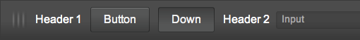
Note that it's possible to style a set of controls to look like they are in a
toolbar without having the container itself look like a toolbar. To do so,
apply the "onyx-toolbar-inline" CSS class to the container that houses the
controls.
In the following example, we apply the onyx-toolbar-inline style to a control
to create a toolbar-like appearance. Then we wrap the result in a scroller to
make it horizontally-scrollable, so that the user can access the offscreen
"Right" and "Far Right" buttons.
{kind: "Scroller", classes:"onyx-toolbar", touchOverscroll:false, touch:true, vertical:"hidden", style:"margin:0px;", thumb:false, components: [
    {classes: "onyx-toolbar-inline", style: "white-space: nowrap;", components: [
        {kind: "onyx.Grabber"},
        {content: "Header 1"},
        {kind: "onyx.Button", content: "Button"},
        {kind: "onyx.Button", content: "Down", classes: "active"},
        {content: "Header 2"},
        {kind: "onyx.InputDecorator", components: [
            {kind: "onyx.Input", placeholder: "Input"}
        ]},
        {kind: "onyx.Button", content: "Right"},
        {kind: "onyx.Button", content: "Far Right"}
    ]}
]}
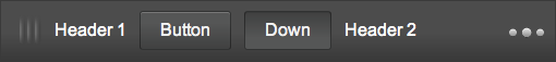
onyx.MoreToolbar
A simpler way to deal with multiple items in a toolbar is to use an
onyx.MoreToolbar. onyx.MoreToolbar
can adapt to different screen sizes by moving overflowing controls and content
into an onyx.Menu, e.g.:
{kind: "onyx.Toolbar", components: [
    {kind: "onyx.Grabber"},
    {content: "Header 1"},
    {kind: "onyx.Button", content: "Button"},
    {kind: "onyx.Button", content: "Down", classes: "active"},
    {content: "Header 2"},
    {kind: "onyx.InputDecorator", components: [
        {kind: "onyx.Input", placeholder: "Input"}
    ]},
    {kind: "onyx.Button", content: "Right"},
    {kind: "onyx.Button", content: "Far Right"}
]}
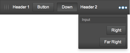
You may prevent a control from being moved to the menu by setting its
unmoveable property to true (the default is false).
In addition, you may customize the menu's visual styling by specifying values
for the menuClass and movedClass properties. The former is a CSS class
applied to the menu as a whole, while the latter is a class applied to
individual controls that are moved to the menu.