Pickers - accountforgithub/enyo GitHub Wiki
Pickers
onyx.Picker
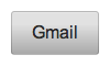
onyx.Picker, a subkind of onyx.Menu, is used to display a list of items that can be selected. It is meant to be used in conjunction with an onyx.PickerDecorator. The decorator loosely couples the picker with an onyx.PickerButton--a button that, when tapped, shows the picker. Once an item is selected, the list of items closes, but the item stays selected and the PickerButton displays the choice that was made.
enyo.kind({
name: "PickerSample",
kind: "FittableRows",
components: [
{kind: "onyx.PickerDecorator", onSelect: "itemSelected", components: [
{}, // A content-less PickerButton
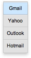
{kind: "onyx.Picker", components: [
{content: "Gmail", active: true},
{content: "Yahoo"},
{content: "Outlook"},
{content: "Hotmail"}
]}
]}
],
itemSelected: function(inSender, inEvent) {
// Do something with the selected MenuItem and its content
menuItem = inEvent.selected;
menuItemContent = inEvent.content;
...
}
});
Note that the above example includes an empty (content-less) component as the
first item inside the PickerDecorator. By looking at the defaultKind of
onyx.PickerDecorator, we can tell that this control--the activating control
for the PickerDecorator--is an onyx.PickerButton.
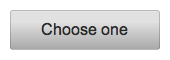
As noted earlier, when the selected item changes, the PickerButton displays the content of the new selection. However, it's also possible to have the Picker display a button with static content. To do this, we define the activating control as an onyx.Button:
{kind: "onyx.Button", content: "Choose one", style: "width: 150px;"}
Now, regardless of which menu item is selected, unless the PickerDecorator is in its active state (i.e., the user has tapped the menu and is about to make a selection), the user always sees the following: