Panels - accountforgithub/enyo GitHub Wiki
Panels
The enyo.Panels kind is designed to
satisfy a variety of common use cases for application layout. Using
enyo.Panels, controls may be arranged as (among other things) a carousel, a
set of collapsing panels, a card stack that fades between panels, or a grid.
Behavior
Any Enyo control may be placed inside an enyo.Panels, but by convention we
refer to each of these controls as a "panel". From the set of panels in an
enyo.Panels, one is considered to be active. The active panel is set by index
using the setIndex method. The actual layout of the panels typically changes
each time the active panel is set, such that the new active panel has the most
prominent position. For example, if the layout arranges the panels as a stack
of cards, setting the active panel will show the active panel and hide the
inactive ones.
enyo.Panels is designed to support animating and dragging between active
states. When the active panel changes, the onTransitionStart and
onTransitionFinish events are fired. Animation between active states can be
turned off by setting the animate property to false. In addition, panels
are draggable by default; to defeat this behavior, set the draggable property
to false.
Here's an example of a card stack:
enyo.kind({
	name: "App",
	kind: "Panels",
	fit: true,
	components: [
		{name: "MyStartPanel"},
		{name: "MyMiddlePanel"},
		{name: "MyLastPanel"}
	]
});
This example will stretch the panels inside the application to fit the size of
the application. If, instead, the panels should be arranged left-to-right as a
carousel, set the layoutKind property of the App kind to "CarouselArranger".
In this case, the size of the panels should be set up in the application (e.g.,
style: "width: 300px;").
Layout
The layout behavior of an enyo.Panels is controlled by the kind specified as
the arrangerKind. A number of arranger kinds have been designed to work
specifically with panels, and new ones may be created as desired.
To simplify the process of creating arranger kinds for use with enyo.Panels,
an interpolation strategy is used to render states between active settings.
This means that only the layout of each active state needs to be specified by
the arrangerKind. See the API documentation for more information.
Responsive Design
enyo.Panels is designed to be used in conjunction with CSS media queries to
support layouts that adapt to different screen sizes. How the layout should
change is left up to the application developer, but the layout should function
correctly as the size of the panels inside it changes. Here is an example use
case: An application uses a Panels kind to arrange panels in a left-to-right
collapsing layout. When the application is tablet- or desktop-sized, the
expanded layout displays each panel side-by-side with the others. When the
application is phone-sized, each panel takes up the full screen width and
collapses to hide the other panels.
The code for this use case is almost the same as in the previous example, but
we've set the arrangerKind and applied a CSS class:
enyo.kind({
	name: "App",
	kind: "Panels",
	fit: true,
	classes: "app-panels",
	arrangerKind: "CollapsingArranger",
	components: [
		{name: "MyStartPanel"},
		{name: "MyMiddlePanel"},
		{name: "MyLastPanel"}
	]
});
Note that in a CollapsingArranger, the last panel will always take up the available space.
The key to achieving the sizing behavior we want is to set up the CSS classes correctly. Here's one way to do it:
/* set the width and some basic styling for each panel */
.app-panels > * {
	width: 320px;
	background-color: #EAEAEA;
	box-shadow: -4px -4px 4px rgba(0,0,0,0.3);
}

/* on small devices, make each panel fit to the app width */
@media all and (max-width: 800px) {
	.app-panels > * {
		min-width: 100%;
		max-width: 100%;
	}
}
Now, technically, the second block of CSS isn't needed to achieve this specific
sizing effect. That's because the narrowFit property of enyo.Panels, when
true (the default), causes each panel to be sized to fit the width of the
application when the screen size is sufficiently narrow--and the default cutoff
for "narrowness" is 800px. But this CSS still provides a useful guide to follow
if you want to define your own custom cutoff width.
Let's say we want to modify our example kind to have a cutoff width of 600px
instead of 800px. In the kind definition, we set the narrowFit property to
false (to turn off the default behavior) and apply a custom CSS class
("app-panels") in which we'll define the new behavior.
We'll also want to override the static method Panels.isScreenNarrow(),
replacing 800 with 600. This method isn't used by the framework itself, but
exists to give application code an easy way to know if it's being run in a
small-screen environment. (For an interesting example of how this can be used
in the context of navigation between panels, see the
Flickr sample app on enyojs.com.)
This gives us the following kind definition:
enyo.kind({
    name: "App",
    kind: "enyo.Panels",
    fit: true,
    narrowFit: false,
    classes: "app-panels",
    arrangerKind: "CollapsingArranger",
    components: [
        {name: "MyStartPanel", content: "start"},
        {name: "MyMiddlePanel", content: "middle"},
        {name: "MyLastPanel", content: "last"}
    ],
    statics: {
        isScreenNarrow: function() {
            return enyo.dom.getWindowWidth() <= 600;
        }
    }
});
Finally, we add the appropriate media query to the accompanying CSS:
.app-panels > * {
    width: 320px;
    background-color: #EAEAEA;
    box-shadow: -4px -4px 4px rgba(0,0,0,0.3);
}

@media all and (max-width: 600px) {
    .app-panels > * {
        min-width: 100%;
        max-width: 100%;
    }
}
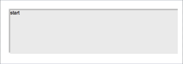
Panels control with window width under 600px
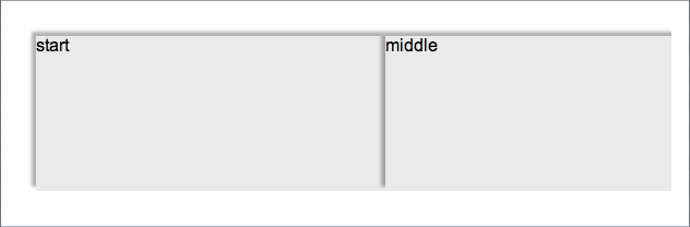
Panels control with window width over 600px