Fittables - accountforgithub/enyo GitHub Wiki
Fittables
The fittable package helps you create layouts that expand to fit the available space--a common need for apps, but one that has historically been difficult to meet using Web technologies.
FittableColumns and FittableRows
The FittableColumns and FittableRows controls let you define views whose children are arranged either horizontally or vertically. Within a given view, you can designate one child to expand and contract to fit the available space, while its siblings retain their natural or explicitly-specified sizes.
To mark a child control as the one having variable size, set its fit property
to true, e.g.:
enyo.kind({
    kind: "FittableColumns",
    components: [
        {content: "1"},
        {content: "2", fit: true},
        {content: "3"}
    ]
});
The preceding code aligns three components as columns, with the second filling the available container space between the first and third.
FittableColumnsLayout and FittableRowsLayout
Another way to use the fittable layout strategy is to set a kind's layoutKind
property to
"FittableColumnsLayout" or
"FittableRowsLayout" while
employing a different base kind:
enyo.kind({
    kind: enyo.Control,
    layoutKind: "FittableColumnsLayout",
    components: [
        {content: "1"},
        {content: "2", fit: true},
        {content: "3"}
    ]
});
Both FittableColumnsLayout and FittableRowsLayout are derived directly from
enyo.FittableLayout, which
provides basic positioning and boundary logic.
Nested Fittables
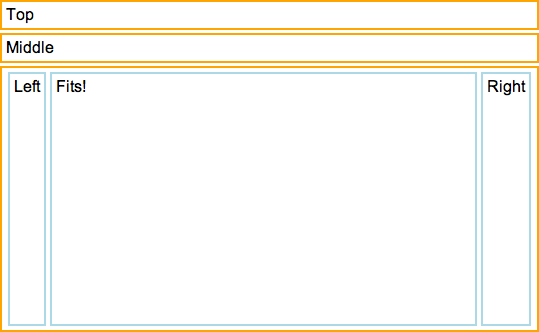
Fittable views may be nested as needed, as illustrated by the following example, in which we've nested a FittableColumns control inside of a FittableRows:
enyo.kind({
    name: "NestedFittablesExample",
    kind: "FittableRows",
    components: [
        {content: "Top", allowHtml: true, classes: "outer-box"},
        {content: "Middle", allowHtml: true, classes: "outer-box"},
        {kind: "FittableColumns", fit: true, classes: "outer-box", components: [
            {content: "Left", classes: "inner-box"},
            {content: "Fits!", fit: true, classes: "inner-box"},
            {content: "Right", classes: "inner-box"}
        ]}
    ]
});
For the sake of completeness, here's the CSS that was used:
.outer-box {
    border: 2px solid orange;
    padding: 4px;
    white-space: nowrap;
    overflow: hidden;
    margin-top: 3px;
    margin-bottom: 3px;
}

.inner-box {
    border: 2px solid lightblue;
    padding: 4px;
    white-space: nowrap;
    overflow: hidden;
    margin: 2px;
}
Parting Thoughts
If you think that fittables sound a lot like a limited version of the CSS Flexible Box Model, you're right. Our main objective in creating fittables was to provide a layout model with capabilities like those of Flex Box, but with compatibility across a broader range of browsers. We also wanted to impose as few limitations as possible on the CSS styling of child components, and to use JavaScript sparingly (we use it to calculate the height of fittable elements, but otherwise leave the layout work to the browser).
As much as we like them, we want to emphasize that you should only use fittables when you need views to expand and contract to fit the available space. If you simply want to arrange elements horizontally or vertically, you're better off employing standard Web layout techniques.
Check the Layout section of the Sampler app for more examples of fittable layouts in action.