Drawers - accountforgithub/enyo GitHub Wiki
onyx.Drawer is a control that appears or
disappears based on its open property. open is a Boolean that defaults to
true, meaning that the control is visible.
A Drawer appears or disappears with a sliding animation whose direction is
determined by the orient property. The default value of orient is "v",
indicating that the drawer opens and closes along the vertical axis. To create
a horizontally-oriented drawer, set orient to "h".
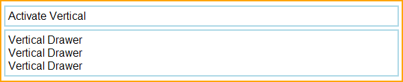
Here's a kind that implements a simple vertically-oriented drawer:
enyo.kind({
	name: "VDrawer",
	components: [
        {kind: "FittableRows", classes: "outer-box", components: [
            {content: "Activate Vertical", classes: "inner-box inner-box-v", ontap: "activateDrawer"},
            {name: "drawer", kind: "onyx.Drawer", open: false, components: [
        	    {content: "Vertical Drawer<br>Vertical Drawer</br>Vertical Drawer",
                    classes: "inner-box inner-box-v", allowHtml: true}
            ]}
        ]}
    ],
    activateDrawer: function(inSender, inEvent) {
        this.$.drawer.setOpen(!this.$.drawer.open);
    },
});
Because we've set "open: false" on the drawer, it starts out in the closed
state when this view is loaded.

Then, when the "Activate Vertical" box is tapped, the activateDrawer method
toggles the open state (and visibility).
(For details on the CSS classes used in this example, see "A Note on CSS" below.)
The following kind implements a simple horizontally-oriented drawer:
enyo.kind({
    name: "HDrawer",
    components: [
        {kind: "FittableColumns", ontap: "activateColumnsDrawer", classes: "outer-box",
            components: [
                {content: "Activate Horizontal", classes: "inner-box inner-box-h"},
                {name: "columnsDrawer", orient: "h", kind: "onyx.Drawer", fit: true, open: false,
                    components: [
                        {content: "Horizontal Drawer Horizontal Drawer",
                            classes: "inner-box inner-box-h"}
                    ]
                }
            ]
        }
    ],
    activateColumnsDrawer: function(inSender, inEvent) {
        this.$.columnsDrawer.setOpen(!this.$.columnsDrawer.open);
    }
});
As in the previous example, we've set "open: false", so the drawer first
appears in its closed state.

A subsequent tap on the activation box toggles the open state to true (i.e.,
visible).

Note that "fit: true" is set on the drawer control. This causes the drawer to
expand horizontally--beyond the natural width of its content--to fill the
available space in the container. If we do not set "fit: true", the drawer
assumes the natural width of its content:

The examples in this document make use of the following CSS styles:
.outer-box {
    border: 2px solid orange;
    padding: 4px;
    white-space: nowrap;
    overflow: hidden;
    margin-top: 3px;
    margin-bottom: 3px;
}

.inner-box {
    border: 2px solid lightblue;
    padding: 4px;
    white-space: nowrap;
    overflow: hidden;
}

.inner-box-v {
    margin-top: 2px;
    margin-bottom: 2px;
}

.inner-box-h {
    margin-left: 2px;
    margin-right: 2px;
}
Note that there are slight differences in how margins are handled, depending on the orientation of the drawer.