Buttons - accountforgithub/enyo GitHub Wiki
Buttons
The Onyx library provides a rich assortment of buttons for use in your Enyo applications. This document surveys the types of buttons that you are most likely to use.
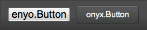
onyx.Button
onyx.Button derives directly from enyo.Button and provides the same basic functionality, along with a modicum of visual styling.
{kind: "onyx.Toolbar", components: [
    {kind: "enyo.Button", content: "enyo.Button"},
    {kind: "onyx.Button", content: "onyx.Button"}
]}
When an onyx.Button is tapped, it generates an ontap event; you may respond
to the event by specifying a handler method, e.g.:
{kind: "onyx.Button", content: "tap me", ontap: "buttonTapped"},

...

buttonTapped: function(inSender, inEvent) {
    // respond to the tap event
}
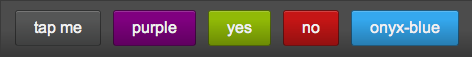
In addition, you may customize the look of a button by specifying foreground and background colors, or by applying one of Onyx's built-in button styles:
{kind: "onyx.Toolbar", components: [
    {kind: "onyx.Button", content: "tap me"},
    {kind: "onyx.Button", content: "purple", style: "background-color: purple; color: #F1F1F1;"},
    {kind: "onyx.Button", content: "yes", classes: "onyx-affirmative"},
    {kind: "onyx.Button", content: "no", classes: "onyx-negative"},
    {kind: "onyx.Button", content: "onyx-blue", classes: "onyx-blue"}
]}
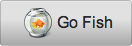
You may also place an image inside a button, with or without accompanying text, as in the following examples:
{kind: "onyx.Button", ontap:"buttonTapped", components: [
    {kind: "onyx.Icon", src: "https://github.com/enyojs/enyo/wiki/assets/fish_bowl.png"}
]}

{kind: "onyx.Button", ontap:"buttonTapped", components: [
    {tag: "img", attributes: {src: "https://github.com/enyojs/enyo/wiki/assets/fish_bowl.png"}},
    {content: "Go Fish"}
]}
onyx.IconButton
Similar effects may be achieved using onyx.IconButton, a subkind of onyx.Icon. For instance, the code
{kind: "onyx.IconButton", src: "assets/my_icon.png"}
yields an icon that acts like a button, but is not displayed against the shaded rectangular background generally associated with buttons.
One may also use onyx.Icon to create a button with both text and an image:
{kind: "onyx.Button", ontap: "buttonTap", components: [
    {kind: "onyx.Icon", src: "assets/my_icon.png"},
    {content: "tap me"}
]}
A key difference between onyx.IconButton and onyx.Button is that the image
associated with the IconButton's src property is assumed to be a 32x64-pixel
strip, with the top half showing the button's normal state and the bottom half
showing its state when active. (By contrast, when you activate an onyx.Button
that contains an image, the state change is reflected in the button's
background, but not in the image itself.)
onyx.RadioButton
In Enyo 2, an onyx.RadioButton is an
enyo.Button designed to go inside an
onyx.RadioGroup (a
horizontally-oriented group of buttons in which tapping on one button will
release any previously-tapped button).
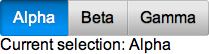
Let's look at how a radio group works.
enyo.kind({
    name: "RadioGroupSample",
    kind: "Control",
    components: [
        {kind: "onyx.RadioGroup", onActivate: "radioActivated", components: [
            {content: "Alpha"},
            {content: "Beta"},
            {content: "Gamma"}
        ]},
        {name: "statusText", content: "Please make a selection"}
    ],
    radioActivated: function(inSender, inEvent) {
	    if (inEvent.originator.getActive()) {
            this.$.statusText.setContent("Current selection: " +
            inEvent.originator.getContent());
        }
    }
});
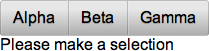
Notice that we have one handler method for the entire radio group. When a
button is tapped (or "activated"), we are able to identify the source of the
event using inEvent.originator. So if we tap the "Alpha" button, we see the
following:
It's also worth noting that we didn't have to explicitly declare the kind for
our radio buttons. When a new control is added to an onyx.RadioGroup, its
kind defaults to onyx.RadioButton. (You can change this behavior by
explicitly setting the defaultKind property of the radio group.)
onyx.ToggleButton
onyx.ToggleButton is a control that
looks like a switch with labels for two states. Each time a toggle button is
tapped, it switches its value and fires an onChange event.
{kind: "onyx.ToggleButton", onContent: "foo", offContent: "bar", onChange: "buttonToggle"},

...

buttonToggle: function(inSender, inEvent) {
    this.log("Toggled to value " + inEvent.value);
}

You may customize the appearance of the toggle button's "on" state by setting the background color as a CSS style:
{kind: "onyx.ToggleButton", style: "background-color: #35A8EE;"}

Finally, you may retrieve the value of the button by calling the getValue
method, which returns a Boolean, true or false:
queryToggleValue: function() {
    return this.$.toggleButton.getValue();
}