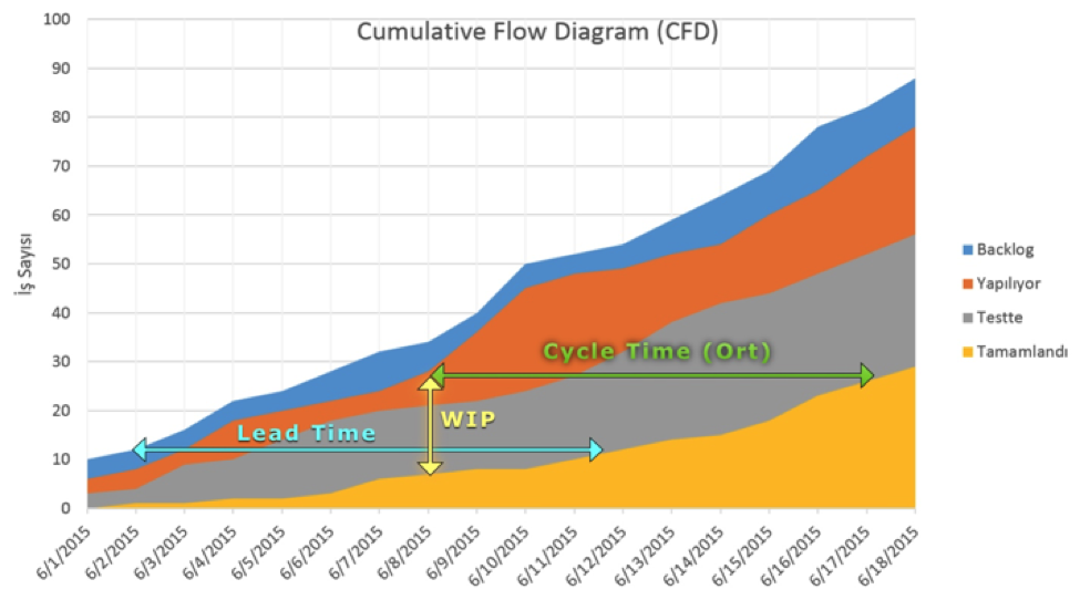
Cumulative Flow Diagram - Yash-777/kanboard GitHub Wiki
The cumulative flow diagram is one of the most common charts used to track progress for agile teams. You can generate the chart using just a kanban board with tasks being moved across columns. No additional data is required.
Understanding Cumulative Flow Diagram
Question 1:

How many workstages are involved?
8 workstages from ‘Arrival Queue’ through Gone Live in the X-axis.
How many days are involved?
13 Days in the Y-axis.
How many items are in the ‘Arrival Queue’ as on Day-9?
5 items. Graph plots X in 9 and Y in 5 where the crest of the respective workstage colored area is seen
How many items are ‘Released’ as on Day-9?
1.5 items. Graph plots X in 9 and Y in 1.5 where the crest of the respective workstage colored area is seen
What is the Work In Progress as on Day-13?
3.5 items. Work In Progress = No. of Items in ‘Arrival Queue’ (5) – No. of items in ‘Gone Live’ (1.5)
In workstage ‘Released’, which time period had accumulated too many work items?
Day 9 to 11. The region between day-9 and 11 is relatively broader for workstage ‘Released’ that means there is more accumulation of work items during that period.
Broad regions in different workflows - what could it indicate?
3 things. Accumulation of work items, Bottleneck in the subsequent stage - likely, blockers in the current stage - likely.
Of all workstages, which has a relatively consistent workflow?
‘Prioritized’. This workstage’s region is relatively of same size allover without any apparent widening indicating that work items has been flowing consistently through this stage.
What is the weekly (5-days) throughput of ‘Ready to Release’ workstage?
2. ‘Ready to Release’ had its first work item arriving just after Day 7. On Day-13, the last day as seen in the graph, 2.5 items have been at ‘Ready to Release’. The difference in days is 6. Hence approximately, it’s weekly throughput is likely to be 2.
What is the daily throughput of ‘Gone Live’ workstage?
0.5. ‘Gone Live’ had its first work item arriving just before Day 11. On Day-13, the last day as seen in the graph, 1.5 items have been at ‘Gone Live’. Hence from 1.5 items in 3 days, we arrive at 0.5 item per day.
Questio 2:

When did work item #3 (WI3) join the queue?
Day 2
How many days did it take for WI3 to be prioritized?
2 days. It arrived at the queue on day 2 and was taken up for prioritization on day 4. The difference being 2 days.
How many days did the team actually work on WI3 to only code and test?
5 days. Day 6 the work item arrived at ‘Coding’ and day 11 it was in ‘Ready to Release’. Hence the difference 5 days to code and test.
What is the lead time for WI3?
11 days. Day 2 it got to ‘Product Backlog’ ad Day 13 it moved to ‘Gone Live’. Hence the difference 11 days.
What is the end to end cycle time for WI3?
9 days. Day 4 it was taken up for ‘Prioritization’ ad Day 13 it moved to ‘Gone Live’. Hence the difference 9 days.
If lead time and cycle time were to be the same for WI3, where would you mark WI3 in ‘Arrival Queue’ workstage?
(Mention both the ‘X’ and the ‘Y’ coordinate values)
X – Day 4, Y – Hypothetical. As per the graph shown, day-4 is when WI3 has been taken up for prioritization. Hence to nullify the initial waiting time that adds up to the lead-time, WI3 needs to be marked on day-4 itself meaning that as soon as it arrived in the queue, it was taken up for prioritization. Value for Y axis is hypothetical as it only shows the cumulative count of work items present at each workstage.
What is the queue length of ‘Testing’ workstage when WI3 arrived there?
1 work item. Graph shows the cumulative work item count as 2 in testing stage and the region width spans from 2 to 1 in y axis. Hence 1 work item could be in the queue.