week02.01 Shapes & Visual mapping - UX-UI-Design-Lab/DH150-viz GitHub Wiki
Agenda
- semiology of image,
- visual mapping: semiology of graphics (intro, Bertin): understanding shapes (point, line, plane)
- gestalt theory, see more from the shapes (storytelling with data, ch.3)
- choose the right visuals (storytelling with data, ch.2)
Let's start with a short reflection on the last assignment: Visual storytelling.
(Q1-1) Discussion: About your visual storytelling -- what do you think the most important process was for you? Which part did you feel challenging?
- refine/define your storytelling to visualize
- finding the right image/photo
- arranging the components (= decide the position, the size, the colors/opacity)
In my experience, choosing a right image is always something that takes long (to review or sometimes to take new ones by setting up the proper context). As you may have experienced with this magazine cover design, images CAN tell something - and the interaction between the image (big) and the contents (small text) can make the storytelling more or less intriguing.
It is because images are polysemic, or conveying multiple meanings (=a floating chain of signifieds underlying (the image's) signifiers; Barthes, 1964). In the case of the visual storytelling like this magazine cover design (or advertisement image in Barthes' text), the message has three layers - one the text (i.e., linguistic message), a coded iconic message, and a non-coded iconic message. The image is 1) perceived message (denoted, literal image) as well as 2) cultural message (connoted, symbolic image). Therefore, the same image with same perceptual figure/design elements can be understood differently by cultural background (or individual's previous experience).
A message without a code: Especially when the image captures the perceptual attributes but missing the anthropological interpretation, like recording photography with a mechanical device comparing to drawing by a human artist's hand, the photographic image is lacking with cultural/ anthropologically codes -- an absence of meaning -- and interestingly such absence reinforces us to fill in with all possible meanings.
The linguistic (text) message can help 1) to hold the "connoted meanings from proliferating" or anchorage to limit and direct individual's understanding under a certain coded message (=ideology of a society, by Barthes) and 2) to reveal unseen/complementary message as a relay that is not found in the image itself.
Q: So, which one is using the text as the anchorage, and which one is using the text as the relay?
- Story: Michael Jackson, Image: A portrait on Time's cover
- Story: Stay home mom, Image: A child image on Time's cover

|

|
Q1-2: How did you use the text for the image in your magazine cover design, to limit the meaning of images into specific (anchorage) or to open the meaning that the image doesn't show (relay)?
Rhetoric of the Image - Roland Barthes, 1964
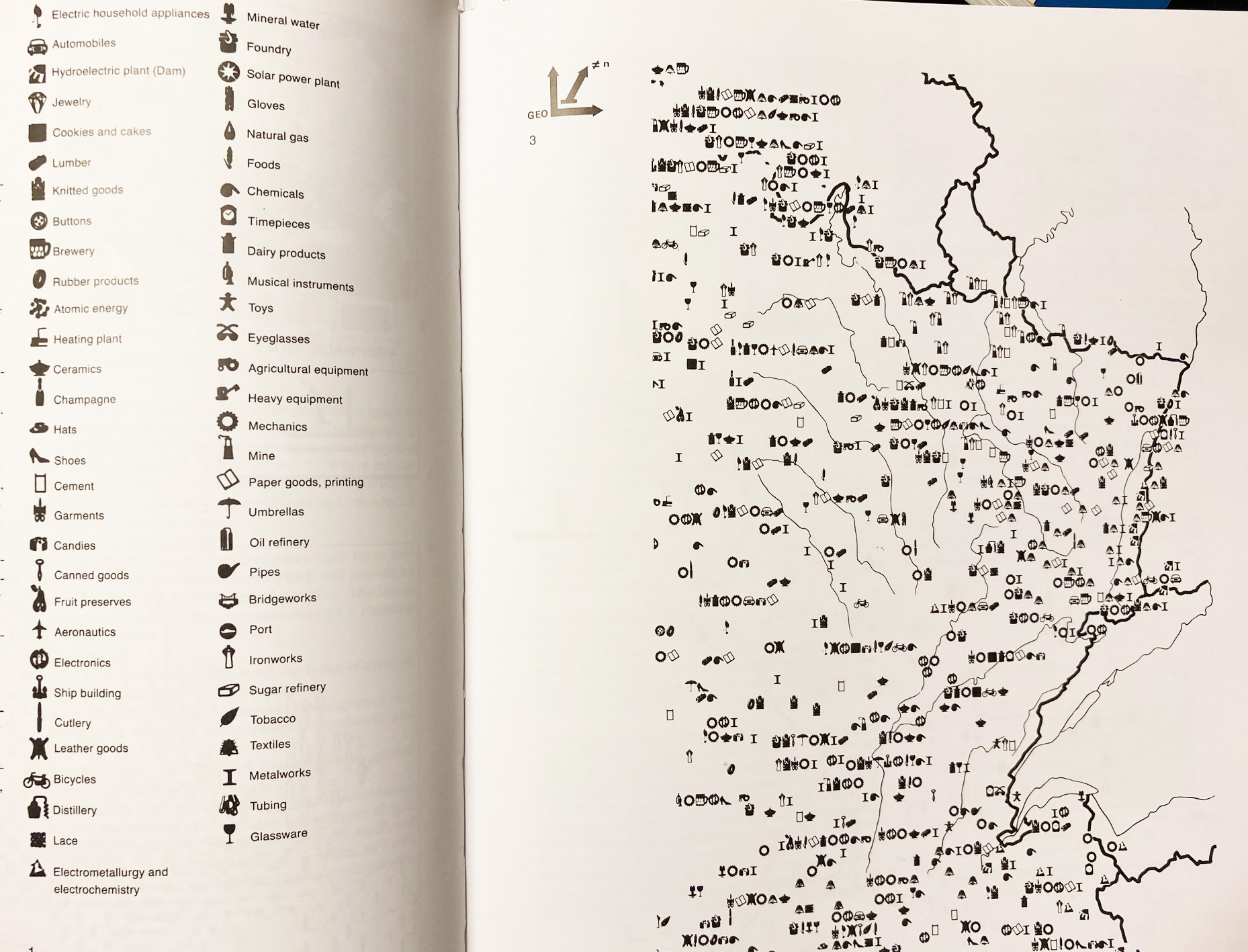
In many cases, a story may not be easily told by representative figures or photograph. From Greek graphē ‘writing’, Graphics is a language for the eyes - a diagram or map for example, can be used to store, understand, and communicate the information.
Graphic representation is, unlike the figurative imagery (including photography), monosemic. It is like Mathematics, playing with the definitions. An equation can be comprehended only when the unique meaning of each term has been specified (by the legend). It uses visible mark and two-dimensional plane. The mark can vary in size, value, texture, color, orientation, and shape. Within the plane, this mark can represent a point (a position without area), a line (a linear position without area), or an area. From the same information, there are great many possible variations produced by the combination of those properties (size, value, texture, color, orientation, and shape on two dimensional space) but a certain choice become compelling due to their greater efficiency - or if one can be perceived shorter than the other (less mental cost).

A mark can be in three type of signification: point, line and area.
- A point represents a location/position on the plane that has no theoretical length or area. It can vary size.
- A line represents the boundary between two areas, measurable in length but no area. It can vary width
- A area signifies something on the plane that has a measurable size. It cannot vary in size, shape, nor orientation but vary in value, texture, and color.
Bertin introduced how such graphic elements and properties and be corresponding signifying properties (meaning of data) -- Dark gray means for appropriate visual mapping. (ex. position x, y is appropriate to represent quantitative, ordered selective, associative data). MacEachren added more detailed visual subvariables, like blur(crispness), color value vs. hue. Look closely how Shape is differently elaborated -- Associative vs. Selective. Why do you think such different interpretation can be suggested?
When a mark in graph is large enough, it is helpful for users to recognize a pattern (similar vs. different) Also the users can associate a shape with some symbolism -- but be cautious that there is no universal shape signification. The meaning of a symbol becomes familiar to us through the repetition and socio-culturally learnable.
How to place the marks on the 2-dimensional plane to express the correspondences/relationship (=imposition or groups of representation)
- Diagrams: the relationship between two components
- Networks: the relationship between multiple components
- Maps: the relationship between multiple components, arranged according to a geographic order = geographic map
- symbols: the relationship is not purely within the plane depending on the reader's interpretation.
Semiology of graphics, J. Bertin 1987.
Gestalt psychologists investigated the interesting psychological phenomena that what we perceived is not only the combination of the objective parts but we interpret more than the given perceptual information. For example, we see a line by a row of dots, even though there are only dots -- our mind to connect the dots and understand it as a line. Researchers explain that it is our mental ability to understand the form, shape, or figure by grouping the information provided.
How we group the information to form a figure is largely based on the context -- what kind of objects are (similar or not), how close they are (proximity), whether they are related under a certain environmental factors (line, shades - (en)closure, connection). We tend to find the most optimized forms (simple).
- Read Storytelling with Data Ch.3.
- Understand proximity, similarity, enclosure, closure, continuity, and connection
- Research more rules about gestalt principles, beyond those visual perception, what other principle has been suggested?
For example, check out Visual Intelligence (by D. Hoffman), ch. 3: The invisible surface that glows
(Q-2) Find one good example of the graphs applied with any one+ of the gestalt principle of visual perception
For example, this graph looks good to represent the difference between states by simplifying the shape as hexagon, it applied similarity.
If you needed some sites where to find some good examples of graphs
https://flowingdata.com/tag/npr/
https://flowingdata.com/tag/new-york-times/
https://twitter.com/nytgraphics?lang=en
The graphics can deliver the message more efficiently than texts.
Graphics are especially useful to show patterns and relationship. >> These "pattern and relationship" are the "whole" part (meaning) of the graph in Gestalt principle -- we perceive the visual elements/ attributes and that perception is linked to a certain meaning like "increasing over time" (for example, when you have a diagram by time(x) and price(y)). This is where the semiotics works for your graphical representation and perception -- and as a designer you want to choose the effective elements and to apply the attribute for the information, in order to deliver the message (meaning) you want to tell.
Then, how to choose which graph for which kind of story (or data)? -- It totally depends on the function of your storytelling and the function depends on your user/audience. You will choose the form that can limit the meaning of the graph - to help the users/audience clearly understand the message (a story from data).
- Read Storytelling with Data Ch.2
- IF you are not familiar with those, get familiar with the basic graphs/charts
What kind of graphs/charts are used in this article?
What other type of graphs are you familiar with? or wanted to try someday?
https://observablehq.com/@d3/gallery
Q3: Those graphics are generated/created by digital tools (computational machine). What do you see the difference from the work that was much involved with anthropological process? (ex. from the reader's perspective vs. creator's perspective, or regarding subjectivity and objectivity of information)
- Comparing with the transitional methods of technical drawing of information (by Calvin Schmidt, reading link)
- comparing with the before-digital methods of creative interpretation of information (by Nigel Holmes, reading link)
advanced reading: Form follows function? by A. Cairo
(extra Q-1): What it means by "form follows function" and why Cairo argue that it doesn't fit in this information design? Do you agree with the perspective Cairo suggested?
advanced reading/watching: Definition of Design, interview with Charles and Ray Eames
(extra Q-2): What do you think "constraints" in Eames's definition of design? How do you see the concept of design constraints can be related to Cairo's argument that form limits the function -- or considering the negative space that shapes the figure (in Gestalt theory)?


