Week05.01 Layout - UX-UI-Design-Lab/DH150-viz GitHub Wiki
Agenda [theory]
- visual balance - perceptual forces / power of center
- visual composition, historical perspective
- principles of composition
- rule of thirds, activity02: analyze the photos, crop the photo to apply the rue of thirds
- anatomy of a grid // modular system - basic terms of margin, column, module, flowline, gutter, activity03: collect grid examples
Activity01 - Reflection: typographic variation What did you learn the process of invitation design, I would like to pick "funeral" invitation and have your thoughts. It is an event you may not have experienced for the design topic - what was your approach like, how did you start sketch? How did you get an idea and decide the message and the tone of message, color scheme, and most importantly how did you decide typography (typeface, size, alignment, spacing, etc)?
I recall that during the process of funeral invitation and handout, it was challenging not to be too emotional, but showing positive sides. What people may know or didn't know about the person in memory and help them to say goodbye to someone. It is also not easy to communicate with the family who want something more or less (like dealing with mother-in-law in wedding invitation design - do you remember that interview in Helvetica?). I want to hear from you how you dealt with your choice of typography to neutralize/ control/ or express the specific event.
(Of course, if you have just googled internet and adopted some styles from the examples, it would work -- in that case, I would like to hear that how you made a judgement which typographic style to take.)
In this week, I want you to try to see the world by a certain rule of proportion, the ratio between the neighboring elements, the ratio between the whole vs. the part, the ratio between before and after the change. It is again the recap of Gestalt psychological perspective and the effort to (de)find the rule behind design/aesthetics and the interaction between the object we perceive and what we create in our mind.
I would like to introduce some quotations, rather summarize them:
Within psychological aesthetics one of the most important of writers has been Rudolf Arnheim (1904–2007), much of whose theorising originates within Gestalt psychology (Cupchik 2007; Verstegen 2007). In Art and Visual Perception (Arnheim 1954; 1974)(1) and The Power of the Center (1982), Arnheim emphasised an holistic interpretation of an entire image or space, in which there are interacting, balancing sets of forces. Despite the suggestion of Cupchik (2007) that the use of terms such as ‘forces’ should be considered as metaphorical, and he was writing specifically within the context of a critical reflection on Arnheim's theory, a close reading of Arnheim suggests that he did indeed want his theory to be taken in a fairly literal sense (and indeed, when talking about ‘perceptual forces’, Arnheim is very clear, since after speculating whether these forces are, ‘merely figures of speech, or are they real’, he continues, ‘they are assumed to be real in both realms of existence—that is, as both psychological and physical forces’ (Arnheim 1974, p. 16).
In interpreting Arnheim, and the simple designs that he considers in Art and Visual Perception, it is important also to realise that much of Arnheim's theorising derives from Denman Ross's A Theory of Pure Design (1907), which Arnheim cites, and which takes a much more explicitly physicalist approach. Denman Ross's book has been much neglected in the psychological literature, to the extent that in Web of Science we found only 11 citations, only 3 of which were from psychology journals (Daniels 1933; Jacobson 1933; Jasper 1933). Nevertheless, the book is of great interest, not least because Denman W Ross (1853–1935) was a polymath in the humanities and a lecturer in the Department of Fine Arts at Harvard (Hopkinson 1937), the university in which Arnheim was based when he prepared the revised edition of Art and Visual Perception. Although not a scientist, Ross does say in the preface to A Theory of Pure Design that although, ‘Art is regarded as the one activity of man which has no scientific basis’, it is nevertheless his, ‘purpose … to show how, in the practice of Art, as in all other practices, we … follow certain principles’ (1907, p. v). Elsewhere Ross was to talk of, ‘Design as a science’ (Ross 1901), and he clearly had a desire for “measurable quantities and qualities” of art (Johnson 1995, p. 59), so that he was aiming for, ‘a scientific basis for design, [which could be] a verification or correction of visual feeling’ (Ross 1901, pp. 371–72).
Descriptions of the Gestalt principles of good organisation (closure, similarity, proximity, symmetry, common fate, etc) can be found in many introductory and advanced textbooks of vision (eg, Metzger 2006; Gordon 2004). The intellectual origins of Gestalt theory can be found in the field theories of electromagnetism, which were described by physicists such as James Clark Maxwell (Ash 1998). To a physicist a circle or sphere is formed, as, say, in a soap bubble, when a system finds an equilibrium at a minimum energy level.
McManus, I. C., Stöver, K., & Kim, D. (2011). Arnheim's Gestalt theory of visual balance: Examining the compositional structure of art photographs and abstract images. i-Perception, 2(6), 615–647. https://doi.org/10.1068/i0445aap
Well, we are looking forward to a nice summary of Arnheim's Book Art and Visual Perception in this week (thanks , but meanwhile, we will talk about layout: how to place (let's say) something (such as a circle) in a given space. We want to experience how to make that arrangement look nice (= organized).
According to Arnheim, there is a visual field that guides us to see the relationship between the visual objects.
We intuitively know/see that the circle is off the center and close to the wall. Because, there is some attraction/repulsion in visual perception that can make us feel the circle's position in the square -- in this case, we don't feel it balanced. Instead, we feel that it is needed to either attracted toward the wall (so may bump into the wall) or to move toward the center (so it can stable). It is in the middle of that process, it doesn't feel visually comfortable (or pleasing) yet.
(A summary with added annotation from The principles & processes of interactive design, ch.5 p. 118-121)
The modern design history usually starts from Art and Crafts Movement - a reaction to the industrial revolution, mass production of "overly decorative and often poorly designed" products in the Victorian era. William Morris who led the movement was a socialist/Marxist who supported the idea that "the separation of the intellectual act of design from the manual act of physical creation was both socially and aesthetically damaging" (John Ruskin). William Morris's workshop showed that mass production can be beautiful -- well-crafted forms of simplicity and a new use of asymmetrical design. (further reading: https://www.theguardian.com/artanddesign/jonathanjonesblog/2016/mar/24/william-morris-google-doodle-socialist)
In layout and typography, the examples includes Aubrey Beardsley's yellow book (https://www.tate.org.uk/art/artworks/beardsley-cover-design-for-the-yellow-book-vol-i-n04171) and typefaces like Copperplate Gothic and Franklin Gothic. (more than 100 years old but still in use)
 |
 |
Another influencer of the modern layout comes form visual expression in "concrete" poetry -- such as Apollinaire's calligram and Cummings'.

|

|
During the First World War, the graphic design reflects a desire for political and social changes -- used bold composition of color, shape, and typography. The examples include Dutch De Stijl, Russian Constructivism (cool video about Aleksandr Rodchenko https://youtu.be/-MMwGkUioFQ) and Swiss Dada.

|

|

|
Under such a historical background, Bauhaus in Weimar Germany (1919) was formed based on the value of the liberal and modernist perspective. Constructivist Moholy-Nagy and De Stijl's founder Theo van Doesburg were joined the school to teach an experimental approach to asymmetrical compositions and photomontage.
The Bauhaus's exhibition influenced Jan Tschichold to setup his minimal aesthetic for typography and grid layout (New typography, 1928) -- and Beatrice Ward's essay on typography ("Crystal Goblet", 1930). When the Bauhaus in Germany was forced to close, the teachers moved to Switzerland, Britain, and the USA and spread the Bauhaus's modernist approach. Known as the "International typographic style" -- Otl Aicher, Josef Muller-Brockmann, Massimo Vignelli and Paul Rand.

|
 |
 |

|
I will stop here for the historical review before we get to post-modern and deconstruction (rule breaker), because I think one needs to master the rule first to break.
(A summary with added annotation from The principles & processes of interactive design, ch.5 p. 122-125)
To compose the layout, you need to consider the followings.
The placement and distribution of elements on a page.
You can make the layout symmetry -- but it can be no more attention is required. So, can be dull. For modernist designers (listed above with a historical perspective), unbalanced layout creates tension (and reading flow, the eyes will look for the next thing to fill the visual balancing) and asymmetrical layout is preferred.
Layout is the relationship between the foreground and background. We call the foreground as shape/positive and background as space/negative. The gestalt law shows interesting interaction between foreground figures how they would form a bigger shape as a group. (recap: the gestalt principles, do you remember laws of closure, similarity, proximity, ...?) We already covered in the visual mapping about the visual attributes you can utilize to adjust this relationship between shape and space into visual balancing. Here are the recap:
- Size and Scale: By adjusting size of the elements(shapes), you can create order and hierarchy of the information -- larger ones would draw more attention (and understood as more important) than the smaller ones.
- Position and Placement: How to arrange the elements(shapes) can change the order of reading, and the change the story. The reading order typically follows the cultural convention (in western, reading order starts from the left top to right bottom). The proximity of the elements can suggest that they belong to the same group comparing to the elements distanced. (Sometimes the blank line used to indicate one block of the story has ended and new story will begin -- it is important to group the title, subtitle and paragraph of one story within a close position and make irrelevant components distanced. If the next story title is closer to the previous paragraph than its own paragraph following, people would be confused)
- Color and Contrast: The hue and saturation can be used to adjust level of focus or importance. The different hue can notify a different group (similarity).
Interesting rule most frequently used in art and photography is the rule of the third (or the rule of thirds). When you place the element of focus in the place of the third, overall layout looks good. Here are some examples:
 |
 |
 |
 |
Image from James Dean in New York, 1955, LIFE magazine + The Mahatma, 1946, LIFE magazine, by Margaret Bourke-White
Activity02: Practice the rule of thirds
Could you make your photo look good in layout?
- step1: take a picture of something/someone - asymmetrically
- step2: examine the layout -- do you place the significant visuals in the third grid line?
- step3: could you crop the picture to satisfy the rule of thirds? describe what you find different when you apply the rule of thirds.
- step4: Try with at least three pictures -- share that before and after photos via google slide
I don't think you will need another example for this activity. The photo should your own work, not from internet.
The example of work can be found here
When you get accustomed to that rule, you will naturally/ (un)continuously apply that layout whenever you take a picture.
Note: In Photoshop crop feature, there is a grid option for the rule of thirds (and other golden ratio as well).
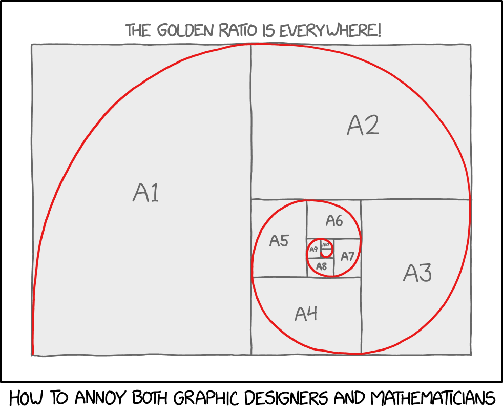
The secret of this rule of thirds is nothing but the proportion -- we like 2:3 ratio. It is a ratio we are exposed frequently in the nature, about every organism that grows -- the numbers called Fibonacci sequence.
To learn more about Fibonacci sequence, check this video (The great math mystery, by PBS): https://cosmolearning.org/documentaries/great-math-mystery/1/
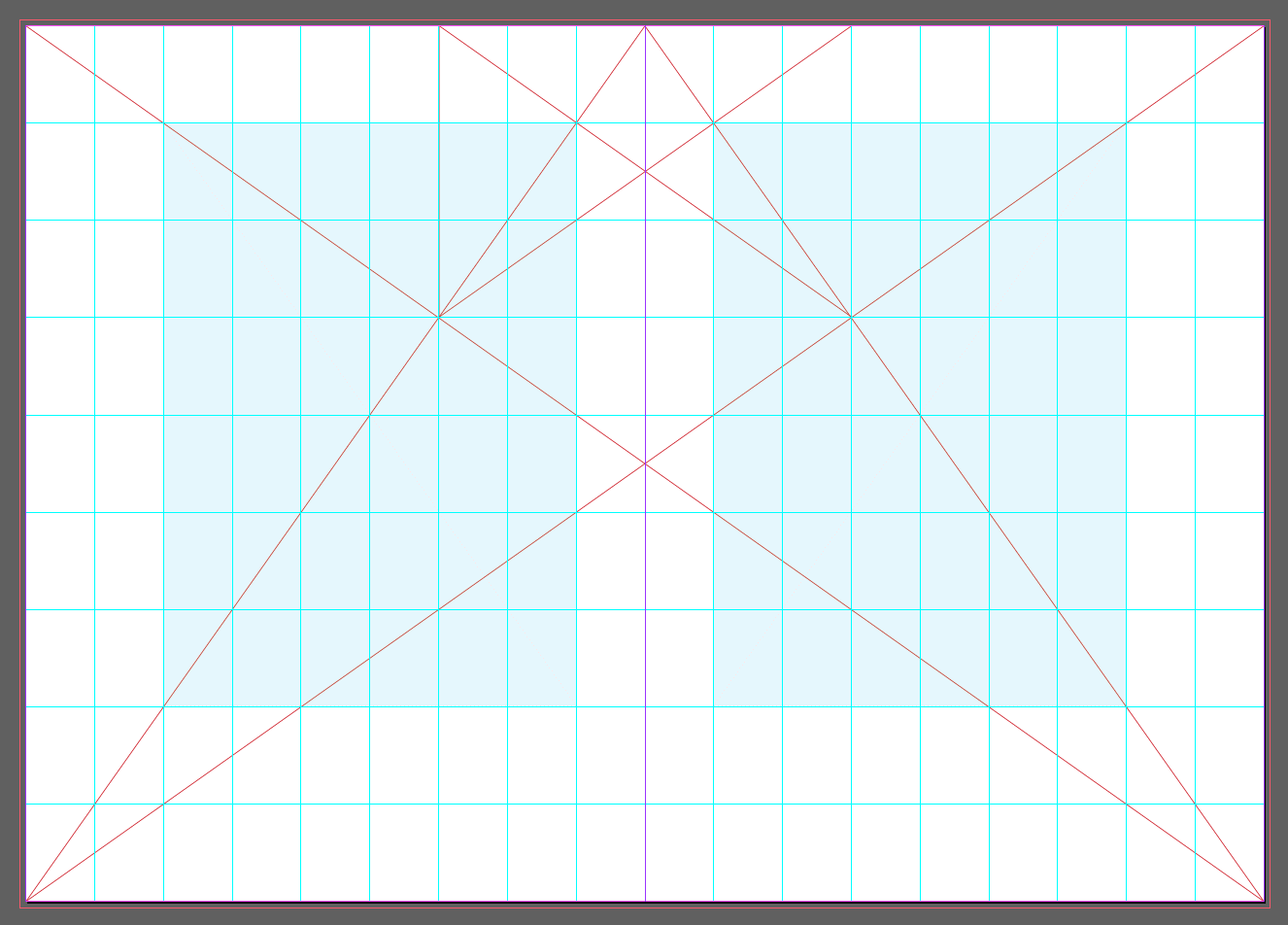
For example, this "golden canon" by J. Tischichold shows how you can divide the space into 2:3 and place the text (in red). The width of one page is equal to the height of the red textbox.
And the ratio you can find in the neighboring Fibonacci sequence (when the numbers get big) is approaching 1:1.618 == which what people call "Golden ratio." Especially the paper production, the ratio between width and height in ISO system is following this golden ratio.
If you have one column, you need can put the contents in the one text box -- and apply proper margin (space from the edge). Here is recommended margin size:
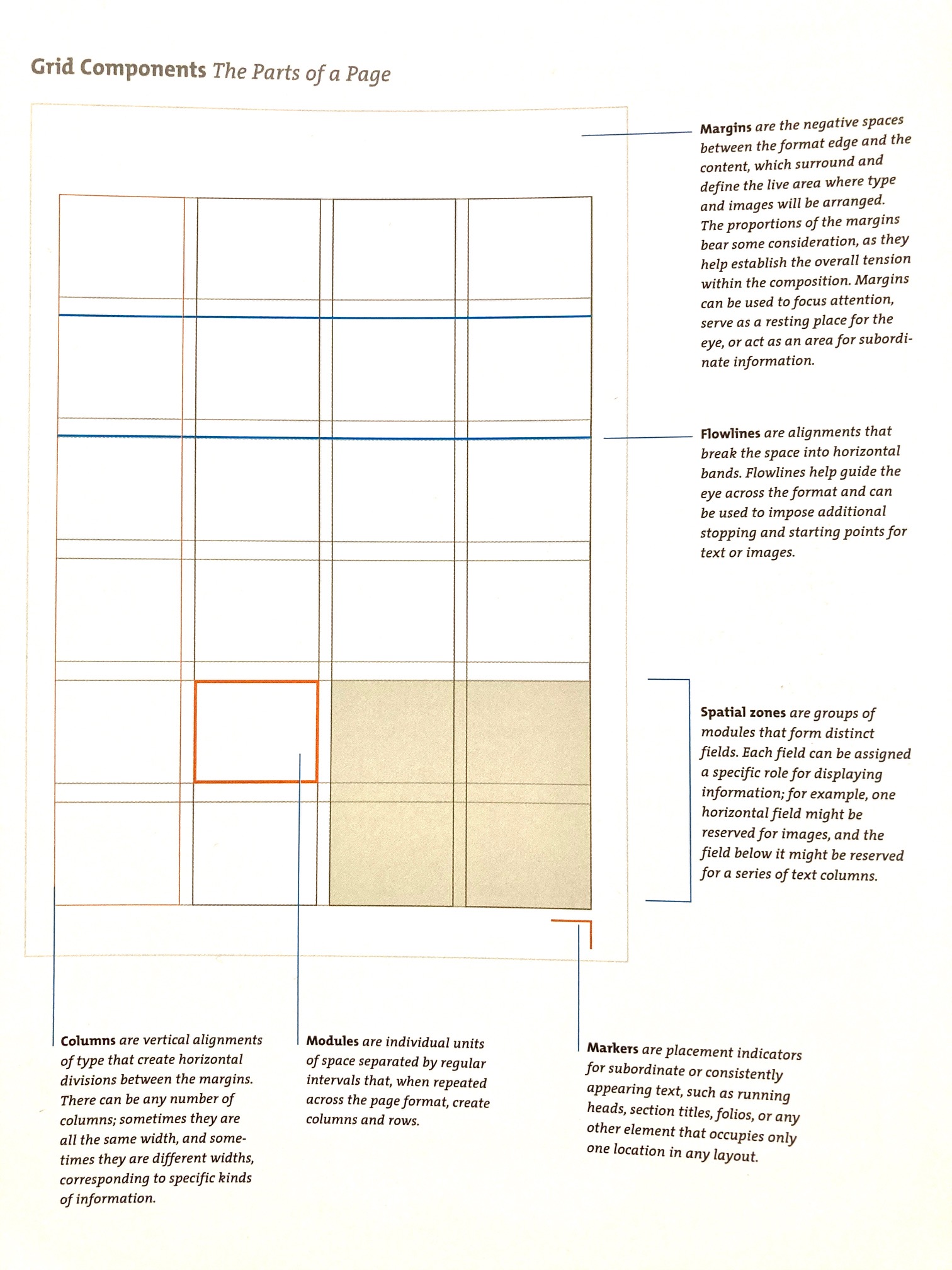
You can divide the space into 2, 3, 4, 5, or 6 columns. you can also combine columns like 2:3 in 5 columns.
In 1950-60, swiss graphic designers like Gerstner, Ruder, and Müller-Brockmann, developed and used the grid system by adding horizontal divisions. (If you remember the interview with David Carson about breaking the system -- he meant this modular system)
This is Karl Gerstner's modular system -- it may look complicated but nothing but an overlapped 1-6 module system:
Can you see the modular system, like how to arrange 6 modules, 5-, 4-, 3-, 2-, 1- module with this system? If not, please check this blog What I learned from the $2,000 elusive design book “Designing Programmes”
Gutter is the space between the modules.
Please get familiar with the term of each part of grid system: margin, column, module, flowline, and gutter.
Activity03: collect grid examples
So, can you find some grid examples? Pick any book or newspaper around you (except the text book) -- and find the structure of the page design. At least two different grid system (1-column, 2-columns, ...)
- step01: take a picture of the page layout
- step02: analyze the layout, marking margins, column, and gutter (and module and flowline if you can see)
- step03: organize the picture and your note in google slide (or similar)
- step04: repeat step01-03 with another type of grid system than you found.
** Please provide a picture of the book cover.
The example of the work can be found here
Next, we will practice more of the proportional experiment on layout in PartII.
Reference/ Image credits:
https://en.wikipedia.org/wiki/Grotesque
https://en.wikipedia.org/wiki/Arts_and_Crafts_movement#William_Morris
https://medium.com/@lauriehilger/words-as-art-520c4abc4380
http://writing.upenn.edu/library/Apollinaire_Calligrammes.html
https://qwiklit.com/2014/05/27/10-poems-that-look-like-what-they-mean/comment-page-1/
http://www.all-art.org/art_20th_century/rodchenko1.html
https://www.moma.org/artists/4975#works
Graphic Design Pioneer—Alexander Rodchenko Russian Constructivist, YouTube video 18 min
https://www.artsy.net/article/artsy-editorial-100-years-on-why-dada-still-matters
https://www.grapheine.com/en/history-of-graphic-design/paul-rand-everything-is-design


