Week04.01 Typography - UX-UI-Design-Lab/DH150-viz GitHub Wiki
Agenda: Design Element: Typography (Theory)
- history of typography + printing industry to digital publication
- anatomy of type
- measurement/unit, spacing, alignment
- legibility vs. readability
- Activity01: How to use font-identifier example here
- Activity02: Create a typeface of your own example+instruction here
- Activity03: Evaluate the typeface of your own example here
Intro: designing of letters
Understanding typography is more like understanding the history of publication. By using a tool/technology, humans have devised a way to communicate the intellectual outcomes via letters. Transitioning from oral communication to written communication was an expensive business, related with many materials (papers, ink, pen), and required skills (script, calligraphy).
The original purpose of the type was simply copying. The job of the typographer was to imitate the scribal hand in a form that permitted exact and fast replication. The hand writing requires patience and precision - so a tireless writing machine dramatically reduces the process from ideation to publishing -- writers do not need calligraphic skills but instead develop an ideal script by various voices and literary styles. The effort to develop a technology that fills the gap in the process between writers and printers has contributed to the industrial revolution by enabling mass production of the publication. The inventors, designers, and technicians around the printing business (including newspaper industry) were highly demanded in the job market (and highly paid). They were an earlier generation of the Interface designers -- who know how to offer a proper form for the information intended.
So, this is the context of learning typography as the design element in this week. We will learn the design principles from the history, so some are foundational but some are not effective any more (but remains as unspoken custom) because the technological context has been changed (that was linked to the constraint of the design). For the further understanding of the history of printing in industry and technology, refer to those two videos in the below.
The Machine That Made Us: Gutenberg Printing Press, 1 hour, check around 30min and 45min for metal types
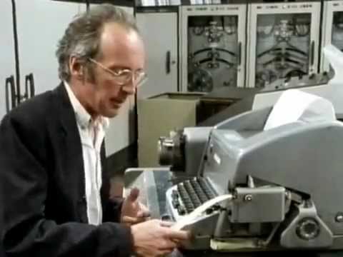
Secret life of machine: Word processor, 20 min
Type, Typography, Typeface, Font, Letter
What is the difference?
Here are some definitions or the origin of the words.
- Type: late 15th century (in the sense ‘symbol, emblem’), from French, or from Latin typus, from Greek tupos ‘impression, figure, type’, from tuptein ‘to strike’. The use in printing dates from the early 18th century; the general sense ‘category with common characteristics’ arose in the mid 19th century.
- Typography: the style and appearance of printed matter. The rule.
- Typeface: a particular design of type. The overall design of lettering. (ex. Times New Roman).
- Font: Each of these variations of the typeface. (ex. Times New Roman Bold 12pt)
- Glyphs: The design of an individual letter, number, punctuation mark, or other symbol. (ex. the design of A)
- Letter: a character representing one or more of the sounds used in speech; any of the symbols of an alphabet.
- Letterset: a method of printing in which ink is transferred from a raised surface to a blanket wrapped around a cylinder and from that to the paper.
For example, Times New Roman is a family of fonts that is derived from one look&feel of type design, therefore typeface. The font of Times New Roman Bold 12pt is what you had to purchase to use it for your newspaper printing - imagine this metal type. (in old graphic design schools have a big room with the shelves/draws with those metal types)
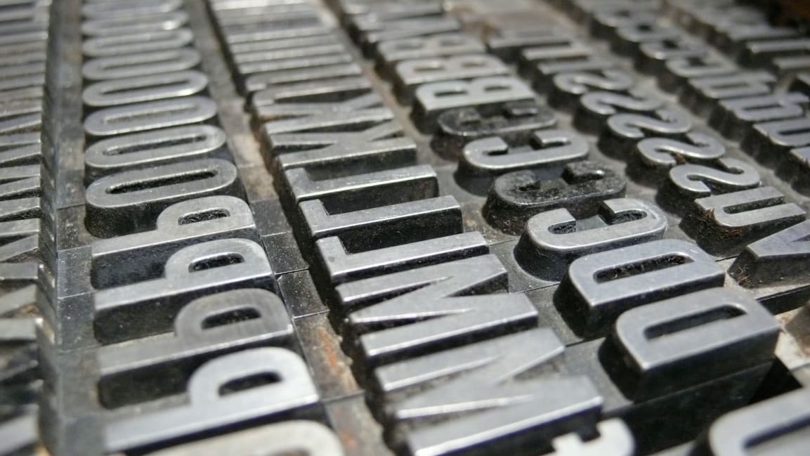 https://www.fastcompany.com/3028971/whats-the-difference-between-a-font-and-a-typeface
In digital environment, many people use the terms interchangeably. So, using "font" is generally safe to communicate which typeface you use in your design, except you are talking with the old-generation type experts.
Anatomy of type (the shape)
Pick two fonts you like - and see what are the differences you can spot - how would you describe such differences?

from http://thinkingwithtype.com/letter/
body parts:
In a human figure, there is upper part and bottom part. The line between upper and lower part is waist. But in type, it is easier to remember if you think a font as a tree. It stands on the ground (=baseline) with a stem. The middle line between upper/lower part is called "x-height" because literally it is a height of lower-case x.
Understanding type by Google Material Design
If you want to learn more of the part name: https://visme.co/blog/type-anatomy/
The most different thing you can notice is about the serif.
- EB Garamond, old-style serif
- Libre Baskerville, transitional serif
- Libre Bodoni, didone / neoclassical serif
- Bitter, slab serif
If you don't see the decorative tick at the beginning or the end of the shape, it is sans-serif ("sans" = without)
- Work Sans, grotesque sans serif
- Alegreya Sans, humanist sans serif
- Quicksand, geometric sans serif
- Grotesque: Low contrast between thick and thin strokes, vertical or no observable stress
- Humanist: Medium contrast between thick and thin strokes, slanted stress
- Geometric: Low contrast between thick and thin strokes, with vertical stress, and circular round forms
You don't need to remember all the details, it is for your curiosity -- If you can tell the different between serif vs. sans-serif, it should be good.
The other families are about the mimicking of the tool of writing -- if you want to show the type-writer style, it is monospace; if you want to show the calligraphy (ex. using rotring pen), you can use Black letter(chisel tip), script(sharp pen), or handwriting(brush).
- Black letter: High contrast, narrow, with straight lines and angular curves
- Script: Replication of calligraphic styles of writing (more formal)
- Handwriting: Replication of handwriting (less formal)
All examples from https://material.io/design/typography/understanding-typography.html#type-classification
(web-)font-family
Here you can find the fonts you can use in your css (web-design).
https://developer.mozilla.org/en-US/docs/Web/CSS/font-family
- serif/
- sans-serif/
- monospace/
- cursive/ script
- fantasy/ blackletter, display
- emoji/ symbol
- and by @font-face rule of CSS, you can add your own font.
Activity01: Identify Typefaces
-
Collect the typefaces; Take picture of any logotype, text of "physical object" not from the screen capture. At least 20 fonts, as much as you can. You will be surprised how easily you can find various fonts around you.
-
analyze the typeface you collected -- is it serif? or sans-serif? (advanced: monospace? script?)
-
Find the name of the typefaces
- These are the site you can use: -- https://www.myfonts.com/WhatTheFont/ -- https://www.fontsquirrel.com/matcherator
- upload the picture on the website of the font-identification and crop accordingly to assign the are you want to find the name of the font (of the text, label, or logo).
- Organize one google slide to present your research
type-family
In each typeface, there are many variations of styles that serve a different function in context.
- romanic: the style that we call regular, used for the main text
- italic: usually used into emphasize individual words and mark specific classes of information, in old times, it is used for preface, notes, or block quotations. (cf. there are fake italic, just sloped romans (= oblique))
- small caps: used to emphasize with capitals - the full capitals are too big and destroy the balance
- bold: to emphasize. Depending on the weights, it can look thicker/heavier.
http://thinkingwithtype.com/misc/Type_Family_Demo.pdf
[advanced] It is helpful to see the historical style of typography [reference01: the elements of typographic style, R. Bringhurst, p.12-15] It is about the stroke style and the stress: old_style, traditional, modern.
This video would be helpful to explore the history of typeface styles:

Well, you may have a question like "do I need to know all this historical terms?" -- of course the answer is no. It is helpful when you choose your typography for your project in the future, because such historical aspects can give you hint that which typefaces do not go along with which.
The development/ design of typeface has been changed as the technology.
Activity02: Create your own font -- This is just for fun to understand the elements of typography.
- create your own digital font; download the font (ttf/otf)
- Here are some font-generating tools you may want to try.
- https://www.calligraphr.com/ (this one is easy to convert your handwriting, but the server doesn't seem to work very smoothly, just retry if it shows error)
- https://fontstruct.com/private/fontstructions/create (this is how you created the bitmap font in the early days with computer -- you may feel it tedious to put dots one by one, but you can start from other people's font file and modify the design)
- Install the font in your system and use the font in MS word
- in Mac system, open the font file with Font Book and click "install"
- open MS word and find your font name
- (optional) convert the font as web-font and use it in your web_project
- Use any web-font converter you feel like to try, for example https://www.fontsquirrel.com/tools/webfont-generator
- Then, upload your ttf file, download the package (that has the converted webfont file such as .woff)
- Refer the css file in the package how to use the font; when you publish your html, place the webfont file in the same directory as your working html/ CSS
detailed instruction + demonstration will be added here
For more information about typeface design process: https://www.digitalartsonline.co.uk/features/typography/how-design-typeface-step-by-step-guide/
measurement and unit

The unit of font-size comes from the physical size of the letter printed on the paper. But it is measured from the top of the uppercase to the bottom of the descender (ex. the bottom of lower case y) -- so the size you feel on print is smaller than actual size of the font.
What you may want to remember is 72 point(pts) = 1 inch -- it includes the space for the buffer, so actual printed 72 point letter will look smaller than 1 inch.
There are some other (old) names for each type sizes (just for your curiosity).
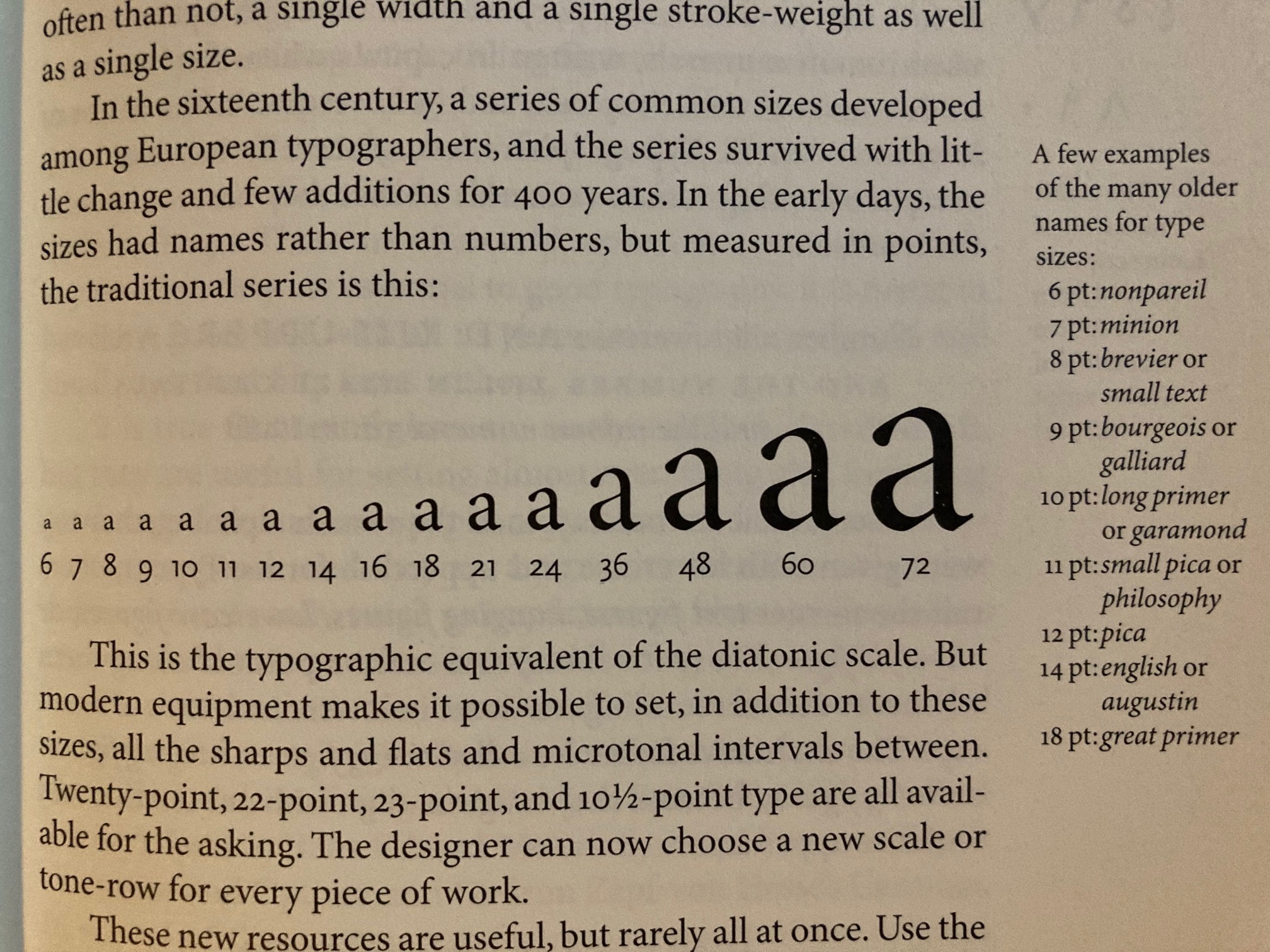
The Elements of Typographic Style by R. Bringhurst, p.45
On screen, the unit of font is presented as pixels -- the ratio how to convert the pixels to inch (when it is printed out) is by dpi (dot per inch) or ppi (pixel per inch). You may have seen this setting like 300ppi when you start Photoshop to set up the resolution or 150dpi when you setup the printing. In short, a higher number is for the finer resolution.
"em" in web-coding is for the 1-unit size of the current default font size of the browser. You can check in the browser setting - for example in chrome, File > Preference, then in the preference page on the left side menu click appearance > custom font size:
You can see that the size of the font is "16" -- it is okay to consider it as 16 pxls (https://material.io/design/layout/pixel-density.html#pixel-density-on-ios), so 1 em = 16pxls in this case.
em is a unit for the horizontal spacing in the traditional printing system. for example 12 pt em means a distance equal to the type size 12point.
Spacing
When you arrange letters into a word, each letter will have some buffer space from the other letters. but some letters has space that may influence the overall distance between the letters to make them perceived as a word. For example V and A, space from the bottom V and upper space of A will create blank space. So, the designers want to adjust that space between two particular letters in context. This is what Kerning is about. Look at the space after the letter "T" and "W" in the following example.

While, you may want to adjust the overall word width to create a solid look&feel (what you probably did for the assignment01). This is tracking.

The designers use this trick to create a logotype -

but, it is not recommended to apply tracking to lowercase letters. Do it with ONLY with Uppercase letters (and for heading, not body text).
The distance between the line (or more exactly speaking the distance from the baseline to the next baseline) is called Leading -- because in the old times, the technician added between metal types with the strips of lead to make the lines more spaced. The default setting of leading is 1.2 (or 120%) of the type size.

It influence the density of the information, it can be helpful to offer large amount of information to scan, but it may not be helpful to make the information more accessible or readable. For more information: https://material.io/design/layout/applying-density.html#accessibility

So, in sum:
- leading: line-spacing
- tracking: letter-spacing
- kerning: space between a specific two letters
Alignment


images from: Thinking with Type, by Ellen Lupton
In sum, the center alignment is for title, not for the paragraph (it will look like a tombstone). The right alignment is only for caption. For the main text, justified would be the best (but be cautious of the word-spacing) - Left alignment is okay but sometimes the ragging can make the whole paragraph look less professional.
Science of reading: Legibility vs. Readability
The readability is a fluency of perceiving the word -- so the spacing matters like line spacing, tracking, and alignment.
Interesting finding from the reading psychology is that your eyes don't not move to perceive the shape of the letters individually but skip through the overall shapes of the word. (reference: https://docs.microsoft.com/en-us/typography/develop/word-recognition) We spot the shape of the top part of the word and jump to the next (and between that movement, there is a pause - processing time). This explains why all capital letters are hard to read comparing to the lowercase text, because the top shape of the word is not so easily distinguished comparing to the lowercase text. -- so, do NOT make all paragraph as all capital.
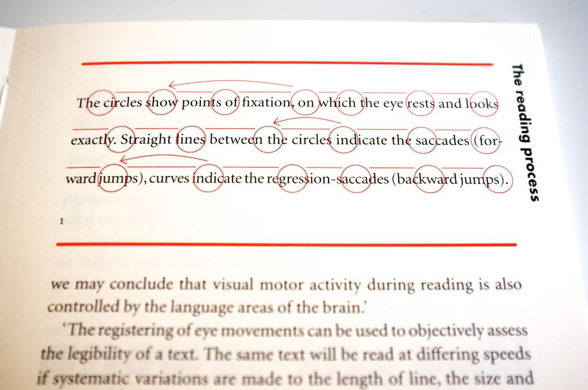
image from: https://24ways.org/2012/science/

image from: https://type-ed.com/resources/rag-right/2016/01/05/how-to-encourage-people-to-read
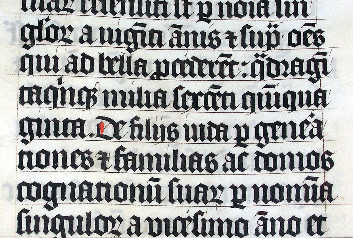
Legibility refers how easily each letter form is recognizable -- in handwriting, if someone write "d" with a short ascender, it will look like "a" and very confusing. Same for v and u, if someone like me have a tendency to write v a bit rounder at the bottom, which look very similar to u. So, this legibility is an issue of the typeface design. Like old Black letter in the below, it is very hard to recognize the shape of the letter.
Activity03:
Evaluate your typeface design about the legibility and readability.
- visit this Project Gutenberg site and find a book you want to use as your contents.
- if you want, you can use this book: Fundamental Principles of the Metaphysic of Morals by Immanuel Kant http://www.gutenberg.org/files/5682/5682-h/5682-h.htm
- copy and paste one short paragraph to your Microsoft word file (or webpage) that you can use the font you designed in Activity02
- screen capture the paragraph
- Check legibility of the font design: analyze how the letters are easy to understand
- Check readability of the font design: analyze how the overall text is easy to read through.
- Make one google slide to organize your font test screen and evaluation/ analysis of the legibility & readability of the font design

