Week03.02 Color Practice - UX-UI-Design-Lab/DH150-viz GitHub Wiki
Agenda:
- Understanding Color in computational system (= find the color code for web programming, color picker)
- How to optimize the number of the colors (change the tone, filter and blending)
- How to check color contrast
- How to analyze colors
- How to experiment with harmonious color schemes
- How to draw abstract forms (vector, pen tool)
Color code
- In google chrome, search "color picker"
- or visit https://www.w3schools.com/colors/colors_picker.asp?color=%23ffab00
RBG code means how much light you will turn on for Red/Blue/Green -- because the LCD display most likely you have in front of you (of your computer) has a grid of LED lamps (each LED has three lights in it).
image credit from B.W. Jones' blog
Each color can use 8bit of memory space (2 power of 8 = 256, so if you count from 0, it will get to 255 as the max). RGB(255, 255, 255) means you will turn on all the lamps on. But... honestly RGB is not very intuitive to describe the color -- do you know how to make yellow by RGB code?
The Hex Code means hexadecimal (0-15, 0, 1, 2, ..., 9, a, b, c, d, e, f = 16 digit system) code. So, simple put, FF means turn the light fully on. 00 means turn off the light. Do it for three lamps RGB, first two for Red, next two for Green, and the third for Blue. #FFFFFF means all three lamps are fully on (so white) -- #000000 means all off (so blue).
These are quite developer/engineer's code -- they didn't seem to mind how the color would look in human eyes, but only care about how much light turn on and off according to the program.
(oh, CMYK is another code for the printing technician, it gives the printer the information how much ink they need to spray -- Cyan Magenta Yellow and blacK >> we are not interested in this -- but just keep in mind that the color you see on the screen and the color you printed out can be quite different.)
So.. people try to convert the color code more understandable way -- by the color theory. We see colors by three dimensions, Hue, Saturation, and Lightness == HSL, which is quite intuitive.
HSV stands for Hue-Saturation-Value. The original color has Value 1 (or 100%) and value 0 is for black. (while in HSL, Lightness 0 shows white, 50% shows the original color, and 0 is for black)
I prefer HSL system, because I can manipulate saturation and lightness independently -- but Adobe system uses HSV. The difference between HSL and HSV is explained well here with a detailed converting formula.
Let's try the converter from google chrome. You can pick any color you want on the color space. You can see the spectrum of hue (or flatten ring/ wheel of hue) and the point your choice of hue is.
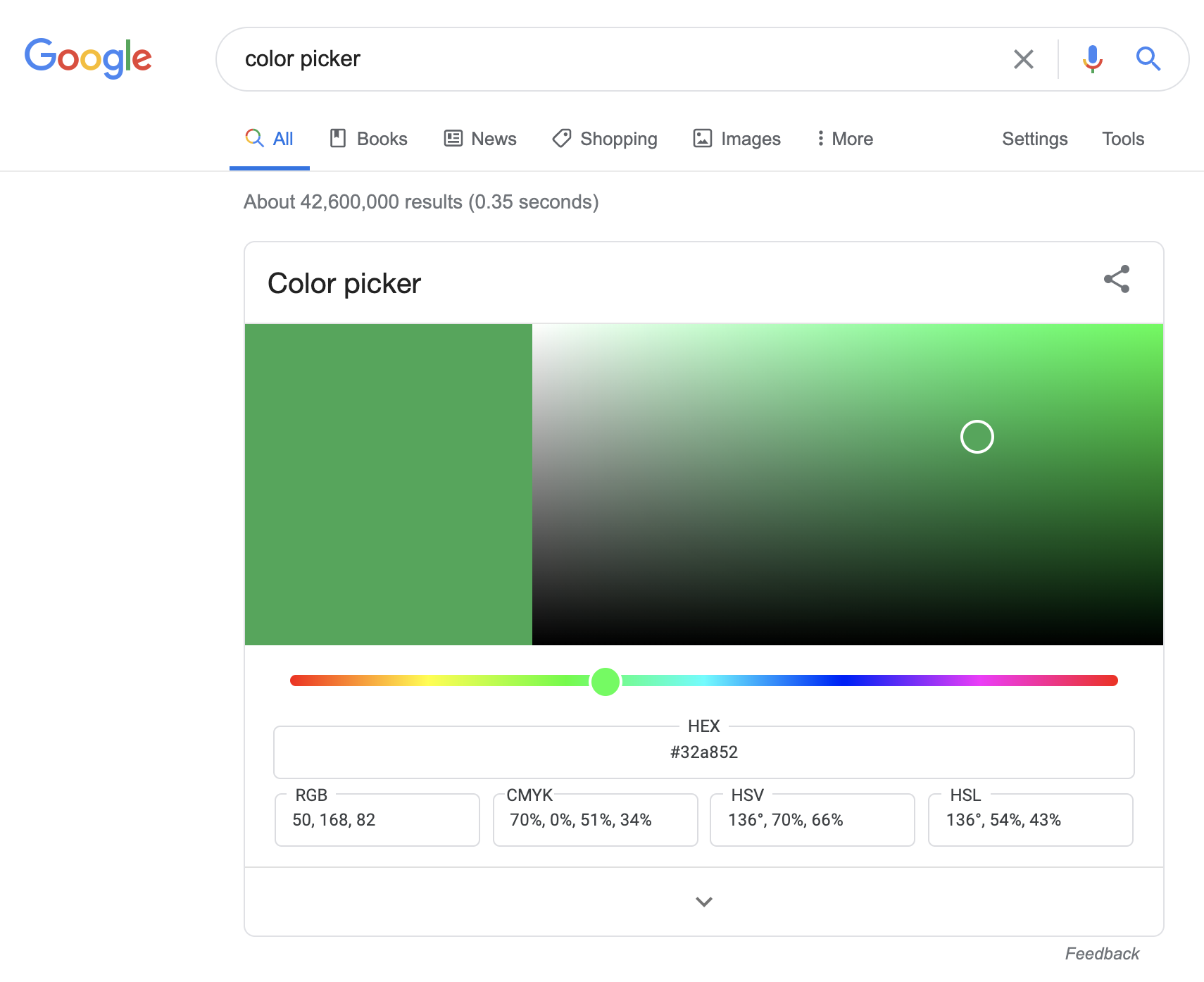
When you move the hue slide thumb to red (left end), you can see hue number as 0. It is easy to remember if you recall that the third color people can tell other than white and black was "red" across the culture. Red should be a good point to be the origin of the hue wheel.
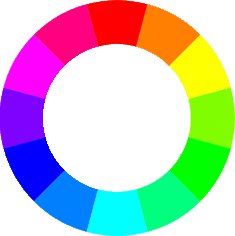
12 O'clock of the wheel is 0, Red. It is 360 deg system, so if you have three primary colors (red, green, blue), you can guess 120 degree for each color -- 120 for green, 240 for blue. Then, you can guess easily from 0 to 120, the hue will turn from red, orange, yellow(60), yellow_green, and Green (120). From Green(120), the hue will turn to cyan(180, the complementary of Red), to blue (240). Again, from blue(240) to purple and hot_pink(330), and turn to red (360 or 0). Once you remember this direction of hue changes, it is easier to guess the number for the hue you want to use.
If you move the color-eye in the plane upward(Y-axis), it will get brighter (lightness). If you move the color-eye in the X-axis (horizontal), it will get more or less color intensity (high-saturated when the color-eye moves rightward).
If you use W3School color picker, use the HTML5 color picker (and change the color code into HSL) -- (screen shot will be here)
This is how you can get the code for the color.
change color tone, by filter or by blending option
(optional demo -- you will apply sepia to make monochromatic. Be cautious about using grayscale, it will eliminate the hue information, so you may not apply the hue later)
Filter is how to calculate the edge -- if the edge gets softer, for example, it turns blurred -- that means the colors around the differentiated pixels gets averaged. the feather in blur option you might be familiar with is about the size of block of pixels the system will calculate and replace the average color value.
Blending is how to calculate and mix the difference between the layers -- so the system will find the color information in the matching coordinate pixel, and for example, sum (linear dodge), multiply (multiply) , or choose whichever min(darken only).
This may be helpful: https://www.guru99.com/how-to-use-blending-mode-in-photoshop-cc.html
How to check color contrast (activity03)
If you have the background color and text color ready, you can put that color code and check if it would comply the web-accessibility requirement (4.5: 1). It is different from the difference of lightness -- 1) because hue/saturation can contribute the overall contrast; 2) humans sensitivity of the color contrast is not linear (as you remember the weber-fechner law -- if not, let's read [this chapter XX from interaction of color] in CCLE
Therefore the calculation of the color-contrast is not just the difference in Lightness (value).
Just for your curiosity, the formula is like this:
Luminance = 0.2126R +0.7152G + 0.0722*B
https://developer.mozilla.org/en-US/docs/Web/Accessibility/Understanding_Colors_and_Luminance
It is the adjusted function as you checked Weber-Fechner law, rather developed into Steven's power law.
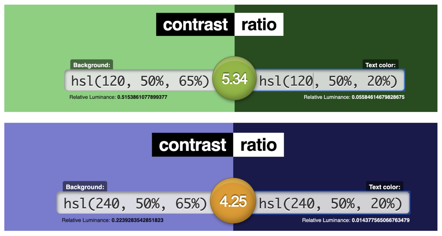
If you test with the same 65% vs. 20% contrast of lightness (control the saturation 50%)- the result of contrast-ratio is different depending on the hue.
How to analyze colors
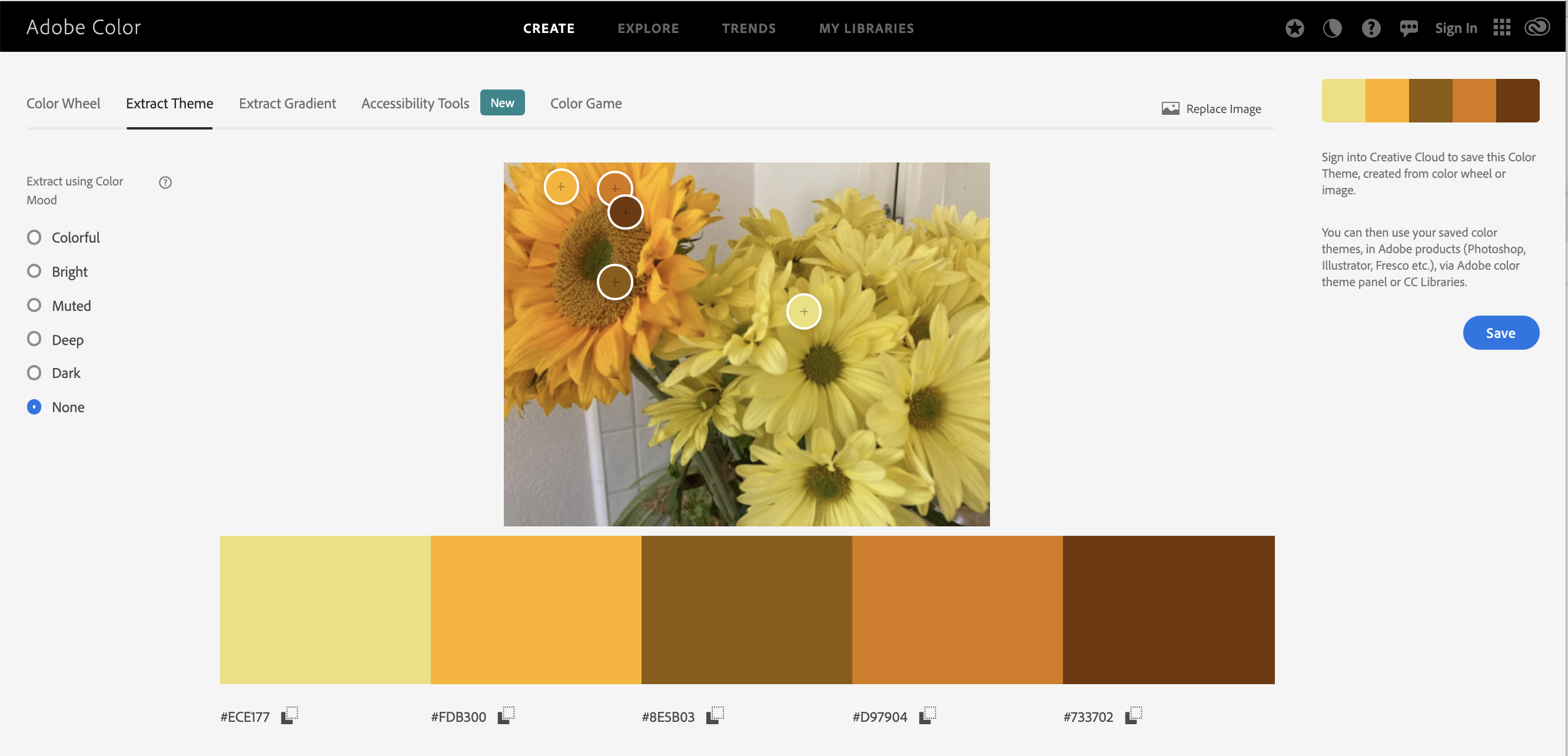
- goto https://color.adobe.com/create/image
- upload the photo you want to analyze the color -- please do NOT retouch/adjust color with other tool (I want you to experience how the color can be identical or different from what you expected)
- then, it will automatically suggest a set of colors. Move around the little dots on the picture to pick the color you want to collect.
(optional) you may want to check the gradient
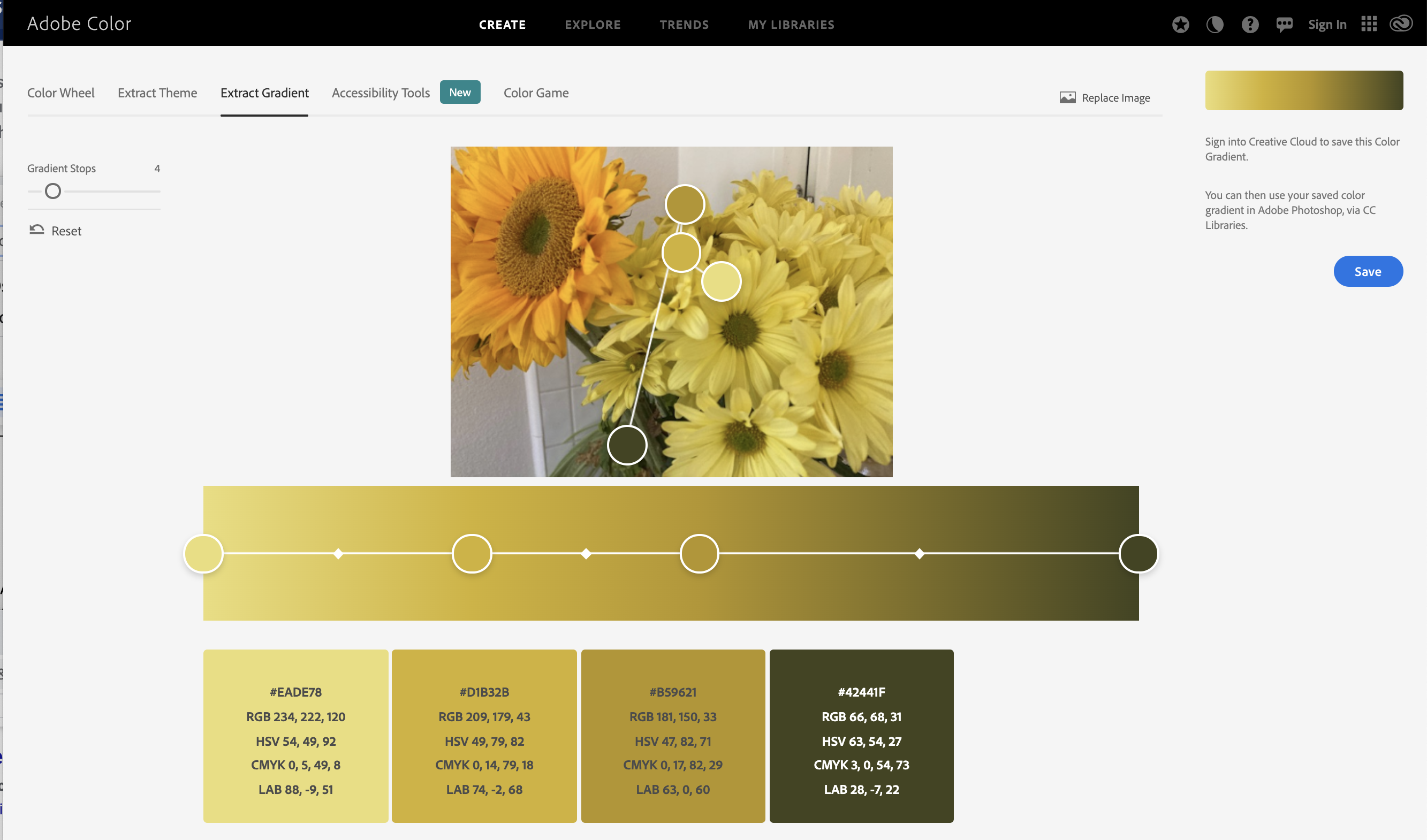
For the activity01, screencapture the outcome.
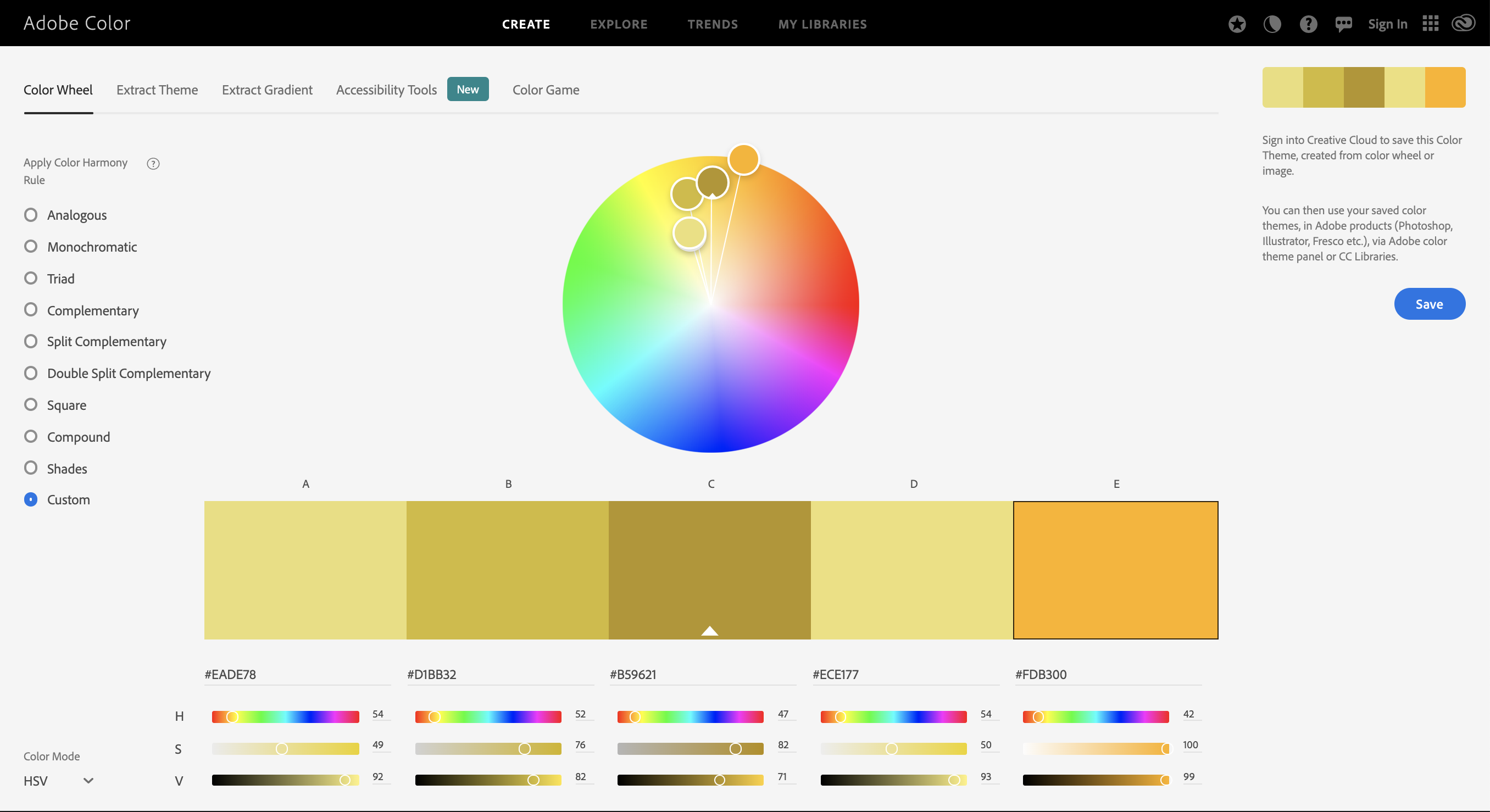
color comparison (for activity02)
- While you have the color analysis screen, pick the color you want to put (copy the hex code)
- open another window/tab; goto https://color.adobe.com/create/color-wheel > choose "Custom" on the left.
- paste the color hex code in the color-wheel tab
- repeat to paste five color codes
- compare the colors -- how would decide they are different or same color?
- it may be helpful to change the color mode in color-wheel as HSV (since RBG is not very easy to understand)
How to experiment with harmonious color schemes
color scheme: arrangement and combination of colors, color juxtaposition.
- Visit https://color.adobe.com/create/color-wheel
- pick one color - and change the harmony rule (left side bar) to understand the possible color scheme
- monochromatic
- analogous
- complementary
- shade
- I would recommend you to refer the theme as a reference -- not as your final choice.
https://material.io/resources/color/#!/?view.left=0&view.right=0
This is useful to check actual interface design in material design layout.
(extra - may be skipped for the later week)
How to draw abstract forms (vector, a pen tool)
How to master pen tool
How to save as svg (scalable vector graphic format)