Week03.01 Color theory - UX-UI-Design-Lab/DH150-viz GitHub Wiki
Agenda:
- Designer's colors (Storytelling with data ch.5)
- Meaning of colors, color code / symbolism
- Color theories: in culture, in physics, in psychology
- Harmony + interaction of colors
Q1: What went well and/or what was a surprise you learned during the process of redrawing?
You might have felt that this assignment was a click business (because you know how to draw a graph, maybe from your 4th grade in elementary school) -- so hope everything went smoothly. But we want to hear about your thoughts during the analysis, replication, and redesign of the information. What was something you learned from your experience of dealing with the design creatively interpret the data?
- Was it okay to understand/ see the data? What did you find about the effect of the illustrated images and texts (relay) - when you removed the supplementary graphics) what did you feel challenged?
- Do you think your information design can successfully communicate with the general public as the old design did?
- What do you think you may want to do it differently if you can dedicate more time?
For me, I always feel grateful to use digital computational technology. It helps me plot the graphs so easily without errors - if I need to plot the data manually, well, I might have missed some possible design spaces with the data -- type of charts, variation of the scale, variables. Also, It prevents me mistakes in numbers/data input. Something I felt limited is about graphical representation, what might have done so simply by hand drawing but not so easy or not provided by a digital viz tool (or hidden, not easy to use). For example, in Google Sheet demo, I wanted to resort the data as in a different way but not easy to do so. Relocating the labels are not easy as well. I think as much as digital viz tools open the possibility, it also limits the some other possibility.
In this week, we will dive into the visual attributes in detail, starting with color.
So, how did you use the color in your assignment02? what did you map with color? Did you have different hues -- then what were the hues you used (by name)? Did you apply different kind of shades? How did you use the changes in hues (or shades) to represent what? -- or did you use the default color the visualization tool set for your draft graph? (and then, WHY...?)
In the reading (storytelling with data, ch.4), you can see what people want to use color for. 1) drawing your audience's attention; 2) highlight the important parts of your visual; 3) maybe you can express your personal taste with your favorite color (?? if saying, because I like blue and it makes me happy and so on... which I don't prefer to listening from my assistance).
In the reading, The guidelines how to use color were listed
- use it sparingly
- use it consistently
- consider someone who can't tell the colors (=accessibility)
- conscious of the tone color conveys
- consider the brand colors
Think it in this way -- every color cost money -- it is a kind of a luxurious item in your design property, not like "would be good to have as much as I can" because it costs a lot (mentally and technologically, and energy_wise as well). So, please use the color when you can expect a certain positive effect.
(You can find the examples very easily -- when you search with the keyword "bad web design" or "bad color scheme" -- most of the bad examples have used too much saturated colors without logical reasons and make the interface look super busy and hard to understand the main information)
Again, in the same logic, try to reuse the colors once you adopt -- and keep its usage consistent across the interface/design, then it will be perceived much comfortable (familiarity, mere exposure effect) and easier to use/learn (coded meaning, ex., exit sign is in always green light; danger is always in red) because you don't need to decode the meaning of the color. But if you use the different color for the same meaning (ex. exit sign in pink or yellow sometimes), or use the color for the different meaning (green for go, but sometimes green for stop) when people are really busy and no time to think, it will be very likely cause the error. The interesting cognitive delay has been experimented with Stroop testing. When the color of the text doesn't fit to the name of the color, it will take longer to react. test yourself here
Well, it is great to see more and more people understand the importance of inclusive design -- As a designer, be considerate for someone who don't see the colors as you do (or color accessibility). There are (surprisingly) many people who have issues on color processing, some people cannot see the difference between red and green, some people cannot bear with too bright background.
The chrome extension will help you to check how some people with limited color vision would see your design:
https://github.com/LeonardoCardoso/Colorblinding
For the web accessibility, the background and the text (foreground) color should be contrasted more then 4.5:1 -- and these are the tools you can check the color contrast:
https://color.adobe.com/create/color-accessibility
https://webaim.org/resources/contrastchecker/
(we will visit this in the part2)
Different color has different tone of voices -- it can be the color (hue) alone or how it is contrasted with others. The meaning of the color and the lots of examples can be found in this video:
(we will visit this "tone" again -- and again in the topic of proportion)
This means, always consider the context when you use the color -- you want to make visual storytelling coherent, so it is wise to check what would be the main color. If your brand has a certain identity color (ex. blue and yellow), you may want to pick your color that can go with the identity color. If the identity colors are highly saturated, you may not want to add any other colors -- so, may be better to use gray scale and white/black as the focus color.
Well, up to here is about a simplified "do vs. don't do" guideline - but in the below, I want you think about the theory behind.
First, let's think about what "color" is. What is this color?
We can say this car is in red - but we know that when we check the car in the garage (with less sunlight), it may not look this kind of red. Also, if we see it at night, the color may not look red after all. As Monet captured, the perception of color depends on the light - time of the day or the weather. This is the color what we perceive.
Second, there is an information about the color, though, we can communicate with. Snow is white, Strawberries are red. The car again is red - it is painted with -- for example, Torch Red (C7) for Corvette, Victory Red of Chevrolet, or Viper Red of Dodge. It has some specific chemical/substance information (color code or name) with which you can get the paint/pigment. In this case, the material/surface characteristics matters -- so what you see in the paint container may look different when you paint on the car exterior. The color also will look different how you apply it with brush or spray; and how many layers either before or after completely dry. (or by learning from my product design training, it also influenced by how much you sand the surface (and how much the material is absorbent), and the primer before the actual color painting and the finishing coat you put after the main color). This is a physics part of color.
Third, there are some individual differences -- depending on something happens in vision system (including eyes). This is a physiological part of color.
Lastly, your previous experience and the culture you are educated/surrounded influence your understanding of the color. Psychology of colors - and meaning.
We will limit the study of color in this course about the colors on the computer screen display (material/physics).
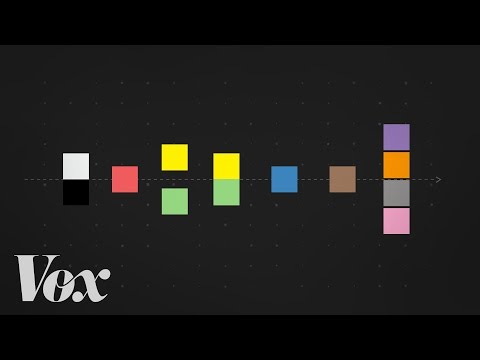
So, let's talk about the color by name. Is it possible to communicate the color with a person from another culture? That is the research question that the anthropologists want to answer -- or in other term, universality of color.
According to this video, what is the third color you can communicate with other people except white/black?
Do you agree that if people cannot communicate the colors if they don't have the language for that color?
Does it mean, people cannot perceive the color, if people cannot tell the color?
Again, can the color be a universal language?
I would say that there is at least a universal way of communication about day and night (light and darkness) -- or value of color. And then, we can talk about intensity (or saturation, chromatic) how much it can look differently from grays. (well, in the situation you don't have much light -- for example, look at something and then squint your eyes and look it again.)
There are some colors that used globally to represent a certain meaning -- like traffic signals, airplane wing lamps, or electronics.
 |
|

|
People use the color for coded message -- In traffic signal, red means stop, and green go. In navigation system like airplane or ships, the red light on left while green on right (for the observer, green on left and red on right) - so people can tell if the vehicle is coming toward to the observer or facing away. Electronics, black means usually ground and red is for power.
According NASA's design guideline, which is hugely based on human-factor/ergonomic research:
-
The number of colors used to code information should be kept to a minimum, not to exceed 4 colors for casual users and 7 colors for experienced
-
Do not violate population expectations regarding use of color. Several examples of population stereotypes are:
- Red: indicates Stop, Warning, System Operating Out of Tolerance
- Yellow: indicates Caution
- Green: indicates Go Ahead, System Operating Within Tolerance
- Color codes should be applied consistently throughout the system; colors should have the same meaning on each screen that the system can display.
This color code can be used as the cultural context - so it is better to follow that expected meaning in the specific situation.
But, this kind of code is arbitrary -- it is agreed to use a certain color for such a meaning. It should not be assumed that users would intuitively know such codes. (Did you know that a red lamp on airplane indicates the direction of movement?)
For example, Red can be perceived as "attractive" in some cases that may encourage an approach behavior (ex. let's talk to that girl in red dress), but in some cases, Red can be perceived as "danger" and evoke as avoidance behavior (ex. oh, my it looks poisonous, let's not touch that mushroom, i.e., aposematism). It is all about the context, spatial context, temporal context, and cultural context around the color presented. reference01: approach vs. avoidance behavior (Meier et. al., 2012)
Experiencing colors are related with the sensory system -- vision. But the assessment of what has been sensed can be different -- like the same lukewarm water can be felt as hot or cold depending on context. In the critical review of color studies, Wise (1988) reported that there is no evidence that specific color(hue) in the surroundings would cause special physiological reaction; but it influenced perceived temperature, weight and spaciousness. reading01: The Human Factors of Color in Environmental Design: A Critical Review, B. Wise & J. Wise (1988), p.53-80 The studies reviewed in this article give you idea why there are some myths around the color usage and some evidence in experimental setting. More recent review [reference02] in the psychology of color can be found in CCLE.
When you look up some marketing/ consumer research, you can find many experiments in a real marketing setting and the findings still in debate. Many of the hypotheses are inspired by the work of Goethe's Theory of colors -- Please watch this short video: color and symbolism
This site has many good design examples by each color: https://www.canva.com/learn/color-meanings-symbolism/
- Red – danger, passion, excitement, energy
- Pink – feminine, sentimental, romantic, exciting
- Orange – fresh, youthful, creative, adventurous
- Yellow – optimistic, cheerful, playful, happy
- Green – natural, vitality, prestige, wealth
- Blue – communicative, trustworthy, calming, depressed
- Purple – royalty, majesty, spiritual, mysterious
- Brown – organic, wholesome, simple, honest
- White – purity, simplicity, innocence, minimalism
- Black – sophisticated, formal, luxurious, sorrowful
The color symbolism/ theory may lack of scientific evidence -- but rather it is used as cultural code. It is hard to explain there is innate meaning of color -- Therefore, if someone believe that the color works in a certain meaning, the design with that code would work for those who believe so. But it is buyer be-aware -- [reference: Colour Psychology and Colour Therapy: Caveat Emptor by O’Connor (2011) in CCLE]
Would you buy this kind of chocolate with an interesting color? Do you think this new style of chocolate color add the value and people would be willing to pay a bit higher than normal chocolate?

A Similar but more luxurious case in Art -- Do you agree or disagree whether the color can be owned by a certain person as a brand/identity?
Color is a "subjective visual sensation produced by light" -- These videos can be helpful to understand the interaction between the Nature (physics) and the Body (eyes). [reading02: The Eye and the Visual Brain (Ch.5, Functional Art, p.97-105) by A. Cairo] in CCLE
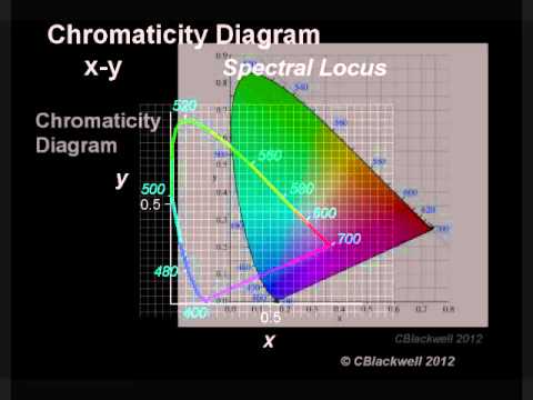
This video (20 min] is so far the best I feel for the explanation of color space (CIE 1931)
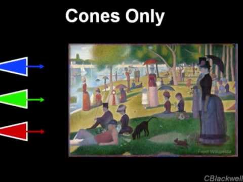
This video (also 20min] will explain how eyes catch the visible spectrum.
Basics understanding of color: hue, value(lightness), saturation(intensity, chroma).
Though a color is uniquely defined by its hue, value, and saturation, the color is not effective alone - it always used with other colors and define itself by the interaction with other colors. Here are some color illusions the color can be perceived differently by the context.
These examples demonstrate that how easily our eyes can be deceived -- the same color looks different by the surrounding colors.
Using the color in harmony, therefore, is a contrast/complement often considered as musical or mathematical proportion. We will revisit this link and experiment on Week5. reading03: Interaction of the Colors, Ch.XVI in CCLE
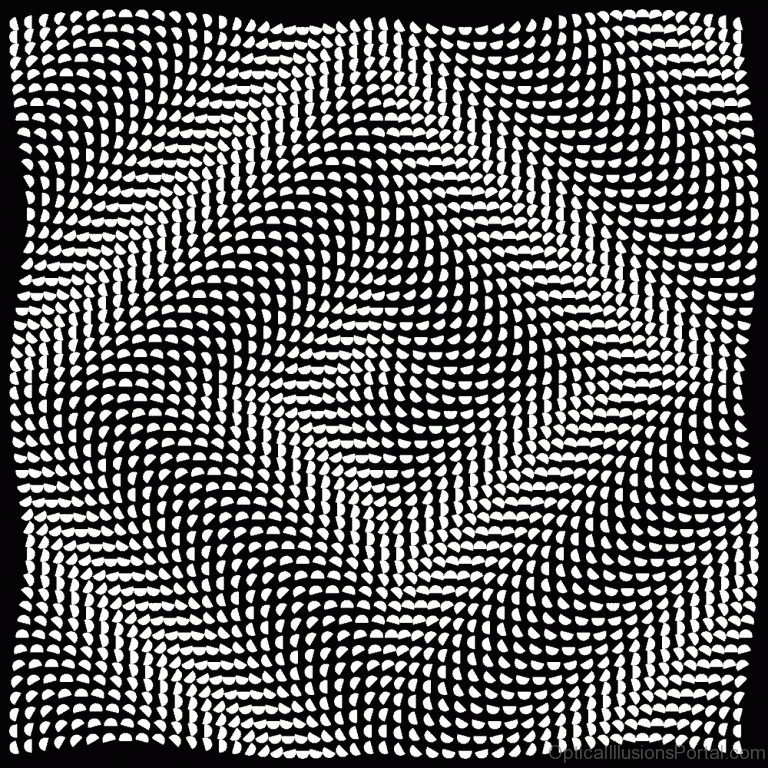
Some guideline how to juxtapose the colors for harmonious feeling is to reduce the contrast (monochromatic, analogous); or have a clear contrast (complementary). It is because our eyes scan the color linear way (one spot at one time) and that influence how we perceive the next color -- after-image. Many optical artworks utilize this effect to create an illusion as if the image is animated/jiggling/rotated...
Read more about (negative) after-image effect here, when you stare one of the work and quickly move your eye focus into white space, you can see the complementary colors of the image -- https://www.illusionsindex.org/ir/negative-afterimages
Conclusion:
This video has wonderful summary of color theories -- from the linguistic perspective and a short animation of the book Interaction of Colors (ch. 1, visual memory). And brief introduction to the assignment I want you to practice in Activity01 -- this is how I was trained to analyze the colors.
Next step: Refer to Part2(color practice) demo and start the activities and share your output link in Forum, by Thursday midnight. I will provide a demo/ Q&A on Tuesday class time (and record).
Activity01: collecting colors
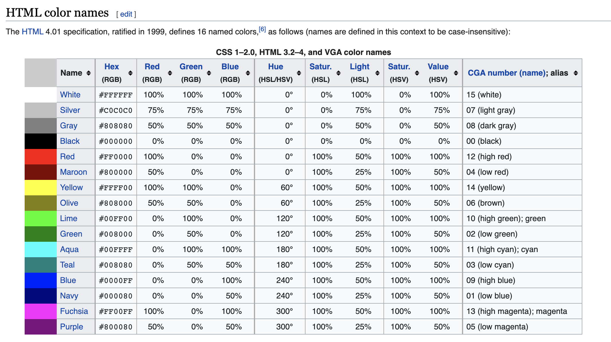
- pick one color from 16 web_color by name, the range of hue can be broader than the code
- collect colors search for the color around you -- take as many pictures as you can, whenever you spot the color, both from nature and from designed objects/space. -- Min 30 ~ Max 100 pictures.
- analyze the colors
- group resemblance (how those can be called by the name of THE COLOR, ex YELLOW)
- analyze the color scheme in context: monochromatic/ analogous/ complementary
Make a google slide (or similar) to show your collection
- first page with the color name (and color code)
- analyze the colors using Adobe Colors > Extract Theme; you can also try the mobile app, adobe capture. Screenshot your analysis.
- organize the analyzed color schemes; label if it were monochromatic, analogous, complementary. Put the same kind of color schemes in one page.
- pick five colors from the analysis that you feel that you can make a monochromatic color scheme; compare the five ones (In the color wheel > Custom, and put the five color codes). How do they look similar or different? What kind of difference can you see between the chosen five colors? why do think they can be called as the color name? Provide the screenshot of the color strip and your explanation.
The example of work (activity01: color analysis) can be found here.
Activity02: Color contrast
Pick two colors you abstract from color analysis; use one color as a background, the second color as a text color
- Use any web accessibility tool, check the color contrast between them. Screenshot the result (original).
- If the pair of the colors doesn't pass, adjust the lightness and make them contrasted more than 4.5: 1 (adjusted)
- Switch the background and foreground/text color, Screenshot the result (reversed) - Compare with the original, which one do you think better to read, or which version do you feel aesthetically pleasing?
- arranged all original, adjusted(if applicable), reversed versions and add a description about which one you would choose to adopt and why.
The example of the work (activity02: color contrast) can be found here
Practice: (harmonious) color scheme
Activity03: Research the web/app user interface design of the children's learning. It is for preschooler under five, who cannot read by oneself, so the long instruction won't be helpful. It may teach color, shape, number, or alphabet.
Surprisingly, you can find a pretty good amount of high-saturate and over-colored screens
- pick one bad screen design of that app you analyze - provide the screenshot
- and criticize what can be done better for the harmonious color scheme and for information design (you can talk about pre-attentive attributes, accessibility, ...).
Assignment03: You will redesign the interface of the screen of the children's learning web/app that you analyzed. You may simply the contents or add more relevant contents.
What we learned today:
- different aspects of color -- interaction between objective traits and the subjective process.
- universality of color -- communicability in different level of color information (physical, physiological, psychological, cultural/semiotical)
- effect of color on our perception and evaluation
- interaction of the colors, how the same color can be perceived differently by the context (or neighboring colors)
- color scheme.


