Week02.02: misinformation - UX-UI-Design-Lab/DH150-viz GitHub Wiki
Agenda
- Pre-attentive attributes (storytelling with data, ch. 4)
- Visual perception of graphics
- Relative judgements in perception + visual illusion
- Mis-information analysis (chartjunk)
- Assignment02
demo
In this part, we will learn how the message can be different from what designers meant - or when/how the graphics can be ineffective and inefficient. Assignment02 is designed to help you practice diagnose the potentially unsuccessful visual mapping.
Pre-attentive attributes
It has been questioned whether the image is what our mind created or what the object engraved in in our mind -- In cognition theory, researchers explain that it is the interactive process between the objective traits and the subjective processing. There are some attributes out mind and eyes are optimized to process so quickly, it is like a magnetic -- a certain visual attributes "pop out" and so easily distinguished from the background. For example, you can easily see the letters in the different shade comparing to the letters in the same shade; in different size, or in different orientation.

The Functional Art, A. Cairo, p.114
So, it seems that when we perceive the world there are several level's of processing -- visual hierarchy. If we apply this attributes in information design we can help users/readers what to pay attention first and next.
Visual perceptions of graphics
However, when the comparison within the perceptual attributes, our eyes seems to well-trained to recognize subtle differences much better (and accurately) than another - changes in the position is least likely missed or mistaken, but color saturation may not be noticed. Cleveland and McGill experimented with some graphs (for analyzing scientific data) and found that some information are harder to be recognized depending on how it were visualized. For example, human brain doesn't seem to work for sharp comparisons in angels, directions, curvature, and area.
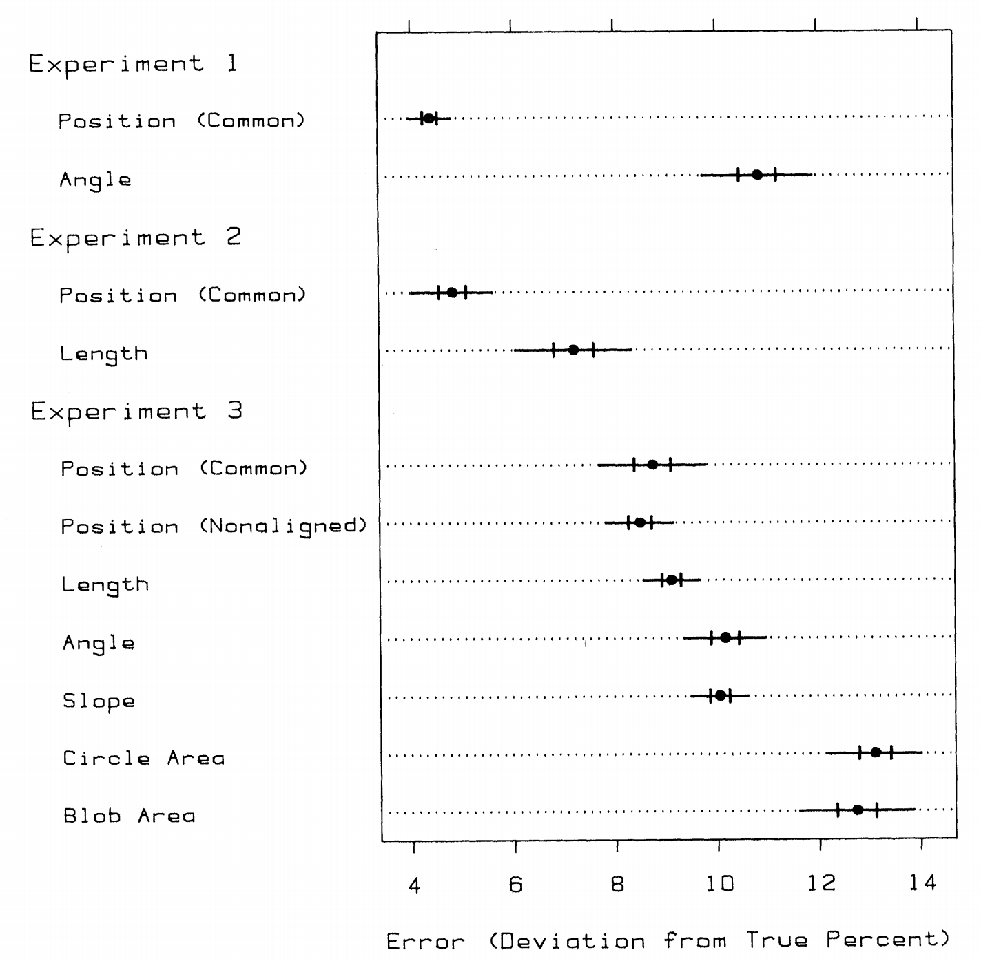
Graphical Perception and Graphical Methods for Analyzing Scientific Data, Science, Cleveland & McGill 1985
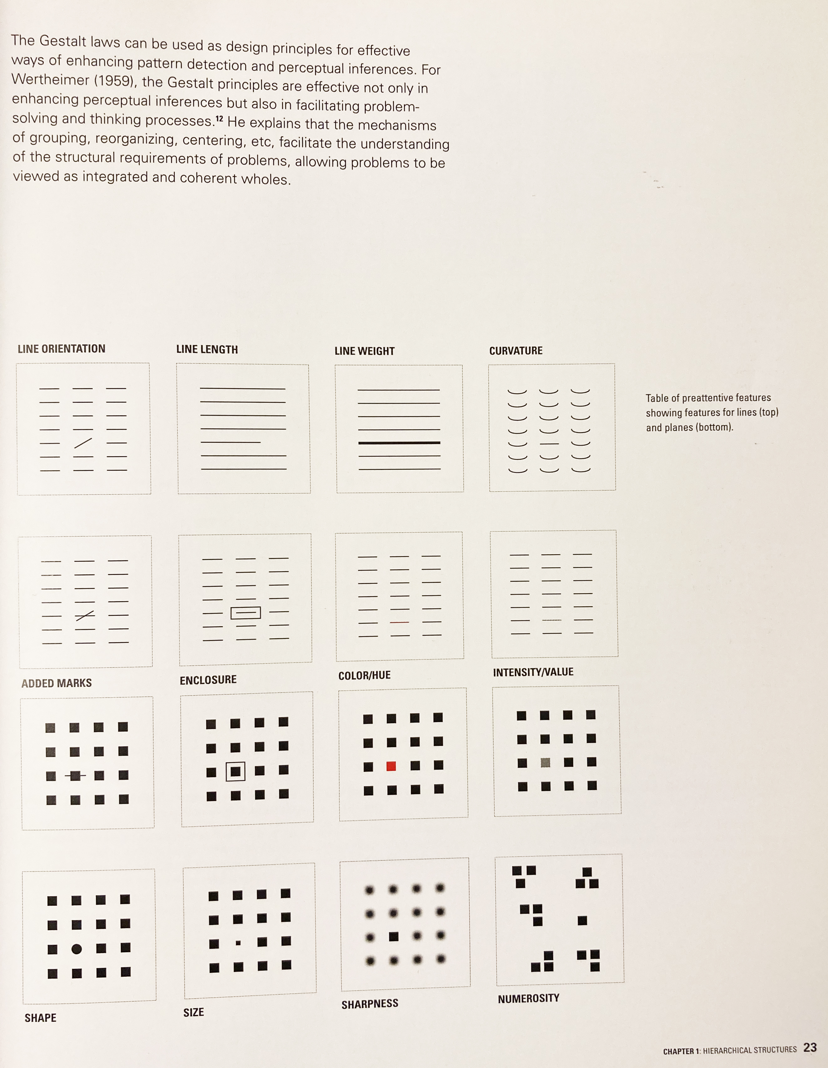
Design for Information, I. Meirelles 2014
Relative judgements in perception + visual illusion
Even though we perceive the same element in same attribute, the context can influence the judgement. First, psychological magnitude may not be linearly correlated with the stimulus magnitude (visual element's attribute). For example, when we increase one unit of length, we perceive the length one unit increased; but when area was one unit increased, the perceived area in our mind is not one-unit increasing but less than one. (therefore, we are not good at guessing the area). It implies that our visual mapping of quantitative scale can be perceived more or less than what the designer intended.
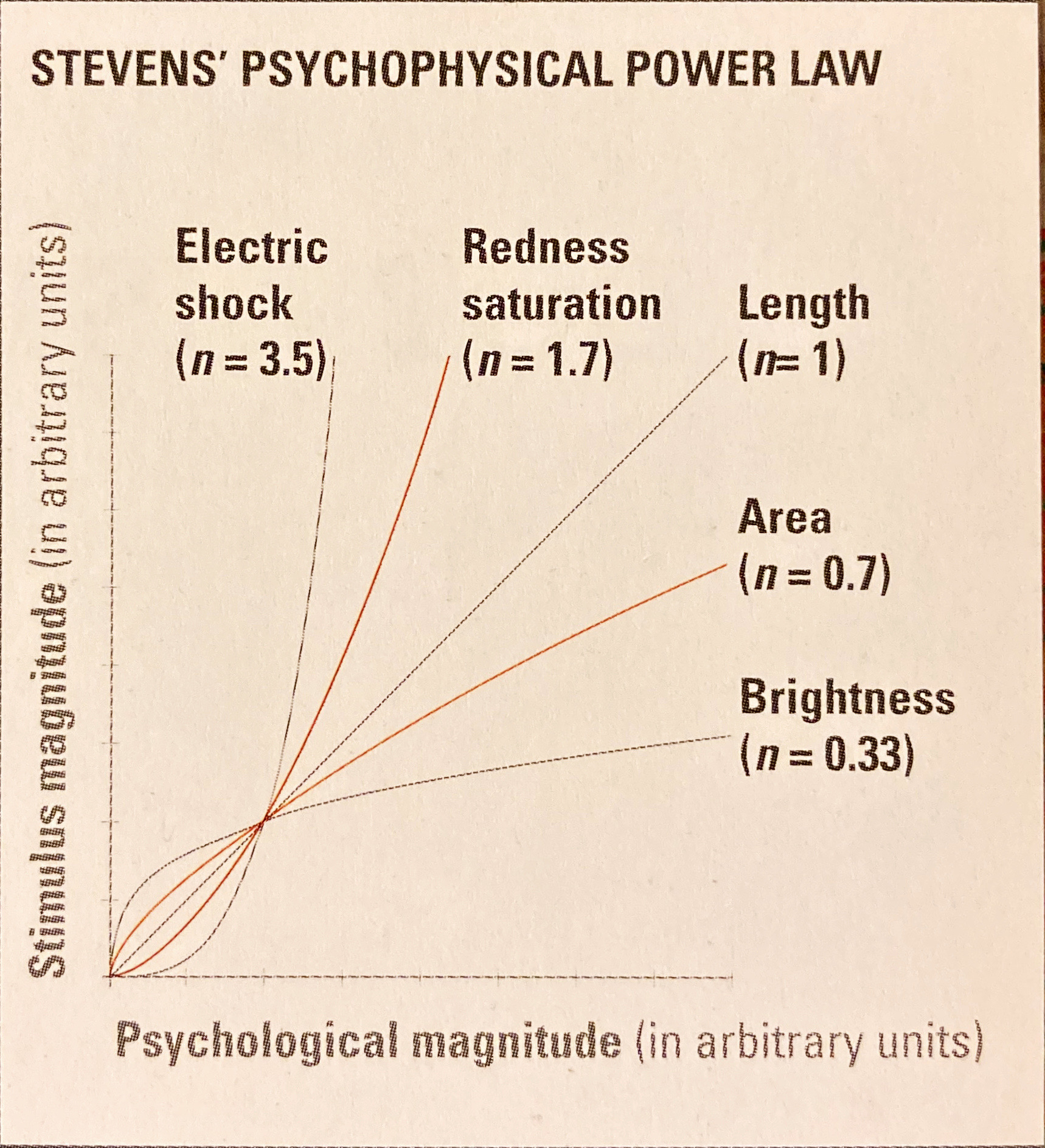
Design for Information, I. Meirelles 2014, p.129
Also, other graphical elements in context can influence the perceived value of the graphics. For example, the same sized circles would be perceived smaller or larger when it is surrounded by the larger or smaller circles (= Ebbinghaus illusion). The lines in the same length can be perceived longer or shorter depending on the background lines (Ponzo illusion) or the shape at the end (arrow inward or outward, Muller-Lyer illusion). the same color can be perceived lighter or darker depending on the background (White's illusion). The parallel lines look angled when it has short lines with a different angles.
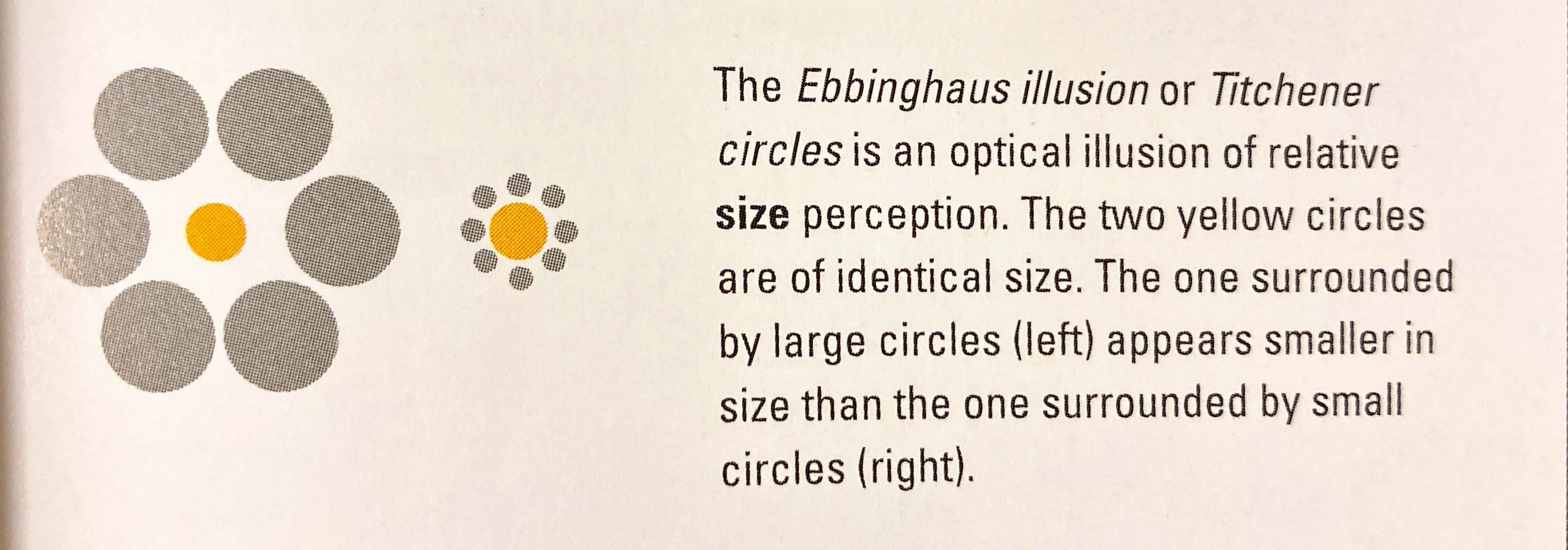
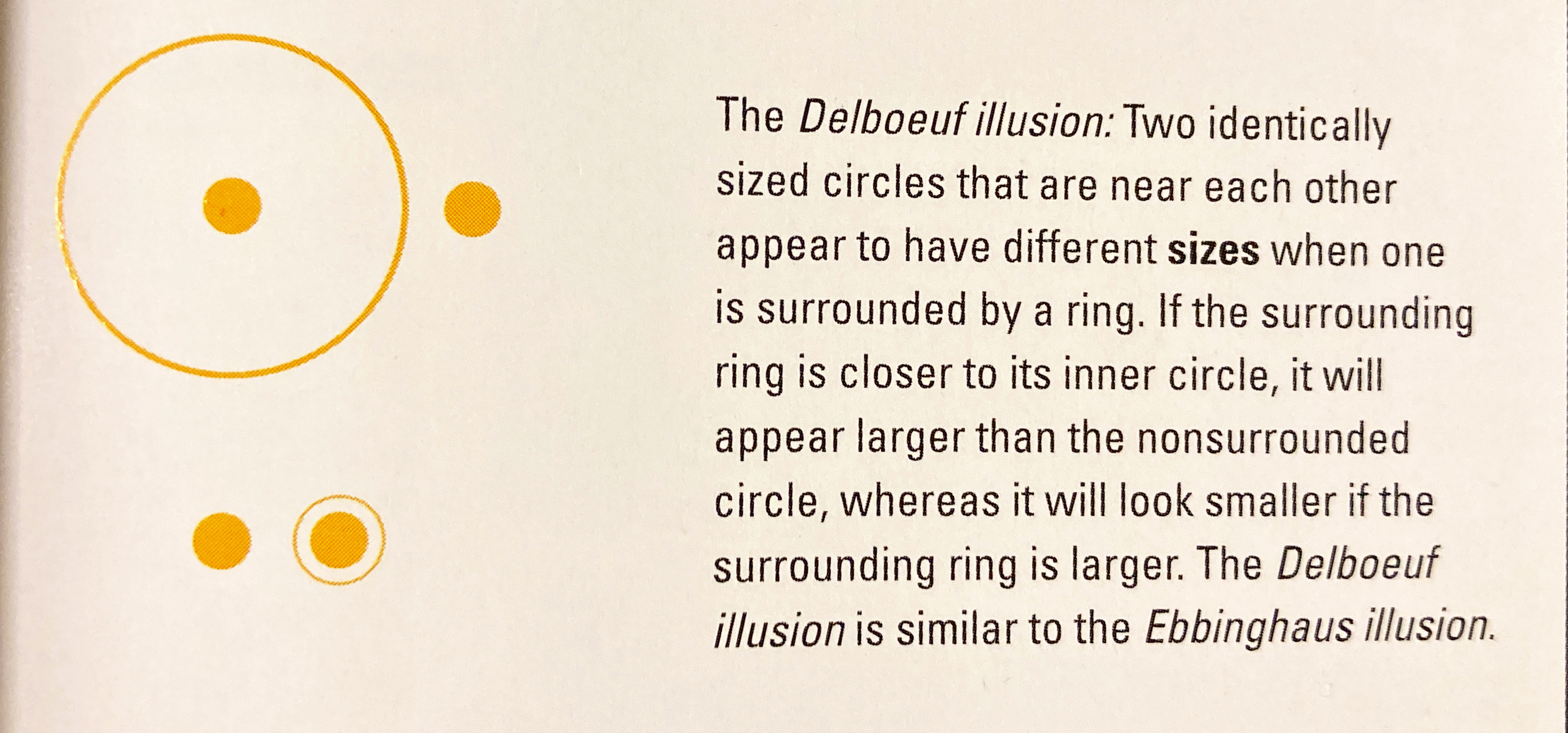
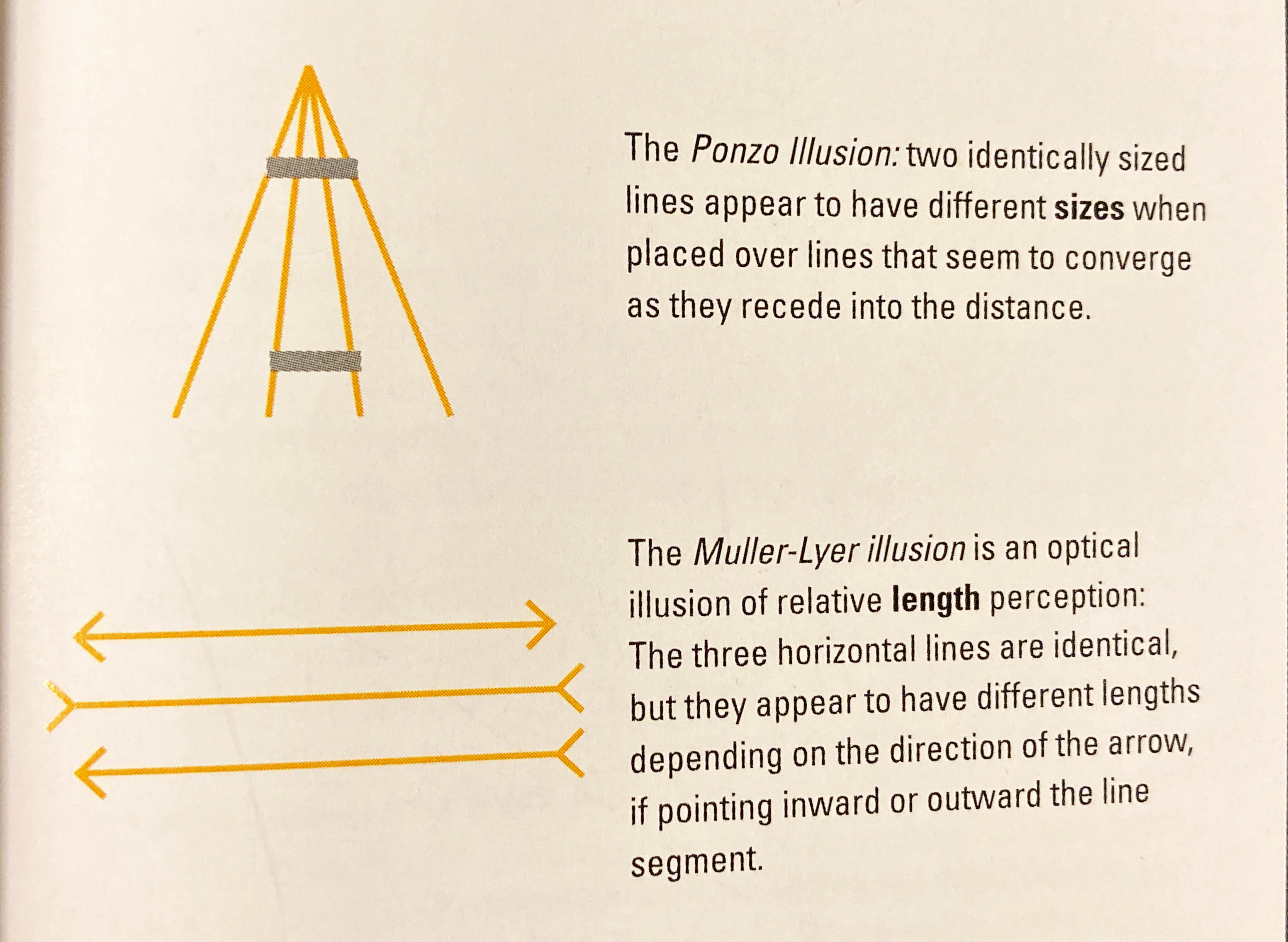

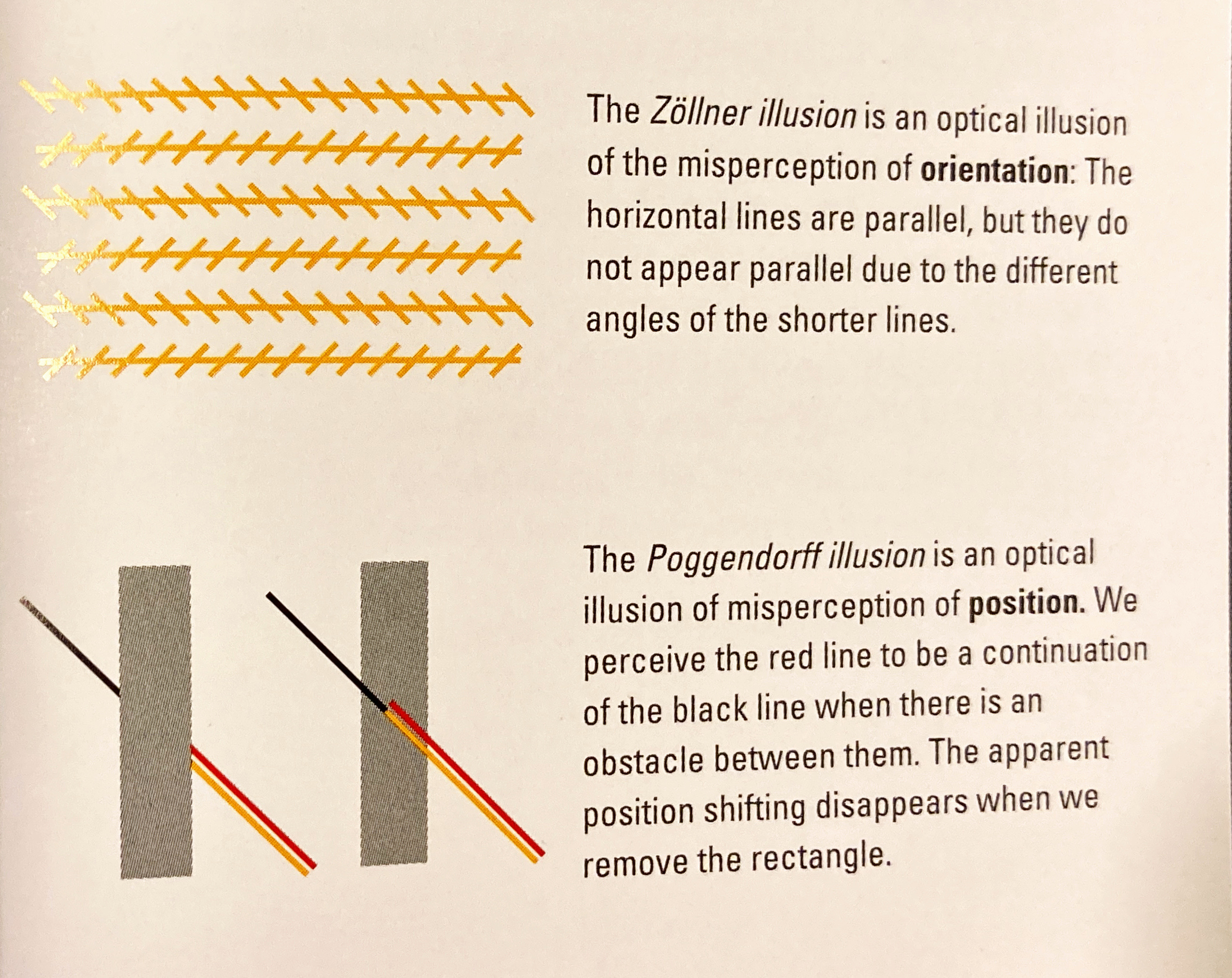
Design for Information, I. Meirelles 2014

https://blogs.scientificamerican.com/illusion-chasers/the-best-illusions-of-the-year/
Well, with some reason we add something (ex. meaning) more to what we see. This is what Gestalt psychology are interested in "wholistic perception, in which multidimensional stimuli were perceived in an unanalyzable whole. This tendency makes us hard to distinguish the difference in parts -- when the whole is what we are familiar with (ex. culturally coded). Chernoff's FACES (1973) is an interesting experiment. You can assign, for example, the city's data into the facial features (the rating of a city's health-care facilities to the curvature of the mouth; pleasantness of climate to angle of the eyebrow.)
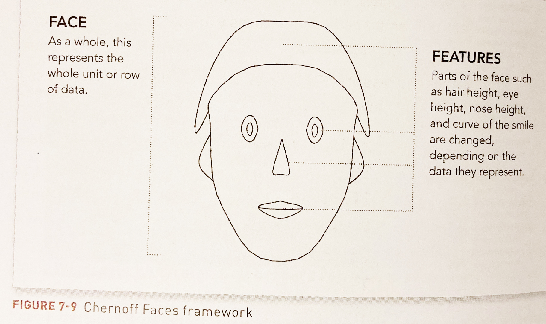
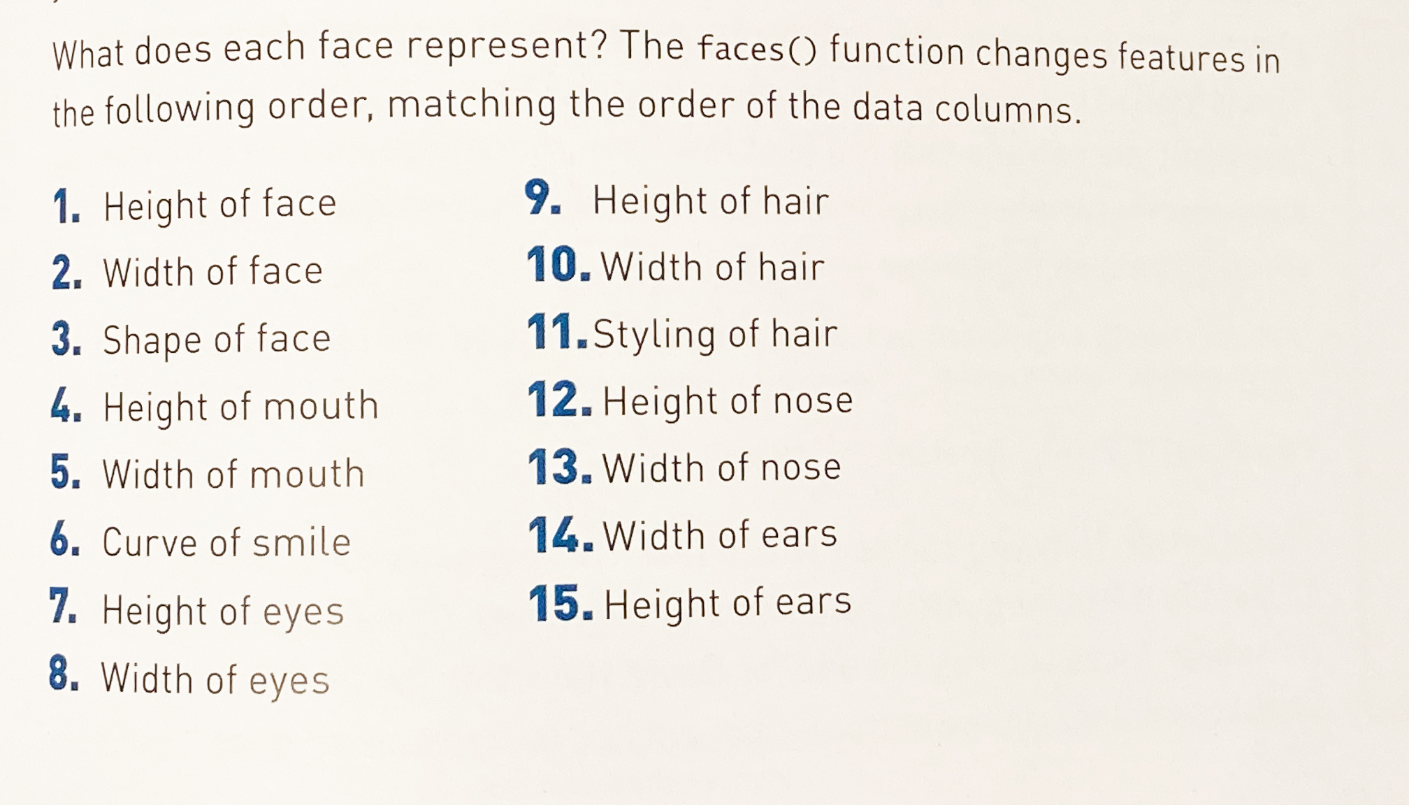
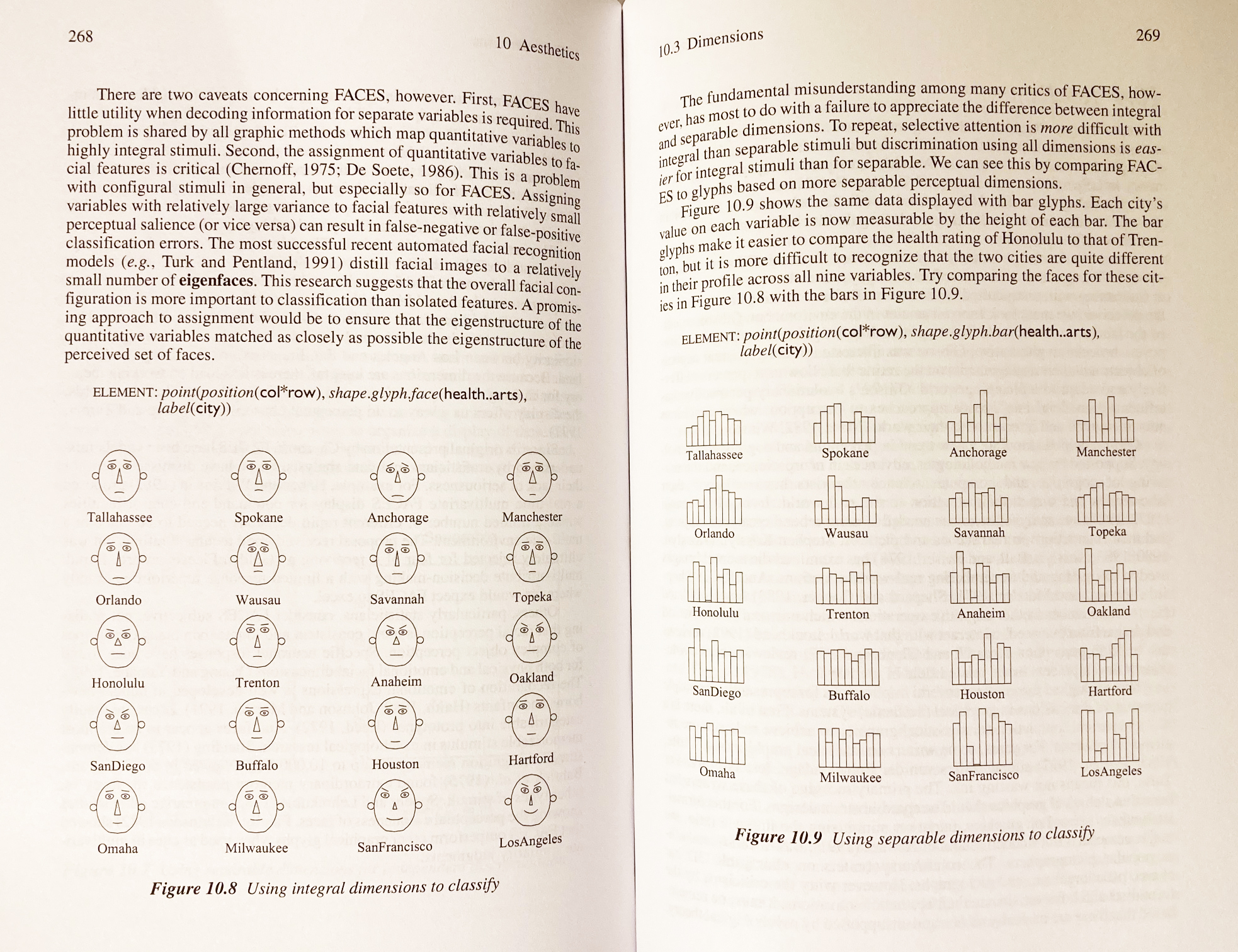
Visualize This, N. Yao (p.238-243) | The Grammar of Graphics, L. Wilkinson (p.268-269)
Can you see what Los Angeles is like as a city? Can you compare LA with Orlando - and what do you see?
How is this FACES effective or ineffective? Comparing with Bar chart, what do you think integral dimensions in FACES fail or success?
the answer is that it is very hard to recognize the details - selective attention is difficult with FACES. But we can clearly see how city life between LA vs. Orlando would be different as a whole .
Mis-information, Chartjunk
Therefore, it is critical to control the unnecessary visuals. Not only it is waste of resources (data-ink ratio, E. Tufte), but also the unnecessary visuals disturbs people from seeing the data. Showing the data clearly and accurately. You can find Do vs. Don't dos in the reading below.
Readings:
- Visual Display of Quantitative Information (ch1, 2, 5, 7, E. Tufte, ccle)
- How to Display Data Badly Wainer, 1984
Take a note and list out what you think make a good graphic vs. bad graphics. You will need your summary of reading for your assignment.
So, can you see why these graphics are problematic or what did Tufte criticize them about?

for more of recent Nigel Holmes works, click here
Q4: Analyze visual attribute of mis-information
please navigate those charts and pick one work to analyze and right-click on the image > open Image in New tab in order to see the large version.
- criticize what visual attributes/ graphic components were not properly used;
- explain your draft idea how you think you can make it better.
This work of choice will be the one you will redraw to make it simple and easy to understand for your assignment2.
But, it should be noted that, from the creativity standpoint, those works are pretty interesting -- Please check these readings about how such illustrated graphics works: fun and memorability.
- The functional Art, ch. 3: Engineers vs. Designers (ccle)
- Useful Junk? Bateman et al., 2010
Assignment02: Redrawn simply
In this assignment, I want you to choose any one work of Nigel Holmes and redraw it 1) for a scientific data presentation and 2) for a general magazine for public.
Detailed instruction/rubrics can be found here and the demo script here.