Week04 01 Buttons - UX-UI-Design-Lab/DH150-UX-WebCoding GitHub Wiki
Objectives:
- Review a:focus and :hover
- CSS border, filters, cursors, visibility
- Activity: buttons
- Assignment04: tab-index
To start with, I would like to check your experience of interface design in color variation. (and other fun ideas that might come to you to apply some "styles" including animation.) What was the feeling like to have a power to control the visual outcomes? (was it exciting, satisfying, and/or scary, intimidating...?)
https://www.w3.org/WAI/WCAG21/quickref/#use-of-color
About color contrast, what was your tactic to choose the color-pairs (background vs. foreground) by considering web-accessibility? What did you learn about the contrast-ratio 4.5:1, was it easy to satisfy the ratio? (or not?) Which tool(s) did you used? Any review on the tools?
Let's start with the color. We have two main colors in use (background and text-foreground). But you may have felt, you need to use another color for interactive contents, such as hyperlinks and buttons. These are often called "focus" color that draw main attention of the users for a "call for action". This focus color really needs to distinguished but not too disturbing way - also harmonious with the background and text-color, and the necessary visual elements (like brand-logo color scheme). I will ask you to include the core visual (the brand-logo) for reference. (and you may need to adjust your color scheme, if you haven't refer to the logo colors). Let's review your design and see what would be a good candidates for the focus color.
The useful tool to abstract the colors is https://color.adobe.com/create/image
You can upload the logo image and analyze which colors are used (and get the color codes). I strongly recommend you to use this type of the color analysis tool (or similar), not depending on your own eyes. Because the perception of the colors are very sensitive to the context, so what you think as the color (ex. red) may not be the red precisely. Also, you may keep in mind that the color in use (code) can be the mixture of several layers (by opacity or alpha).
If you pick the focus color, you need to check the color contrast to the background. And if the focus color is used for buttons (=background), you need to check the button-label text color too.
Suppose that we have decided a focus color. Then, let's make a simple button.
I will test with the "skip to content" hyperlink.
I reviewed the getty front page (https://getty.edu/) - the logo is luckily black and white. And it seems that they used blue as the focus color (or hyperlinks) mainly. When you inspect the element, you can find the relevant css code when you open the styles tab (usually there are several windows below the html code - see the screenshot below).
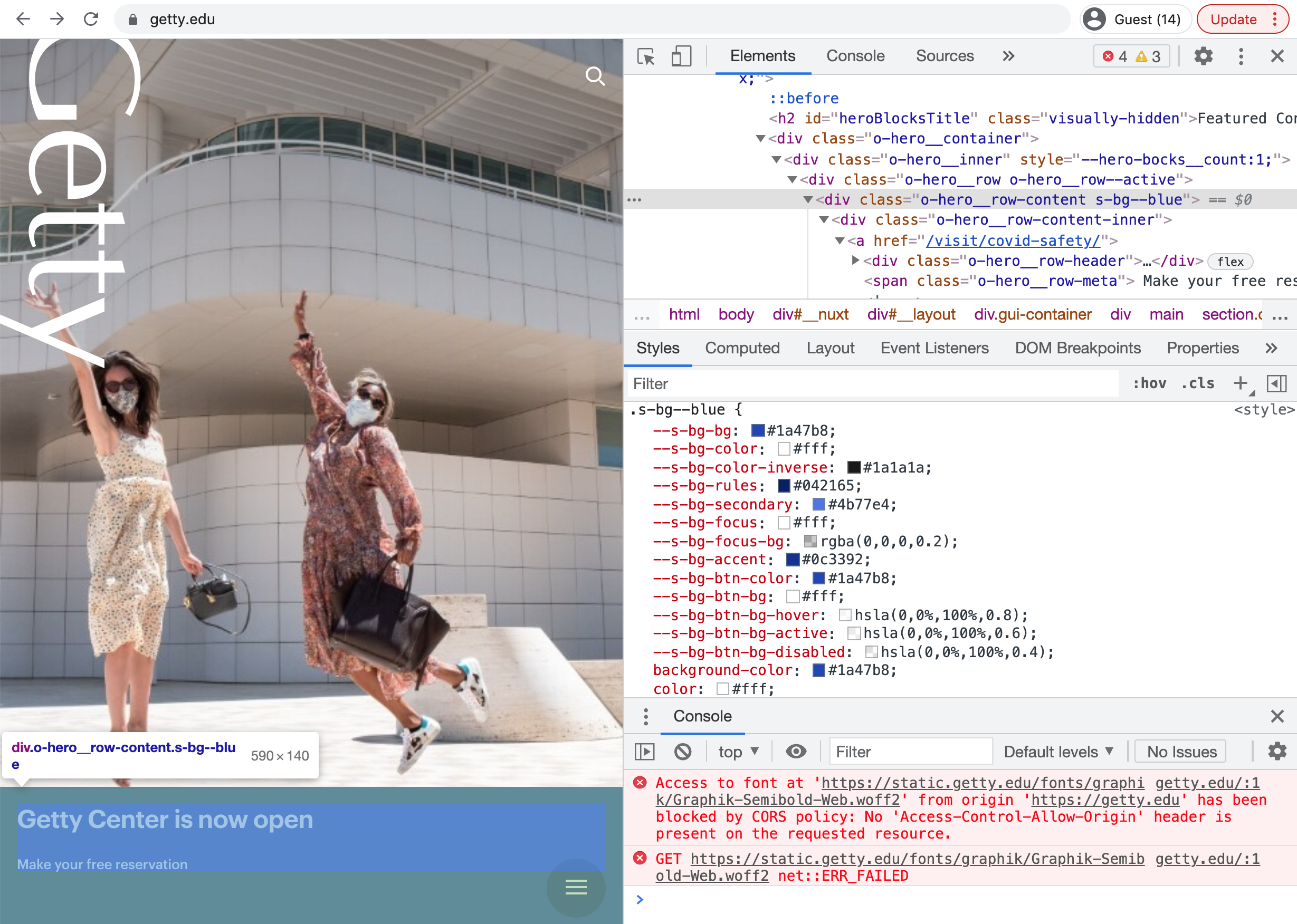
It is interesting to see that how many blues they used!
(if you are curious about --*, it is a variable definition - you can define variable in css and use the value whenever it is needed. Read more here: https://developer.mozilla.org/en-US/docs/Web/CSS/Using_CSS_custom_properties)
Let's use that blue #1a47b8; as button background. And if I use white - the contrast ratio seems very good, over 7:1 (WCAG2.1 AAA level) https://contrast-ratio.com/#white-on-%231a47b8
 a {
      color: #1a47b8;
 }

 a:hover {
      background-color: #1a47b8;
      color: white;
 }
and also, when it is focused
 a:hover, a:focus {
      background-color: #1a47b8;
      color: white;
 }
We will explore some CSS properties to decorate the style of hyperlink that looks more "clickable".
Since I would like to develop my own style about button, I think it is good to make a class (so I can apply that style to the multiple items). Let's call it myButton. I can rewrite all again with `.myButton'
 .myButton {
      color: #1a47b8;
 }

 .myButton:hover {
      background-color: #1a47b8;
      color: white;
 }

 .myButton:focus {
      background-color: #1a47b8;
      color: white;
 }
Then, in <html> ... <a ... I will add the class information to "skip to content" and "back to top".
<a class="myButton" href="#main"> skip to content </a>
   ...
<a class="myButton" href="#main"> back to top </a>
Test the preview, hover the mouse over those hyperlinks.
Let's make the area visually polished (this means, it won't affect the accessibility but only increase (maybe) perceived friendliness.
First, you can make the rectangle (in focus color) rounder by using CSS property border-radius. By default the radius (at the corner of the rectangle) is set as 0, so the corner is in a sharp 90deg or right angle. If you increase the number, the corners will turn rounder.
 .myButton {
      border-radius: 10px;
      color: #1a47b8;
 }
You can put the absolute value (in pixels or em). Or, if you put %, it will calculate the ratio of the length (width of the rectangle vs. height). 50% is make the corder like circle (or ellipse, depending on the ratio of the rectangle or box).
 .myButton {
      border-radius: 50%;
      color: #1a47b8;
 }
for the basics of border-radius -- https://developer.mozilla.org/en-US/docs/Web/CSS/border-radius
The value 50% is actually short-hand of the ratio 50% / 50%, the first 50% is from horizontal and the second 50% is for the vertical.
 .myButton {
      border-radius: 50% / 50%;
      color: #1a47b8;
 }
If you want to change the ratio, you can use / to define the ratio. For example, if I want to have 20% from the horizontal and 50% of the vertical (the height of the box), `20% / 50%'. CSS will calculate the number and set as the radius of the border.
If you want to have circular ends, the easiest way is to set the border-radius by the half of the height of the box (or the smaller length either width or height). I set the line-height as 2.5em and set the padding 1em, so the height would be 4.5em = 2.5em (content height) + 2em (top + bottom padding). The half would be 2.25em. (or more, it won't change the rounding more rounder visually, if you put the greater number in this case).
 .myButton {
        padding: 1em;
        line-height: 2.5em;

        color: #1a47b8;
        border-radius: 2.25em;
 }
If you put only one number, the all four corners will have the same radius. But you can separately apply the different values for each corner.
border-radius: 50%;
is actually for the four corners, from the top-left clockwise : top-left, top-right, bottom-right, bottom-left corners. (be cautious, NO comma but Space)
border-radius: 50% 50% 50% 50%;
or separated by each of the four corner.
     border-top-left-radius:     50%;
     border-top-right-radius:    50%;
     border-bottom-right-radius: 50%;
     border-bottom-left-radius:  50%;
So, if you want to make the shape of rectangle looking like a leafy rounded only diagonally, such as top-right and bottom-left, you can try:
border-radius: 0% 50% 0% 50%;
or separated by each of the four corner.
     border-top-left-radius:     0%;
     border-top-right-radius:    50%;
     border-bottom-right-radius: 0%;
     border-bottom-left-radius:  50%;
and again, for this diagonal situation another shorthand would be:
border-radius: 0% 50%;
For the advanced code for border-radius, please check the reference (CSS Secret ch.9 Flexible Ellipses)
Beyond this -radius, you can do more with border. On the very top view, border is a css property to set the outline. The basic values you can start to setup the border are border-width (ex. 1px), border-style (ex. solid, default none), and border-color (ex. black).
border: 1px solid hsla(223, 50%, 50%, 0.5);
https://developer.mozilla.org/en-US/docs/Web/CSS/border
The other way to make the element outstanding is with 3D (or 2.5D) effect. The common technique is to add a drop-shadow so it feels like floating on the screen (toward you). Technically speaking by z-index order (which I will explain later when we cover visibility), you place the item over the shadow effect.
box-shadow is a css property to help you to add such effect (cf. there is text-shadow as well, but I honestly don't recommend you to use it due to the legibility issue, that makes the text hard for users to recognize.)
When you make a shadow, here is what happens. First, you will copy the shape; turn the copied shape to black silhouette (very simply speaking) and put it behind of the shape; push the shadow a bit (= offset) to make that shadow noticeable; may need to skew or distort the shape into the opposite direction to the source of light (ex. so under the sunlight your shadow is under your feet but due to the ground it is shorten/skewed in shape); blur the shadow (to add the reflection); and spread smudge the shape.
In css, if I want to make a shadow, 1px pushed to rightward (x-offset) horizontally, 1px pushed to downward (y-offset) vertically; blur very subtle 2px; and spread it 2.5px; by black shadow:
box-shadow: 1px 1px 2px 2.5px black;
I recommend to apply the semi-transparent color by using hsla() or rgba(), so you can blend the shadow into the background and make the button look more natural. I would use the button color and make it a bit darker and a bit transparent.
box-shadow: 1px 1px 2px 2px hsla(223, 50%, 20%, 0.5);
You can adjust the blur and alpha level to make the shadow look softer.
Check the more options here -- https://developer.mozilla.org/en-US/docs/Web/CSS/box-shadow
filter: drop-shadow()
You can also make the shadow effect by using CSS property filter: drop-shadow():
filter: drop-shadow(1px 1px 2px hsla(223, 50%, 20%, 0.5));
The difference is about no use of the spread parameter, you will set 1px 1px (x and y offset) and 2px blurf effect and the color.
The function accepts a parameter of type (defined in CSS3 Backgrounds), with the exception that the inset keyword and spread parameter are not allowed. This function is similar to the more established box-shadow property; the difference is that with filters, some browsers provide hardware acceleration for better performance. https://developer.mozilla.org/en-US/docs/Web/CSS/filter
More details of the difference between box-shadow vs. filter:drop-shadow() can be found here.
You can do quite interesting (photoshop) effects with filters - like adjusting brightness, contrast, saturation, grayscale, monochromatic(sepha) and changing the color temperature by hue-rotate and inverted.
You can blend the several layers of backgrounds and have quite a similar effect to using photoshop.
https://developer.mozilla.org/en-US/docs/Web/CSS/background-blend-mode
Let's finish our "skip to content" - you may have been curious that how the "skip to content" doesn't show but appears only when it is focused?
There are several css code you can use to hide the elements.
-
opacity: 0;Yes, you can hide it by making transparent! but it may be ghosty if you make the interactive elements as transparent. (not recommended for usability) -
visibility: hidden;This is an old technique that works for the old versions of the browser (like internet explore). It keeps the space but just not shows the element (so a blank big space appear). It may feel likeopacity:0. -
display: none;Some old browsers cannot handle this code, the element (and its space) disappears and other next elements will fill in the space. -
position: absolute; left: -10000000px; top: -10000000px; z-index: -9999999;move the element out of sight (positioning out of browser's visible area, that means somewhere in the negative coordinate on left and top (above the browser). Or, use z-index (very far far away deep). -
width: 1px; height: 1px;and also you can make it really tiny, not so easy to spot, like tiny one pixel square. -
color trick? same color as background (like transparent?)
any other ideas?
We will try webAIM's recommendation:
 .myButton {
      position:absolute;
      left:-10000px;
      top:auto;
      width:1px;
      height:1px;
      overflow:hidden;
 }

 .muButton:focus {
      position:static;
      width:auto;
      height:auto;
      /* add the rest of css code */
 }
https://webaim.org/techniques/css/invisiblecontent/
If you are curious about "auto", check this: https://ishadeed.com/article/auto-css/
I want you to try to make a simple button design as activity01. Please start with your "skip to content" of your assignment03.html
- apply the background-color to make it stand-out; adjust the text color accordingly (check color contrast)
- apply border, border-radius to make the look-n-feel friendly and easy to understand
- apply box-shadow or filter:drow-shadow() to add a shadow effect
- apply padding and margin to make the button look less busy or squeezed
- apply :focus and :hover to make the link more clickable for the context of mouse or keyboard navigation
- make the "skip to content" button not visible on the site at first, but show when it got the keyboard focus (tab).
Rename the work as activity04-01.html, publish it via github and submit the url.
- I will show you how you can convert the social media links into icon buttons (and eventually you need to make them clickable to go to the relevant site).
- and if we have time, let's make a search icon button
I may show, if have time, a demo on side menu or nav bar by showing and hiding (or sliding, collapsing transition).
The goal of this week is to polish the interface, especially key navigations with tab-index (and focus).
https://webaim.org/techniques/keyboard/#testing
https://www.w3.org/WAI/WCAG21/quickref/#keyboard-accessible
Tab-order (focus-order) is expected to follow the (western) reading order. left to right, top to bottom.
https://developers.google.com/web/fundamentals/accessibility/focus/using-tabindex
- All interactive content should be accessible via a keyboard interface.
- The tab order should have the same structure as reading a book. It should be from left to right from top to bottom.
- The keyboard focus should be visible for all sighted users.
- Verify that keyboards can navigate and interact with the web page on their own without the use of a mouse.
For more examples:
https://developer.mozilla.org/en-US/docs/Web/HTML/Global_attributes/tabindex
-
Open your choice of museum site (the original) and audit the tab-order. Make a copy of this audit template and fill in your evaluation
-
Choose one design variation from assignment03 (ex. light-mode) and add interactive items.
- Add all hyperlinks/buttons from the original and test if the links work
- Organize/Optimize nav/menu/side-menu items and add the relevant link to the original site’s subpages (You won’t make those subpages, just link to the original ones)
- Add the link to the contact details (ex. tel and email, google map for the location)
- Add the link to the social icons
- Do not need to add the links for next/previous
- Apply proper css codes for the visual (focus) styles of the interactive items
- Apply text-decoration and color to the hypertext in text
- Apply background-color and border radius to the button (or any hyperlink that works as button) and make sure to check the contrast ratio.
- Apply distinguishable borders and shadow effect by using either box-shadow or filter:drop-shadow() to :focus
- Check keyboard accessibility of your work (ex. assignment04.html) with the listed items in #1. [add on to the audit template above, column L - M] And revise your work if you detected any issue.
- If the tab-order is not natural, move the html elements to change the focus order
- If the element doesn’t need to be focused, use tab-index = -1; if the element needs to be focused (but it is not working), use 0 for tab-index.
- Add a short summary in the footnote (footer) in assignment04.html about keyboard accessibility audit result and provide the link to the audit sheet. Update assignment04.html in the github repository and the keyboard accessibility audit report (the original vs. your revision).
[side note]
If you are familiar with <form>, you know that there are other semantic elements you can use for the clickable items.
- by making
<a>hyperlink look more clickable >> this actually makes a "look-a-like" button - by using
<button> - by making button by using
<input type="button">
https://stackoverflow.com/questions/2906582/how-to-create-an-html-button-that-acts-like-a-link
If helpful, you can change the cursor when the mouse over the item. (You can use your own little shape/image for cursor and also not to show the cursor by setting cursor: none;
https://developer.mozilla.org/en-US/docs/Web/CSS/cursor
CSS secrete Ch.29 Picking the right cursor
- search box with search button or magnifier icon
- input box with submit to subscribe the newsletter
- toggle/radio button (dark vs. light mode)
- check boxes