Loading Screen Transition Screen - UQdeco2800/2022-studio-2 GitHub Wiki
Description
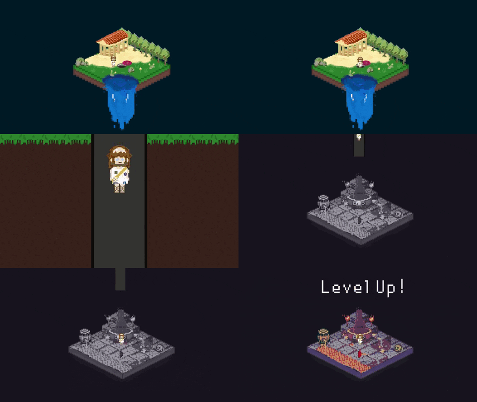
The purpose of having a loading screen/transition screen is to inform the players when they are levelling up. If the player has successfully passed the first level and wants to proceed to the next level, this screen will pop up.
Ideas
The loading screen will use the existing designs for the death screen and incorporate the following into the design:
- Main character in the game
- A hole - where the player will jump into to move to different levels
- Animations will be drawn to satisfy the above action
Sketch 1
This sketch showcases what the animation would look like:
Team agreement: All team members are satisfied with this idea and can be used in the future.
Animation 1
This animation was created based on sketch 1. It has kept most elements described in sketch 1 and added an animation that shows the process of the plumber jumping into the hole:

Animation 1 Layers (52)

Animation 2

Animation 2 Layers (53)

Link to see the layers more clearly: https://miro.com/app/board/uXjVPRmEk5M=/?share_link_id=144140443913
Testing Plan
Survey Aim
- Decide which animation is more suitable for the game
- Gather good design elements from both animations to improve the current design
- Get rid of any design elements that do not suit the theme of the game
Results
Which animation do you like better
What do you like about Option 1?
What do you like about Option 2?
If you chose option 1 what are some improvements that can be made?
If you chose option 1 what are some improvements that can be made?
Takeaways
Since most people like the animation for option 1 better, option 1 will be chosen. There are also many suggestions mentioned by respondents that can be considered for improvements:
- Uneven ground was something in animation 2 that can be implemented into animation 1
- Different colour for the tunnel that the player will go through
- Faster animation falling can be changed when coded
Final Animation
Below is the final animation after user testing feedback:

What has been changed
- The side design when the player jumps down the tunnel has been changed from stone blocks to soil blocks. This was done to match the death screen designs better as the island drawn has soil beneath the ground it makes more sense to have soil blocks instead of stone blocks
- The tunnel colour has been kept the same even though the feedback suggested changing the colour. This is because the plug colour designed was grey so to keep consistency it was left unchanged.
- The ending scene where the island jumps up and down was suggested by one of the feedback received. This adds more fun to the animation and makes the ending look less boring.