Dialogue Box Designs - UQdeco2800/2022-studio-2 GitHub Wiki
< Back to Dialogue & NPCs page
Documentation of Dialogue Box Designs by @MonitaMegaele and @Fayrain
Overview
This wiki contains information on the Dialogue Box Designs. This page consists of the iterative process of creating these dialogue box designs with justifications as to changes/no changes made throughout. Unique NPC Dialogue box design was implemented for a sense of originality towards the game, a small however detailed aspect towards the game. The unique boxes add depth towards the game and story.
Contents
First Ideations, Rough Drafts

Inspirations
Child
Elements from Sprite


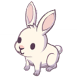
The Child NPC was inspired through the golden leaf crown they are wearing in the sprite and the rabbit accessory which they hold. Colour Scheme was taken straight from the Sprite image with colours consisting of purple, yellow and white. I wanted to create a small rabbit on the dialogue box to add detail towards the character and lore.
Female
Elements from Sprite


The Female NPC was inspired by the elements found in female sprite. The colour scheme is not as commonly identified through the entire NPC however, took colours of the hair and scarf which drapes the female NPC. The drapes were replicated into the dialogue box which created textural visuals towards the design. The designs were made minimal for male and female citizens as they do not oppose any functionality but create a short storyline to contribute immersive-ness to the game.
Male
Elements from Sprite


To reflect the female citizen, The male citizen was created vaguely similar as the previous design. The colours were changed to prevent repetitiveness however kept the same drapery as they wore roughly the same clothes and styles. The designs were made minimal for male and female citizens as they do not oppose any functionality but create a short storyline to contribute immersive-ness to the game.
Human Guard
Elements from Sprite
The shoulder pads and its straps became the focal point for the dialogue box design. This is because it brings nice contrast between two colours.
Guard
Elements from Sprite


The Guard dialogue box design was taken from the horns and leg details of the sprite. The leg details are a constant feature found in the guard that stems from the leg to neck. The horns were an identifiable feature towards the sprite and therefore was taken into context when designing for. The overall feel of the design was inspired from searching up atlantis patterns which had an underwater-tribal feel towards it. The tribal underwater perfectly matched the Atlantis Guard NPC and was made in terms of this.
Friendly Creature
Elements from Sprite
At first the plan was to include part of the head of Friendly Creature as dialogue box design. However, it might fill up the space inside the dialogue box and it could be distracting to read the text. So the friendly creature's tail is drawn so there is minimalist feel and yet managed to complement of the Friendly Creature NPC.
Plumber Friend
Elements from Sprite
The Plumber Friend dialogue box design was a combination of the uniform of the Plumber Friend is wearing and one of the tools holding inside his hand. The uniform provides a nice background colour for dialogue box and the wrench indicates the friend also is a plumber.
First Iteration


Second Iteration


Justifications
Friendly Creature
Based on the feedback, the white colour background gave the bland look for dialogue design. The background colour of Friendly Creature dialogue box is changed from white to dark yellow which derived from the colour underside of the tail. The change is due to the text colour in the game is white, thus needed a good contrast between light and dark for better readability.
Human Guard
The background colour of Human Guard dialogue box is changed from white to medium tan which derived from the colour human's guard skin. The change is due to the text colour in the game is white, thus needed a good contrast between light and dark for better readability. In addition based on the feedback, it fits better with the NPC physical attribute.
Other NPCs
Most of the feedback from our user surveys and interviews showed little to no improvements which could be made for the dialogue box designs of other NPCs. Therefore, We had decided to keep the dialogue box as is. This was because iterating through a design with minimal errors would cause some problems. If it is not broken then you should not fix it.
Final Design
| NPC Sprite | Dialogue Box |
|---|---|
 |
 |
 |
 |
 |
 |
 |
 |
 |
 |
 |
 |
 |
 |
Source Code of Images
- Images of Dialogue Boxes are under
source/core/assets/images/NPC/Dialogue
User Testing
Future Sprint Directions
For Sprint 4, The dialogue box designs are going to be stated as complete however has a potential to have a final iteration through it to keep consistency within designs and create further details towards the storyline.