Child Citizen - UQdeco2800/2022-studio-2 GitHub Wiki
Documentation of Ideation process for Child NPC by @MonitaMegaele
First Iteration Concept Walkthrough:
When I was assigned the task to create a child NPC character, I had a few inspirations in mind.
Firstly, I sketched 4 designs to ensure everyone in the studio agrees with the character design.
 Most students went for the first option as the backstory of the child had a nice touch.
Therefore my journey towards creating a spooky child started. Inspiration for this character design came from Pokémon Sword and Shield. A ghost girl appears where you have a mini quest to send her letter. Once you have, You will realise she had passed away years ago and disappears once you check back on the NPC's standing location.
A video of the quest (Click on Image):
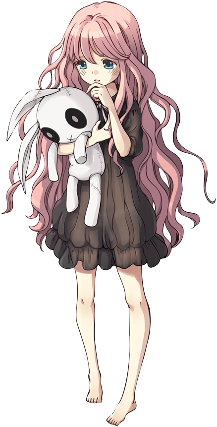
Character was vaguely inspired by Game of Dice's Isabelle:

Pixel Art Inspiration:
I was particularly interested in the details and the anime-style look of the pixel art reference.
I also wanted to include a minimalist coordinating colour scheme for my first iteration since guidelines has not been given at this point

First Iteration of Character (128x128 and Enlarged Version)
![]()

This is the outcome of all the inspirations combined.
User Testing
I sat down with a few students from the studio to give me feedback on my Child NPC character. Most people mentioned the clothes were not part of the theme and additionally, It had not given a spooky look. The NPC Child could be much better overall if the design was centered on the story guidelines and more towards the first sketch
Second Iteration Concept Walkthrough:
As mentioned, There were no set guidelines before and to fit into the newly created documentation, I had to adjust and iterate through my NPC design. Firstly, The colour scheme was set to purple and blue tones. Which had not reflected on my previous design. Changes mentioned during studio workshop:
- Colour Scheme
- Art Style
- Clothing choices (The story sought for high class child citizen instead)
New Art Style Inspiration:
I wanted to try a less detailed NPC character therefore this was one of my inspirations.

Second Iteration (Animated, PNG and Zoomed in version)


User Testing
Once again, I obtained opinions from my studio session classmates and they all expressed the NPC Child was looking a lot gloomier than before with clothing and colour schemes that suited towards the story guidelines. Feedback received stated I should make the bunny plushie more apparent with a second arm holding the bunny to prevent any awkward design flaws.

