Chapter 9 problem set 2 - UCD-pbio-rclub/python_problems GitHub Wiki
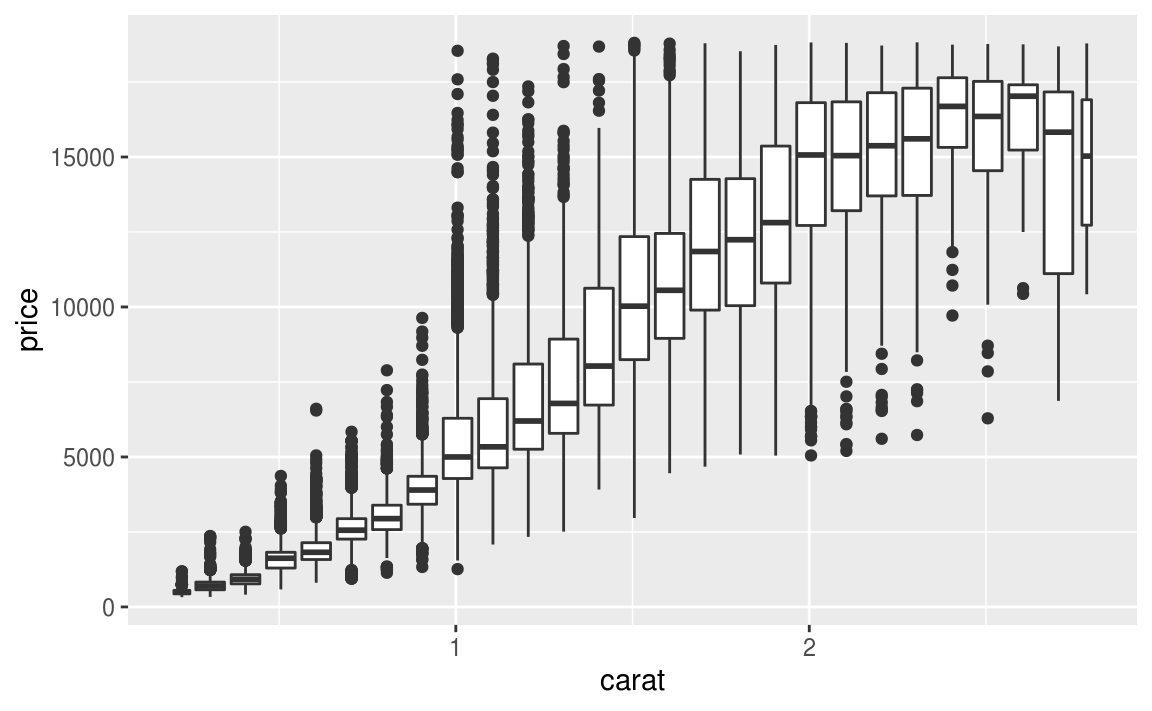
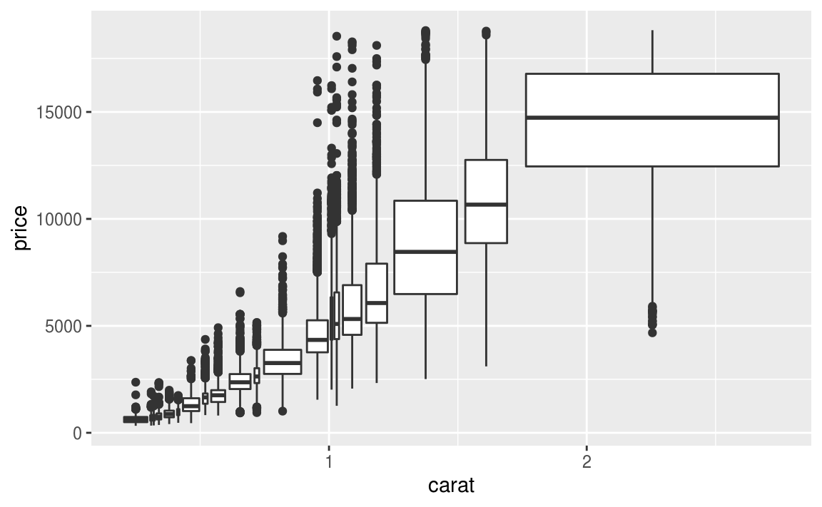
- Recreate the two plots below using this dataset: diamonds
Note: In the 2nd plot, there are approximately the same number of points in each bin

Using the same data from chapter 8. (Import my RNA-Seq CPM data from 'Expression Browser_CPM_practice.xlsx' file. Expression Browser_CPM_practice.xlsx).
1. Please go to Sol Genomics and find out the Solyc ID for these genes.
2. Please use the Solyc ID to find these genes in this dataset and make boxplots to show the expression level of each gene in different genotypes and treatments combination.
Use the weather data from the nycflights13 dataset (https://raw.githubusercontent.com/hadley/nycflights13/master/data-raw/weather.csv) to have some fun plotting.
- How would you look at the overall distribution of temperatures in each airport (origin). For now, don't filter by month/day/hour.
1 (answer)
Use a boxplot:
import pandas as pd
weather = pd.read_csv('https://raw.githubusercontent.com/hadley/nycflights13/master/data-raw/weather.csv')
weather.boxplot(column=["temp"],by=["origin"])- Plot the temperatures over a warm and a cold month. Is the scale in farenheit or celsius?
2 (answer)
import seaborn as sns

## Plot December, using hour as the x axis.
# seaborn automatically uses the mean as the main line and shades the ranges.
dat = weather[(weather.month==12)]
sns.lineplot(data=dat, x="hour",y="temp",hue="origin",style="origin",palette="tab10", linewidth=2.5)

## Plot July, now using day as the x axis.
dat = weather[(weather.month==7)]
sns.lineplot(data=dat, x="day",y="temp",hue="origin",style="origin", linewidth=2.5)


Water boils at 100˚C and freezes at ~32˚F. Looking at the plots, it seems that temperatures are given in ˚F. Use the tomato data set
-
Make a boxplot of hypocotyl length ("hyp") with the data plotted separately for 'species' and 'trt'. Try making this plot both with and without using facets.
-
Make a plot of the internode data, int1, int2, int3, and int4 where each internode is in a different facet. plot values for each trt and species. Layout the plot so that it is a 2X2 grid
Using the data here please make a bar graph showing the number of men and the number of women (a bar for each) that survived the trip on the titanic at each age point.
