Radio Buttons - SAP-archive/techne GitHub Wiki
The radio buttons main use is to select a single option from a set of options that are visible and comparable all the time.

| Element | Description |
|---|---|
| Label | This label is used to group all radio buttons in the set |
| Input | The element that can be selected |
| Option Label | The Option Label describes the particular option so the user can make the selection |

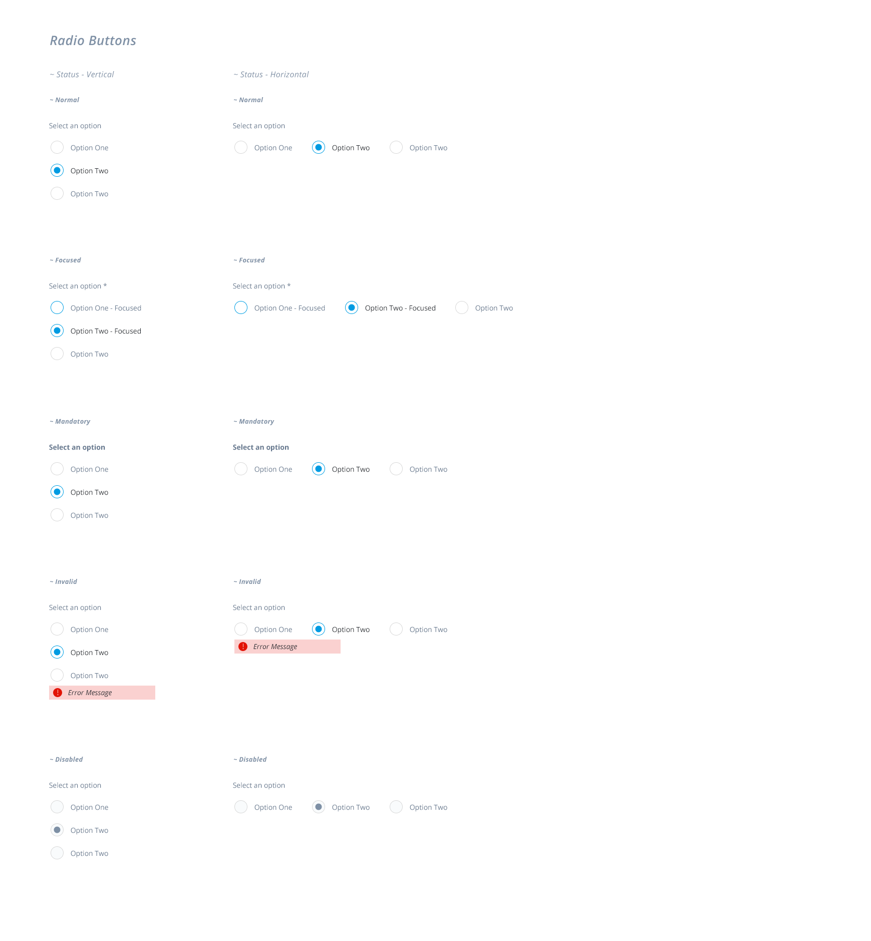
| Status | Description |
|---|---|
| Normal | The Radio buttons doesn't have the focus. |
| Mandatory | Setting a Radio Button group as mandatory means: the user have to select one option to validate the screen or continue with the flow. The Label is displayed in bold and a * at the end, indicating that field is mandatory. The Option Labels are not displayed in bold or have the *. This is the only case where the Radio Button can be put to Invalid after performing the validation. |
| Focused | Like the rest of the Form Inputs the Input Element will highlight indicating to the user that the element have the focus. Only the input element will be highlighted, not the Option Labels |
| Disabled | The Input element and the Option Labels are dimmed/grayed out to signal they cannot be used |
| Invalid | The Input Element will highlight in a error color and a message will be displayed right bellow the set of options |
The Radio Buttons can be displayed Verticaly and Horizontally.
Use Horizontally when the Option labels text is short and the options are not more than 2.