Week 07 (W52 Jan11) Global Climate Dataset - Rostlab/DM_CS_WS_2016-17 GitHub Wiki
Week 07 (W52 Jan11) Global Climate Dataset
1- Summary
The past few weeks we have been working on the analysis of various emissions that affect the environment and are directly correlated with global warming. At the same time we were trying to detect how the local temperature may be affected not only by the emissions of neighboring countries, but also by the global emissions. This is necessary to set up our prediction model which will have as input the targeted country, the target year and as output the projected temperature in that year as well as the list of biggest contributors to its climate change. In order to do this we have to make several assumptions about our model. After extensive research in various online sources there is no common and explicit conclusion or approach about how emissions are moving around the atmosphere or how long does it take to see the effect of temperature rise due to increased emissions. Based on our analysis we see that emissions increase linearly and in some cases exponentially over the years, while the temperature change rate is increasing linearly with oscillations at the same time. This implies maybe a semi-sinusoidal function to fit in the change. We use this as a base to set up our prediction model. Apart from that, this week we also identified the biggest contributors of emissions as well as the average heating of all the countries based on our data. Following we present our analysis and the correlation results.
2 - Dataset Stats
Global Climate Data (GCD) : Main Dataset
- Number of files: 100.791
- Format: .dly files (Complete Works Wordprocessing Template)
- Size: 26.5 GB
- Features: 46
- Source Date: 1763 - 2015
World Bank (WB) : Complementary Dataset
- Number of files: 1
- Format: .csv
- Size: ~15 MB
- Features: 82
- Source Date: 1960 - 2015
3 - Goals achieved
- Biggest contributors-countries with highest rates of emissions
- Estimation of average warming
- Correlation of local temperature with global emissions
- Analysis of our collective results
- k-mean clustering of the countries with respect to the emissions
- Setup of prediction model
4- K-mean clustering
We further tried detail our experiments with the data by k mean clustering.k-means clustering is a method of vector quantization, originally from signal processing, that is popular for cluster analysis in data mining. k-means clustering aims to partition n observations into k clusters in which each observation belongs to the cluster with the nearest mean, serving as a prototype of the cluster. This results in a partitioning of the data space into Voronoi cells.We wanted to see how our variables ie emissions are inter related with each other or if there are some patterns which all countries are showing for the emissions around the world.So we tried to cluster our data into 3 groups and carried our iteration for 5000 to get the appropriate centroid of the each cluster. *The results remained the same irrespective of the comparative variables we chose i.e. CO2 emissions vs methane or CO2 vs other greenhouse gasses emissions.
- The clusters we got are as follows
- Group1- G'Angola' 'Albania' 'United Arab Emirates' 'Argentina' 'Armenia' 'Austria' 'Azerbaijan' 'Belgium' 'Benin' 'Bangladesh' 'Bulgaria' 'Bahrain' 'Bosnia and Herzegovina' 'Belarus' 'Bolivia' 'Brunei Darussalam' 'Botswana' 'Switzerland' 'Chile' 'Cote d''Ivoire' 'Cameroon' 'Congo. Rep.' 'Colombia' 'Costa Rica' 'Cuba' 'Cyprus' 'Czech Republic' 'Denmark' 'Dominican Republic' 'Algeria' 'Ecuador' 'Egypt. Arab Rep.' 'Eritrea' 'Spain' 'Estonia' 'Ethiopia' 'Finland' 'France' 'Gabon' 'United Kingdom' 'Georgia' 'Ghana' 'Gibraltar' 'Greece' 'Guatemala' 'Honduras' 'Croatia' 'Haiti' 'Hungary' 'Iran. Islamic Rep.' 'Iraq' 'Iceland' 'Israel' 'Italy' 'Jamaica' 'Jordan' 'Kazakhstan' 'Kenya' 'Kyrgyz Republic' 'Cambodia' 'Korea. Rep.' 'Kuwait' 'Lebanon' 'Libya' 'Sri Lanka' 'Lithuania' 'Luxembourg' 'Latvia' 'Morocco' 'Moldova' 'Mexico' 'Macedonia. FYR' 'Malta' 'Myanmar' 'Mongolia' 'Mozambique' 'Malaysia' 'Namibia' 'Nigeria' 'Nicaragua' 'Netherlands' 'Norway' 'Nepal' 'New Zealand' 'Oman' 'Pakistan' 'Panama' 'Peru' 'Philippines' 'Poland' 'Korea. Dem. People’s Rep.' 'Portugal' 'Paraguay' 'Qatar' 'Romania' 'Sudan' 'Senegal' 'Singapore' 'El Salvador' 'Slovak Republic' 'Slovenia' 'Sweden' 'Syrian Arab Republic' 'Togo' 'Thailand' 'Tajikistan' 'Turkmenistan' 'Trinidad and Tobago' 'Tunisia' 'Turkey' 'Tanzania' 'Ukraine' 'Uruguay' 'Venezuela. RB' 'Vietnam' 'Yemen. Rep.' 'South Africa' 'Congo. Dem. Rep.' 'Zambia' 'Zimbabwe'.
- Group2-'Australia' 'Brazil' 'Canada' 'Germany' 'Indonesia' 'India' 'Ireland' 'Japan' 'Russian Federation' 'Saudi Arabia' 'Uzbekistan'
- Group3-'China' 'Hong Kong SAR. China' 'The United States' ![] (https://github.com/magiob/DataMining/blob/master/NewFolder.1/co2%20n%20nitrous.jpg) ![] (https://github.com/magiob/DataMining/blob/master/NewFolder.1/co2nhfc.jpg) The blue cluster is the set of countries represented in group 1, the red one represents set of countries in group2 and the green cluster represents the set of countries in group3. The interesting thing was that China , Hong Kong SAR and the United States emissions were clustered together and were the main contributors to the emissions around the world.The first group which consisted of mainly the developing nations or undeveloped nations and who were small in size contributed the least in emissions
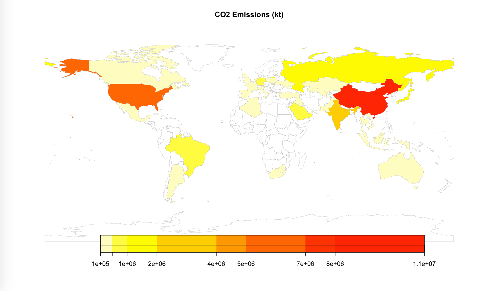
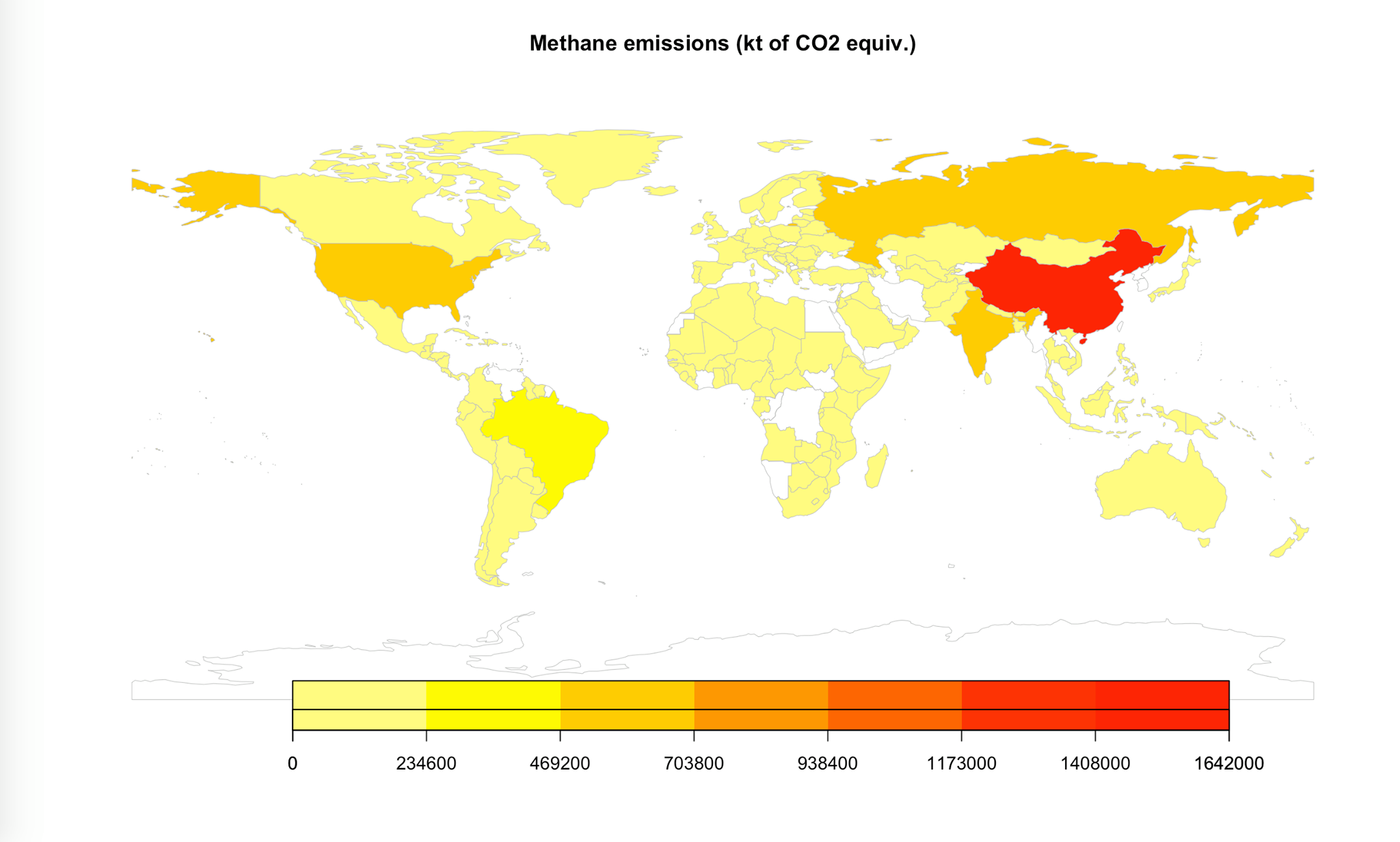
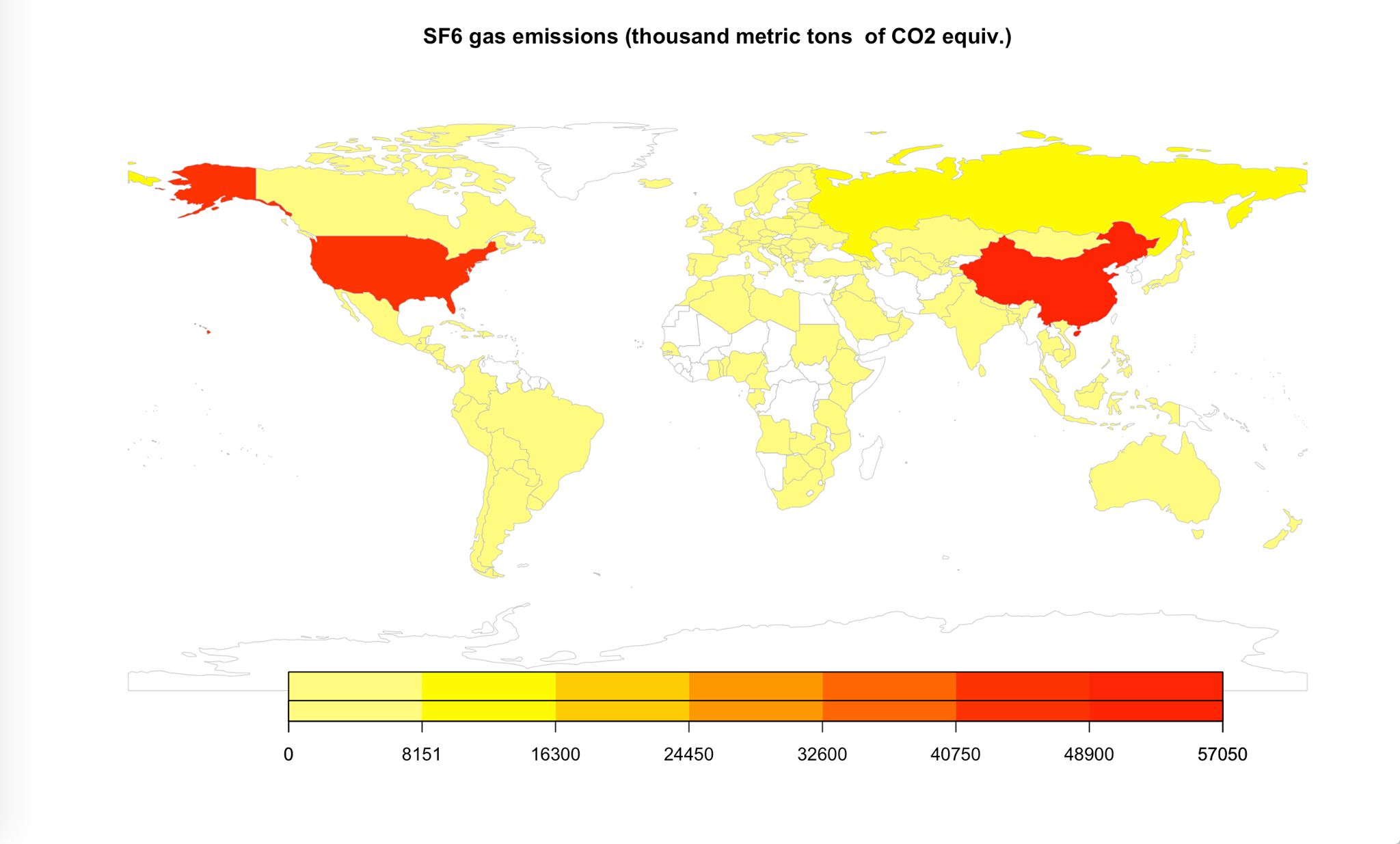
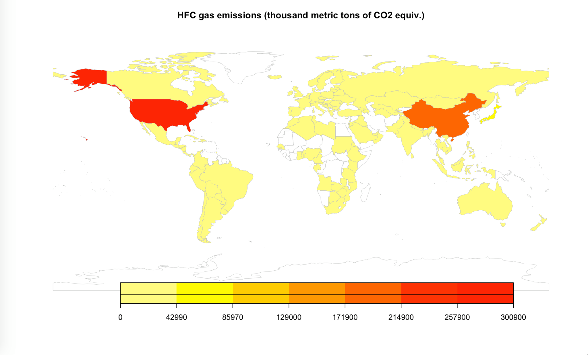
5 - Biggest contributors to emissions
We extracted data about emissions linked to global warming (carbon dioxide, methane, SF6 gas, nitrous oxide, HFC gas) and visualized them on the map based on the countries latitude and longitude with a library on R. We can see the countries with the highest emissions rates, thus the biggest contributors to global warming. As expected USA and China hold the leading position in the emissions. Apart from those, India, Russia, Brazil have also increased emissions but not at the same scale. These countries are also some with the highest population. It makes sense that population is correlated with the emissions in the modern world. Following are the visualized data on maps for year 2010.

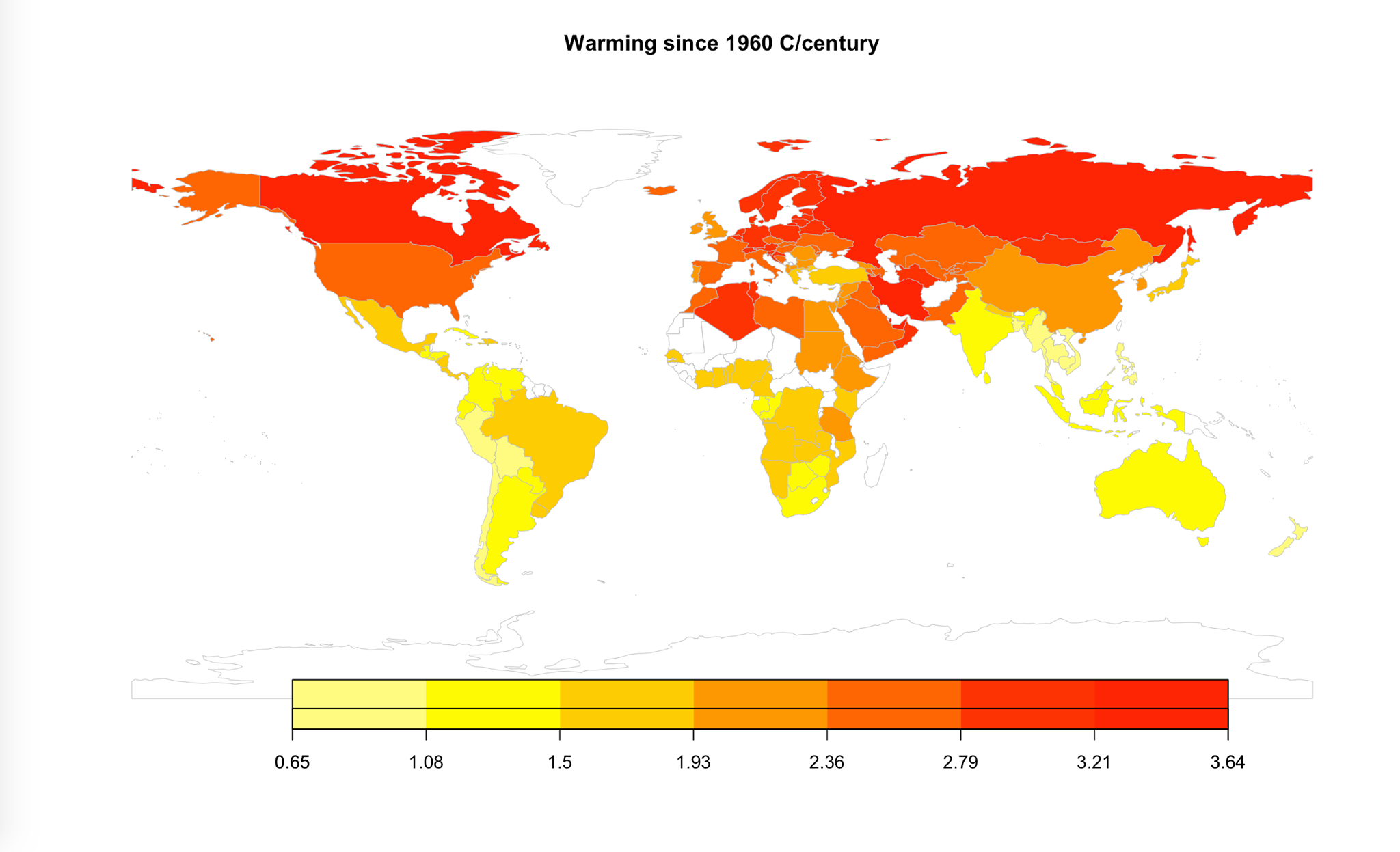
In addition to this, we estimated the average warming per country and visualized it in map.
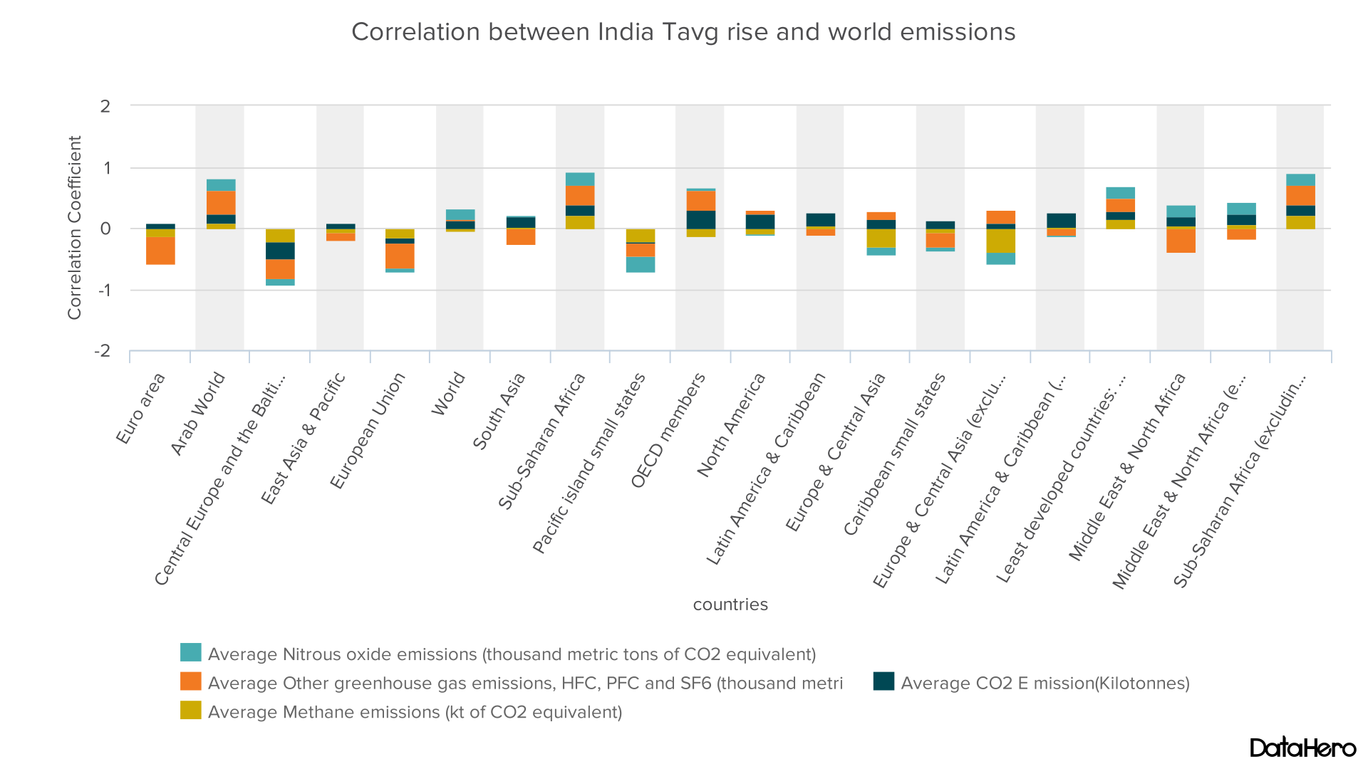
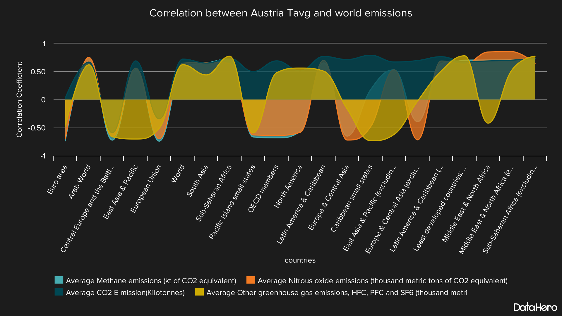
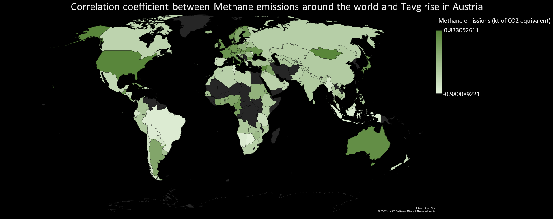
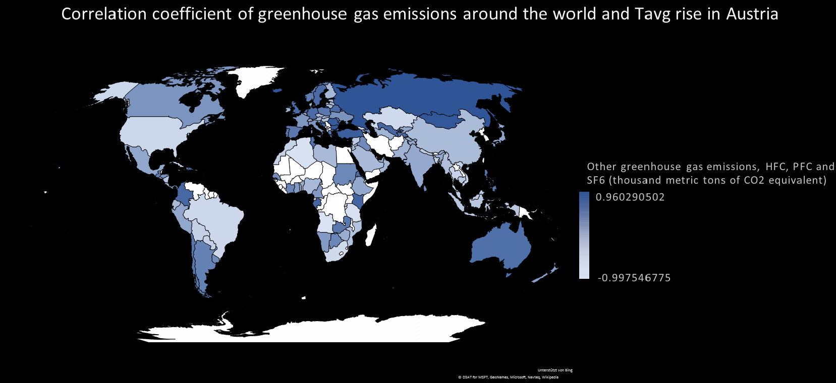
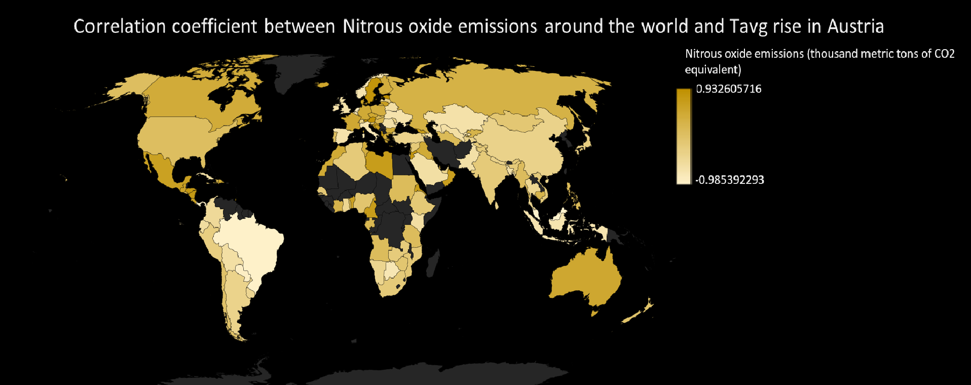
6 - Correlation of local average temperature (Austria, India) with global emissions
Last week we correlated the average temperature of Austria with the neighboring countries. We could find some noticeable correlation of the total emissions of the neighbors and the temperature of Austria. This time we made use again of the data of previous weeks (climate data for Austria and India) and correlated them with the global emissions. Based on the literature we found, a percentage of emissions can travel through long distances even along oceans through the atmosphere. It is hard to predict though where they will move to as it is affected by a number of complicated factors. With this motivation we decided to correlate the temperature with the regional and global emissions. Following is the correlation analysis for India and Austria respectively. We observe that the correlation results are still not clear, as for some emissions in some regions we have positive correlation, while for others negative or hard to tell. Focusing on the global ones, we can see a slight positive correlation, which is actually the expected result based on the research on climate change.
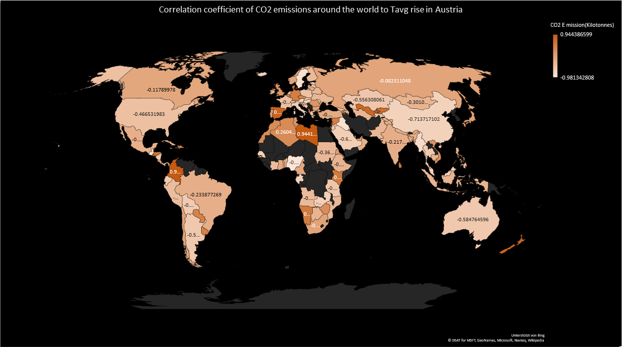
A different more detailed view of the correlation analysis is presented in the following graphs. It is a map visualization of the correlation coefficients for each country separately. Thus, the effect of every country's emissions on the average temperature of Austria. We notice that for some the correlation makes sense, while others do not agree to the expected result. For example we expected a high positive correlation coefficient for USA and China which have the biggest emissions globally, based on the analysis of the previous section. However, this is not the case.
7 - Strategy for our prediction model
We are planning to create a prediction model that will take as input the country and the target year. The final output will be the temperature at the given year, as well as the countries that are contributing more to this local rise of temperature. Based on the literature we found around 50% of emissions travel through the atmosphere, while the rest is absorbed by the sea, plants, ground. From this 50% of emissions it is really hard to predict towards which direction it will move as it is affected by many complicated and seasonal factors. Nevertheless, there are reports like the one talking about China pollution affecting west coast of USA in our references that support this claim. We will have to make the assumption that emissions can move uniformly towards all targets with a decreasing rate based on the distance of the target country and emissions source. Based on our analysis of previous weeks, we know that emissions are increasing linearly over the years, and for some cases exponentially. Thus regression would be employed to estimate the emissions at the target year. On the other hand, analysis about temperature rise is not clear. There is a clear trend of oscillating temperature rise over a range of many years. Average warming would be around 2 degrees Celsius per century. Also, the function describing temperature-years looks like a semi-sinusoidal one, increasing linearly with fluctuations. On the other hand, correlation of emissions with temperatures does not show a clear positive correlation for all cases. However, we have to make the assumption that there is a clear positive correlation of the global emissions and the local temperature of a country, based on the numerous reports that support this. The challenge lies in predicting the temperature not only based on the average warming of previous years, but also based on the increasing global emissions. We would like to discuss our approach further during class.
8 - Next Week Goals
- Prediction model
- Comparision of PLSR and PCR for determining which emissions in the respective countries are the the main contributors to the Tavg rise around the World.
9 - Presentation Link
https://docs.google.com/presentation/d/1hRdQWh9MT18LGzfl7lc9_xwBNityZomhsJ-u5CfHotk/edit#slide=id.p
References
- Menne, M.J., I. Durre, R.S. Vose, B.E. Gleason, and T.G. Houston, 2012: An overview of the Global Historical Climatology Network-Daily Database. Journal of Atmospheric and Oceanic Technology, 29, 897-910, doi:10.1175/JTECH-D-11-00103.1.
- Menne, M.J., I. Durre, B. Korzeniewski, S. McNeal, K. Thomas, X. Yin, S. Anthony, R. Ray, R.S. Vose, B.E.Gleason, and T.G. Houston, 2012: Global Historical Climatology Network - Daily (GHCN-Daily), Version 3. [indicate subset used following decimal, e.g. Version 3.12]. NOAA National Climatic Data Center. http://doi.org/10.7289/V5D21VHZ
- WB Dataset - http://data.worldbank.org
- Correlation Analysis - http://sphweb.bumc.bu.edu/otlt/MPH-Modules/BS/BS704_Multivariable/BS704_Multivariable5.html
- Climate change impacts on Austrian ski areas, Robert Steiger & Bruno Abegg (Link)
- HFCs? Curbing Them Is Key to Climate-Change Strategy (Op-Ed), Hallie Kennan, Energy Innovation: Policy and Technology (Link)
- How do we know more CO2 is causing warming? (Link)
- Does CO2 always correlate with temperature (and if not, why not?)
- Earth itself is telling us there’s nothing to worry about in doubled, or even quadrupled, atmospheric CO2
- China Exports Pollution to U.S., Study Finds