Week 02 (W47 Nov16) Global Climate Dataset - Rostlab/DM_CS_WS_2016-17 GitHub Wiki
Week 02 (W47 Nov16) Global Climate Dataset
1 - Summary
This week we digged deeper into our datasets. First we created functions to extract and manipulate our data efficiently and fast. This helped us obtain better control of our data. We then explored more features in our dataset and used various visualization methods to understand better our data, find patterns, outliers and possibly faulty data. Additionally, we quantified the missing values for our datasets and figured out ways to fill them. We applied transformations in the data to convert them into a useful format that can be correlated with features from other datasets. At the same time we merged smaller datasets into one to gather collective information. In particular, besides the features examined in previous week (minimum and maximum Temperatures) we explored the feature of Precipitation. We also decided to focus our analysis to India, as it is a country with big variations and the climate change effect is apparent. We picked datasets derived from the 7 biggest Indian cities, we examined them separately but also merged as one. At the same time we extended our research into the dataset of World Bank. We analysed the dataset and extracted information related to India, to prepare the ground for features correlation and prediction. Finally we applied PCA analysis to 3 core features of Delhi (Tmin, Tmax and PRCP). .
2 - Dataset Stats (Reminder)
Global Climate Data (GCD) : Main Dataset
- Number of files: 100.791
- Format: .dly files (Complete Works Wordprocessing Template)
- Size: 26.5 GB
- Features: 46
- Source Date: 1763 - 2015
World Bank (WB) : Complementary Dataset
- Number of files: 1
- Format: .csv
- Size: ~15 MB
- Features: 82
- Source Date: 1960 - 2015
3 - Goals Achieved This Week
- Created functions to process and parse data efficiently
- Improved visualizations about minimum and maximum Temperatures (Tmin, Tmax)
- Explored Precipitation feature of GCD
- Estimated missing values in both datasets GCD and WB
- Filled missing values
- Extracted datasets related to India from GCD and WB. Applied transformations to turn them correlatable
- Explored features of WB and visualized
- Applied Data Analysis methods to 3 core features of GCD
4 - Pre-Processing Methodology
Our dataset takes the form of multiple .dly files. Even though we can read these files as documents the format is unstructured. Thus our way of processing them is column-character-wise. The format of each entry is explained in the previous week Wiki. We will explain here shortly our methodology we follow to turn this unstructured format into a structured one. The steps we follow in Python:
- Function to download dataset and then read content
- Iterate on each dataset entry and then process based on the following characters sequence (Variable-Columns-Type):
ID 0-10 CharacterYEAR 11-14 IntegerMONTH 15-16 IntegerELEMENT 17-20 CharacterVALUE1 21-25 IntegerMFLAG1 26-26 CharacterQFLAG1 27-27 CharacterSFLAG1 28-28 CharacterVALUE2 29-33 IntegerMFLAG2 34-34 CharacterQFLAG2 35-35 CharacterSFLAG2 36-36 Character. . .. . .. . .VALUE31 261-265 IntegerMFLAG31 266-266 CharacterQFLAG31 267-269 CharacterSFLAG31 268-268 Character - We split each row based on spaces into an array, remove flags, replace missing values (-9999) with NaN
- We create a DataFrame that contains the features indexed with Datetimes (Year-Month-Day)
- Finally we have functions that extract specific features and create a new DataFrame with them yearwise or monthwise
5 - GCD Findings
Minimum and Maximum Temperature (Tmin, Tmax) for Delhi, India
We re-visualized this week Tmin and Tmax yearwise to verify the trend of Temperatures rise. This time the results are from workstations in Delhi, India. First is the graph about Tmin and second the graph about Tmax yearwise. We observe that there is a slight rise in both maximum and minimum temperature over the years. However, there is a steep max in early years that is not fully accurate because of the big number of missing values in the early years. In order to estimate the temperatures year-wise we computed the average per month, where existing day values are available and then converted to yearly average. It is apparent that during months or years where most of the values are missing, the error of our estimates grows.
 Minimum Temperature year-wise for Delhi (tenths of degrees Celsius)
 Maximum Temperature year-wise for Delhi (tenths of degrees Celsius)
Further, we split the graph for Tmax into four different. Each one of them represent the maximum temperatures per season. The missing values are represented by NaN and are apparent in the graph where the line is discontinuous. It is not clear from the graph that there is a trend towards the shrinking of the seasons but it seems as if spring, summer and autumn temperatures approach each other over the years.
 Maximum Temperature season-wise for Delhi (tenths of degrees Celsius)
Precipitation (PRCP) for Delhi, India
Based on the following figures, there is an apparent trend of increasing precipitation. At first sight there could be a correlation between precipitation and temperatures.
 Precipitation year-wise for Delhi (tenths of mm)
 Precipitation season-wise for Delhi (tenths of mm)
The rain cycle seems flawless but after 1980 it has started getting distorted as rainfall has increased in other season as well other than monsoon.
Merging Datasets from Cities of India
Our climate data derive from various weather stations. Depending on their ID, longitude and latitude we can spot the exact location. In order to represent India we picked weather stations from the 7 biggest cities, located at different parts of India. We collected the data and then merged them. The final dataset contains data of the 7 biggest cities from 1901 to 2016. Below in the map the cities chosen are marked with red circles. The cities chosen along with their population are the following:
- Mumbai (Bombay) - 16,368,000
- Kolkata (Calcutta) - 13,217,000
- Delhi - 12,791,000
- Chennai - 6,425,000
- Bangalore - 5,687,000
- Hyderabad - 5,534,000
- Ahmadabad - 4,519,000
 Map of India. Cities marked with red circle are the datasets chosen
Missing values for India of GCD
One of our goals this week was to quantify the missing values in our dataset. For the merged dataset of 7 cities the missing values represent the 43.87% of the total values. The matrix of features showing the missing values is given below.
 Missing values in matrix of features for Indian cities in GCD
6 - WB Dataset Findings
The WB dataset contains important features about pollution, emissions and other interesting factors that can be correlated with our climate data. We converted our data in GCD to yearly, since the data in WB dataset are only available yearly for every country. Thus this week we explored also this dataset and tried to understand more about through visualizations. The total values in the dataset are 4560. The 49.2% of them is missing though and marked as blank cells. Below is the feature matrix showing the missing values. Dark parts represent the existing values.
 Missing values in matrix of features for WB dataset
Following we decided to pick and visualize some specific features. We decided to examine the CO2 emissions, as well as the electricity production sources in India. It is obvious from the graph below that India's electricity production depends a lot on coal, which has severe effects on the environment. At the same time, we attempted to fill in the missing values for electricity production. Our interpolation attempts failed so for now we only did forward filling and backwards for the remaining ones. We plan to apply more accurate methods like spline and quadratic next week. What we did for now is repeat the previous available value to the next missing one.
 Electricity production sources for India yearly
Further we visualized the feature of CO2 emissions in India and compared it with the global one. The graphs follow the same trend. The emissions increased almost exponentially over the years and tend to stabilize the recent years both globally and in India.
 CO2 emissions globally and in India yearly
7 - Data Analysis
We selected 3 core features of the GCD dataset (Tmin, Tmax and PRCP) for Delhi to apply some data analysis methods. We present our results in this section.
First we visualized our feature matrix to examine the sparsity. The feature matrix contains daily values of three featuress (Tmin, Tmax and PRCP) for all available years. The figure below is the sparse representation of our matrix. It shows that we have 50205 number of complete data out of 25568*3 of the total, which translates to 65.45% of available data.
 Sparsity Matrix for daily data of Delhi (3 features - Tmin, Tmax, PRCP)
Due to the big amount of data, as well as for usability reasons we converted the daily data into yearly average for each of the features. We are aware that this decreases the accuracy of our measurements due to the increased number of missing values. However, yearly values are more useful to condense the amount of data and for correlation reasons. Next we present the Box plot which represents how the values of variables like precipitation , high temperature and low temperature lie around mean in different years.
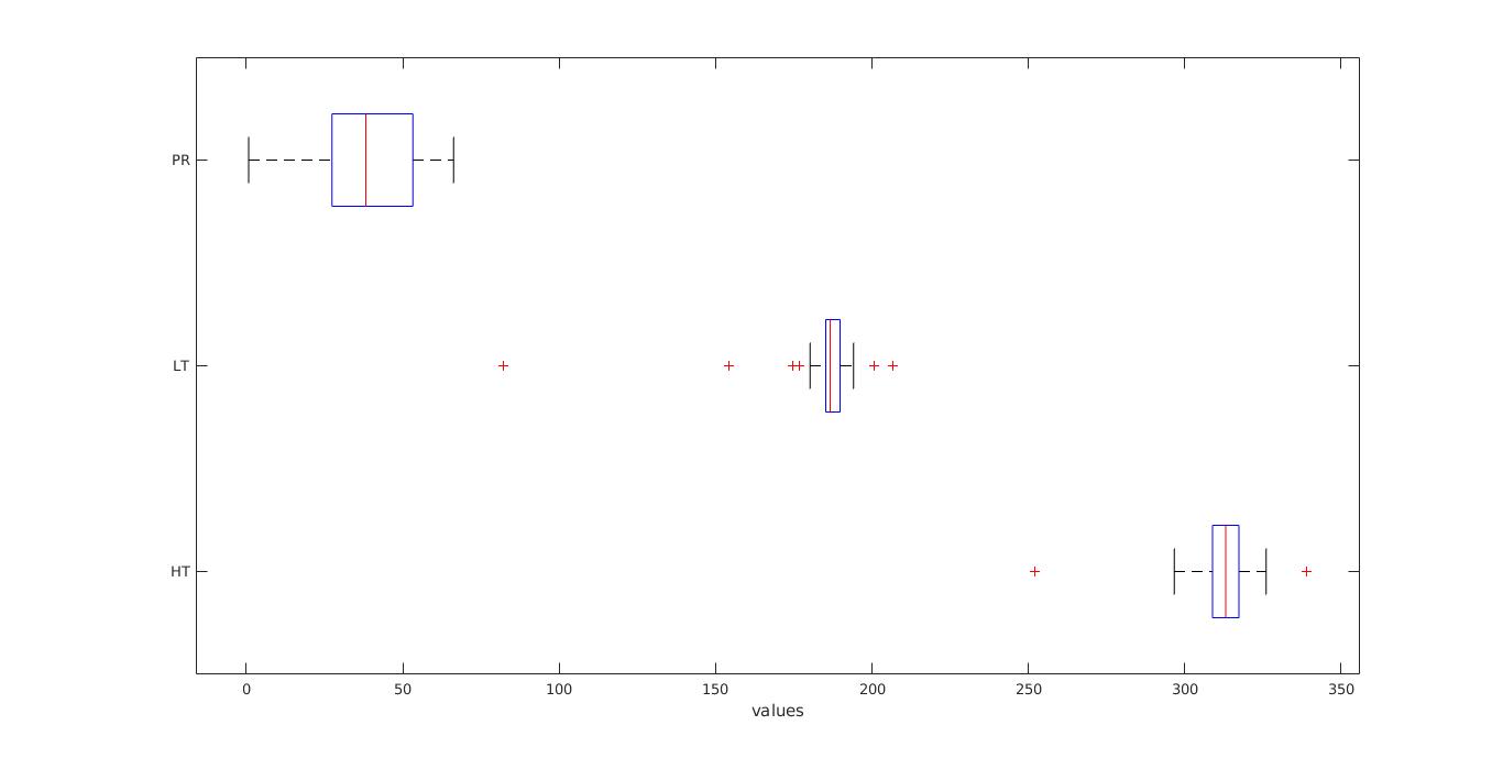 Box plot of 3 features with yearly data (PRCP, Tmax/HT, Tmin/LT) for Delhi
By applying PCA we created the following graph. This graph is useful if the first two principal coordinates do not explain enough of the variance in the data hence includes all the 3 principle components in the data. All three variables are represented in this tri-plot by a vector, and the direction and length of the vector indicate how each variable contributes to the two principal components in the plot. For example, the first principal component, on the horizontal axis, has positive coefficients for all three variables. The largest coefficients in the first principal component are the third and seventh elements, corresponding to the variables Low temperature and Precipitation.
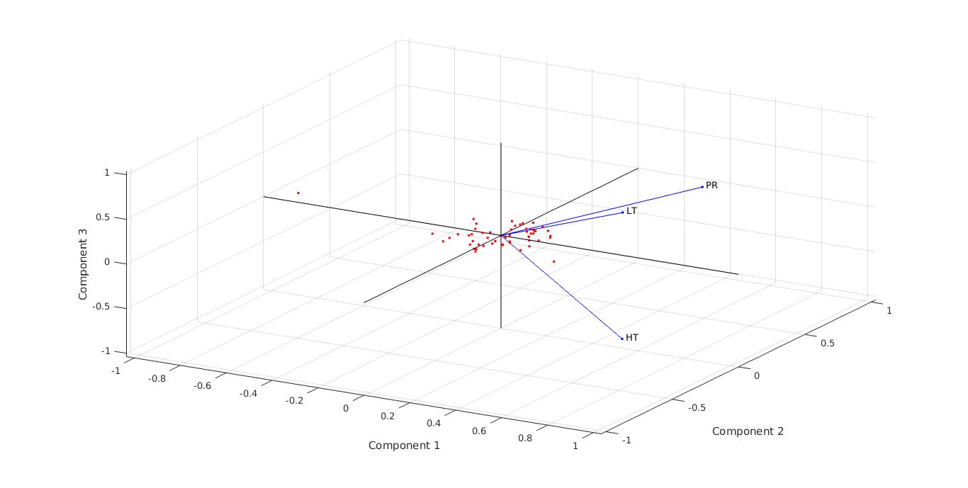 3D PCA Analysis for yearly data in Delhi
In order to explain variance we created a pareto. This screen plot only shows the first 2 (instead of the total 3) components that explain 95% of the total variance. The only clear break in the amount of variance accounted for by each component is between the first and second component. However, the first component by itself explains less than 40% of the variance, so more components might be needed. You can see that the first principal components explain roughly two-thirds of the total variability in the standardized ratings, so that might be a reasonable way to reduce the dimensions. Below the pareto, a figure of the two components scores is also illustrated.
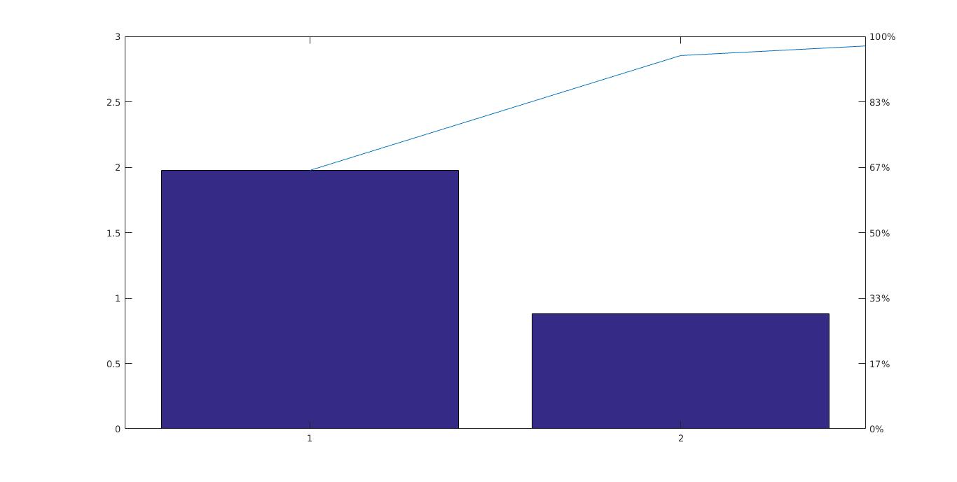 Pareto of two components for Delhi
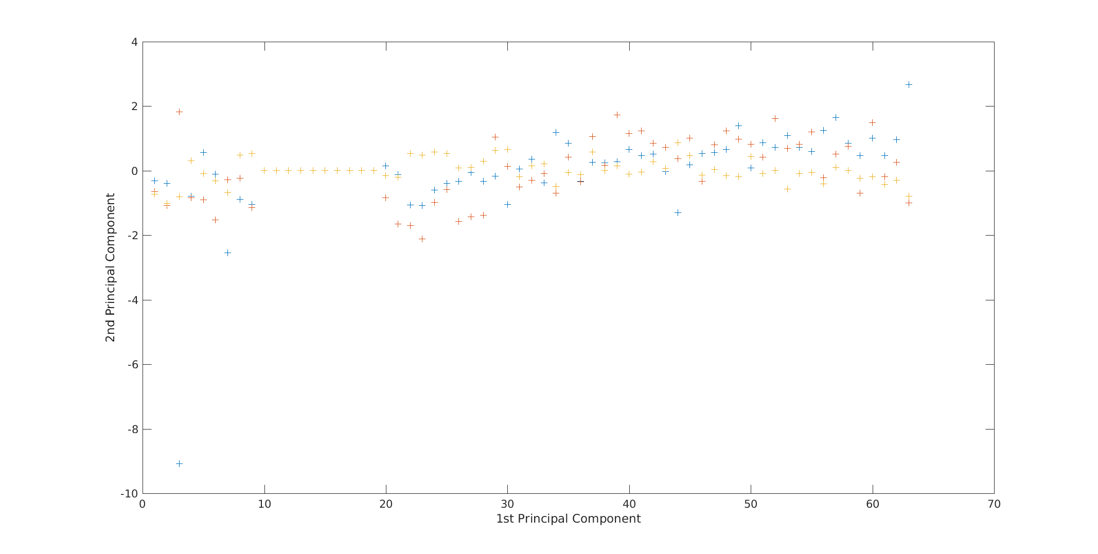 Score of two components for Delhi
8 - Next Week Goals
- Correlate data from the two datasets
- Apply interpolation to missing values
- Extend PCA, spectrum analysis
9 - Presentation Link
https://docs.google.com/presentation/d/1FTVLqrrU1XgHuw-flmaY73AEf2renMzCwAMmN15Va3A/edit#slide=id.p
References
- Menne, M.J., I. Durre, R.S. Vose, B.E. Gleason, and T.G. Houston, 2012: An overview of the Global Historical Climatology Network-Daily Database. Journal of Atmospheric and Oceanic Technology, 29, 897-910, doi:10.1175/JTECH-D-11-00103.1.
- Menne, M.J., I. Durre, B. Korzeniewski, S. McNeal, K. Thomas, X. Yin, S. Anthony, R. Ray, R.S. Vose, B.E.Gleason, and T.G. Houston, 2012: Global Historical Climatology Network - Daily (GHCN-Daily), Version 3. [indicate subset used following decimal, e.g. Version 3.12]. NOAA National Climatic Data Center. http://doi.org/10.7289/V5D21VHZ
- http://data.worldbank.org
- https://www.co2.earth/global-co2-emissions