Figures - Radega1993/the-one-scenario-corpus GitHub Wiki
English | Español
All figures are generated by run_analysis.py --phase figures (and outputs for the outputs heatmap). They are stored in analysis/figures/ (PNG and PDF). Links below point to the repo; if the wiki is published from a clone, you can upload these images to the wiki or use raw URLs.
Base path in repo: analysis/figures/
Raw URL pattern: https://raw.githubusercontent.com/Radega1993/the-one-scenario-corpus/main/analysis/figures/<filename>.png
Correlation matrix between scenario feature vectors (60x60, corpus_v1). Each cell is the Pearson r between two scenarios. Red = high positive correlation; blue = negative. High off-diagonal values indicate pairs that are linearly similar in parameter space.
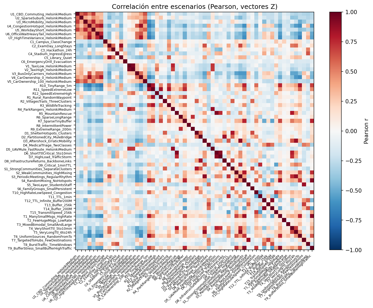
File: heatmap_pearson.png
Same as above but Spearman (rank) correlation. Useful to check robustness to non-linear monotonic relationships.
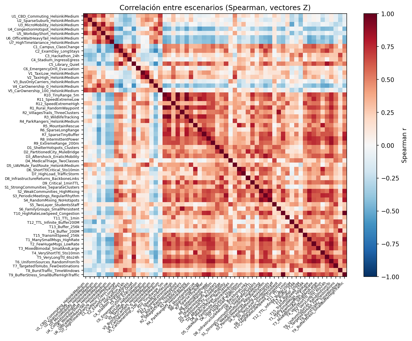
File: heatmap_spearman.png
Distribution of pairwise Pearson |r| across all scenario pairs (1770 pairs, 60 scenarios). Shows how many pairs fall in each correlation bin. Goal: most mass below 0.7.
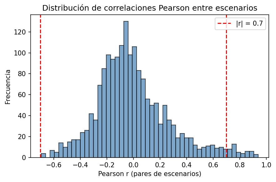
File: histogram_correlations_pearson.png
Distribution of pairwise Spearman |r|. Compare with Pearson to see if rank correlation is similarly spread.
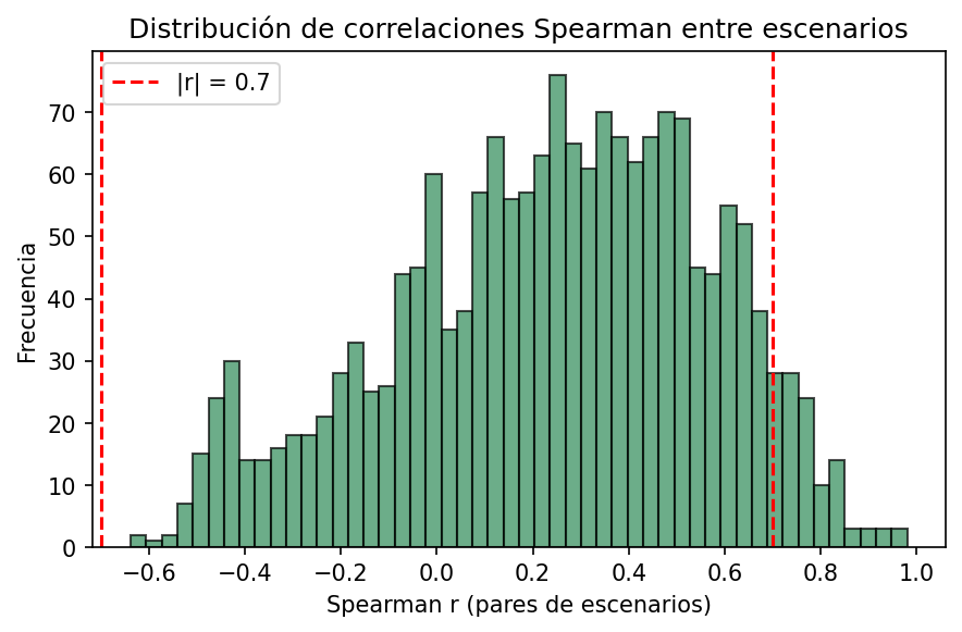
File: histogram_correlations_spearman.png
First two principal components of the normalised feature matrix Z. Each point is a scenario. Shows how scenarios are distributed in feature space; clusters and outliers are visible.
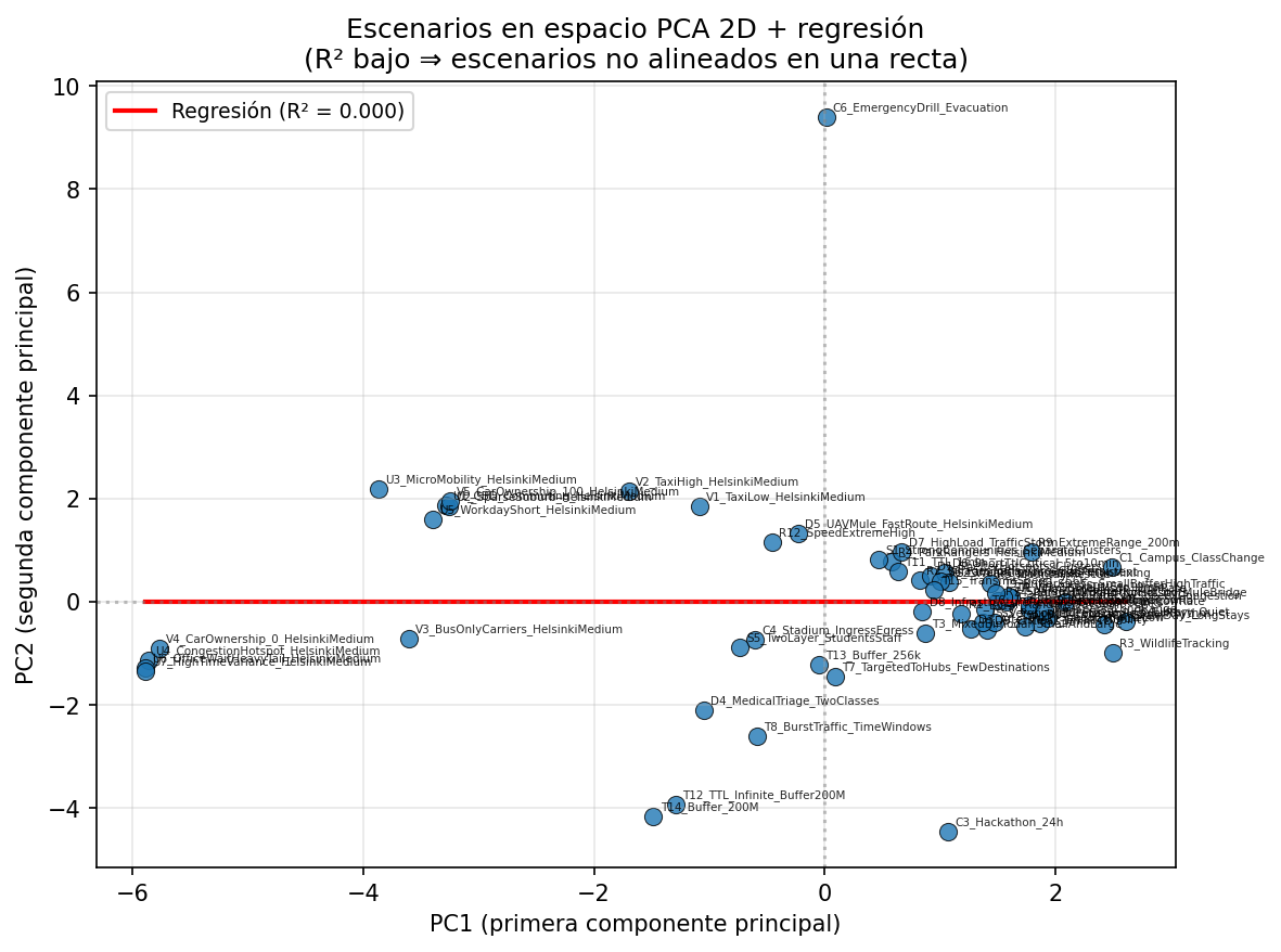
File: scatter_pca_regression.png
The two scenarios that have the highest Pearson |r| (most correlated pair). One scenario’s normalised features on the x-axis, the other on the y-axis. Points near the diagonal indicate strong linear agreement.
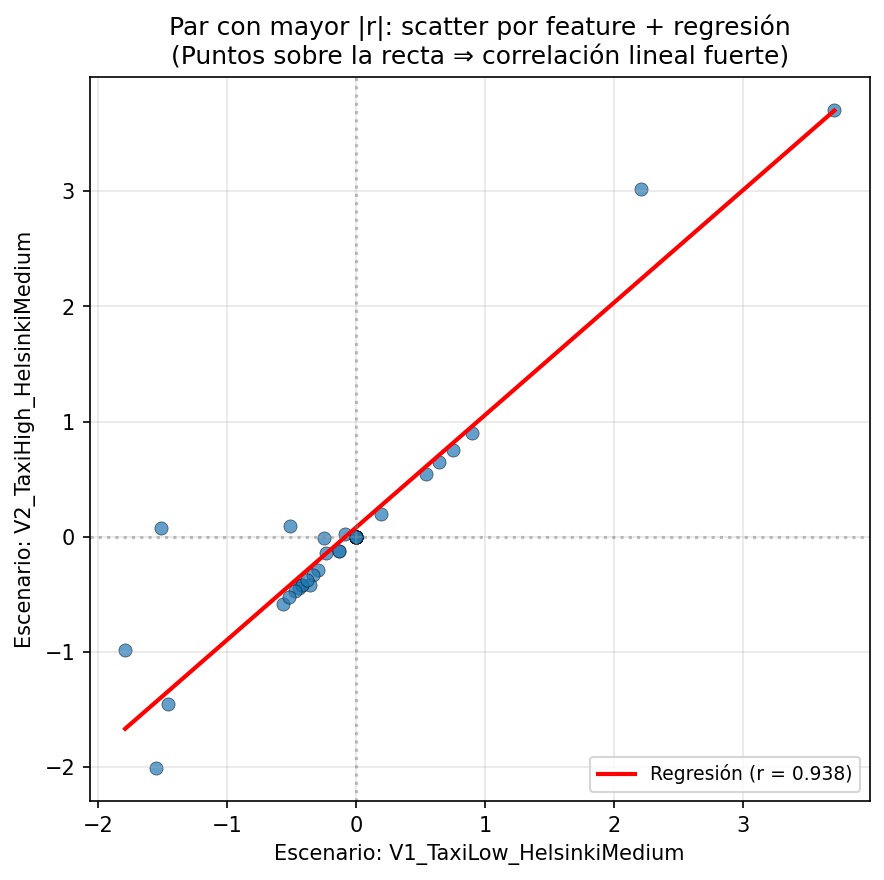
File: scatter_max_r_pair_regression.png
Correlation matrix between scenario output vectors (delivery ratio, latency mean, overhead ratio, drop ratio from ONE). Shows whether scenario behaviour (not only parameters) is redundant.
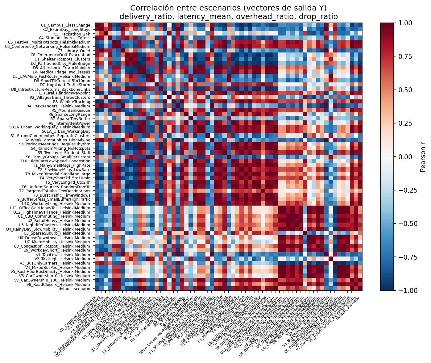
File: heatmap_pearson_outputs.png
| File | Description |
|---|---|
| correlation_report.txt | Max |r|, mean |r|, pairs with |r| ≥ 0.7, Spearman summary, cosine/euclidean distances, diversity criteria, top correlated pairs, FDR/Bonferroni. |
| multiple_comparisons_report.txt | Rejections and pairs with high |r| significant after FDR and Bonferroni. |
| clustering_report.txt | Ward clustering summary (e.g. k=7), silhouette. |
| outputs_correlation_report.txt | Correlation and distances on output vectors. |
| scenarios_to_diversify.txt | List of scenarios to diversify (high correlation or dense clusters). |
| observaciones_correlacion.md | Notes on correlation and benchmark criteria. |
| plan_radical_scenarios.md | Plan for radical scenarios (spatial structure, TTL, buffer, etc.). |
| cambios_diversificacion_top_pares.md | Record of diversification changes for top pairs. |
Links: reports/ in repo
Main CSV files produced by the pipeline:
| File | Description |
|---|---|
| features.csv | One row per scenario, columns = features (46). |
| features_normalized.csv | Z-score normalised features. |
| normalization_params.csv | Mean and std per feature. |
| correlation_pearson.csv, correlation_spearman.csv | 60x60 correlation matrices (feature vectors). |
| distance_cosine.csv, distance_euclidean.csv | 60x60 distance matrices. |
| cluster_assignments.csv | Scenario → cluster (Ward). |
| output_metrics.csv | Delivery ratio, latency mean, overhead ratio, drop ratio per scenario. |
| correlation_pearson_outputs.csv, distance_*_outputs.csv | Correlation/distance on output vectors. |
Links: data/ in repo
- Results overview — Main metrics and interpretation
- Methodology — How figures are produced
-
Quickstart — Regenerate with
--phase figuresand--phase outputs