Network visualization - QueensGambit/CrazyAra GitHub Wiki
Network visualization
In order to understand what the neural network has learned one common technique is to visualize the parameters of the network and to show the activation maps of a forward propagation of a single data sample.
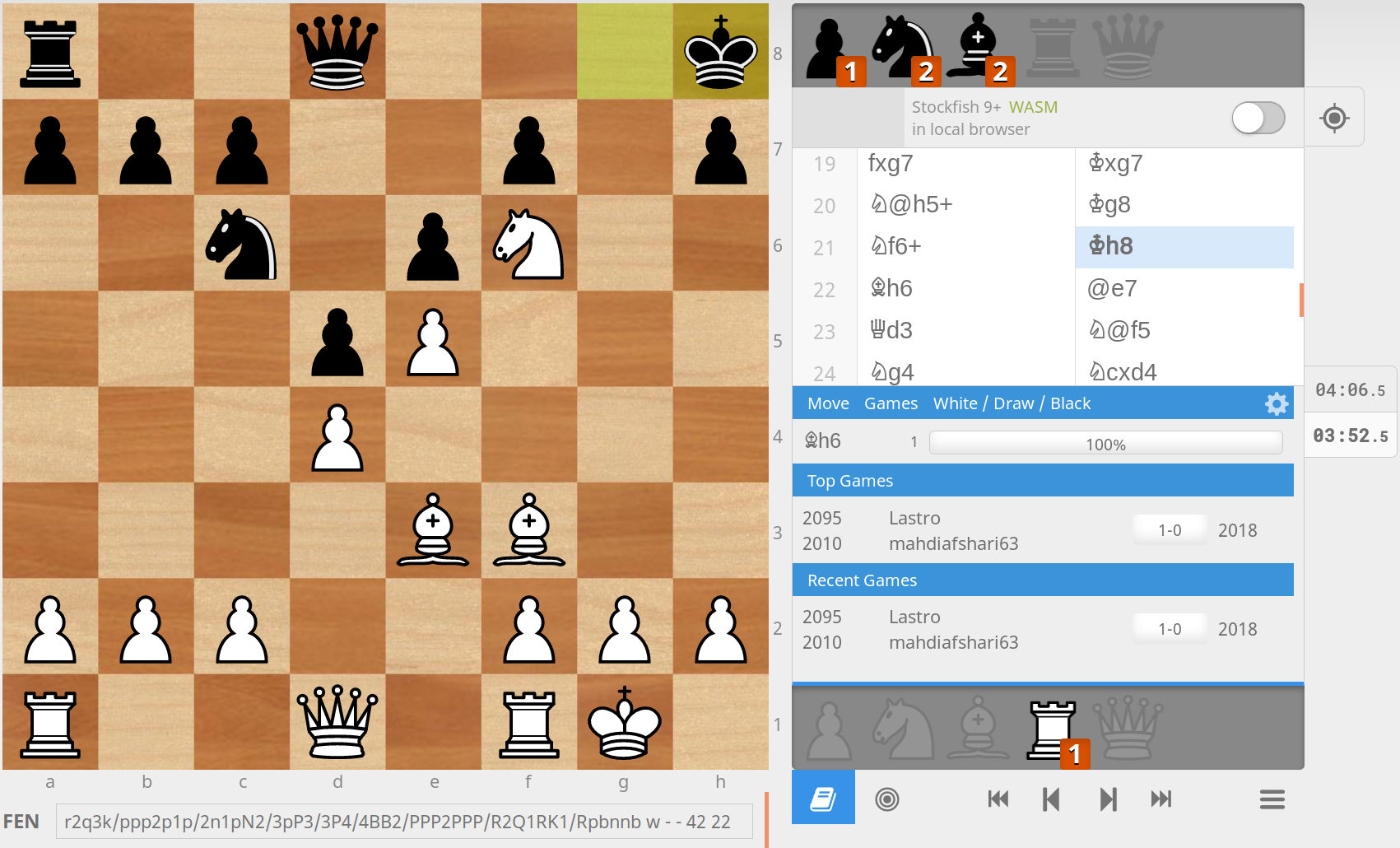
In this case we use an example board position which is the first game in the test dataset.
The game was played by FM Lastro (2095) and mahdiafshari63 (2010) in august 2018: https://lichess.org/jsPkVxaU
As the board position we use move 22 with white to play:
- FEN:
r2q3k/ppp2p1p/2n1pN2/3pP3/3P4/4BB2/PPP2PPP/R2Q1RK1[Rbbnnp] w - - 4 22
White is winning and has many potential good moves to play.
For all coming graphs the trained Rise model for the CrazyAra 0.2.0 release was used.
 Source: https://lichess.org/jsPkVxaU (Url-date: 2018-10-27)
Plane representation
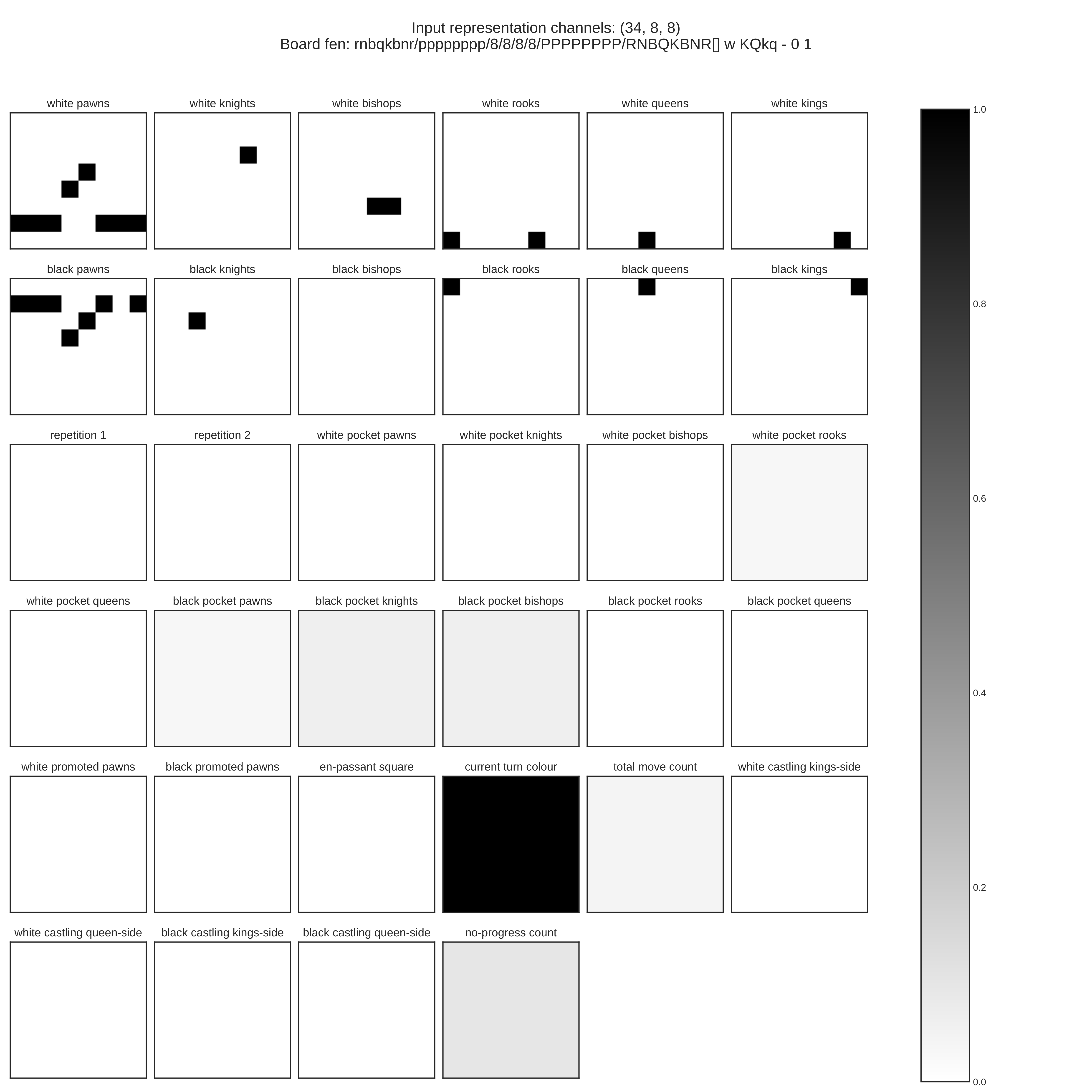
The board position is first converted into the plane representation for the convolution neural network.
The resulting floating point matrix has a dimensionality of 34x8x8:

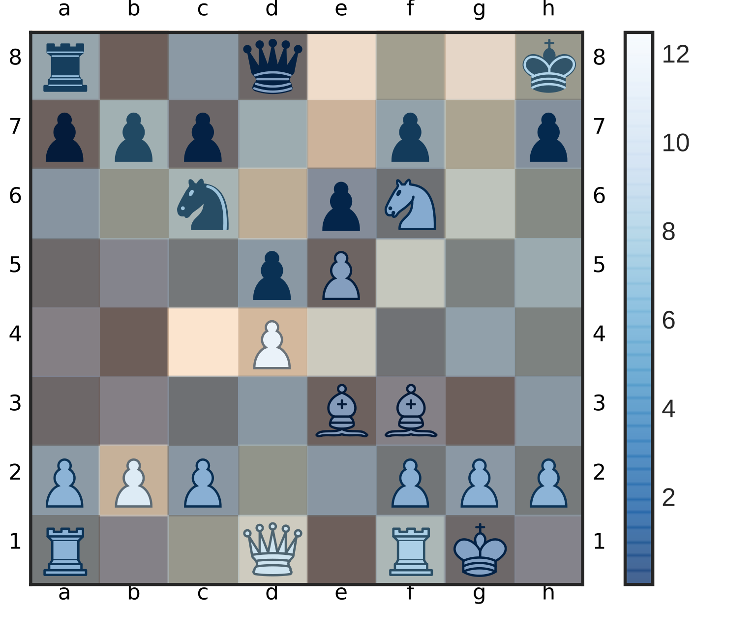
For a more compact visualization representation one can use a pseudo color conversion for the first 12 channels:
| Game: https://lichess.org/jsPkVxaU | Pseudo color visualization |
|---|---|
| Starting position | Pseudo color visualization |
Convolutional filter kernels
Next one can take a look at the 3x3 kernels of different convolutional filters.
The left plot visualizes all parameters of the convolutional filter which has dimensionality of 34x3x3.
In order to show all 256 filter of the fist conv-layer, the filter parameters have been summed across the firs access. Meaning that the first image in the 16x16 grid represents all 34 channels at the right.
| First kernel filter of first convolutional layer | Kernel filters of first convolutional layer - summed across axis=1 |
|---|---|
Feature activation maps
The feature map activations indicate to which parts of the image the network attaches the most importance in order to give the final prediction. The left image shows the activation maps in the early stage of the network. The right plot shows the 256 activation maps after they have been processed by the residual tower. One can notice a lot more details and visually sharper activation maps in the right plot.
| Activation maps after first conv-layer | Activation maps after residual tower |
|---|---|
Network predictions
Now we take a look at the actual network move predictions.
To avoid overplotting only the first ten candidate moves are shown.
The move that the human played was e3h6 which is also the top recommendation according to the network policy distribution.
The predicted value of the board state is 0.78 which can be interpreted as a (0.78+1)/2.=89% chance to win the game from here on. White in fact won this game.
| First 10 proposed candidate moves | Sorted policy distribution |
|---|---|
The maps for predicting the single scalar value indicating the chance of winning is determined by eight feature maps. For the policy the Rise architecture uses 16 feature maps.
| Value activation maps | Policy activation maps |
|---|---|
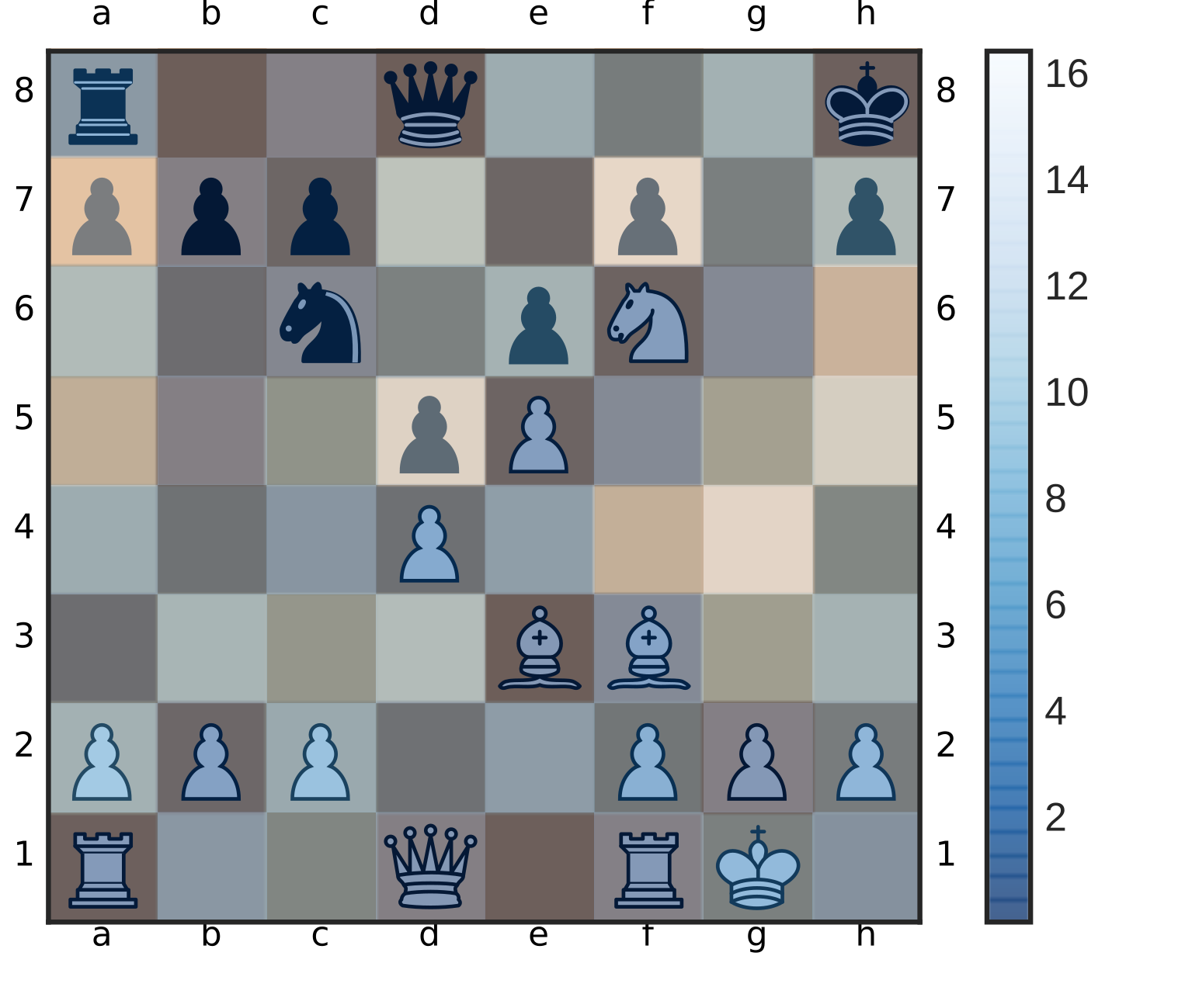
To improve the connection of the policy map and value map, all value and policy maps have been summed across the second axis and overlayed on top of the given chess board. Intuitively the network highlights the squares of the piece which are most likely to move.
| Value overlay - summed across axis=1 | Policy overlay - summed across axis=1 |
|---|---|
Comparision to old policy activation using 2 channels
The architecture proposed by DeepMind only had two channels for the policy distribution prediction.
For the game of Go two feature are sufficient to create a stable policy distribution.
In the game of Shogi and Crazyhouse there are a more ambiguities for a single square.
First you have to encode the starting- and the target square. Besides that one must declare all possible dropping moves for the same square for all possible pieces. Additionally there the option for promoting a pawn to different piece types which is also mapped to the same square.
The next two figures show the policy overly of a trained model with only two final policy maps.
The highlight for most squares appears to be reasonable.
However one thing that appears to be strange is that the squares a5 a6, a7 are highlighted in the second policy map despite the fact no one of the first ten candidate move has an obvious connection to it.
We argue that this is the result of creating a too harsh bottle-neck. The network seems to have learned to encode meta-informations such as the type of piece to drop or to promote with move square which are rarely seen in the train dataset.
This explains why the training process became a lot more stable when adding new convolutional channels for the policy distribution.
| Policy map channel 0 | Policy map channel 1 |
|---|---|
 |
 |