4. PRIDE Inspector charts documentation - PRIDE-Archive/pride-inspector GitHub Wiki
PRIDE chart Documentation
PRIDE Inspector Toolsuite ‘Quality Chart’ is a library to provide quality charts for quality assessment of MS/MS proteomics experiments ranging from spectrum and peptide/protein identifications to quantitation results. It provides at present nine charts: Delta m/z, Number of peptides identified per protein, Number of missed tryptic cleavages, Average MS/MS Spectrum, Precursor ion charge distribution, Precursor ion masses distribution, Number of peaks per spectrum, Peak intensity distribution and Quantitation variables distribution per peptides. For all the charts five different categories are used: unidentified spectra, identified spectra, target identifications, decoy identifications, all spectra.
Delta m/z
This chart represents the distribution of the relative frequency of experimental precursor ion mass (m/z) - theoretical precursor ion mass (m/z). Mass deltas close to zero reflect more accurate identifications and also that the reporting of the amino acid modifications and charges have been done accurately. This plot can highlight systematic bias if not centered on zero. Other distributions can reflect modifications not being reported properly. Also it is easy to see the different between the target and the decoys identifications.
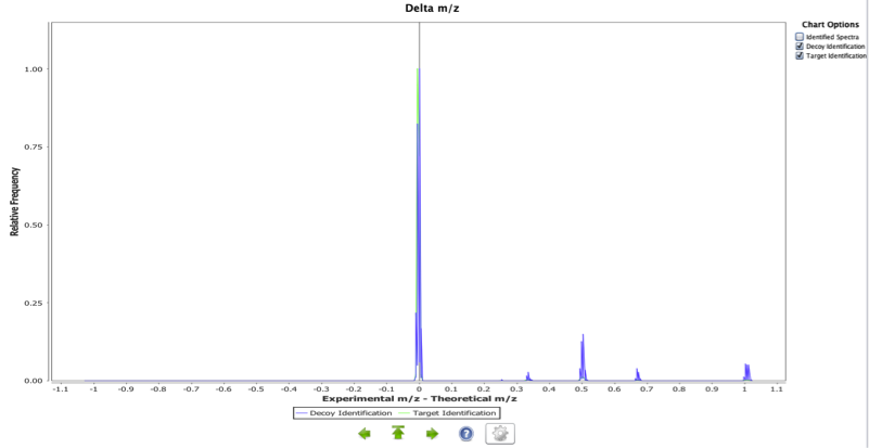
In Figure 1, we can clearly see that the distribution for this experiment is centred close to zero with for target identifications, but for decoy identifications peaks at 0.5 and around 0.7 m/z units show that are wrong identifications. Peptide sequences, charges and modifications, have been accurately reported and the instrument calibration was fine.
Distribution of Peptides per Proteins
This is a bar chart displaying the percentage of protein identifications in the whole experiment according to the total number of peptides used to report the identification. Proteins supported by more peptide identifications can constitute more confident results.
Note: To investigate further, in the Protein view, one can sort the proteins by number of peptide identifications.
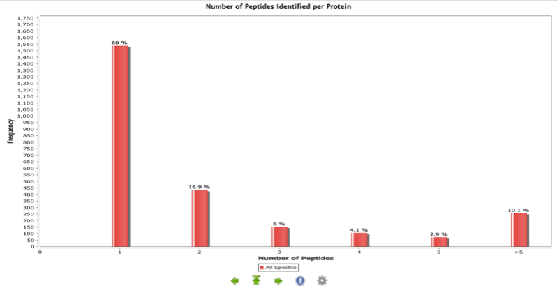
In the experiment represented in Figure 2, 60% of the proteins were identified through one PSM only. The rest of the protein identifications, especially the ones with higher peptide numbers can be considered more reliable identifications.
Number of Missed Tryptic Cleavages
This is a histogram representing the percentage of peptides in the experiment with a different number of missed tryptic cleavages in peptides. This graph is only applicable to experiments where trypsin is used. Two assumptions were made for these calculations: first, the enzyme used in the experiment is trypsin; second, the cleavage rule used by the enzyme is “C-terminal side of K or R except if P is C-term to K or R”. This chart can be used to compare several experiments where the same number of missed cleavages has been used as a parameter for the search, and the same experimental conditions used. Then a dramatic change in the shape of the chart could mean a change in the efficiency of the trypsin used (though many other factors can also be the reason for it, such as a change in the parameters of the search engine, database size and other experimental causes).
In a more practical way, this chart has two immediate applications: first, checking that the search engine is working correctly and the number of missed cleavages found in the identified peptides matches with the "missed cleavages" parameter used in the search engine. Second, by knowing the distribution of this chart, the researcher can adjust the number of missed cleavages used in future searches: e.g. maybe the use of 4 missed cleavages instead of 1 is producing only a 0.1% increase in peptide identifications with searches that are 10 times longer.
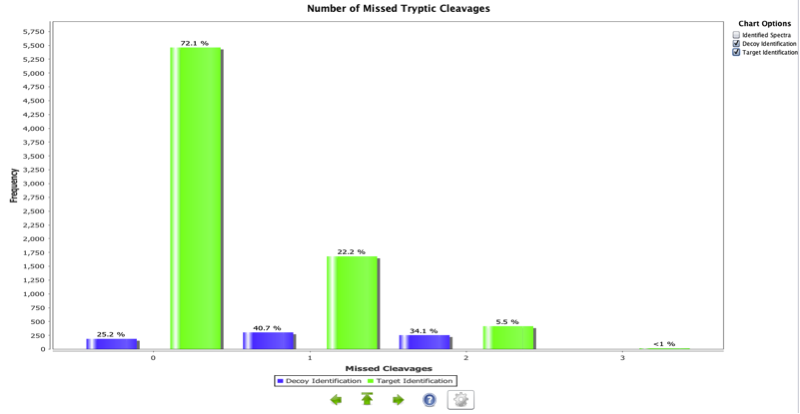
Figure 3 shows an example where only about 72% of the target peptides do not have a missed cleavage. However, it is interesting to see that most of the decoy identifications contain missed cleavages.
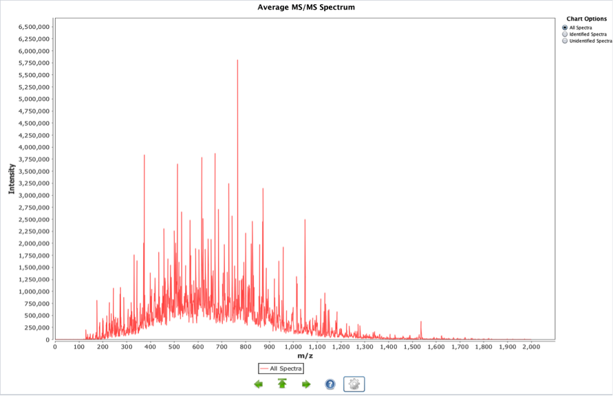
Average MS/MS spectrum
This graph is obtained adding all the MS/MS spectra in a given experiment. The result is an averaged spectrum. The highest peaks will reflect abundant and intense peaks in the overall set of MS/MS spectra. Most intense and ubiquitous peaks (both conditions needed) will be displayed here: contaminants, reagents used in the experiment, frequent fragmentations from highly common peptides. The next chart (Figure 4) shows an example of a public experiment in PRIDE, using iTRAQ reagents for quantification. The zoom has been used to show in detail the highlighted information.
Precursor Ion Charge
This is a bar chart representing the distribution of the precursor ion charges for a given whole experiment. This information can be used to identify potential ionization problems including many 1+ charges from an ESI ionization source or an unexpected distribution of charges. MALDI experiments are expected to contain almost exclusively 1+ charged ions. An unexpected charge distribution may furthermore be caused by specific search engine parameter settings such as limiting the search to specific ion charges.
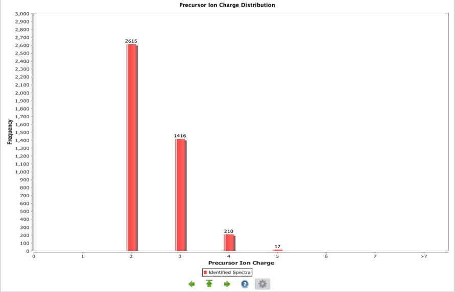
In this ESI experiment there are no single charged ions but only double and triple charged ones.
Precursor Ion Masses
This chart represents a relative frequency distribution of precursor ion masses for the experiment (red curve) against a reference (if selected by the user). It is possible to filter the information for all, identified and unidentified spectra. Three references are available for the users:
1- Empirically derived precursor ion mass distributions from PRIDE experiments that have a single tryptic digest step annotation associated with them and its upper and lower quartiles. This reference is aimed to provide a species independent distribution.
2- Reference obtained in an analogous way from PRIDE human experiments.
3- Reference obtained in an analogous way from PRIDE mouse experiments.
Experiments that only contained peptides without missed cleavages were ignored as such results are caused by specific search engines parameters and do not reflect the biological background. These peptides are generally shorter and thus these experiments would shift the overall distribution towards the lower masses.
A curve that lies to the left of the empirical distribution (in a different colour) identifies a disproportionate number of lower mass peptides being identified/ fragmented. In an analogous way, a curve that lies to the right of the empirical distribution identifies a disproportionate number of higher mass peptides being identified/ fragmented. Such alterations may be caused by the general amino acid composition of the organism being investigated, or the digestion protocol used (non-tryptic) but does not necessarily indicate a problem in your experiment.
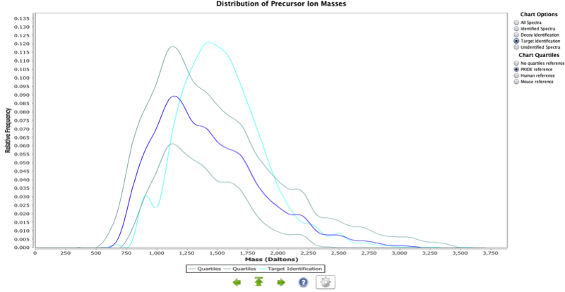
For human, the average tryptic peptide mass is 1,100 Da. This distribution should encompass this average. A shift to the right in this distribution should be expected due to a number of missed cleavages resulting in higher mass peptides.
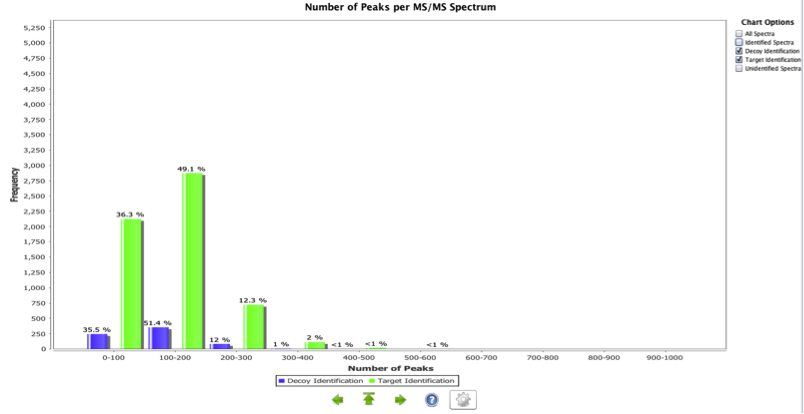
Peaks per MS/MS spectrum
This chart represents a histogram containing the number of peaks per MS/MS spectrum in a given experiment. This chart assumes centroid data. Too few peaks can identify poor fragmentation or a detector fault, as opposed to a large number of peaks representing very noisy spectra. This chart is extensively dependent on the pre-processing steps performed to the spectra (centroiding, deconvolution, peak picking approach, etc). The example shown in Figure 7 shows that poor quality spectra are more likely to be decoy identifications that target identifications.
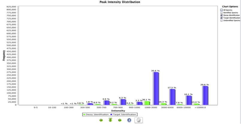
Peak Intensity Distribution
This is a histogram representing the ion intensity vs. the frequency for all MS2 spectra in a whole given experiment (Figure 8). It is possible to filter the information for all, identified and unidentified spectra. This plot can give a general estimation of the noise level of the spectra. Generally, one should expect to have a high number of low intensity noise peaks with a low number of high intensity signal peaks. A disproportionate number of high signal peaks may indicate heavy spectrum pre-filtering or potential experimental problems. In the case of data reuse this plot can be useful in identifying the requirement for pre-processing of the spectra prior to any downstream analysis. The quality of the identifications is not linked to this data as most search engines perform internal spectrum pre-processing before matching the spectra. Thus, the spectra reported are not necessarily pre-processed since the search engine may have applied the pre-processing step internally. This pre-processing is not necessarily reported in the experimental metadata.
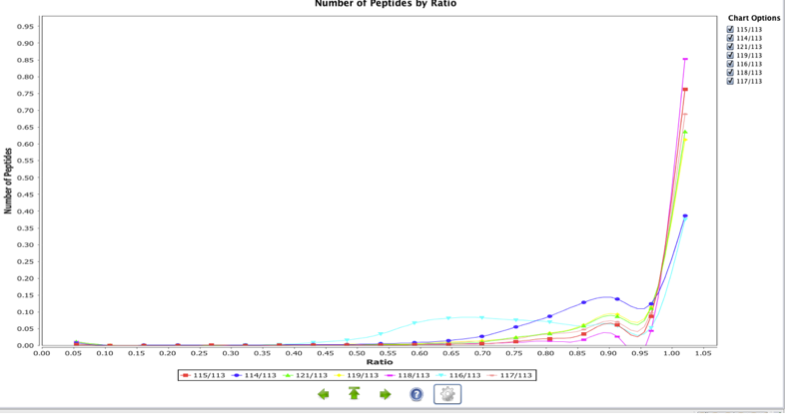
Peptide per Ratio
The Peptide per Ratio is a chart representing the peptide distribution versus the study variables in the quantitation experiment. It shows the differences between all the replicates and samples for every peptide. In addition, it shows the relation between different conditions globally. The following example shows the differences between all the samples in an 8-plex iTRAQ experiment.