OpenESF_UI_Changes_v13_6_8 - OpenESignForms/openesignforms GitHub Wiki
Updated Open eSignForms User Interface for v13.6.8
Introduction
The Open eSignForms release 13.6.8 was a significant rewrite based on the updated Vaadin 7 port. This is an overview of how the screens have changed as a quick start introduction for those familiar with the previous releases.
Note that there are no changes for customers, employees, partners and others who are signing your documents online. This just affects those who login to the advanced Open eSignForms Web 2.0 application.
Browser support has changed
With Vaadin 7 comes the latest Google Web Toolkit, and this means that support for buggy, unpatched and insecure old browsers is no longer supported. You should be using IE9 or later, or an up-to-date version of Firefox, Chrome, Safari, Opera, etc. as they are free and much more secure than any old browser.
Yozons recommends you keep your browser current so as to have the best standards compliance, but also to have a more secure version. Old browsers with their well-established security vulnerabilities should never be connected to a global network within a business environment, especially when it comes to a secure system like electronic signatures and encrypted data that may include sensitive information.
For those who are stuck using IE6 or IE7 (dangerous on the Internet), you may want to consider this:
http://www.google.com/chromeframe
Of course, it should not be a problem to use a modern browser as they are all free and you can run more than one browser on a computer if you really need to preserve compatibility with a particular application that itself is old and less secure by relying on insecure client software.
Overview
- The main menu no longer is the tree on the right side. It is now a more traditional tab-like menu on the top. This allows for long lists of transactions and reports and such to not cause the navigation to get too long. Also, after you you select something, the menu list pops back in so it doesn't remain cluttering the view.
- Except for clicks that start a transaction in a new browser window, you will note that the menu automatically opens in the tab interface. You should close these tabs when you are done to improve performance, but any tabs you leave there will re-open if you logoff and then log back in.
- The next change is the Production, Test Like Production, and Test modes. There's no more right-clicking or choosing Test/Production modes in reports. When you login, the last mode you set will be remembered.
- The document page editor has also changed a bit. The fields, parties, files, images and dropdowns lists that were all shown on the right side now only show one of them at a time in their own tabs, with the default being the list of fields. The "Add new" button for adding new of any of those is now in the main editor area.
- When in the document page editor, the TEST button puts the controls at the top since it was confusing to have the regular document buttons appear, and then scroll lower to find the test window buttons (to close the test window and select the party view to test).
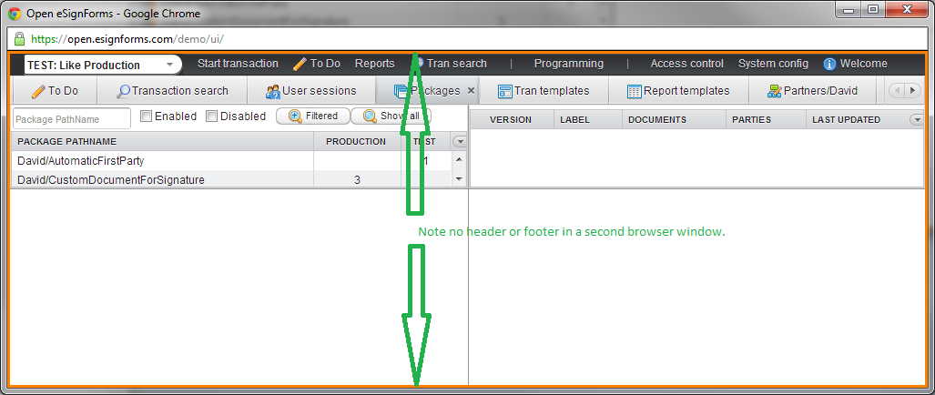
- If you have a large or dual monitor, there are times when you'd like to open multiple items and compare them. The easiest way to do that now is to click on the Open eSignForms logo in the upper left corner after you login. This will open a new browser window (note that it will not have the header/footer areas to make it clear it's a subordinate window) where you can navigate separately and then compare entries between the two browser windows.
Main View Modes: Production versus Test
Note that the mode selector is below the logo, on the menu bar line. The default mode is PRODUCTION: Live, meaning that these are real transactions for your business.
The mode primarily works on the first four menu items shown next to it:
- Start transactions will start new transactions in production mode, test like production mode, or test development mode
- To Do will show either Production or Test transactions based on the mode when you start it or refresh the list
- Reports will show either Production or Test transactions based on the mode when you list transactions
- Tran search will show either Production or Test transactions based on the mode when you list transactions
NOTE: Your mode has no impact on Programming, Access control or System configuration.
PRODUCTION: Live mode
The "normal" mode is PRODUCTION: Live, in which new transactions you start are for your regular needs, and To Do, Reports and Transaction Search return production-mode transactions. Also, when you click Start transaction you will only see transactions suitable for production mode.
Note that the header and footer have a blue background and the mode selector reads Production: Live
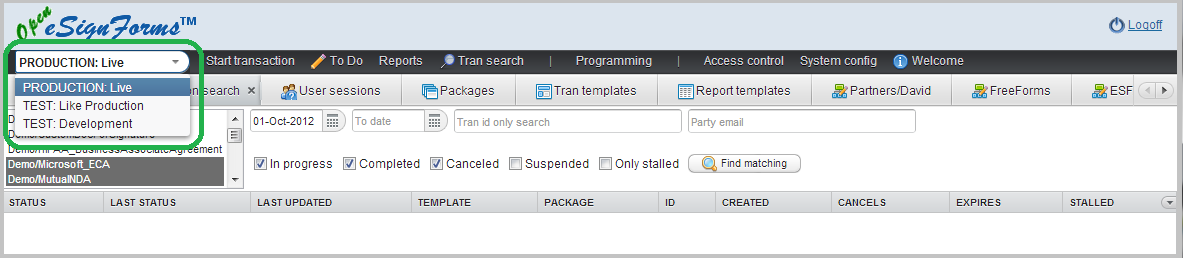
Click on the mode selector to change modes.
TEST: Like Production mode
In Test Like Production mode, you will see a new orange border that will help you understand that you are actually in test mode, albeit for production-level components (package, document, image, drop down, etc. all will use production versions). To Do, reports and transaction search will show only test transactions. When you run To Do or reports you will see a similarly colored orange dotted line appear under the search area to make it clear that the output you see in is for test transactions. This is because if you switch modes and you run reports or the like in different tabs, you will be able to tell easily if you were looking at test/production transactions in those reports.
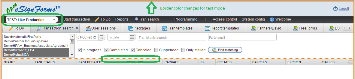
You should use this mode when testing what your customers/users will see so that you do not pollute your production reports with test transactions.
TEST: Development mode
In TEST: Development mode, the header and footer backgrounds will change to a yellow color along with that new orange border. It's the same background color as the library programming navigation shows to help tie in the fact that you are not only doing test transactions, but it resolves all parts with the latest test versions when available.
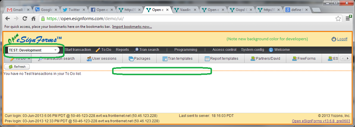
This is the mode suitable to the programmer or tester of new documents and process flows before they are put into production.
Main menu
The navigation tree that was on the left-side column has been moved to the black strip where the Production/Test mode drop down is. Click on any item to either view the screen or show a listing of additional choices.
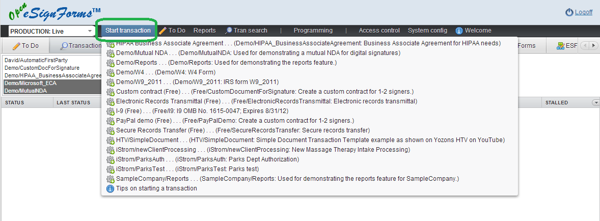
In this case, we've clicked on Start transaction which has produced a list of production-ready transactions. Just click on the transaction listed to start a new transaction of that type.
If in TEST: Like Production mode, the same set of transactions would be listed, but when you clicked on it, it would start it as a test transaction, though it would resolve all parts using production versions only.
If in TEST: Development mode, the list of transactions will include those that are under development but have not yet been put into production. If you click on a listed transaction then, it will be a test transaction that resolves test version parts first, and if no test version exists, then it would use a production version if available.
Main tabs
When you start a transaction, it will always appear in its own browser window. But for every other menu selection, it will open the chosen item in a tab below the menu bar.
Just click on an existing tab to view its contents again, or click the X in the tab name to close it (you must have at least one tab open, though).
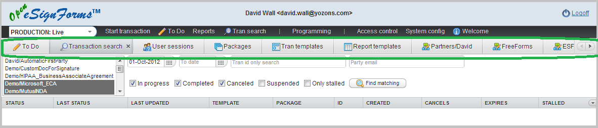
If you have more tabs than can be shown, arrow buttons will appear on the far right side to make those other tabs visible. There is no limit on the number of tabs you can have open, but we do produce a warning whenever you open the 15th tab during your login session. In general, you want to close tabs you are not longer using to improve performance on the server as well as in your browser.
If you click on a menu item that is already open in a tab, that tab will be shown again.
Comparing in a second browser window
If you have a large or dual monitors, you may want to open another view in a second browser windows to compare items. Just click on the logo in the upper left corner to open a new browser window that you can navigate separately, or even be in a different mode.
Document page editor
The document page editor should be familiar, except that now the fields, parties, files, images and drop down lists on the right panel are individually behind tabs. Just click on the appropriate tab to see the respective lists.
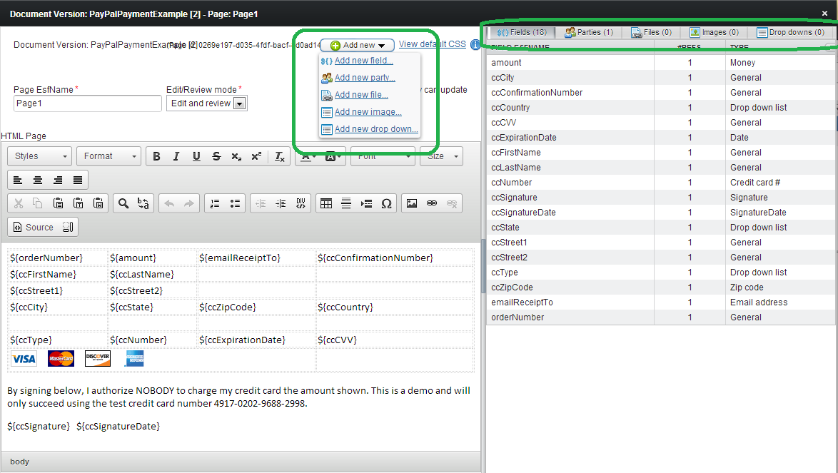
Also, the Add new button has moved to the main document editor area.
Document tester
The document tester should also be familiar, but note that the Close test window and View document as party drop down are at the top of the test window instead of at the bottom.
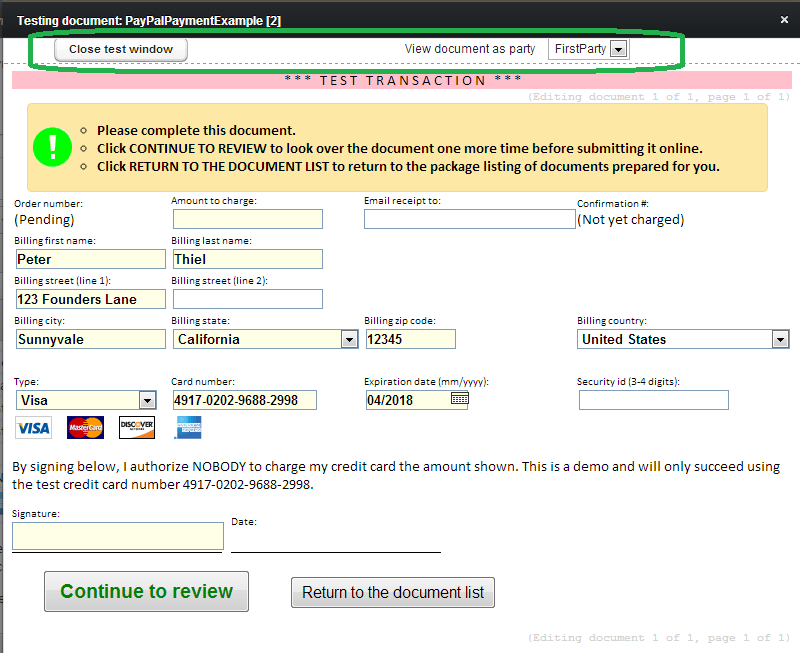
The buttons at the bottom, of course, are the document navigation buttons that parties will use when completing the document.
See it in action early
You can see the new user interface in action now on the demo system.
https://open.esignforms.com/demo/
Login using [email protected] and password demo2013 (THIS PASSWORD IS NO LONGER CURRENT)