Input Dialog - Neo-Mind/WARP GitHub Wiki
Ideally this should have been part of the Control Types page but it would have become even more bloated.
When the Exe.GetUserInput function gets invoked either in Main GUI or Test Bench, the tool dynamically creates an Input dialog tailored to suit the DataType being requested.
While the other controls are added based on the DataType the following set is common for all.
- The title on top
- The prompt text below it
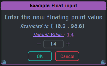
- The limit display (Only for Integers, Floats, Text & Hex strings)
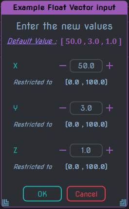
- The default value display (except for Boolean type). It also has a link to quickly set the value back to the default.
For integers, an IntField named intInput gets added below the default value display.
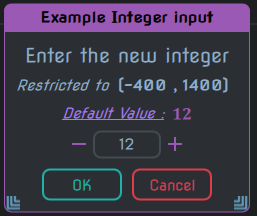
This is the common form that appears for all the D_Int* & D_Uint* types.
For D_Uint* types the lower limit will start from 0 or higher.
For integer vectors, multiple IntField gets added one below the other upto a maximum of 4. All of them are named intInput as well.
Each of them also get a TextLabel named idxPrompt containing their name.
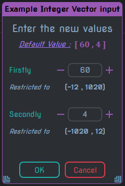
This is the common form that appears for all the D_VecI* & D_VecU* types.
For D_VecU* types the lower limit will start from 0 or higher.
For floating point number (D_Float), a FloatField named floatInput gets added below the default value display.
Just like Integer vectors, float vectors also get multiple FloatField added one below the other upto max of 4.
All of them are named floatInput and each gets the idxPrompt containing the name.
For font size/height, we get an IntField added with the name sizeField as well as a group of controls for demonstration purposes.
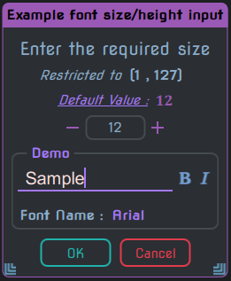
These are the names for each of the fields in the demonstration section
| Name | Description |
|---|---|
demoFrame |
The outer TitledFrame |
demoText |
The StringField inside which has the sample demonstration text |
boldBtn |
The ImageToggler to control boldness |
italicBtn |
The ImageToggler to control italics |
fontNamePrompt |
The TextLabel which says 'Font Name' |
fontSelector |
The ChoiceButton containing the list of fonts to select from for demonstrating the font size |
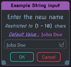
For text string (specified with D_Text), a StringField named strInput gets added below the default value display.
For hex string (specified with D_Hex) also we get the strInput just like Text string.
However the input characters are limited to hex characters only i.e. 0-9, a-f & A-F.
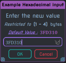
Future plans: Change to a seperate [HexField] which has a spinbox.
For file inputs (either D_InFile or D_OutFile), we get 3 controls added in a row below the default value display.
- The StringField named
strInput - An ImageButton named
browseBtnfor browsing the file system - An ImageButton named
viewBtnwhich opens the currently specified file with the default viewer.
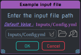
The difference between Input & Output only affects how the browseBtn works.
For D_InFile it will show a dialog to load a file and for D_OutFile it will show a dialog to save a file.
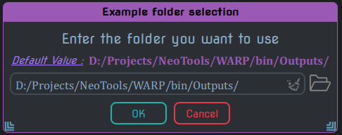
For folder input (specified with D_Folder), we get 2 controls added in a row below the default value display.
- The StringField named
strInput - An ImageButton named
browseBtnfor browsing the file system
For font name (specified with D_FontName), we get a list containing all the font families and a group of controls below it for demonstration purposes.
The list is placed inside a TitledFrame named fontFrame
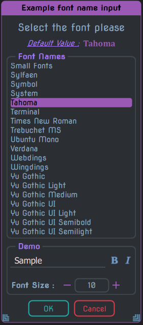
These are the names for each of the fields in the demonstration section
| Name | Description |
|---|---|
demoFrame |
The outer TitledFrame |
demoText |
The StringField inside which has the sample demonstration text |
boldBtn |
The ImageToggler to control boldness |
italicBtn |
The ImageToggler to control italics |
fontSizePrompt |
The TextLabel which says 'Font Size' |
sizeField |
The IntField for specifying the size to demonstrate the selected font with |
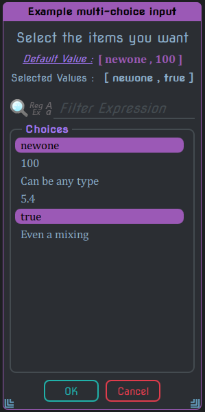
For choice types i.e. D_Choice & D_MultiChoice, we get the following set of controls added beneath the default value display.
-
Row of TextLabels
selValuePromptandselValueto show the currently selected value(s). For D_MultiChoice the values would be displayed within[ ] -
A Filter control for the list
-
The list containing the provided choices wrapped in a TitledFrame named
choiceFrame
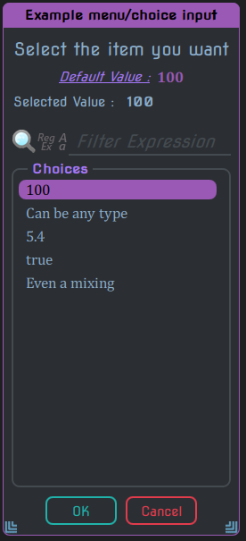
For D_Choice you can only have 1 selection at a time, but for D_MultiChoice there is no such restriction (in fact you can select everything in the list).
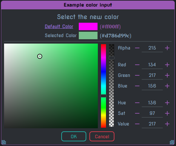
For color type (D_Color), the default value display also gets modifed to actually display the color next to it's hex value equivalent. The following set of controls also gets added below that.
-
A Selected value display using TextLabel named
selValuePrompt -
A demarcation line below which we get a group of controls some of which are custom.
-
On the left side a custom Saturation & Value picker control
-
Next to it is a Hue selector control
-
Next to it is an Alpha selector control. Depending on the constraints used this might not be visible.
-
Next is a column of IntFields to specify the individual components directly instead. All of them go from
0to255(except for the Hue which goes till365).
For Boolean type (D_Bool), there are no additional controls set. Instead the button texts get changed to Yes & No (or whatever has been set in the constraints).
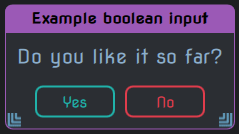
For this reason, this type is often used for posing Yes or No queries from scripts.