Visualizing correlations - Nealelab/ldsc GitHub Wiki
Visualizing LDSC correlations
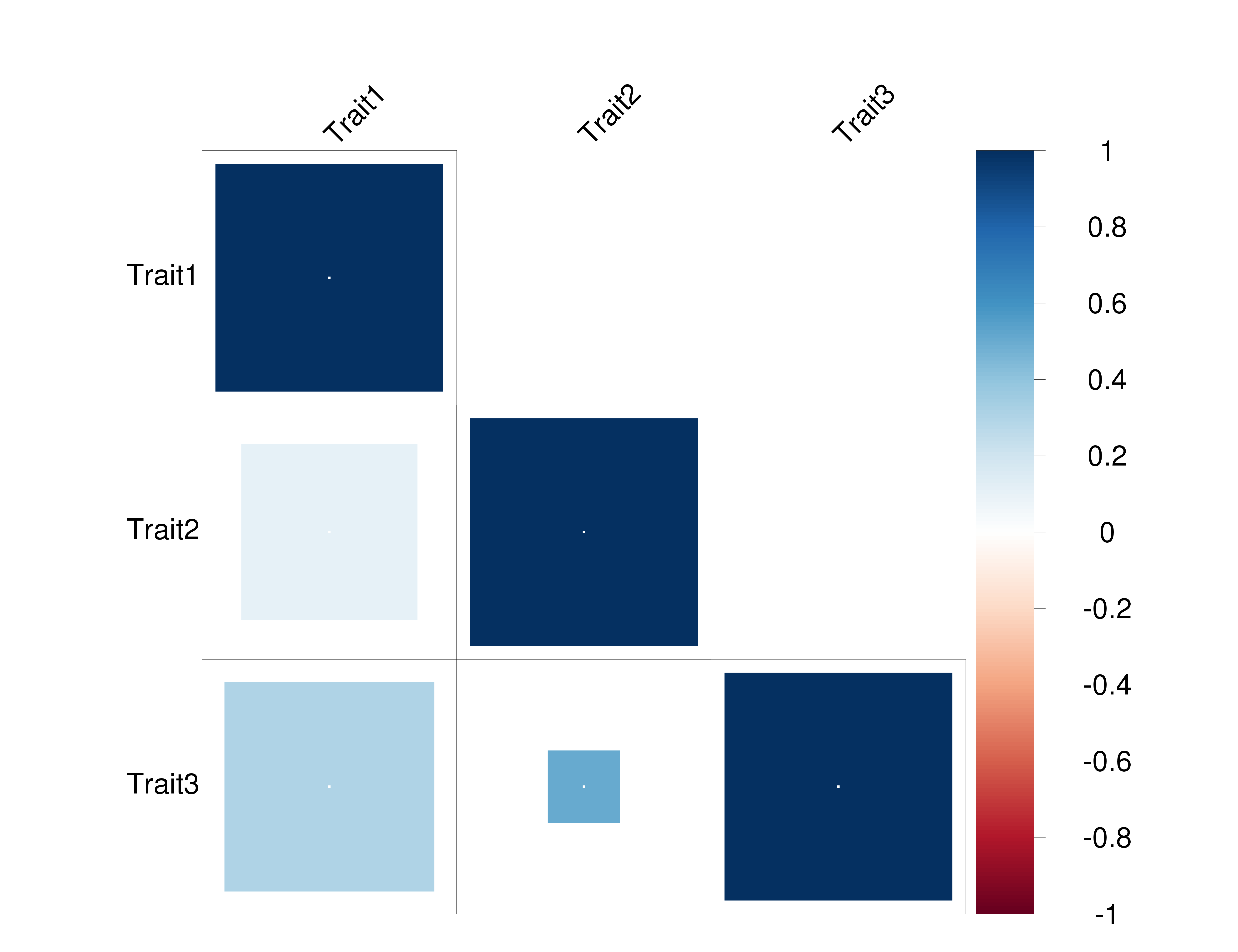
One good way to visualize the correlations from LDSC is to use a the corrplot package, which we used in the Atlas and Brainstorm papers.
A working implementation of the code used for the papers can be found here.
Usage:
Rscript plot_ldsc_corrplot.R CORR_VALUE_FILE P_VALUE_FILE NUM_TESTS
N.B.: both input files are expected to be tab-delimited, and need to be symmetrical (minus the header in correlation file used for phenotype names). If NUM_TESTS is zero, Bonferroni correction for multiple testing is done based on all tests in the input file; otherwise, e.g. if plotting a non-symmetrical matrix, enter number of tests.
The CORR_VALUE_FILE should look like:
Trait1 Trait2 Trait3
1 0.1 0.3
0.1 1 0.5
0.3 0.5 1
while the P_VALUE_FILE should look like:
1 0.1 0.05
0.1 1 0.5
0.05 0.5 1
This should give you the following plot: