Results Interpretation - NAVADMC/ADSM GitHub Wiki
The Results Home provides a visual reference point for exploring the outputs that have been created by a simulation. Each component of the Results Home will be covered in detail. All results data are available in a tabular form for further manipulation by statistical or other data processing software.
The example images shown in the document are taken from a variety of scenarios to show variations in the outputs. Comparisons of these images will not provide a consistent message.
Supporting Concepts - Managed Workspace
It is expected that users have a basic understanding of navigation in a file structure. ADSM uses a managed workspace. The application reads and writes to one directory on a user’s computer. This directory is created when the ADSM application is installed, according to the user’s preferences. File Explorer (formerly known as Windows Explorer) or other file management applications can be used to navigate within the file structure. The user may move files into and out of the ADSM Workspace. However, files moved out of the managed workspace will no longer be visible from within ADSM.
Results Options
ADSM returns more than 240 distinct variables that vary depending on the input parameters that were selected. Results from ADSM are presented in several ways.
- View the results. Visualizations of results are presented within ADSM in images, graphs, and tables. These viewable results are provided as summarized representations of the data. Details of each of these options are provided in this document.
- Query and export. Tabular data in raw form are stored in the SQLite database. These data are the base data for all visualizations and provide the granular detail shown in daily time steps. The database files are organized with the name given to the scenario followed by the .sqlite3 extension. These database files are stored in the ADSM Workspace. Accessing and manipulating data at the database level will be documented in the wiki.
- Supplemental files—details by iteration. Certain datasets can be generated based on user preference. These datasets have the potential to contain many records and therefore are not generated without specific instruction from the user. They are generated in granular detail providing the daily time steps for each iteration that the user has chosen to run. Details are provided later in this document.
The navigation panel on the left presents all the result sets that have been generated. The center panel displays a heat map representation of the outbreak, and a summary of selected variables appears on the right panel. At the bottom of the screen is the Calculate Summary button, a list of any supplemental files that may have been created, and the Back to Inputs button.
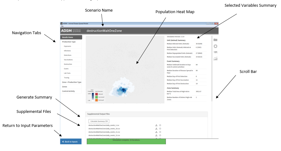
Navigation Tabs
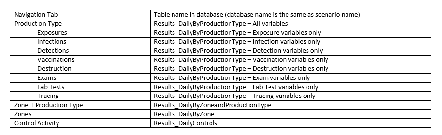
The Navigation tabs allow users to browse and visualize each output variable that has been created. The tabs correspond to a table in the scenario’s database. Due to the number of variables, Production Type is broken down into subsets.
Variables that were not populated appear under Empty Fields at the bottom of the variable list, indicating that the parameter to generate this output variable was not populated on the input side of the model.
All output variables that have returned data will provide a graphical representation of the data. The data will be presented in a string graph when a small number of iterations have been run and will appear as a heat map when a larger number of iterations have been run. A heat map is a two-dimensional representation of data in which values are represented by colors. In ADSM, a larger number of units appears as a darker color and a fewer number of units appears as a lighter color. A box and whisker plot is also provided.
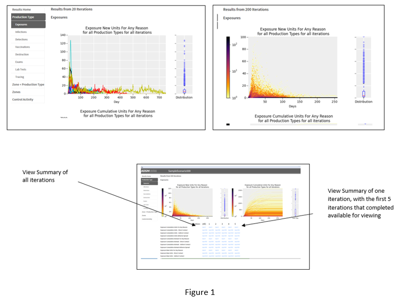
An example of New Exposures, regardless of contact method across all Production Types, is shown in figure 1. On day 1, there are few new exposures, as this example starts from a single index unit. As the outbreak progresses, there are more new exposures. As the outbreak wanes, the number of exposures drops. The string graph with fewer iterations illustrates this jump in exposures with a spike in the line. The heat map with many iterations illustrates this jump in exposures by showing a dark color on day 1 and a color spectrum as fewer units reach a high number of exposures. This illustration allows a visualization of the outliers in this results set.
Summary Population Heat Map
The grey box in the center displays a relational layout of the units included in the population file. The mouse scroll button allows magnification of the map. Within the application, resolution of the map is limited. On populations covering a large geographical area, scrolling may be limited and details may be difficult to see on the units. An output file named "population_map.png" is created in scenario/Supplemental Output Files/Map folder. This image file can be enlarged in a standard image file viewer to allow a more detailed view of the image.
This image shows the population units as they are related to each other based on a coordinate system, but they are not georeferenced or projected for a GIS system. For example, the population of a Texas herd would show the shape of Texas, but there is not a true reference to any geospatial data layers of Texas. Any real feature that would disrupt disease spread (e.g. the ocean) is not considered by the application.
The units appear as black square symbols. The size of the square relates to the number of animals in the unit, so a smaller square has fewer animals and a larger square has more animals.
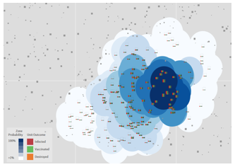
If the unit was infected in any iteration, the symbol changes from a black square into a graph. The bars in the graph from left to right are: Infected, Vaccinated, and Destroyed. This graph represents the number of times the unit had each of these events occur out of all the iterations completed. It would be expected that the index herd would always have 100% infection, as it is infected in every iteration.
If the scenario included zones, the color intensity also communicates information about the data. The darker the blue color, the more likely the unit was infected in more iterations. This shows the probability that the unit was in a zone of infection. The colors graduate out to white. This gradation allows the visualization of the full geographical spread of the outbreak over all iterations.
This map is a summary of all iterations. Just as we cannot distinguish individual farm details, we cannot distinguish individual zone details in a simple visualization. Therefore, zones are a generalized reference of how disease spreads that is suitable for viewing within the application. If detailed farm location and status analysis are needed, use the Supplemental Output files and a GIS system for a day-by-day, farm level assessment of spread. Zones are drawn to be 1/50 the width of the total map.
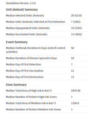
Selected Variables Summary
The Selected Variables Summary shows a subset of variables that give a high-level overview of the scenario. All variables are available in the Navigation tabs. These variables were selected by CEAH analysts to provide a quick comparison between scenarios. Several items provide both a unit count and an animal count.
Supplemental Output files
Below the Population Heat map are any supplemental files that may have been generated. Supplemental files are activated in the Output Settings Modules for input. They are saved in the ADSM Workspace under the Scenario Name directory. There are four options for supplemental output:
-
Daily Unit States. This file is created by iteration, by day, and contains the state of each unit on each day of the iteration.
-
Daily Events. This file details by iteration, by day, and by herd ID every event that takes place and the reason that the event happened.
-
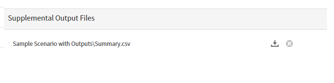
Daily Exposures. This file details the disease spread through contact. It includes the unit that was the source of the disease exposure and infection and the recipient unit and the contact method that caused the disease spread, as well as other information.
The fourth option is a summary report. There is a button to generate the summary report, labeled Calculate Summary CSV. The time to generate this .csv report depends on the number of iterations completed. Since this action adds additional time for processing, it was not incorporated into the general results datasets. When completed, the report path will display icons to delete or download. Please note that the report is already saved into the common ADSM Workspace. The download options give the user the ability to navigate to another directory to save the report file.