A Quick Start Guide: Running the sample scenario - NAVADMC/ADSM GitHub Wiki
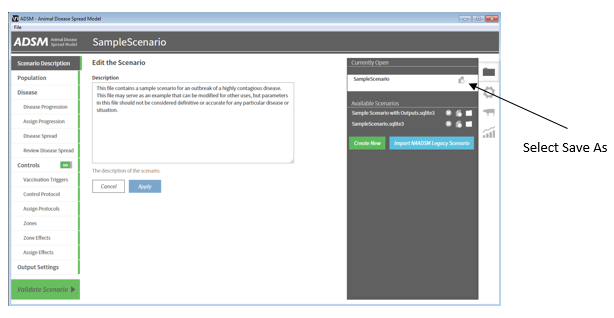
ADSM is supplied with a sample scenario, which includes an fake population and parameters for a fictitious disease. To view and run this sample scenario, start the ADSM application, select the File Management panel on the right, select SampleScenario.sqlite3. To make a copy of the Sample Scenario under a new name use the duplicate or Save As button and the prompt to rename the scenario will appear.
The starting population
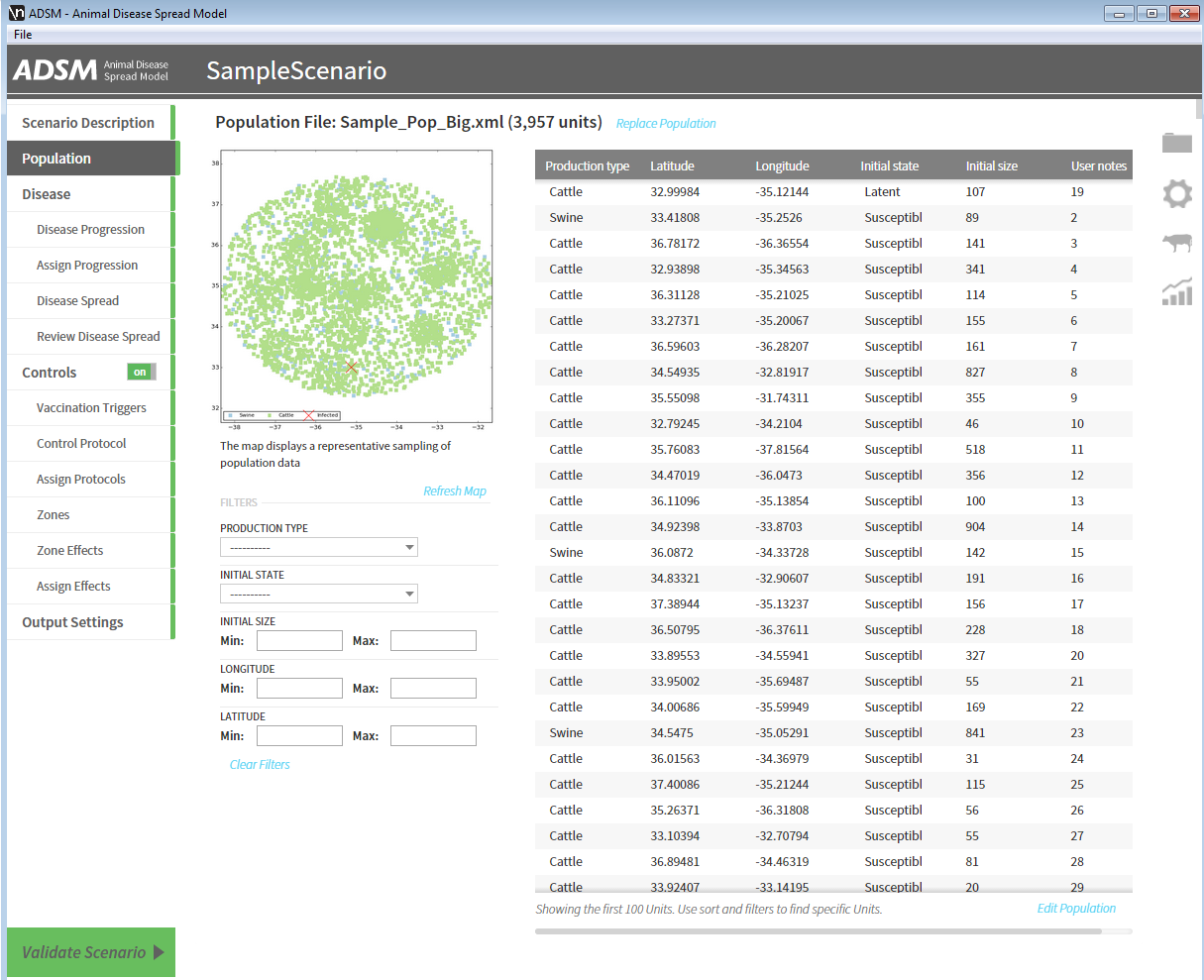
Once you have opened and renamed the scenario, select the population module. You will see a map of the population. Each dot represents the location of a particular unit. Note that nearly all Units in the Population have the inital state of "Susceptible". The Unit listed first is "Latent". This represents a latent infection in the herd, which will be the source of the simulated outbreak. You can edit the population to change the initial state or other attributes of the population using the "Edit Population" option in the lower right corner.
The disease scenario
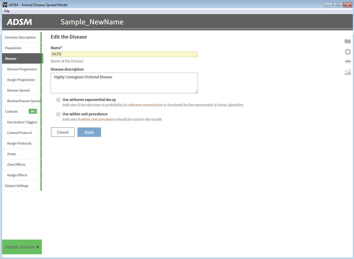
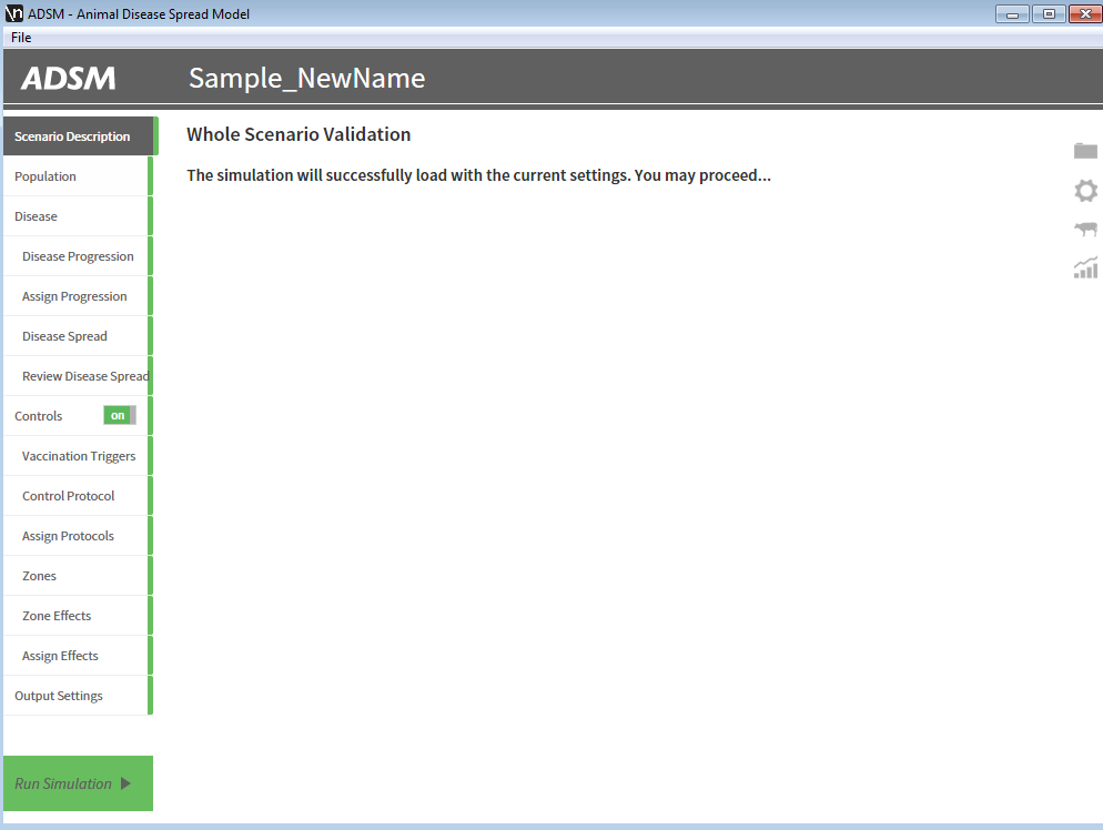
To review the parameters for this scenario, you may select any one of the headings in the Navigation Panel on the left to skip directly to the section of interest. The Navigation Panel is sorted in the recommended order that a user would fill out the scenario. At the bottom left, there is an option to validate the scenario. Selected this to proceed.
Ready to Launch the simulation
To start the simulation, click "Run Simulation" in the bottom left hand corner. As the simulation runs, the progress bar under "Results Home" will fill in and turn green when complete. The Results Home page will show a map of your Population followed by some important median statistics that are useful for understanding the typical outcome.
Viewing simulation output
Once all iterations of the simulation complete, ADSM will render a new map which shows the distribution of outcomes in all simulations. Zones coverage is colored from white (1%) up through dark blue (100%). Unaffected Units are grey squares according to the Unit size. Affected Units show their distribution of outcomes in three bar graphs: Infected (Red), Vaccinated (Green), and Destroyed (Black).
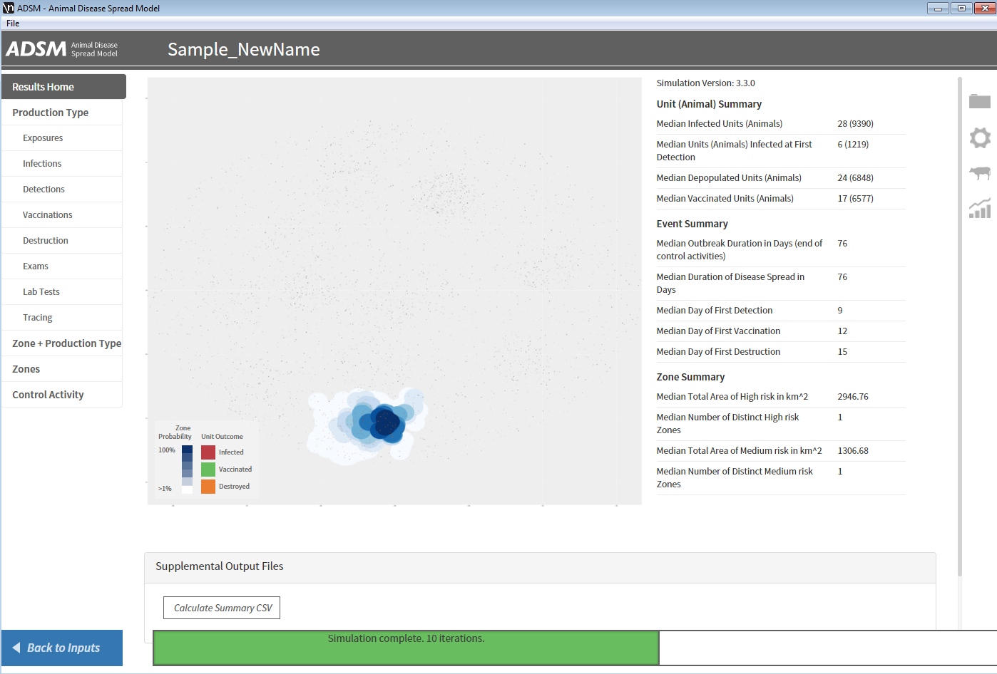
Results Details
To dig into the details, you can visit each of the sections in the Results Navigation Panel. ADSM reports on over 300 variables, broken down by Production Type, Zone, both Zone and Production Type, or Control Activity. Production Type has the most information and filtered subsections (Exposures, Infections, etc) are listed in the Navigation Panel.
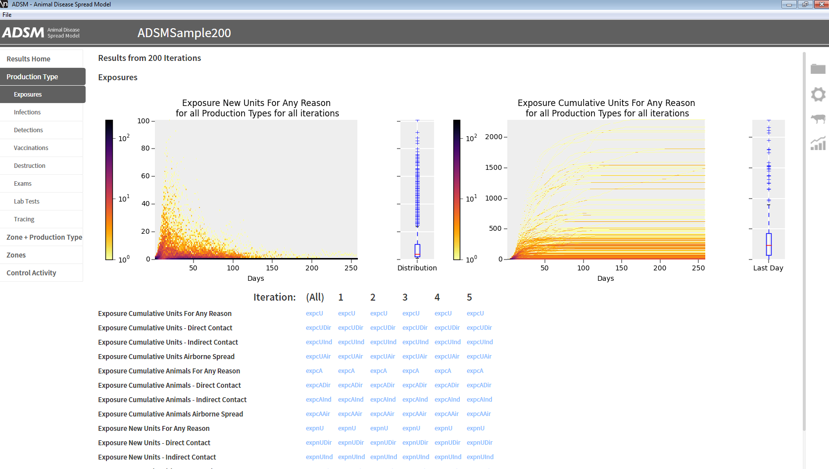
The distribution of outcomes for all iterations on every day is represented as a 2D Histogram. This screenshot shows the outcome over 200 iterations for statistical significance (and because these graphs look more interesting). The 2D Histogram is equivalent to 200 line graphs piled into 1 graph. The color at any point represents the number of lines that overlap at that point. Dark colors represents the common outcomes >10% while light yellow colors are the outliers. Keep in mind that these graphs give a lot of screen real estate to outliers. The boxplots show that the mean is less than 10 while the outliers can reach over 80 Exposures in a single day.
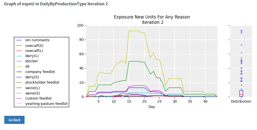
To dig deeper, browse through the links for more specific statistics e.g. "Exposure New Units - Any Reason". The first column (All) shows the distribution of all outcomes summarized. The remaining columns allow users to look at a sampling of specific iterations. When only one iteration is being shown, ADSM shows the results as a normal line graph and further breaks the results down by Production Type. This image varies from the other examples and shows a different scenario that has many production types.