QC Guide - Mye-InfoBank/scRAFIKI GitHub Wiki
Perfoming QC on AnnData
Introduction
This wiki aims to be a generalized QC guide for all scRNA seq datasets. It starts with your generated or downloaded read/count matrix with your added metadata. The goal is to filter out bad quality samples, without filtering out rare populations of cells. The usual covariates analyzed for this purpose are percentage of counts from mitochondrial genes, number of genes (features) per barcode, number of total counts (library size/count depth) per barcode. The step before filtering your dataset is to find meaningfull thresholds to exclude outliers. One approach well suited for small datasets is the manual approach via visual outlier search. For larger datasets or several ones it is advised to use an automated approach based on the median absolute deviations within the distribution of the chosen covariates. We also use the term 'barcode' instead of cell following the example of several publications of the Theis lab, as a barcode may mistakenly tag multiple cells (doublet) or may not tag any cells (empty droplet/well) Current best practices in single‐cell RNA‐seq analysis: a tutorial (Luecken and Theis, 2019).
See Current best practices in single‐cell RNA‐seq analysis: a tutorial (Luecken and Theis, 2019) for examples on the meaning of high or low values in either of the covariates and a good overview on how to perform QC in the paragraph 'quality control' on page 3.
Manual approach for few or small datasets
1. Data pre-processing
- label mitochondrial (mt) genes
- use scanpy calculate_qc_metrics function
The first step is to calculate the QC covariates e.g. using the scanpy function 'calculate_qc_metrics', which can also calculate the proportions of counts for specific gene populations. setting log1p to True also logtransformes the counts and saves them into a new column in obs.
adata.var['mt'] = adata.var_names.str.startswith('MT-')
sc.pp.calculate_qc_metrics(adata, qc_vars=['mt'], percent_top=None, log1p=True, inplace=True)
2. Visualization of data
- violin plots of covariates
- histograms of feature count and total counts
- scatter plot of all covariates
To visualize your data before filtering you can plot violin plots of the three covariates:
sc.pl.violin(adata, ['n_genes_by_counts', 'total_counts', 'pct_counts_mt'], jitter=0.4, multi_panel=True)
Example histogram of violin plots:
Also have a look at a scatter plot of all 3 covariates together as you want to consider them jointly:
sc.pl.scatter(adata, x='total_counts', y='n_genes_by_counts', color='pct_counts_mt')
Example histogram of joint scatter plot and log version:
Have a look at this figure with the chosen thresholds (red line) for your manual thresholding (also from Current best practices in single‐cell RNA‐seq analysis: a tutorial (Luecken and Theis, 2019)):
look at the histplots to remove outliers (you can subset your data to 'zoom in').
p1 = sns.histplot(adata.obs['total_counts'])
plt.show()
p3 = sns.histplot(adata.obs['total_counts'][adata.obs['total_counts']<2000], bins = 40)
plt.show()
Example histogram of total counts and 'zoom' into counts below 2000
You can also have a look on the log distribution of your counts, as single cell expression data can be heavily skewed (lots of zeros) and to stabilize variation within groups.
Example histogram of log total counts and proportion of cell types
As Germain et al. 2020 found out in their study, manual quality controls varies on populations (have a look at the Figure 3 A):
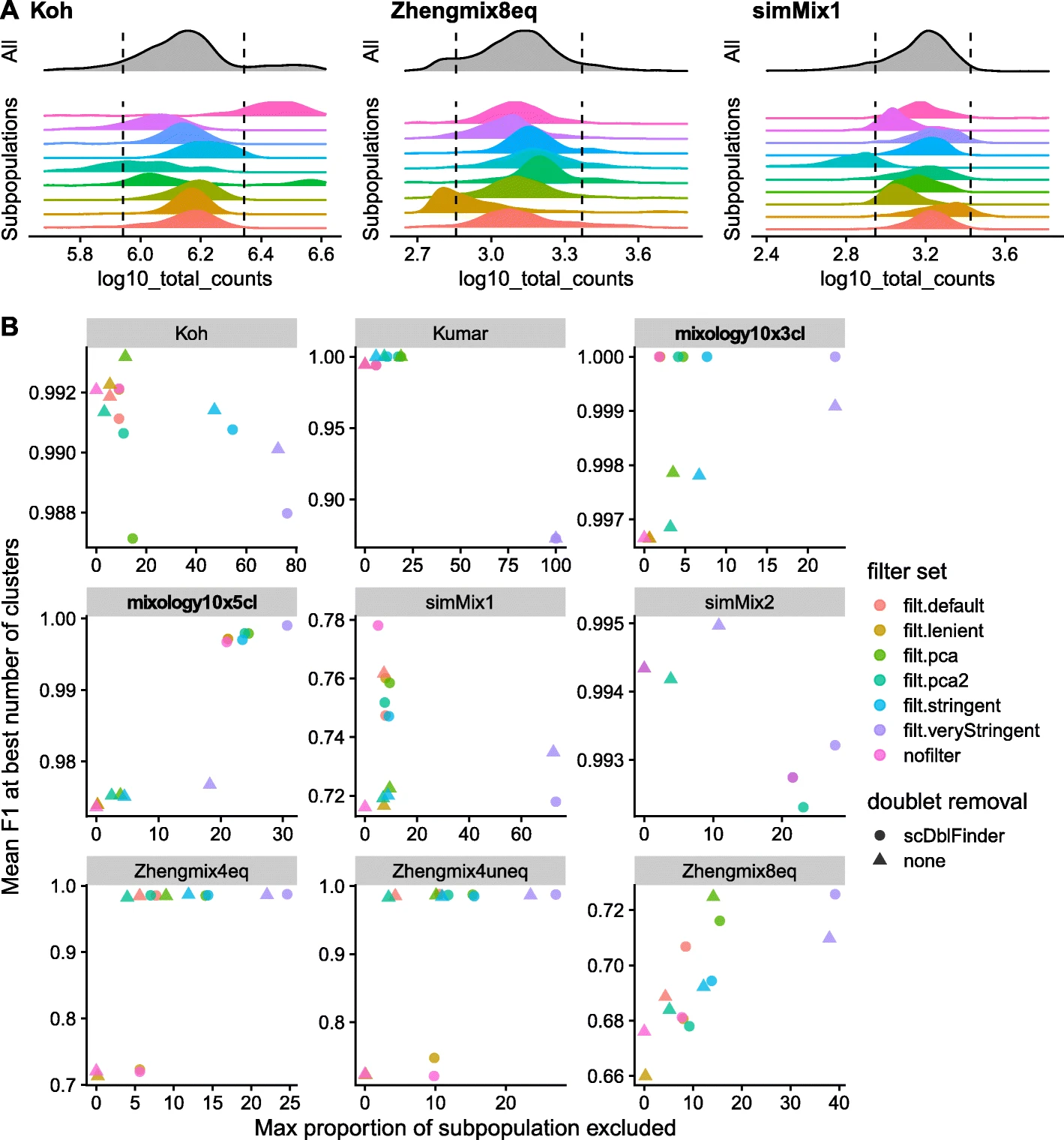
We can confirm this with our example dataset (Zeve_data), but of course cell population information are not available at time of QC. But keep that in mind while looking at your data - you can always come back later and apply a more stringent threshhold.
Example histogram of feature counts and 'zoom' into counts below 2000
Example histogram of log feature counts and proportion of cell types
3. Filter with manually set thresholds
- filter cells with high fraction of mitochondrial genes
- filter cells with low feature count (not enough genes expressed)
- filter cells with low total count (not enough reads captured or sequenced)
- filter cells with too many total counts ( probably doublets, but doublet removal is also handled by SIMBA🦁, so not necessary here)
- filter genes expressed in only a few cells (optional, SIMBA🦁 will have a threshold of at least 10 cells lateron anyways but over all datasets included for the atlas)
Perform QC filtering (e.g. filtering out cells with > 20 % mitochondrial genes, cells with less than 370 genes and less than 1350 total counts and genes expressed in less than 2 samples):
print(f'Total number of cells: {adata.n_obs}')
print(f'Total number of genes: {adata.n_vars}')

adata = adata[adata.obs['pct_counts_mt'] < 20]
print(f'Number of cells after MT filter: {adata.n_obs}')

sc.pp.filter_cells(adata, min_genes = 370)
print(f'Number of cells after gene filter: {adata.n_obs}')

sc.pp.filter_cells(adata, min_counts=1350)
print(f'Number of cells after count filter: {adata.n_obs}')

sc.pp.filter_genes(adata, min_cells=2)
print(f'Number of genes after cell filter: {adata.n_vars}')
Then look at the plots again --> do they look more uniformely distributed? If not you can adapt your thresholds more accurately.
scatter after filtering
Here, cells with low gene counts or small library size do not all have high mitochondrial gene fraction --> not necessarily dying or low quality cells.
This is even more visible in the log plot. For us this looks like our dataset is ready for the SIMBA🦁 pipeline!
Automated approach for several datasets or large ones (based on Heumos et al. 2023 and Germain et al. 2020)
In Python
To account for the changes in quality between your datasets, a relative approach is prefered to an absolute one. A good method for relative quality filtering is the MAD (median absolute deviation). A deviation between 3-5 is usually seen as good practice.
MAD = median(|X_i - median(X)|) with (X_i) being the respective QC metric of an observation
The first step in automated QC is the same as in the manual one. Here we will always look at log transformed feature and total counts.
"A log-transformation is used to improve resolution at small values when type="lower" and to avoid negative thresholds that would be meaningless for a non-negative metric. Furthermore, it is not uncommon for the distribution of library sizes to exhibit a heavy right tail; the log-transformation avoids inflation of the MAD in a manner that might compromise outlier detection on the left tail. (More generally, it makes the distribution seem more normal to justify the 99% rationale mentioned above.) The function will also do the same for the log-transformed number of expressed genes." (Orchestrating single-cell analysis with Bioconductor, Amezquita, 2021)
adata.var["mt"] = adata.var_names.str.startswith("MT-")
sc.pp.calculate_qc_metrics(adata, qc_vars=["mt"], inplace=True, percent_top=[20],log1p=True)
"An important risk of excluding cells on the basis of their distance from the whole distribution of cells on some properties (e.g., library size) is that these properties tend to have different distributions across subpopulations. As a result, thresholds in terms of number of MADs from the whole distribution can lead to strong biases against certain subpopulations" (Germain et al. 2020) They found that a "relatively mild filtering provided a good trade-off, often leading to high clustering performance while retaining most of the cells in each subpopulation" and they defined the following default set of filters in which cells are excluded if they are outliers in at least 2:
- log10_total_counts >2.5 MADs or <5 MADs,
- log10_total_features >2.5MADs or <5MADs,
- pct_counts_in_top_20_features > or <5MADs,
- pct_counts_Mt >2.5 MADs and >8%.
They also found that "Removal of ribosomal genes robustly reduced the quality of the clustering, suggesting that they represent real biological differences between subpopulations. Removing mitochondrial genes and restricting to protein-coding genes had a very mild impact."(Germain et al. 2020)
Then define the function 'is_outlier':
def is_outlier(adata, metric: str, nmads: int):
    M = adata.obs[metric]
    outlier = (M < np.median(M) - nmads * median_abs_deviation(M)) |
    (np.median(M) + nmads * median_abs_deviation(M) < M)
    return outlier
Then apply it to your data:
adata.obs["outlier"] = (
    is_outlier(adata, "log1p_total_counts", 5)
    | is_outlier(adata, "log1p_n_genes_by_counts", 5)
    | is_outlier(adata, "pct_counts_in_top_20_genes", 5)
)
adata.obs.outlier.value_counts()
For the mitochondrial gene fraction You can use the same function but apply an additional threshold:
adata.obs["mt_outlier"] = is_outlier(adata, "pct_counts_mt", 3) | (
adata.obs["pct_counts_mt"] > 8
)
adata.obs.mt_outlier.value_counts()
Now have a look at how many cells were filtered out:
print(f"Total number of cells: {adata.n_obs}")
adata = adata[(~adata.obs.outlier) & (~adata.obs.mt_outlier)].copy()

print(f"Number of cells after filtering of low quality cells: {adata.n_obs}")
And finally plot the filtered data:
p1 = sc.pl.scatter(adata, "total_counts", "n_genes_by_counts", color="pct_counts_mt")
populations after filtering - fixed MAD vs manual approach:
To compare our manual thresholding with the MAD generalized thresholding, we plotted all population and covariates subplots together:
The MAD version excluded more cells based on their gene counts while we excluded more cells based on the total counts. Still, both methods did not exclude a cell type entirely or even reduced it dramatically - in this example both methods are quite comparable.
Total number of cells: 25673
Total number of genes: 36610
manual:
Number of cells after MT filter: 20371
Number of cells after gene filter: 20188
Number of cells after count filter: 19376
Number of genes after cell filter: 26632
MAD:
Number of cells after MT filter: 20067
Number of cells after filtering of low quality cells: 18221
Automated visually aided thresholding with shiny
For a even more generalized and easier approach, we developed a UI where you can upload your dataset and median and MADs are calculated and visualized by lines in a plot for each covariate. This way you can use the best fitting MAD threshold for your data for each covariate without having to rely on trial-and-error and potentially excluding a population. We based this idea on 'pipeComp, a general framework for the evaluation of computational pipelines, reveals performant single cell RNA-seq preprocessing tools' (Germain et al. 2020). 'Link to Shiny'