User Guide - MicroHealthLLC/mSuite GitHub Wiki
Registration and Login
There is no need to login. There is no user registration. Just click any of the document type you want to create then share that unique URL with your collaborator. Even better, password protect your link as shown in Sharing a document.
Sharing a document
To share the document you just created by clicking any one of the document buttons on the home page above...
- Click the share button in your browser. Typically in the upper right hand corner of your browser URL bar like so.
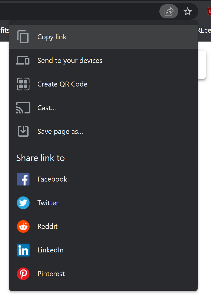
-
Send that link by email, text or some other way that is private to you and the people you are looking to collaborate with. Its a random url so its hard to guess but not impossible so don't rely on security by obscurity. You should password protect your document before sending a link by doing the next step first.
-
Click the floppy disk icon in the upper right hand corner to save private.

- Next give it an expiration date where it will automatically delete the document. The default is 30 days. However you can change it up to 90 days. After its deleted, its gone. We can't help you recover anything after its deleted...its gone. After you give it a timeframe to automatically delete, click save private.

- Saving public would simply save it for the time period you specified in step 4 but anyone with the url could access the document. The URL is random and though difficult to guess, its not impossible. We have next-gen firewalls to help stop bots from guessing the random url among other things but is any firewall fool proof? Therefore we don't recommend saving public.
It is HIGHLY recommended you choose to click save private which will password protect the link so that anyone you shared the link with will be required to also provide the password to access your shared document. Its a low friction multi-factor authentication...One a unique url you know, two a unique password you have. Well that is a stretch as cyber analysts are cringing at us right now but you get the idea. Its not Fort Knox, for that you should use Cryptpad which is an amazing product that inspired us...we just wanted even LESS friction. With that said, your data is encrypted at rest and in motion. Your password is encrypted and as a result, we cannot recover a lost password or forgotten url.
- After you give it a password go back to step 1 and 2 and provide the url and in a separate communication channel provide the password. You ALWAYS want to use a different channel of communication for sharing this password than you did the link. For example, if you did step 1 and 2 and chose to email your collaborator the link then you should text them the password separately and not include the link in the same text message. If you texted them the link then you want to call them and tell them the password. The idea is that the link and password are not in the same communication channel. Ideally, after you send the link to your collaborators, you get on your favorite web conference like WebEx, Zoom, Teams or whatever and on that conference, you provide the password to the url you sent previously in the web conference chat.
Map Menu Bar
MicroHealth Logo

User should click the logo to display the "Save Document Key" Modal (see below), before returning to the Index screen. The document key needs to be saved in order to return to this map.
Map Title
Click the "Title" text on the top menu to edit the title for the map. Change the text, then enter to submit.

Zoom Buttons
Included on Mindmap, TreeChart, and FlowMap
Zoom In Button
When clicked, the map will zoom in incrementally by 10%.
Zoom Out Button
When clicked, the map will zoom out incrementally by 10%.
Zoom 100% Button
Only visible when the map is not displayed at 100%. When clicked, will scale the map to 100%.
Save Map Button
When a user hovers over the "Save" button, a tooltip will display with the current expiration date. When a user wants to save the map and continue working, they should click the button to display the "Save Document Key" Modal.
Save Document Key Modal
The "Save Document Key" Modal will display when either the MicroHealth Logo is clicked or the "Save" button is clicked.
User should save the map key shown on the modal, so they can return to the map once closed.
The number of days a map will be saved past the last date of interaction can be edited by direct input or by clicking arrow up or arrow down. The default is 5 days.
A validation alert will display when the input for number of days is not valid. A number below 1 will default to 1. A number that exceeds the maximum allowable days will default to maximum allowable.
Save Public
Clicking "Save Public" will allow any user with the map key to access the map (default).
Save Private
It is highly recommended that a map is password protected. User should click the "Save Private" button, then save the map with a Password.
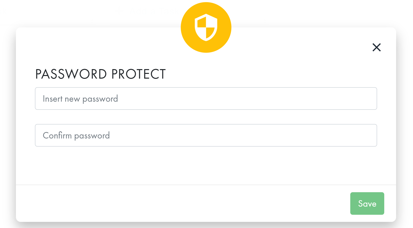
Create Password
The "PASSWORD PROTECT" Modal will display when the "Save Private" button is clicked. User should fill in the Create Password Form, then click the "Save" button when it becomes enabled. Otherwise, click the Close button.
When the Password updates successfully, a success message will display.
When the Password fails validation, the "Password Mismatch" Modal will display. User should click "Try Again" to return to the Password Protect Modal; otherwise, click "Cancel".
A map that is saved private will have a "Change Password" button on the "Save Document Key" Modal.
Change Password
Click the "Change Password" button on the "Save Document Key" Modal (for a map that is Save Private) to display the "PASSWORD PROTECT" Modal.
Reset Password
To reset the password for a map, user should fill in the Reset Password Form, then click "Save", when it becomes enabled.
When the new password passes validation, a success message will display. When it fails validation, the "Password Mismatch" Modal will display (see above).
Delete
User should click the "Delete" button on the "Save Document Key" Modal, then click the "Continue" button on the "Confirm Delete Map" Modal that displays. Otherwise, click the "Cancel" button or Close button.
Verify Password to Delete
The Verify Password to Delete Modal displays for a Save Private map, after the "Continue" button was clicked on the "Confirm Delete Map" Modal. User should input password, then click the "Verify" button.
When the password passes validation, the map will be deleted, then the Index screen will display.
When the password fails validation, an Incorrect Password Message will display. User should click the Close button, then try to delete the map again.
Export Map Buttons
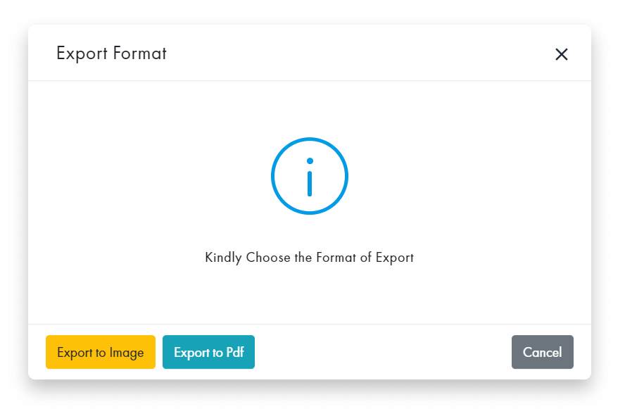
Export Image Button
Export to PNG or PDF
For Mindmap, Kanban, WhiteBoard, TreeMap, TreeChart, FlowMap, ToDo, and Spreadsheet
To export map to Image (PNG) or PDF format: Click the "Export" button on the top menu to display the Export Format modal; then click the button that corresponds to the desired format.
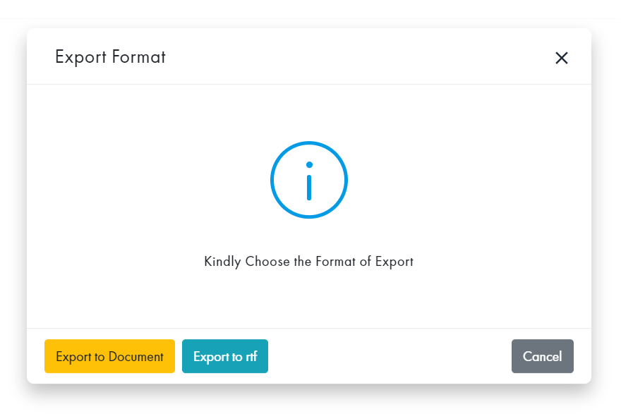
Export Word Button
Export to Document or TRF
For Notepad
To export map to Document or RTF format: Click the "Export" button on the top menu to display the Export Format modal; then click the button that corresponds to the desired format.
For Mindmap
To export map to Word format: Click the "Export Word" button on the top menu to display the Export modal. Siblings can be rearranged by drag ' drop, and will retain their rearranged position. Click the "Download" button.
Export Excel Button
Export to Excel or CSV
For Spreadsheet
To export map to Excel or CSV format: Click the "Export" button on the top menu to display the Export modal; then click the button that corresponds to the desired format.

Undo/Redo Buttons
Click the "Undo"/"Redo" buttons on the top menu to return/remove deleted objects.
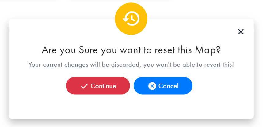
Reset Map Button
Confirm Reset Map Modal
Click the "Reset" button on the top menu, then click the "Continue" button on the Reset Map Modal that display; otherwise, click the "Cancel" button or "X" to close.
Comments Button
NOTE: When the "comment" icon is green, comments for this map exists.
Comments Modal
To include a comment on the map, click the "Comments" button on the top menu to display the Comments Modal.
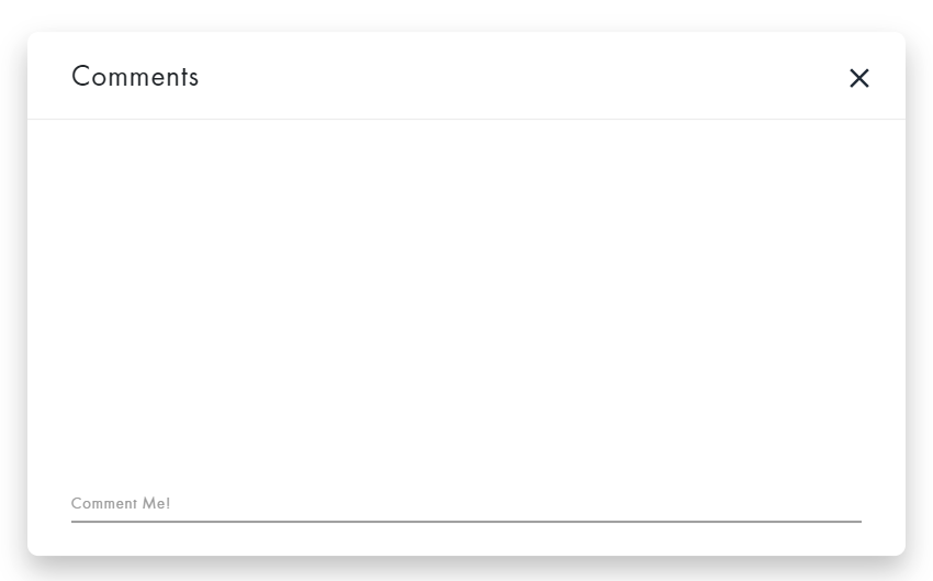
Create Comment
To create a comment, click the comment section on the bottom of the Comments modal, input your comment, then enter to submit.

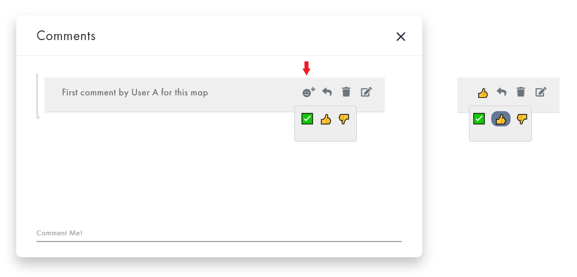
Comment Emoji
To include an emoji for a comment, click the "emoji" icon, then select an emoji. The selected emoji will display next to the comment. To change an emoji, click the icon, then select another emoji. Deselect an emoji so that comment will not have an emoji associated with it.
Reply to Comment
To reply to a comment, click the "arrow" button, then input your reply. Press enter to submit, or click the corresponding "X" to remove.
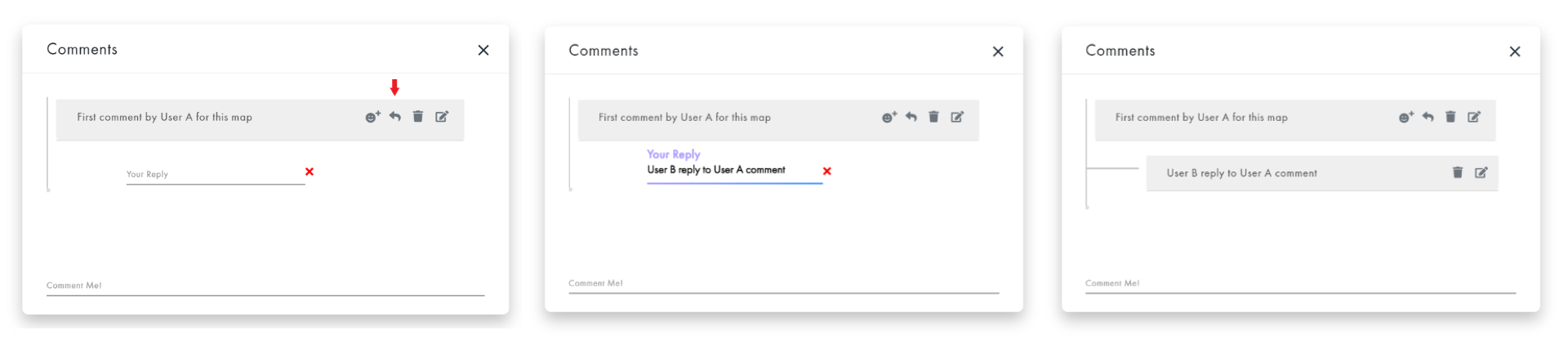
Edit Comment or Reply
To edit a comment or reply, click its corresponding "pencil" icon, edit the text, then enter to submit.

Delete Comment or Reply
To delete a comment or reply, click its corresponding "trash can" icon, then click the "Delete" button on the Confirm Delete Comment modal. Otherwise, click the "Cancel" button or "X" to close.

User Button
User Name Modal
When a user is going to collaborate on a map, first they should click the "User" button, then update the Name on the User modal. All users are given a random Name by default, since User Name is required to keep track of editing.
Delete Map Button
When the "Delete" button on the top menu is clicked, the "Confirm Delete Map" Modal will display. Click the "Continue" button to proceed; otherwise, click the "Cancel" button or "X" to close.

After user confirms delete map that is Save Private, the user will also need to Verify Password to Delete (see Verify Password to Delete section above).
Duplicate Map Button
To duplicate a map, click the "Duplicate" button on the top menu. The duplicate map will display in another browser tab. Be sure to save the url.
NOTE: Creating a duplicate Calendar Map and ToDo Map has an extra step to select dates. See those sections for instructions.
Editing By and Last Edited By
The purpose of the editing text (located on the right, just above the map) is to keep up with the editing status during the collaboration. A user is identified by the Name under "User" (see above).
Mindmap

Click the "Mindmap” box on the Index screen to view the Mindmap App.
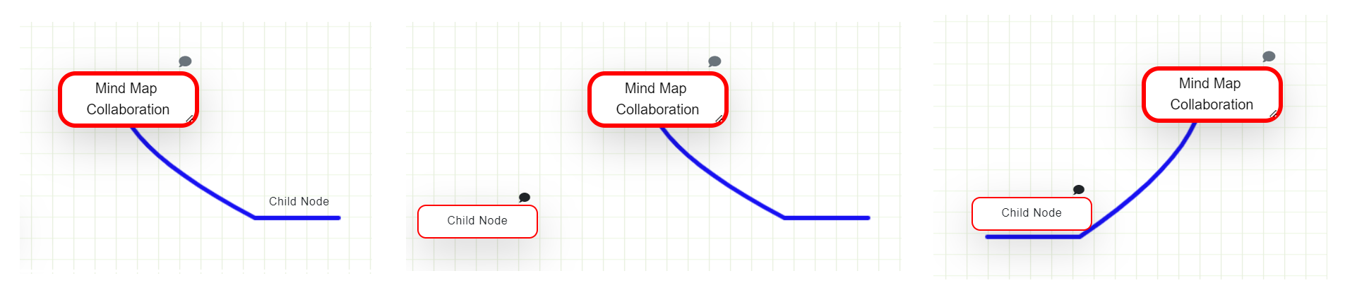
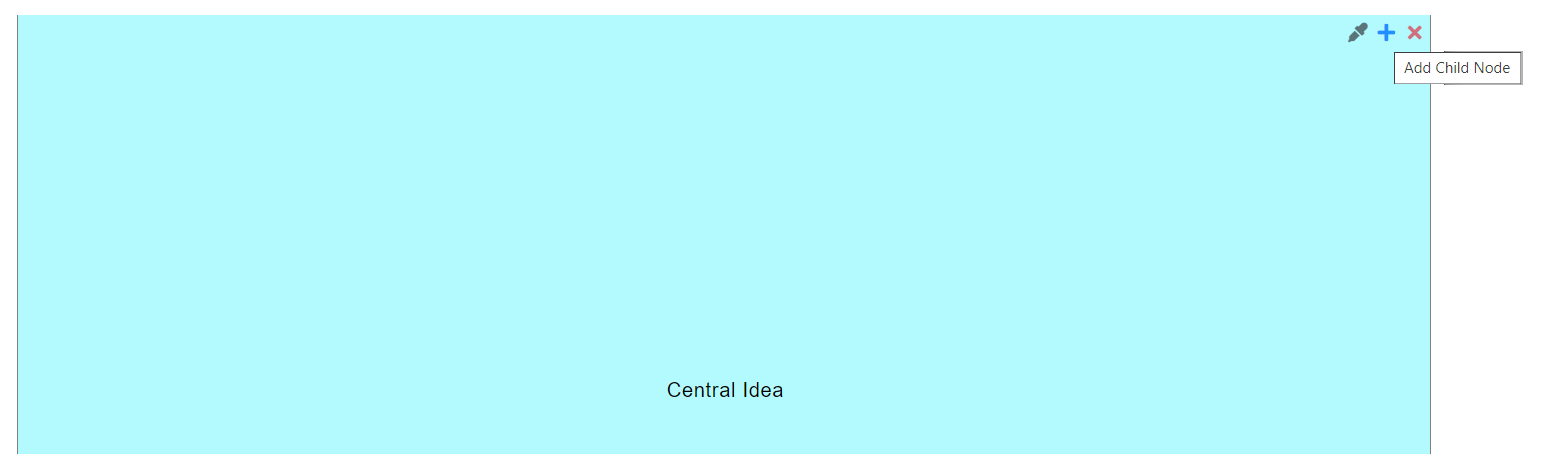
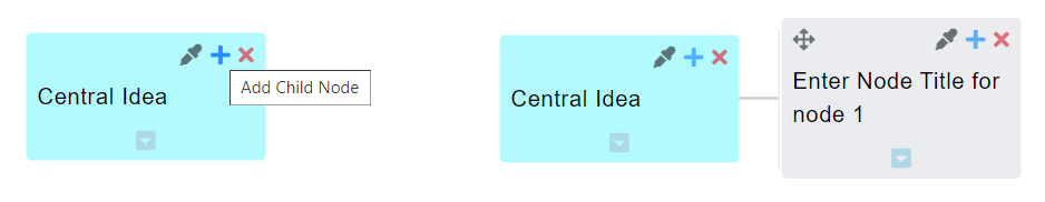
Add Child Node
To add a child node, place the pointer within the parent, then drag to the desired position. When the pointer is released, the child node will display with a branch to the parent.
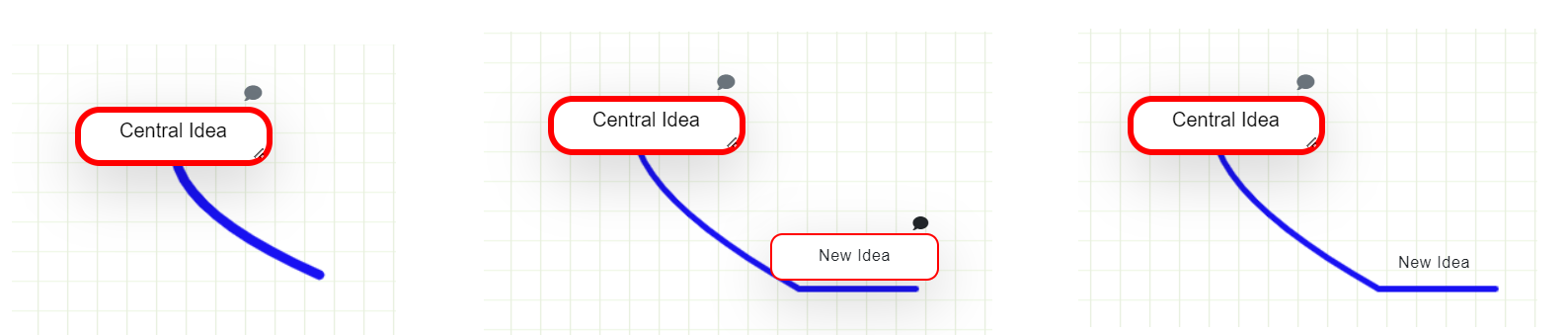
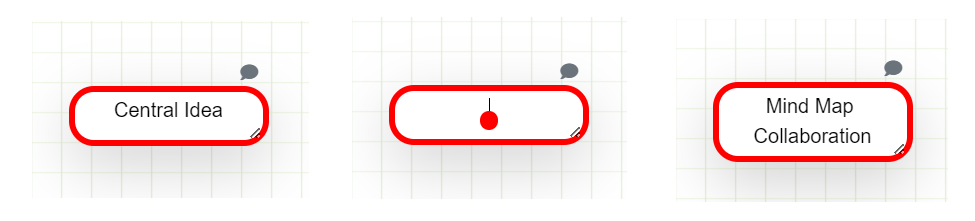
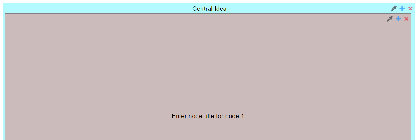
Edit Node Title
To edit the Central Node title, click the node, then change the text.
To edit the title of a child node, double click the container that becomes visible when the pointer is over the title. Change the text, then click off of the node.

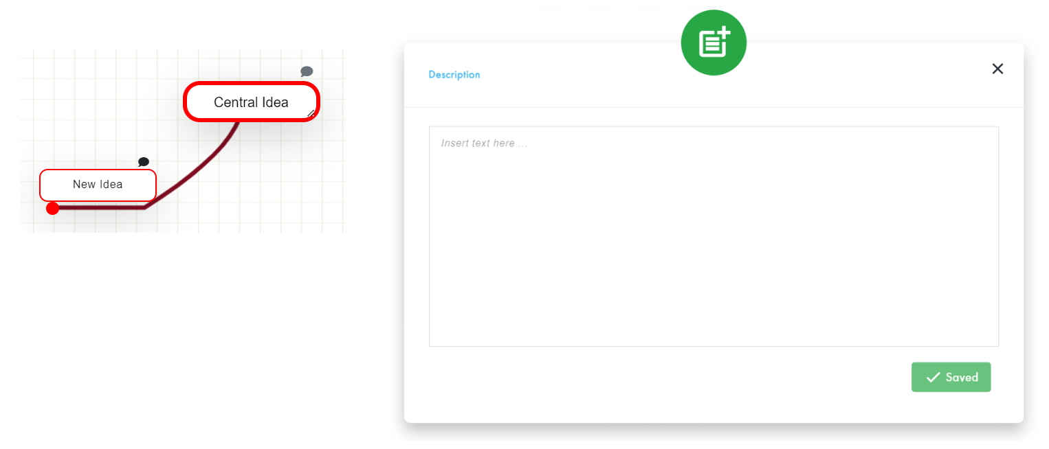
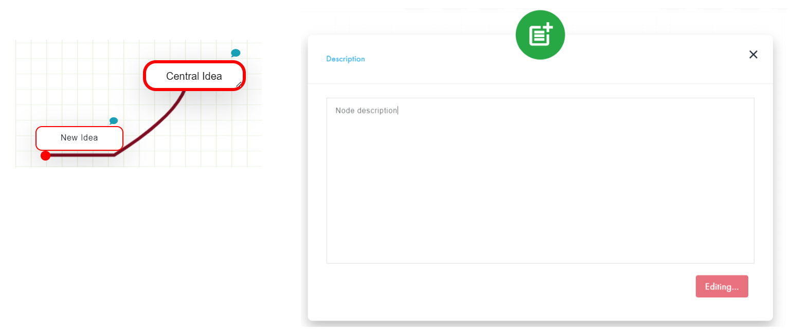
Node Description
To input/remove a description for a node, click the node's "Comment" icon to display the Description modal. As the user inputs/removes text, the edit mode box will either display the text "Saved" or "Editing". When the user is finished and the edit mode box displays as "Saved", click the "X" icon to close the modal. The "Comment" icon will display green when a node has a description; otherwise dark grey.
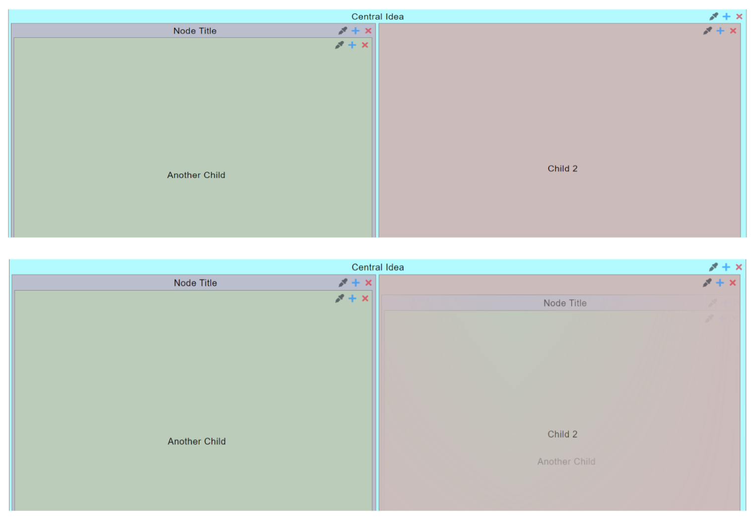
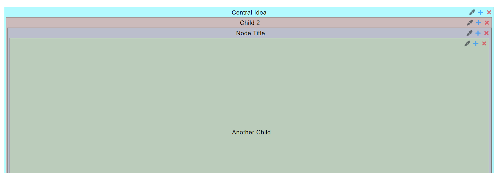
Edit Node Position
To change the position of the entire map, click the Central Node, then drag 'n drop it to the desired position.
To change the position of a child node and its descendants, click the child so that the container displays, then drag 'n drop it to the desired position.
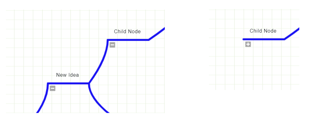
Toggle Descendants Shown/Hidden
To toggle a child node's descendants shown/hidden, click its toggle button. When a toggle button is displayed as "-", click it to hide its descendants. When a toggle button is displayed as "+", click it to show its descendants.
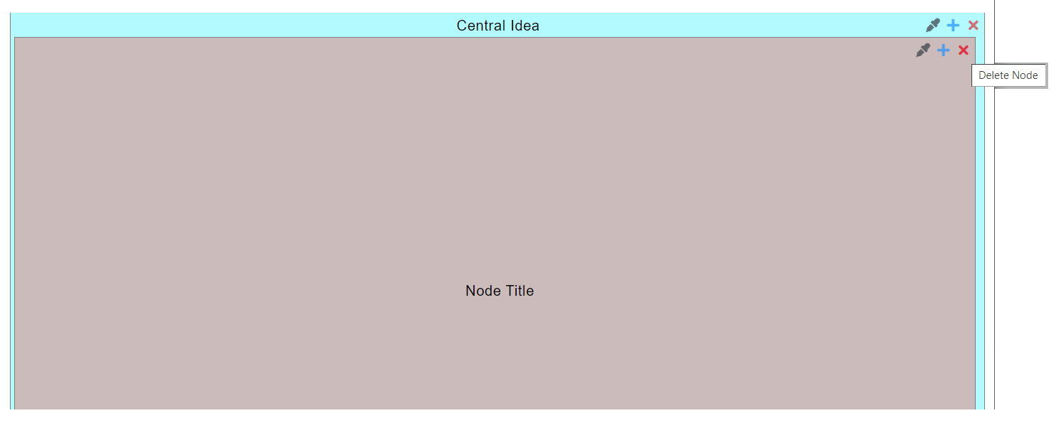
Copy, Cut, Paste, or Delete Child Node
First select a node, then click the copy, cut, paste, or delete button.
Kanban
Click the "Kanban” box on the Index screen to view the Kanban App.
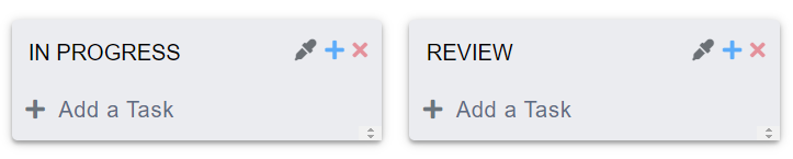
Add a Stage
To add a stage: click the "+" button on the stage you want to add another stage after; then input a title (required). Otherwise, click the "X" to delete.
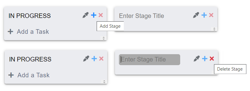
After a stage gets a Title: the "Add a Task" button will display, its "Color Picker" button and "Add Stage" button will be active, and drag 'n drop will function.
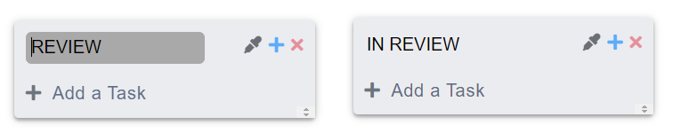
Edit Stage Title
To change a stage title: click the title; edit the content in the textbox; the title will automatically update.
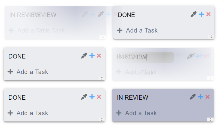
Edit Stage Position
To change the position of a stage, drag 'n drop the stage.
Edit Background Color of Stage(s)
To change the background color of a stage: Click the "pencil" link to display the Color Picker; select a color by adjusting the options, or clicking a recently used color box (located just below Hex); then click "Update" to apply. Otherwise, click "Cancel".
To change the background color of all stages at once, using a color scheme, click one of the "pencil" links to display the Color Picker. Colored circles, totaling the number of stages, will display just above the buttons. To change the color scheme, click the "recycle" button. To view the color scheme on all stages, click one of the circles in the scheme group. Click "Update" to apply, or "Cancel".
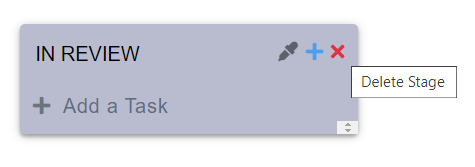
Delete a Stage
To delete a stage, click its "X" button.
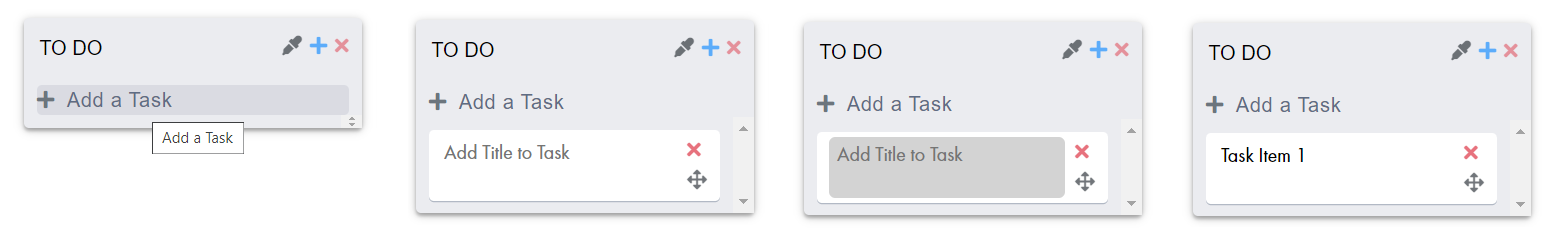
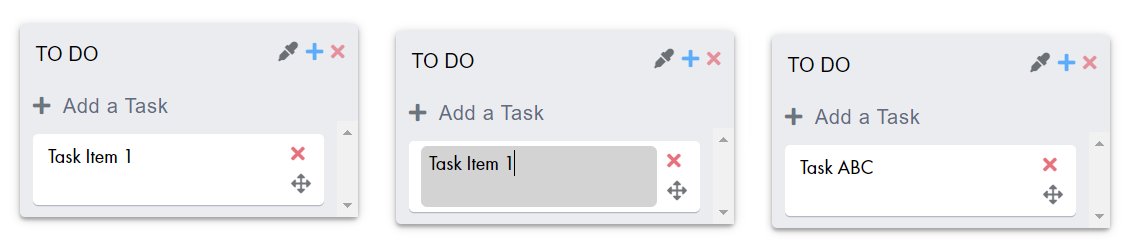
Add a Task
To add a task to a stage, click the "Add a Task" button; a default task will display on the stage in the bottom position. To input a title, click the title box, then input a task title (optional).

Edit Task Title
To change a task title: click on the title, then edit the text.
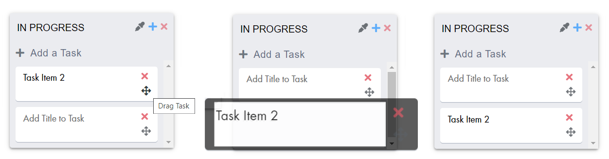
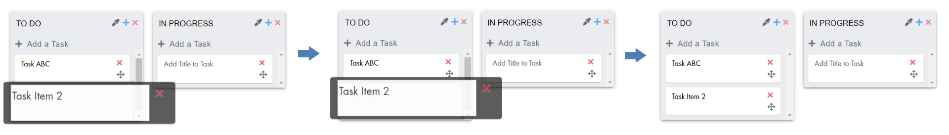
Edit Task Position
A task can be rearranged within a stage, or moved to another stage by drag 'n drop.
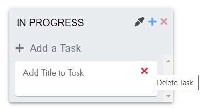
Delete a Task
To delete a task, click its "X" icon.
WhiteBoard
Click the "WhiteBoard” box on the Index screen to view the WhiteBoard App.
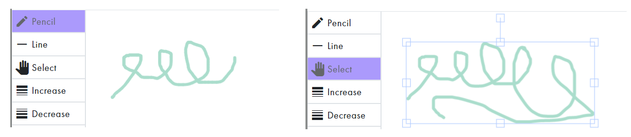
Add Pencil
Click the "Pencil" button, then draw on the board. The "Pencil" button will remain active until the user lifts the pointer, indicating object drawn is complete.
Add Line
Click the "Line" button, then draw on the board. The "Line" button will remain active until the user lifts the pointer, indicating line drawn is complete.

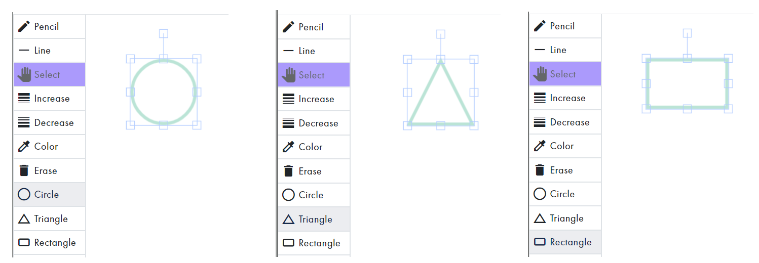
Add Shape
Clicking the "Circle" button, "Triangle" button, or "Rectangle" button will automatically include that shape on the board.
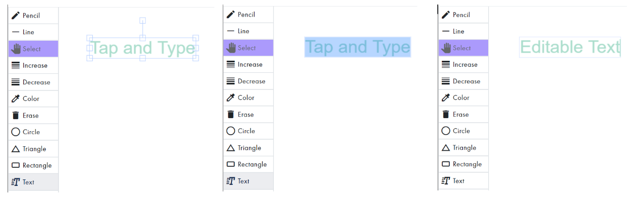
Add Text
To include editable text: click the "Text" button; triple tap the selected object that automatically displays to select all text; then input content.
Select
The "Select" button automatically becomes active:
- When a user clicks an object to select it.
- After an object is added to the board:
- User clicked the "Circle", "Triangle", "Rectangle", or "Text" button.
- User lifted the pointer after drawing with the "Pencil" or "Line" button active.

User can toggle the "Select" button inactive/active by clicking it.
To edit an object, the "Select" button should be active and the object should be selected.
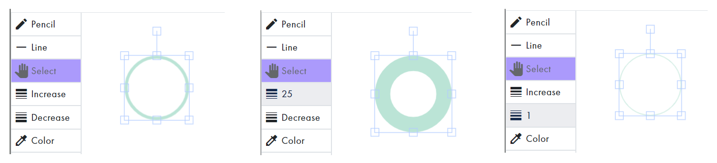
Increase/Decrease
To increase or decrease the line width of a selected object, click the corresponding button until that number displays on the button. The default size is "5"; the maximum is "25"; and the minimum is "1".
Color
To display the Color Picker, click the "Color" button. The active color will be the same as the currently selected object, or the previously selected color.
NOTE: The Color Picker will not display until at least one object has been added to the board.
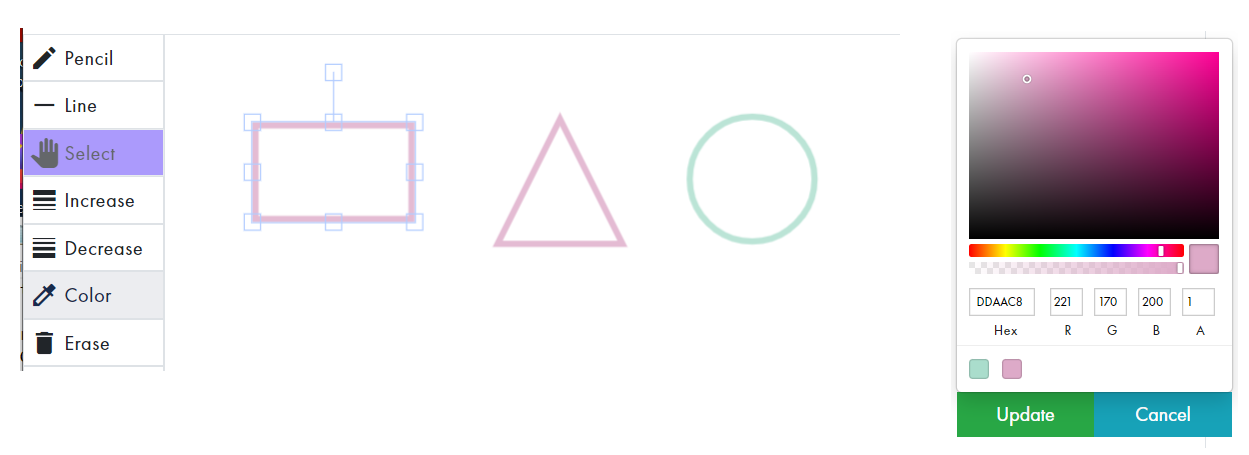
Select a color by adjusting the options, or clicking a recently used color box; then click "Update" to save. Otherwise, click "Cancel".
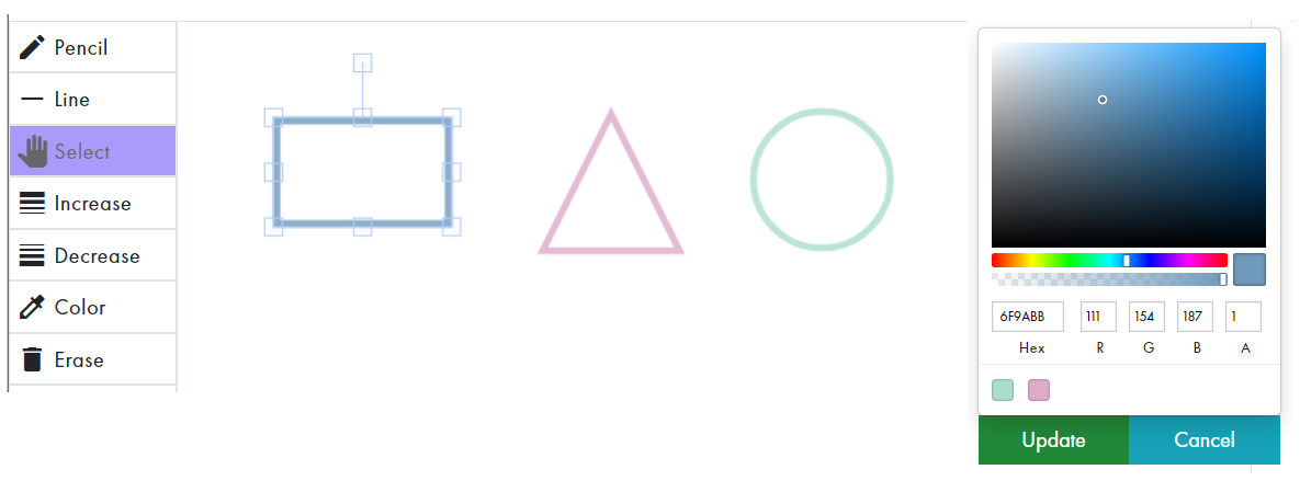
The opacity of an object can also be adjusted.
Edit Object
Resize
To adjust the size of a selected object, drag one of its corner handles.
Adjust Width
To adjust the width of a selected object, drag one of its middle vertical handles.
Adjust Height
To adjust the height of a selected object, drag one of its middle horizontal handles.
Skew
To skew the the selected object, drag one of its handles while holding down the "Shift" key.
Rotate
To rotate a selected object, drag its rotation bar.
Change Position
To move the object to a different position, drag 'n drop the object.
Erase
To erase a complete object: with the "Select" button active, select the object to be erased so that it's selected; then click the "Erase" button.

Forward
To arrange a layered object above another, click the "Forward" link while the object is selected.
Backward
To arrange a layered object below another, click the "Backward" link while the object is selected.
TreeMap
Click the "TreeMap” box on the Index screen to view the TreeMap App.
Add Child Node
To add a child node, click its "+" icon.
Edit Node Title
To change the title of a node: click its "Title", then edit the Title in the textbox that displays.

Edit Node Position
To change the descendant level of a child node and its children, drag 'n drop the node onto the node you want to become its parent.
Edit Background Color of Node(s)
To change the background color of a node: Click the "pencil" link to display the Color Picker; select a color by adjusting the options, or clicking a recently used color box (located just below Hex); then click "Update" to apply. Otherwise, click "Cancel".
To change the background color of all nodes at once, using a color scheme, click one of the "pencil" links to display the Color Picker. Colored circles, totaling the number of nodes, will display just above the buttons. To change the color scheme, click the "recycle" button. To view the color scheme on all nodes, click one of the circles in the scheme group. Click "Update" to apply, or "Cancel".
Delete Node
To delete a child node, click its "X" icon.
TreeChart
Click the "TreeChart” box on the Index screen to view the TreeChart App.
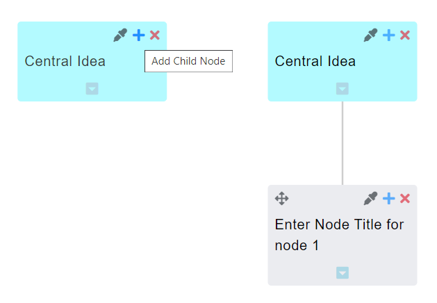
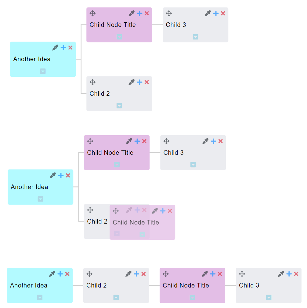
Add Child Node
To add a child node, click its "+" icon.
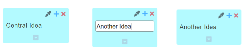
Edit Node Title
To change the title of a node: click its "Title", then edit the Title.

Edit Node Position
To change the position of the entire map, drag 'n drop the Central node. To change the position of a node and its children, drag 'n drop the node onto the node you want to become its parent.

Edit Background Color of Node(s)
To change the background color of a node: Click the "pencil" link to display the Color Picker; select a color by adjusting the options, or clicking a recently used color box (located just below Hex); then click "Update" to apply. Otherwise, click "Cancel".
To change the background color of all nodes at once, using a color scheme, click one of the "pencil" links to display the Color Picker. Colored circles, totaling the number of nodes, will display just above the buttons. To change the color scheme, click the "recycle" button. To view the color scheme on all nodes, click one of the circles in the scheme group. Click "Update" to apply, or "Cancel".
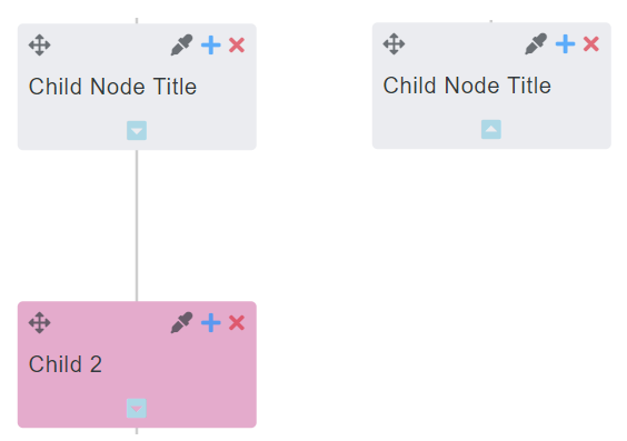
Toggle Descendants
To toggle a node's descendants hidden/shown, click its arrow down/arrow up icon.
Delete Node
To delete a child node, click its "X" icon.

FlowMap
Click the "FlowMap” box on the Index screen to view the FlowMap App.
Add Child Node
To add a child node, click its "+" icon.
Edit Node Title
To change the title of a node: click its "Title", then edit the Title.
Edit Node Position
To change the position of the entire map, drag 'n drop the Central node. To change the position of a node and its children, drag 'n drop the node onto the node you want to become its parent.
Edit Background Color of Node(s)
To change the background color of a node: Click the "pencil" link to display the Color Picker; select a color by adjusting the options, or clicking a recently used color box (located just below Hex); then click "Update" to apply. Otherwise, click "Cancel".
To change the background color of all nodes at once, using a color scheme, click one of the "pencil" links to display the Color Picker. Colored circles, totaling the number of nodes, will display just above the buttons. To change the color scheme, click the "recycle" button. To view the color scheme on all nodes, click one of the circles in the scheme group. Click "Update" to apply, or "Cancel".
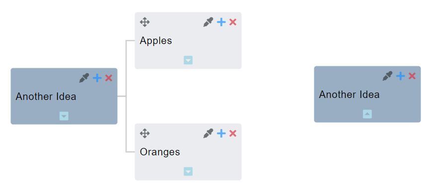
Toggle Descendants
To toggle a node's descendants hidden/shown, click its arrow down/arrow up icon.
Delete Node
To delete a child node, click its "X" icon.
ToDo
Click the "ToDo” box on the Index screen to view the ToDo App.
Add Parent ToDo
Input the Title into the textbox with placeholder “Add Todo” (required). To input Start and Due Dates (optional), select from the Calendar that displays when the textbox is clicked. Click a Start Date and a Due Date. For a single day ToDo, double click the Date. Click the "Save" button to submit; otherwise, click the "Reset" button to cancel.
A saved Parent ToDo will display with a checkbox, title, date(s) (when exist), a “+” button to Add a Child ToDo, and a “X” button to delete the ToDo.
EXAMPLE WITH DIFFERENT START DATE AND DUE DATE
EXAMPLE WITH SAME START DATE AND DUE DATE
EXAMPLE WITHOUT DATES
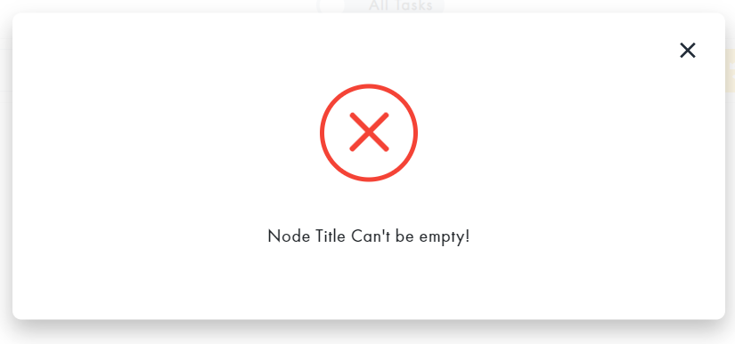
NOTE: Clicking "Save" without required title for a ToDo will display the following alert. Click the "X" to close the modal.
Add Child ToDo
Click the Add ToDo button ("+") on the Parent ToDo to display the Child ToDo Form. Input the title into the textbox with placeholder “Add Child ToDo for …” (required). Select Dates (optional). Click the “Save” button to submit; otherwise, click the “Cancel” button.
A saved Child ToDo will display with a checkbox, title, date(s) (when exist), and a “x” button to delete the ToDo.
Edit ToDo
To edit a Parent or Child ToDo, click its title or due date, then make changes on the form. To remove a due date, click the "X" that displays in the textbox. Click the “Save” button to submit; otherwise, click the “Cancel” button.
Edit Position of ToDo
To rearrange the ToDo List, drag 'n drop a ToDo item (along with its children) to the desired position.
BEFORE DRAG 'N DROP
EXAMPLE DRAG 'N DROP CHILD TO ANOTHER PARENT
EXAMPLE DRAG 'N DROP CHILD AMONG SIBLINGS
EXAMPLE DRAG 'N DROP PARENT (WITH CHILDREN) AMONG SIBLINGS
EXAMPLE DRAG 'N DROP CHILD TO BECOME PARENT
EXAMPLE DRAG 'N DROP PARENT TO BECOME CHILD
Checking/Unchecking ToDos
Check/uncheck a ToDo as complete/incomplete.
- Checking a Parent ToDo will automatically check its Children ToDos.
- Unchecking a Parent ToDo will not uncheck its Children ToDos.
- Adding another Child ToDo to a checked Parent ToDo will automatically uncheck the Parent ToDo.
- Unchecking a Child ToDo will automatically uncheck a Parent ToDo.
Toggle All Tasks/Actionable
To hide complete ToDos, click the toggle button so that "Actionable" is displayed. To view all ToDos, click the toggle button so that "All Tasks" displays.
Delete ToDo
To delete a ToDo, click its corresponding "X" button.
Switch to Calendar
To view ToDos with a selected Date in Calendar map view, click the "Switch to Calendar" button on the top menu.
NOTE: There has to be at least one ToDo with a selected Date for the button to be enabled.
To switch from Calendar view back to ToDo map view, click the "Switch to ToDo" button on the top menu.
Duplicate ToDo Map Modal
To make a duplicate of a ToDo map: Click the "Duplicate" button on the top menu bar; select a date from the Clone Modal that displays; then Click "Clone". Otherwise, click "Cancel".
Notepad
Click the "Notepad” box on the Index screen to view the Notepad App.
Format Menu Bar
Text Style
Bold, Italic, Underscore, Strikethrough, Quote, and Code

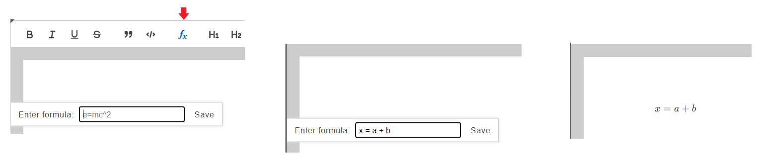
Formula
To input a formula, click the "fx" button on the menu bar. Input the formula into the textbox on the Formula Modal that displays, then click "Save". The formula will be included in the container as one object.
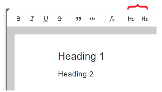
Heading 1 and Heading 2
Numbered List, Bulleted List, and Multilevel List (Indent and Outdent)
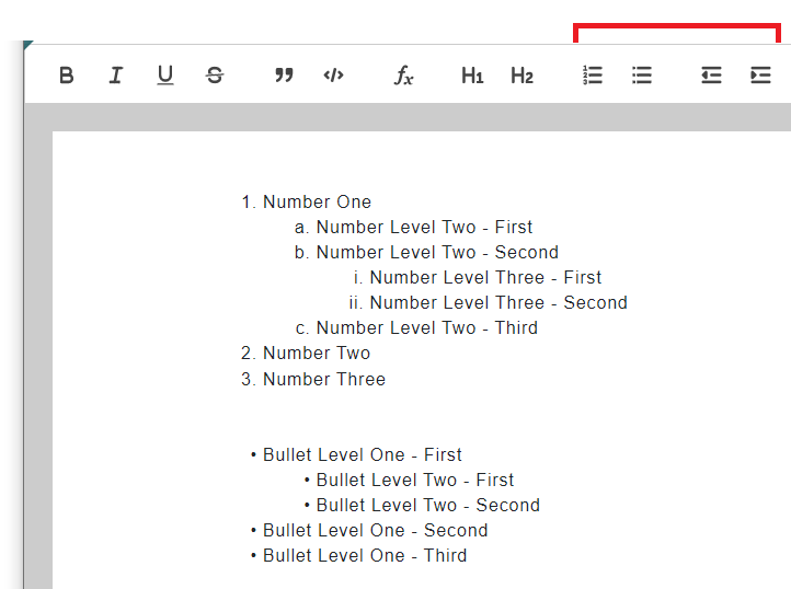
To start a Numbered List either:
- Click "Numbered List" icon on the menu bar, before or after entering text.
- Type a number with a period, followed by a space to automatically start a Numbered List
To enter another Numbered List item, click "enter" at the end of the last line OR between the placeholder and the first character to insert between.
A Numbered List starts with a number for the first level, a character for the second level, and a roman numeral for the third level. After the third level, this pattern will repeat for 2 more levels, for a total of 9 Levels.
To adjust the level, click "tab" (when the cursor is before text input); or the "indent" icon on the menu bar.
To get to a level above, click "backspace", "shift" + "tab" (when the cursor is before text input); or "outdent" icon on the menu bar.
To end a List, click "enter" at any level indent that does not have corresponding text for its list placeholder.
To separate a List, click "enter" twice after the list item that should start the next list.
Bulleted List functions the same as the Numbered List, except all the bullets have the same style for each level.
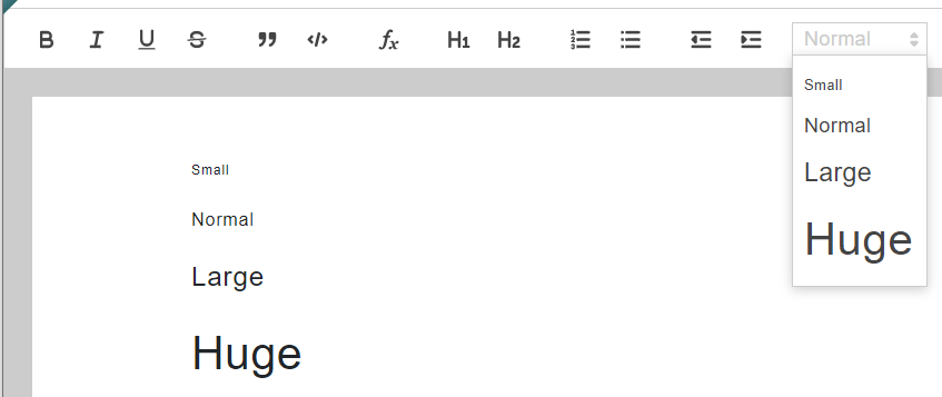
Paragraph Font Size
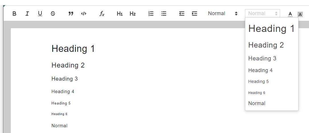
Paragraph Heading Size
Text Color and Background Color

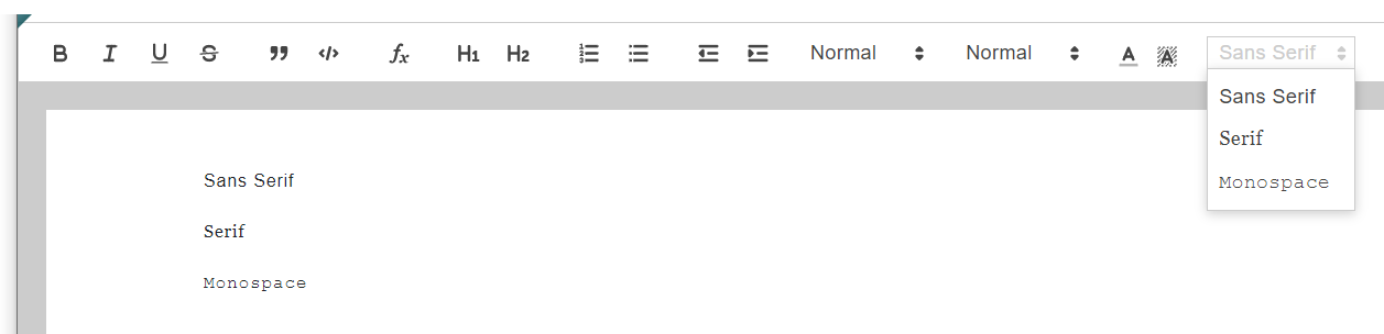
Text Font Type Style
Paragraph Alignment

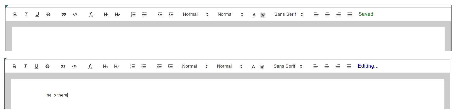
Input Status Indicator
Format Text
For word formatting, select the text to format, then select an option from the Format Menu Bar to apply format.
For paragraph formatting either:
- Select the paragraph, or
- Place the cursor just before the first character, within the text, or just after the last character, before the return. Select an option from the Format Menu Bar to apply format.
NOTE: Text attributes will automatically update on the editor's screen, but the user needs to press "enter" for shared map(s) to update for real time collaboration.
Spreadsheet

Click the "Spreadsheet" box on the Index screen to view the Spreadsheet App.
Undo/Redo Formatting Buttons
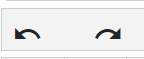
To undo text or cell formatting, click the arrow left icon. To redo text or cell formatting, click the arrow right icon.
Text and Cell Formatting

To change the attributes of a cell or its content, select the cell(s), then select an attribute from the cell attributes menu bar. User can change font style; font size; cell text alignment (left, center, right); font weight bold; text color; and cell background color.
Insert Column
To insert a column, right click the column header to display the context menu; then select either option to Insert a new column before/after.
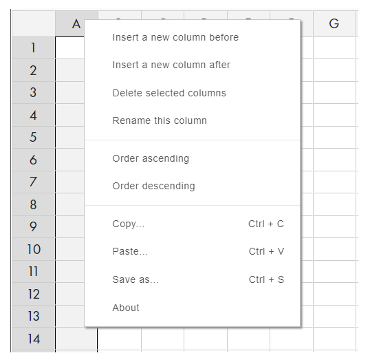
Delete Column(s)
To select one column to delete, right click on that column header.
To select more than one consecutive columns to delete, hold down the shift key while clicking the column headers. Click the columns from left to right.
Right click on a selected column header to display the context menu; then select option Delete selected columns.
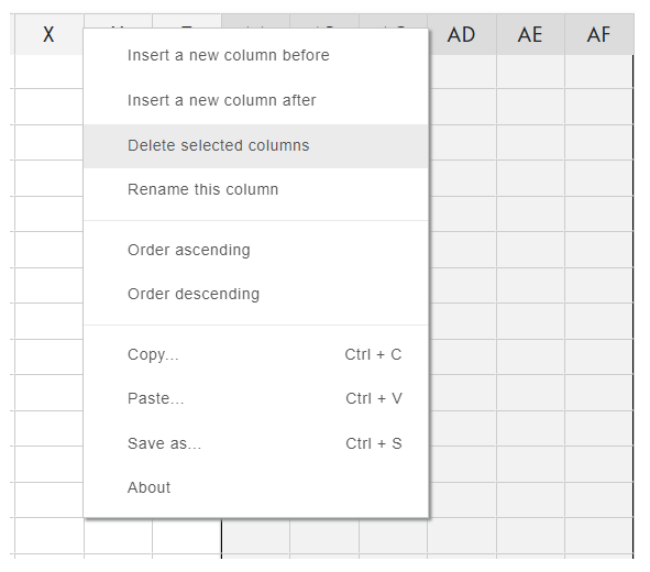
Rename Column
Right click on a column header to display the context menu; then select the option Rename this column. A modal will display with the current column header Name. Change the content in the textbox, then click the "OK" button; otherwise, click "Cancel".
Order Ascending/Descending
To order rows based on the input of a column: select the column header; right click to display the context menu; then select "Order ascending" or "Order descending".
Insert Row
Click the row number or any cell within that row; right click to display the context menu; then select either option to Insert a new row before/after.
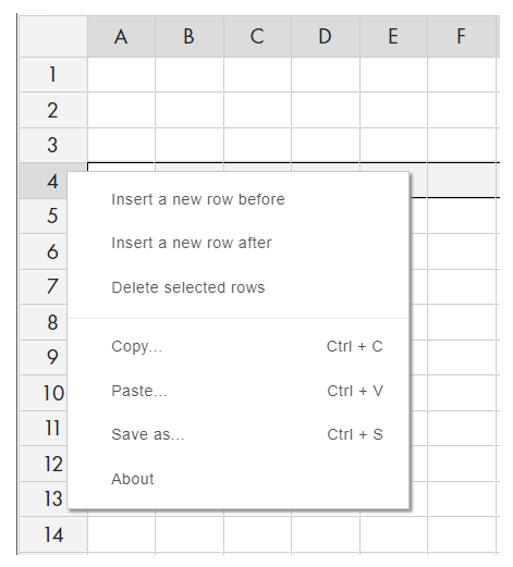
Delete Row(s)
To select one row to delete, click the row number or any cell within that row.
To select more than one consecutive rows to delete, hold down the shift key while clicking either two row numbers or two cells in different rows. Click the cell/row with the lowest number first.
Right click on a selected row number or selected cell to display the context menu; then select option Delete selected rows.

Copy/Paste
To copy the content of cell(s): select the content to copy; right click to display the context menu; then select option Copy. To paste contents of the clipboard: select first cell to paste into; right click to display the context menu; then select option Paste.
Toggle Chart/Spreadsheet
Click the "Toggle View" button (located on the left, just above the spreadsheet) to view the spreadsheet input in chart format or spreadsheet format.
Toggle View button when displayed above Spreadsheet.
Chart with Input
Toggle View button when displayed above Chart.
Chart View
Chart Options and Selections
The Chart initially displays in default view, without any selections.
The user should make their Chart selections.
Chart with Options and Selections
Poll
Click the "Poll" box on the Index screen to view the Poll App.
Create Poll
User should input "Title" of Poll on the header. On the Poll Form, "Description" is optional.
Question Group
Each Poll must have input for at least one Question with at least two corresponding Answer Options. User should select the number of selectable answer options (default 1).
Add Answer Option
Click the "Add Option" button to include another answer option textbox to the corresponding group.
Edit Option Position
User can rearrange the Answer Options by drag 'n drop.
Remove Answer Option
To remove an Answer Option, click its corresponding "Remove Option" button. Since the first two answer options are required, the user will need to drag 'n drop before removal.
Add Question Group
Click the "Add Question" button to include another Question Group to the Poll.
Edit Question Group Position
User can rearrange Question Groups by drag 'n drop.
Remove Question Group
To remove a Question Group, click its corresponding "Remove Group" button. Since the first question is required, the user will need to drag 'n drop before removal.
Poll End Date
Poll End Date is optional. User can select date from date picker; edit end date; or click "Clear Date" button to remove.
Poll URL
The Poll Vote is given a random URL.
User should click the "Copy URL" button, then save the Poll Vote URL with the Poll Map URL.
Preview Button
When the "Preview" button (located on the bottom right) is clicked, the Poll Form will be validated. If it passes validation, then the Poll Preview screen will display. Otherwise, any textbox that requires input will fail validation, and will temporarily be outlined in red.
Poll Preview
A preview of the Poll Vote will display. Click the "Close" button to return to the Poll Form screen.
Launch Poll Button
When user(s) decide that the Poll is ready for voting, click the "Launch Poll" button located next to the Poll URL.
A "Poll launched successfully..." message will display.
The "Launch" button will no longer be visible. The text, "Poll has been published. Please copy link above to share." will display below the Poll URL.
The Poll Vote URL should be sent to voters.
The Poll Form can still be updated, until the first poll vote is submitted.
The Poll Form will become disabled after the first poll vote is submitted, and the total submits will display at the bottom of the screen, along with the "Show Results" button and "Reset Poll" button.
Show Results Button
After at least one poll vote is submitted, user can click the "Show Results" button that displays at the bottom of the Poll Form.
Reset Poll Votes Button
Clicking the "Reset Poll Votes" button will delete the Poll Votes, and enable the Poll Form. The "Show Results" button and "Reset Poll Votes" button will not display, until a poll vote is successfully submitted.
Poll Vote
User should input their Name on the User Name modal (click "Users" button), fill out the Poll Vote, then click "Submit" or "Reset".
A message will display after a poll vote is successfully submitted.
Poll Results
When the "Show Results" button is clicked, the Poll Results screen will display. Each Question in the Poll will have a corresponding chart for submitted Poll Votes.
User should select the type of chart and make selections to complete the desired chart.
User can click the "Go Back" button to return to the Poll Form screen.
NOTE: User should "Export" the chart(s) to image or PDF.
Calendar
Click the "Calendar" box on the Index screen to view the Calendar App.
Calendar Navigation
The Calendar displays with the current month by default. To view the previous month, click the left arrow before the Month Name above the Calendar. To view the next month, click the right arrow after the Month Name above the Calendar.
Calendar Views
The Calendar Map displays in Month (default), Week, and Day views. The user selects a view from the selector, located on the right side above the calendar.
Month View
Week View
Day View
Add Sprint
When a user drags
Add Event
When a user double clicks or drags within a single date area of the Calendar, the Add Event/Sprint Modal will display with form elements for "Add Event" by default.
"Title" is required, and "Description" is optional. By default: "Start" and "End" Date will be the date clicked or dragged within; "Start" Time will be the current time; and "End" Time will be one hour after the "Start" Time.
To change the "Start" Date or "End" Date, click the corresponding textbox:
- Select a date from the date picker that displays, or
- Manually input a valid date in the correct format.
To change the "Start" Time or "End" Time, click the corresponding textbox:
- Select a Hours and Minutes from the time picker that displays, or
- Manually input valid time in the correct format.
For all day event, check the "All Day" checkbox.
When the "Title" has input, the "Add" and "More Options" buttons will become enabled.
To make the event recurring, click the "More Options" button to display the "Add Recurrence" modal.
Select from the recurring options.
Click the "Continue" button to include recurring selections, or "Cancel" button. Click the "Add" button to save the event; or close the modal by clicking the "X" icon to cancel.
Event Options Modal
Click the event "Title" on the calendar to display the Event Actions modal. Click the "X" to close the modal, or another actions button.
Event Color Picker
Click the "Color Picker" icon on the Event Actions modal to display the Color Picker modal. Select a color, then click "Update" or "Cancel".
Edit Event
Click the "Edit" icon on the Event Actions modal to display the "Edit Event" modal. Make changes, then click "Update"; or close the modal to cancel.
User can drag 'n drop an event to a different location on the calendar, changing its Start and End date(s).
User can change the End date of a multi-day event by drag 'n drop using the end selector.
Delete Event
Click the "Trash" icon on the Event Actions modal to delete the event.
Switch to ToDo
Duplicate Calendar Map Modal
To make a duplicate of a Calendar map: Click the "Duplicate" button on the top menu bar; select a date from the Clone Modal that displays; then Click "Clone". Otherwise, click "Cancel".