How I adapted the example code and made it my own - MartijnKeesmaat/functional-programming GitHub Wiki
The code I use in its entirety is referenced in the code. For example with this wrap function below. These types of functions are easily referenced. Libraries I use like D3 or the examples I've used as a base are referenced as an acknowledgment in the readme. Below this code block, I show how I adapted the examples and made them my own.
// https://bl.ocks.org/guypursey/f47d8cd11a8ff24854305505dbbd8c07
export function wrap(text, width) {
  text.each(function () {
    let text = d3.select(this),
      words = text.text().split(/\s+/).reverse(),
      word,
      line = [],
      lineNumber = 0,
      lineHeight = 1.1, // ems
      y = text.attr("y"),
      dy = parseFloat(text.attr("dy")),
      tspan = text.text(null).append("tspan").attr("x", 0).attr("y", y).attr("dy", dy + "em")
    while (word = words.pop()) {
      line.push(word)
      tspan.text(line.join(" "))
      if (tspan.node().getComputedTextLength() > width) {
        line.pop()
        tspan.text(line.join(" "))
        line = [word]
        tspan = text.append("tspan").attr("x", 0).attr("y", y).attr("dy", `${++lineNumber * lineHeight + dy}em`).text(word)
      }
    }
  })
}
Bar chart
I learned how the build the most basic chart from FCC. Below you see the screenshot of how this chart looks.
Just 8 bars created with a rect elements that have a navy blue fill. Above those, you see the value of each bar displayed.
    svg.selectAll("rect")
       .data(dataset)
       .enter()
       .append("rect")
       .attr("x", (d, i) => i * 30)
       .attr("y", (d, i) => h - 3 * d)
       .attr("width", 25)
       .attr("height", (d, i) => 3 * d)
       .attr("fill", "navy")
This is the code that creates these bars. Since I followed the FCC course I gained the basic knowledge of how to use D3. Then I used that basic knowledge, created a custom design and coded the graph.
How I adopted the bar graph
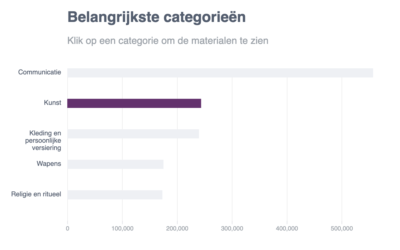 Here you see the result I created from the example.
- Changed the orientation of the bars to horizontal.
- Added labels to the side and wrapped it with a max-width
- Added a scale
- Added the x-axis
- Added gridlines
- Styled the graph according to the design
Change the orientation
This can be done by changing the x and y values. Here I also adjust the values to match the design. This is the code above which I adjusted to fit my needs.
const addBarsToBarChart = (xScale, svg, categories, barheight, barSpacing) => {
  svg
    .selectAll("rect")
    .data(categories)
    .enter()
    .append("rect")
    .attr("x", (d, i) => 100)
    .attr("y", (d, i) => i * barSpacing)
    .attr("width", d => xScale(d.value))
    .attr("height", barheight)
    .attr("class", "bar")
}
Add labels to the side
I wrote this code myself. Since I followed the FCC tutorial I knew how to dynamically add text elements. Using the same principles as the bar chart, I could now add the text. I wrote a capitalize function, which capitalizes each first letter of a string. Then I used a wrap function that I used from someone else. This is linked as a comment in the code.
const addLabelsToBarChart = (svg, categories, labelWidth, barSpacing) => {
  svg
    .selectAll("text")
    .data(categories)
    .enter()
    .append("text")
    .text(d => capitalize(d.name))
    .attr("x", (d, i) => 0)
    .attr("y", (d, i) => (i * barSpacing) + 10)
    .attr("class", "label")
    .attr("dy", 0)
    .attr("text-anchor", "end")
    .attr("transform", "translate(90," + 0 + ")")
    .call(wrap, labelWidth);
}
xScale
I used the scale from a later chapter in the tutorial. The example was from a scatter plot that had implemented a scale. What I did with this code is put it into a function that I later save in a variable. This makes the code more functional and reusable.
const addXScaleBarChart = (width, barSpacing, categories) => {
  return d3
    .scaleLinear()
    .domain([0, d3.max(categories, d => d.value)])
    .range([barSpacing, width - barSpacing]);
}
Gridlines
I wrote this code based on the D3 docs and then adapted it to the design.
const addGridlinesToBarChart = (svg, width, height, xScale) => {
  const x = xScale;

  svg.append("g")
    .attr("class", "grid")
    .attr("transform", "translate(50," + (height - 45) + ")")
    .attr("stroke", "#E9EBF1")
    .call(makeXGridlines(x)
      .tickSize(-height)
      .tickFormat("")
    )
}
Donut chart
Here you can see the example I used for the donut chart. I used an example for this chart since I didn't know how to create the arcs of the donut shape.
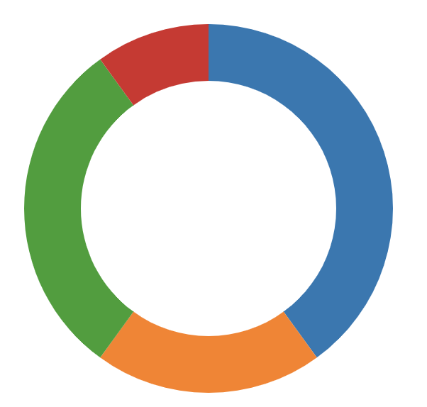
Here you see the main code that the donut chart uses to create the donut-like shape. This code is just one blob. There is no structure to it and lacks comments. It reminds me of the spaghetti code I used to write with jQuery. This code became the base of my code. I then added structure to it and adapted it to my design.
var radius = Math.min(width, height) / 2;
var color = d3.scaleOrdinal(d3.schemeCategory10);

var svg = d3.select("#chart")
.append('svg')
.attr('class', 'pie')
.attr('width', width)
.attr('height', height);

var g = svg.append('g')
.attr('transform', 'translate(' + (width/2) + ',' + (height/2) + ')');

var arc = d3.arc()
.innerRadius(radius - thickness)
.outerRadius(radius);

var pie = d3.pie()
.value(function(d) { return d.value; })
.sort(null);
How I adopted it
Instead of writing all the code in the global scope, I went for a more functional approach. Here you see my main function which contains a function for each step like storing the arcs in a variable and adding a legend.
export default function renderDonutChart(categories, size, thickness) {

  // Setup
  const width = size, height = size;
  const radius = Math.min(width, height) / 2;
  const colorPalette = addColorPalette();

  // Create donut
  const svg = addGlobalSvg(width + 180, height + 30)
  const arc = addArc(thickness, radius);
  const g = rotateArc(svg, width, height);
  const pie = addPieRadius();
  let path = createArcPaths(g, pie, categories);
  addLegend(categories, colorPalette);

  // Interactions
  showCategoryText(path);
  resetDonutText(path, categories);
  path = addFillToDonut(path, arc, colorPalette);
  addArcHover(path, colorPalette);
  addDefaultText(categories, width, height);
}
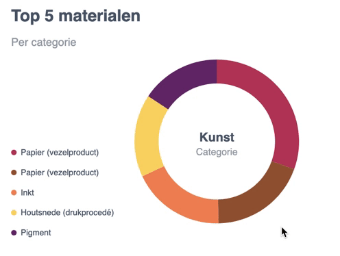
Then I adopted this donut chart to my design and added functionality.
Adopting the style
I added a custom color palette with D3, added the correct data and changed the dimensions.
const addColorPalette = () => {
  const colorArr = ['#B83B5E', '#995A3A', '#F08A5D', '#F9D769', '#6A2C70'];
  return d3.scaleOrdinal(colorArr);
}
Adding functionality
Default text
This function adds the text to the center of the donut. This text is later updated with a mouseover to show the value of the category.
function addDefaultText(categories, width, height) {
  const defaultText = d3
    .select('.pie')
    .append("g")
    .attr('class', 'default-text');

  defaultText.append("text")
    .attr("class", "donut-title")
    .text(truncator(categories[1].name, 1))
    .attr('text-anchor', 'middle')
    .attr('dx', width / 2 + 180)
    .attr('dy', height / 2)

  defaultText.append("text")
    .attr("class", "donut-sub-title")
    .text('Categorie')
    .attr('text-anchor', 'middle')
    .attr('dx', width / 2 + 180)
    .attr('dy', height / 2 + 20)
}
Adding a legend
I also created a legend that shows a text and a circle that corresponds with the donut-chart. For this, I could use the same principles I learned from the FCC tutorial.
const addLegend = (categories, colorPalette) => {
  const legend = d3
    .select('.pie')
    .append("g")
    .attr('class', 'legend');

  legend
    .selectAll("text")
    .data(categories[1].materials)
    .enter()
    .append("text")
    .text(d => capitalize(d.name))
    .attr("x", (d, i) => 14)
    .attr("y", (d, i) => 140 + (50 * (i / 1.7)))
    .attr("class", "legend-label")

  legend
    .selectAll("circle")
    .data(categories[1].materials)
    .enter()
    .append("circle")
    .attr("r", 4)
    .attr("cx", (d, i) => 4)
    .attr("cy", (d, i) => 140 + (50 * (i / 1.7)) - 4)
    .attr("class", "legend-color")
    .attr('fill', (d, i) => colorPalette(i))
}
Donut part hover
The original donut already had a hover effect. I removed this code and used my own. The code was removed since it simply had too much code for what it did.
const showCategoryText = el => {
  el.on("mouseover", function (d) {
    d3.select('.donut-title').text(truncator(d.data.name, 1));
    d3.select('.donut-sub-title').text(`${d.data.value} objecten`);
  })
}
This text is then reset by replacing the hover text with the default text. This is done on the mouseout event.
const resetDonutText = (el, categories) => {
  el.on("mouseout", function () {
    d3.select('.donut-title').text(truncator(categories[1].name, 1));
    d3.select('.donut-sub-title').text('Categorie');
  })
}
Darken donut color
The color of the donut is darkened with this mouseover function. I select the this element which updates the style element and uses this darken function. The link is placed in the javascript helpers.js file.
.on("mouseover", function (d) {
      d3.select(this)
        .style("cursor", "pointer")
        .style("fill", shadeColor(colorPalette(this._current), -20));
    })